New 2017 Mercedes-Benz E-Class Interior Raises The Bar
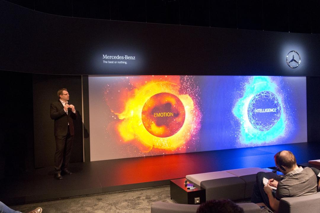
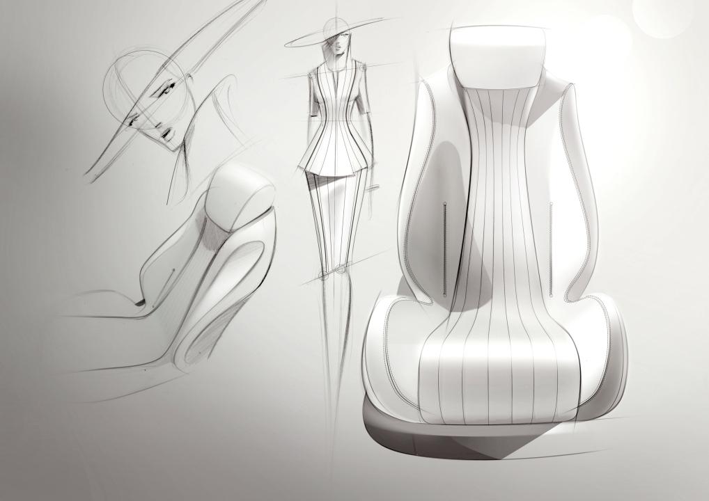
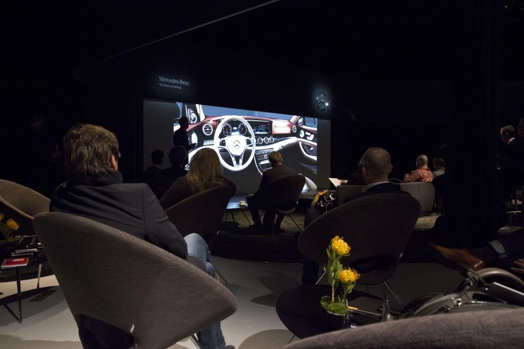
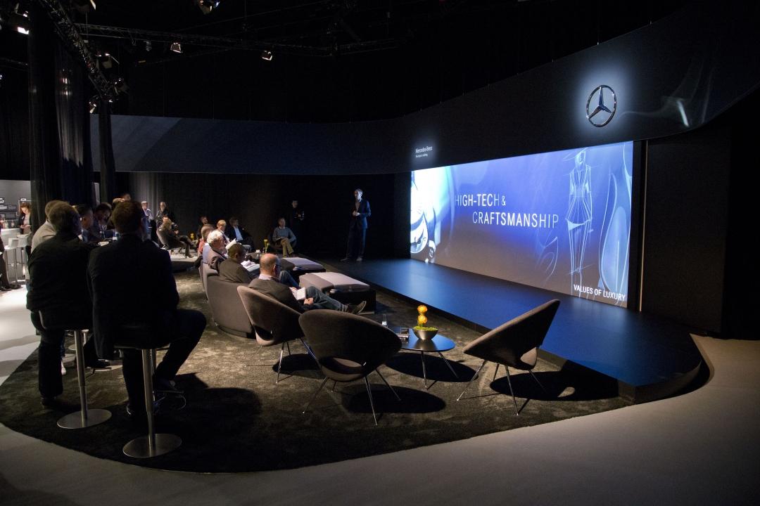
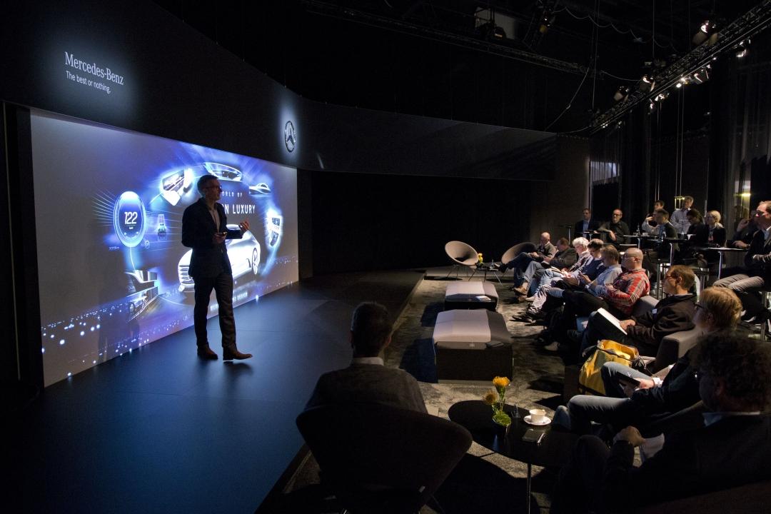
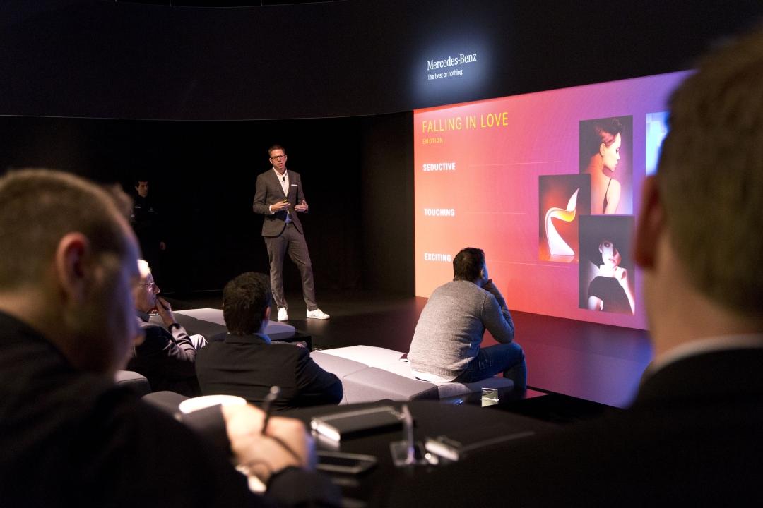
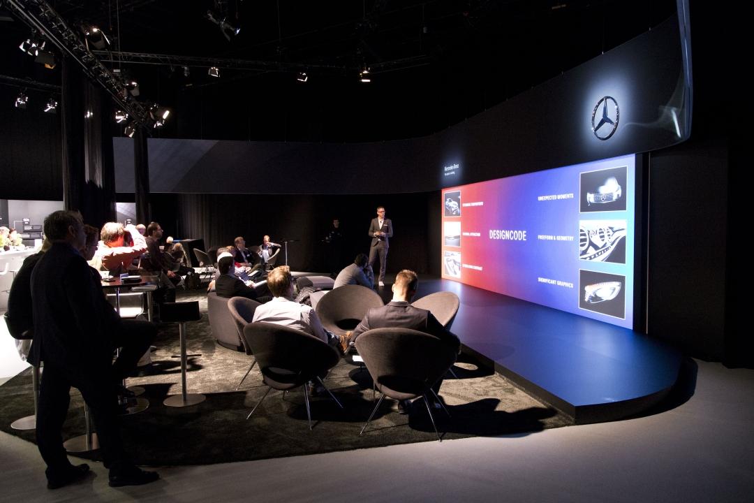
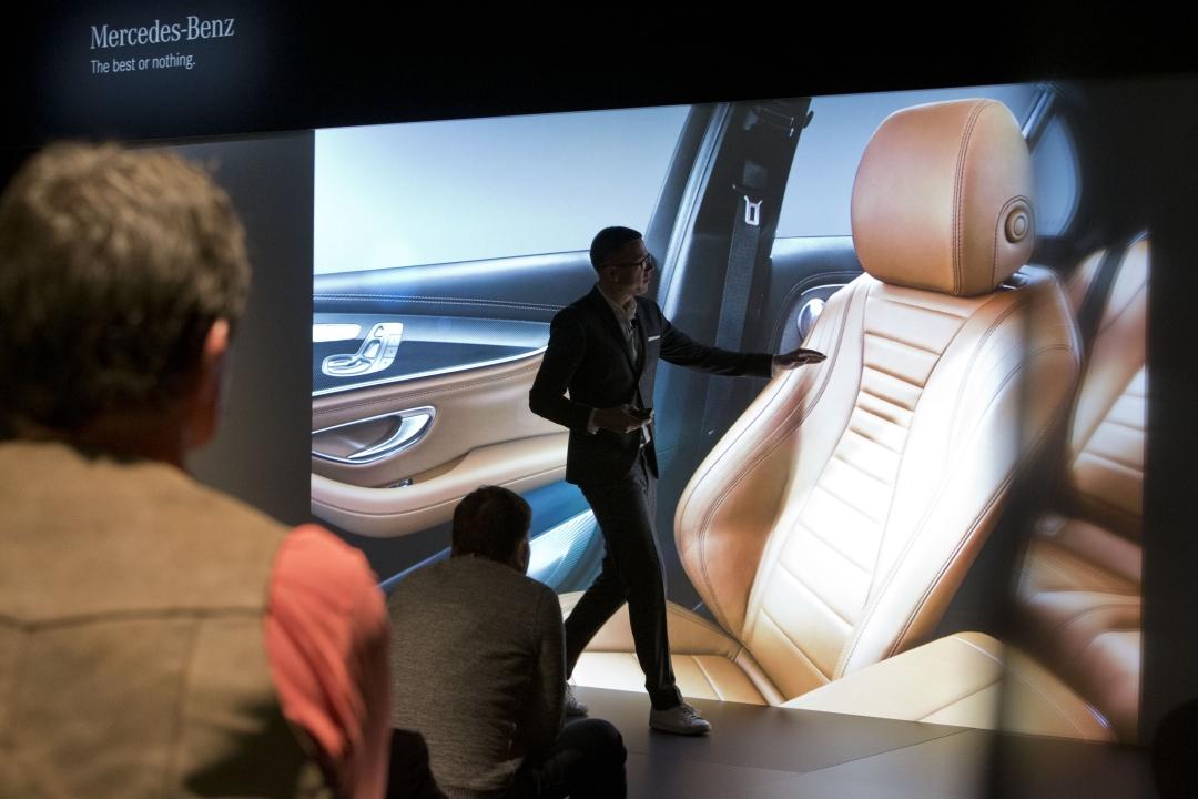
There were a lot of loaded, descriptive words thrown out during Mercedes-Benz's intimate press conference describing the new E-Class. "Luxury", "simplicity", "experience", "high-tech", "beauty"... all of which tie into a hard division between two categories: emotion and intelligence, the yin and yang if you will of the automaker's latest view on what a high-end sedan should be.
The new core of the Mercedes-Benz brand is made up of emotion — things like, according to the company, the contrast between using colors such as red and free movements such as red hot flames – and intelligence – which is simply pure form.
Image Credit | Mercedes-Benz
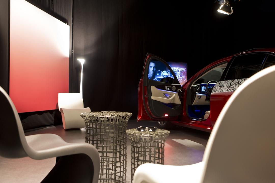
Words only get you a fraction of the way, mind; turned out, Mercedes had a fairly surreal way in mind for me to physically experience the new car.
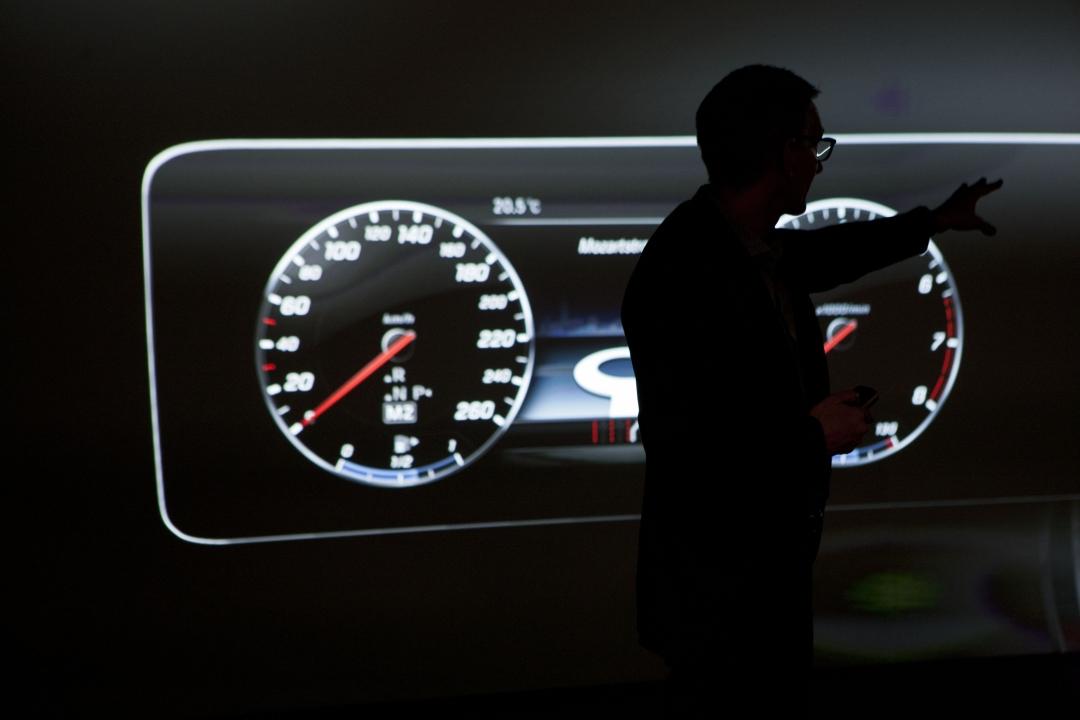
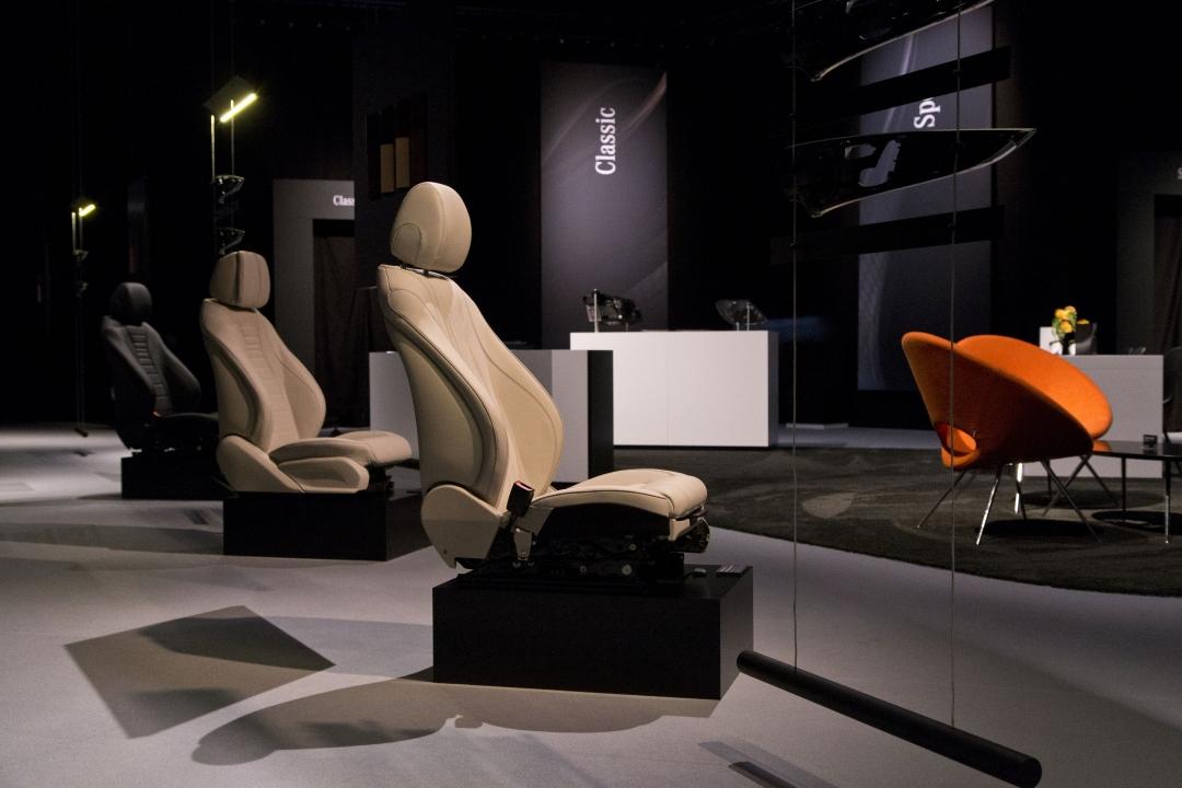
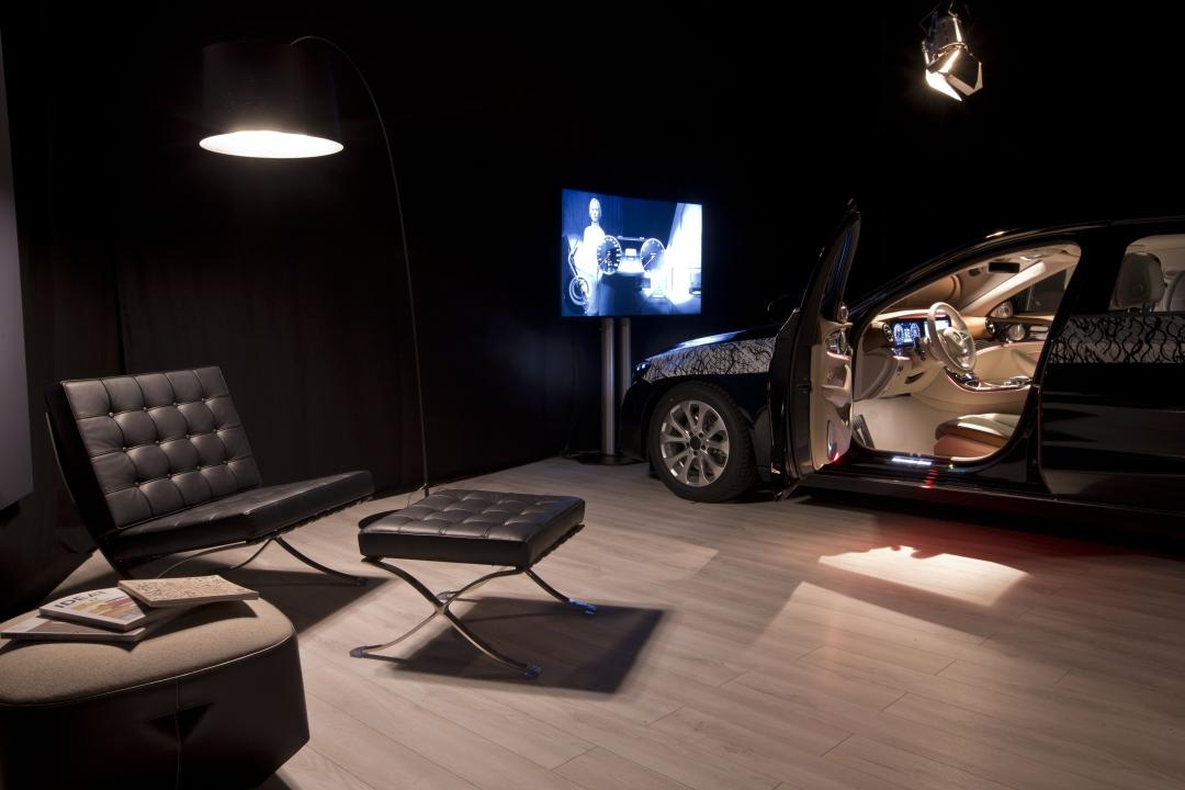
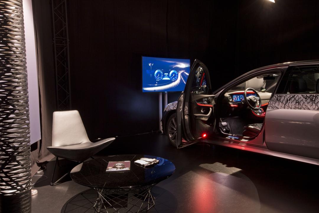
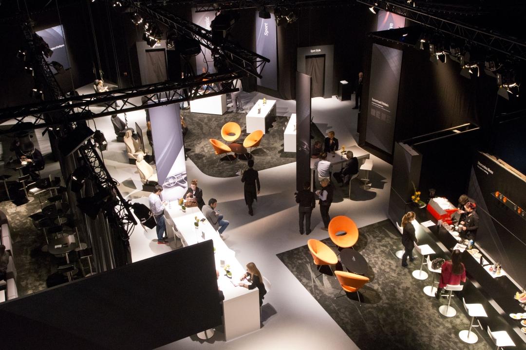
The setup: four new E-Class models, neatly tucked into its own partitioned nook behind black curtains. In one space, I can try out the Classic model, the standard configuration with the default two-gauge dashboard and various driver-selectable pages set in the screen the analog dials flank.
Image Credit | Mercedes-Benz
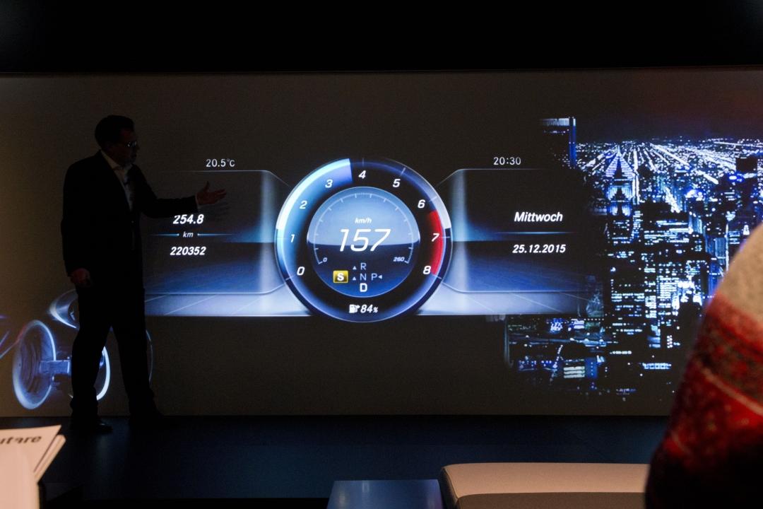
More interesting layouts appear in the new Sport and Progressive screen designs, with less analog and more digital to play with. The final curtain hides an E-Class fitted with the new, second-generation Burmester 3D surround system – the second-generation to what wowed audiophiles in the S-Class – with a whopping 23 speakers and two amplifiers for a total of 1540 watts.
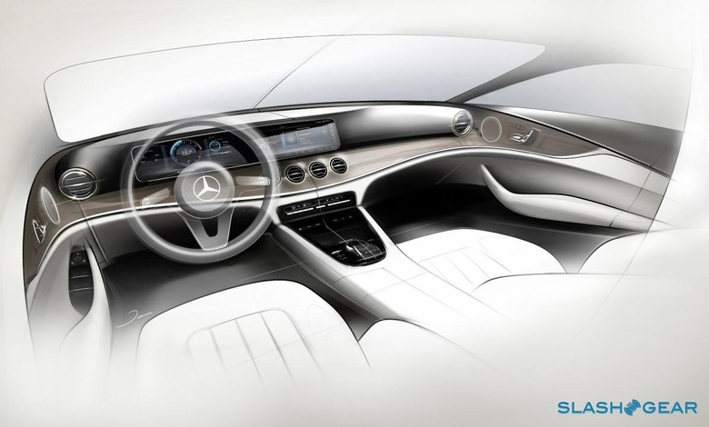
More displays, fewer physical buttons and all-round simpler yet elegant design
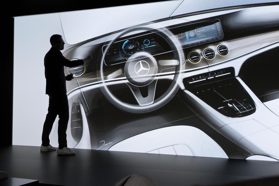
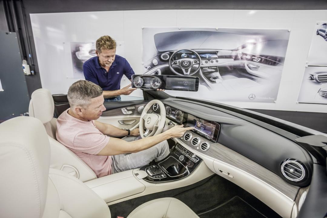
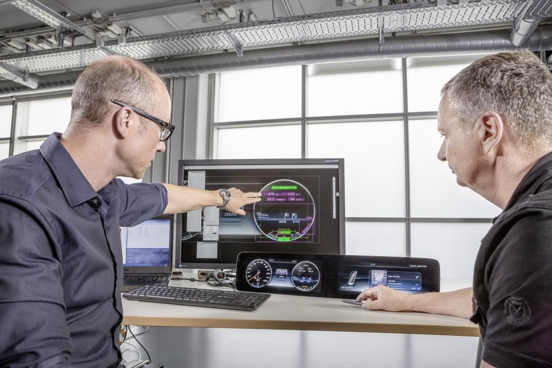
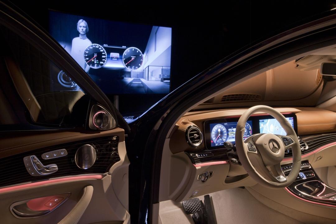
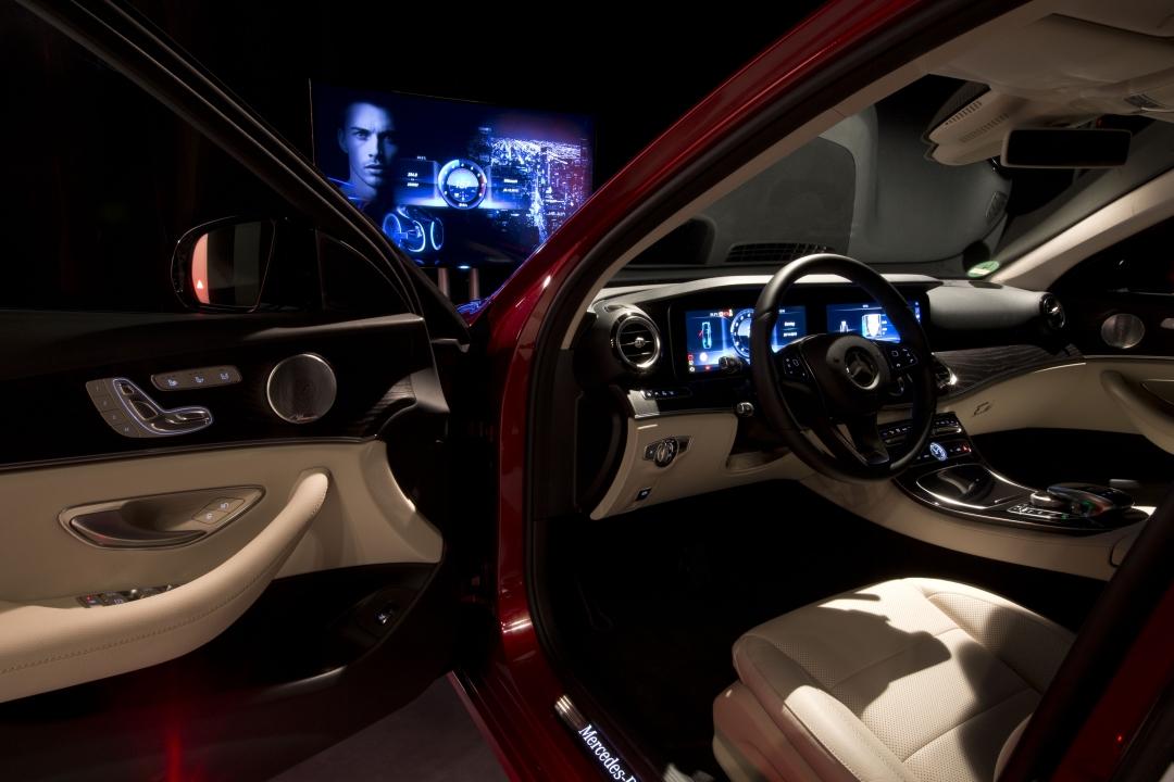
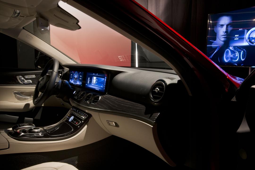
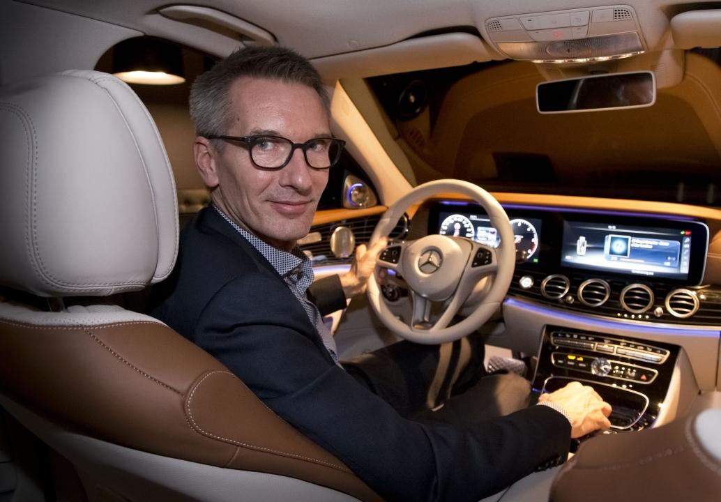
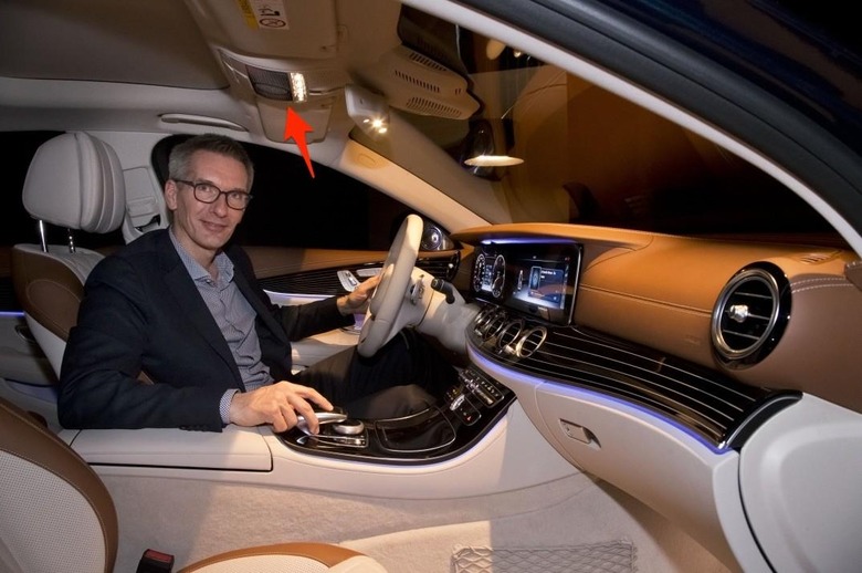
After handing over my phones and any recording devices I might have smuggled in with me, I slipped past the first curtain to experience the Progressive model. Mercedes has given this particular E-Class variant dual 12.3-inch displays with a resolution of 1920 x 720 pixels. Though they're two separate panels, they're covered by a single sheet of Gorilla glass: the resulting visual effect is spectacular, a real sense of a cohesive interface spanning both driver and front-seat passenger.
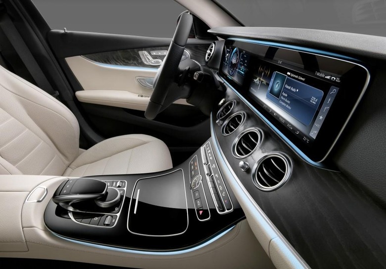
Image Credit | Mercedes-Benz
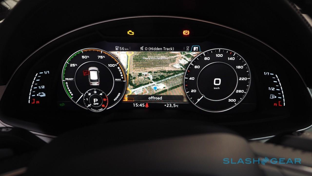
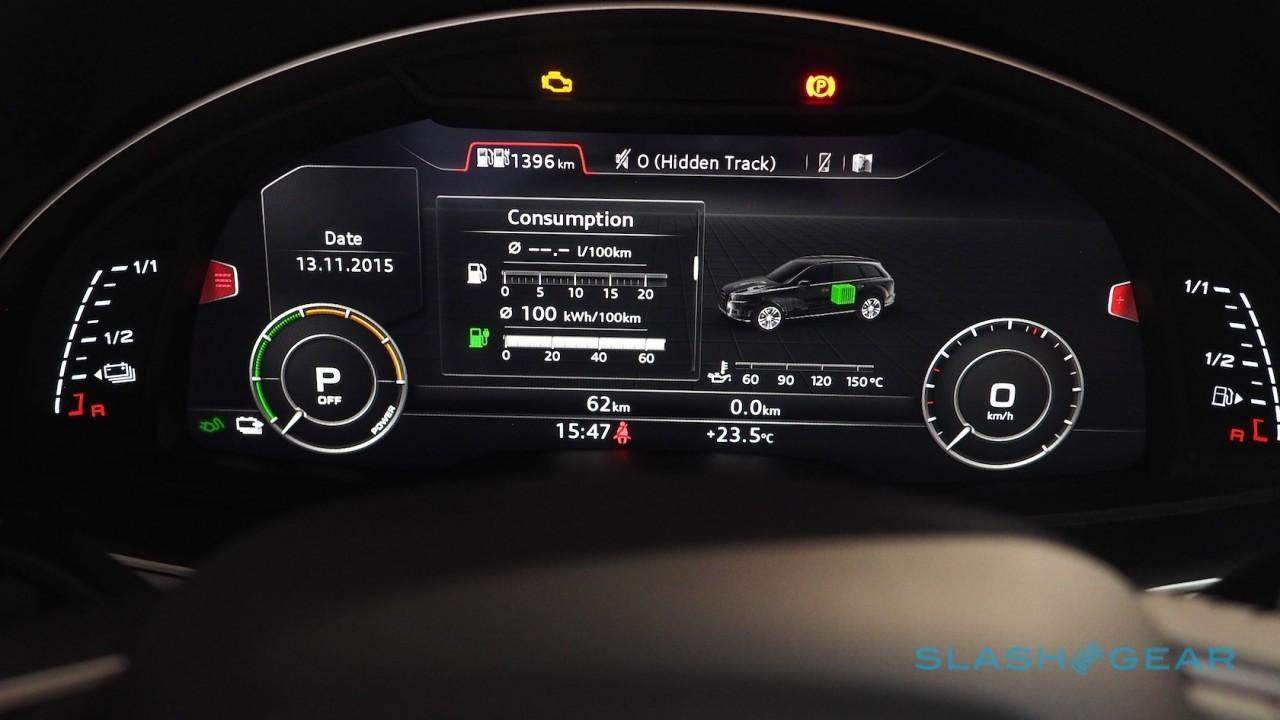
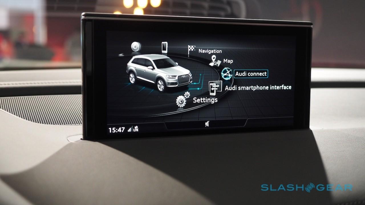
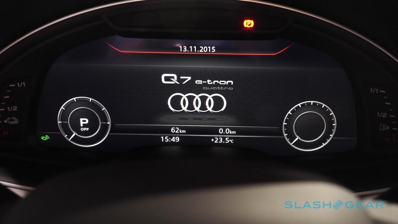
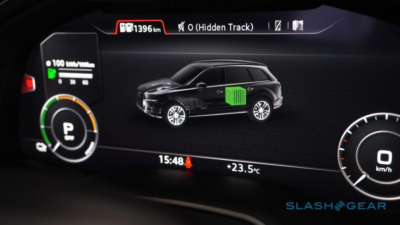
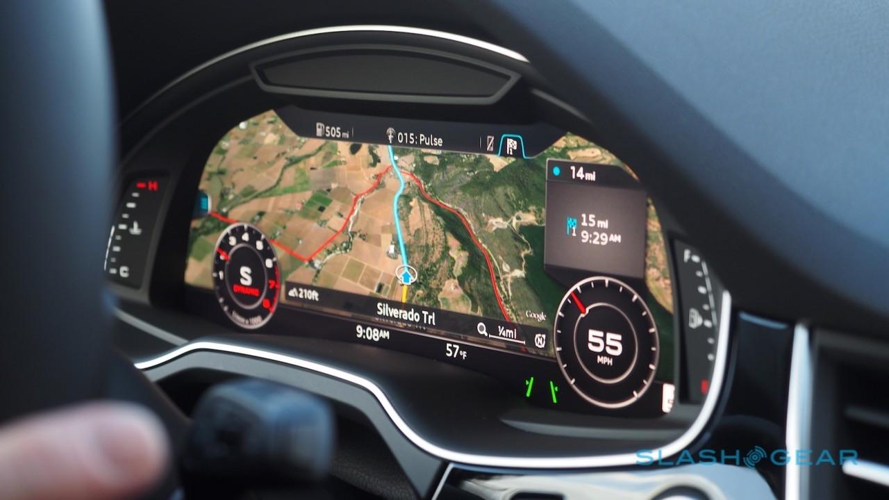
The obvious comparison is the Virtual Cockpit that Audi has used to great effect in its R8, TT, and most recently Q7 models, which also replaces traditional dials with a far more configurable digital display.
Image Credit | Mercedes-Benz
While I do love both implementations – I'm all for anything that gives you better information while you're on the move – I do think Audi's is more striking courtesy of its Google Earth integration, the entire display becoming your navigation screen with small cutouts for tach, speed, and other details. Other than that, though, both allow for drivers to easily change the look of the dials and the type of information being displayed.
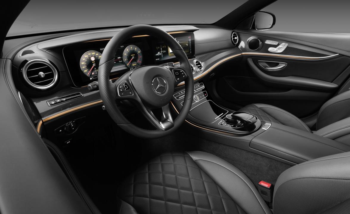
The ultra-widescreen aspect of Mercedes' panels, along with the horizontal layout of the dashboard leaves a clean line spanning from the doors up, around, and over to the passenger's door. Engagingly, the split between driver and passenger is clear, yet when I sat on the passenger side, I felt as much a part of the car as I had in the driver's seat.
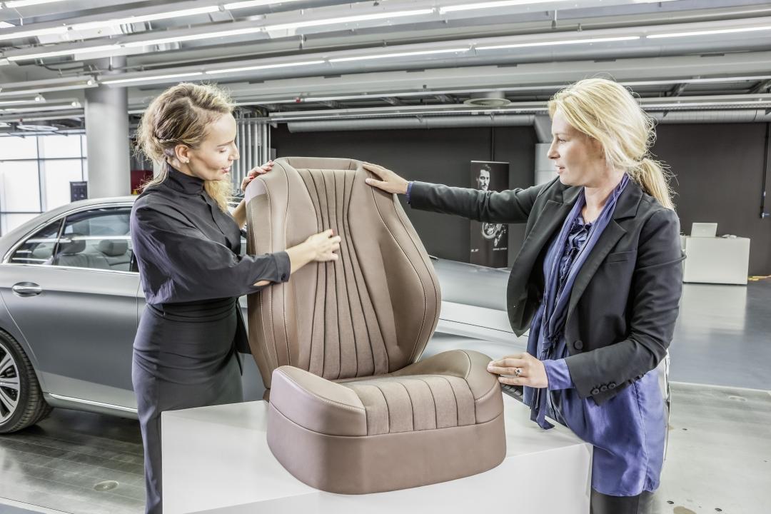
Speaking of seating, new to the E-Class is a redesigned massage option for giving your glutes special attention. It actually consists of four individual massagers – think of each one as a very large thumb – and you get two per cheek. According to Mercedes-Benz's experts, it's meant to help release strain in your lower back, and you certainly notice their handiwork once they get underway.
Image Credit | Mercedes-Benz
Don't get too relaxed, mind; there's still a luxury sedan to pilot. The steering wheel features new touch-control buttons, square-ish touchpads featured for the first time ever on a wheel. Placed at the 3 and 9 o'clock positions, they're perfectly placed to be caressed by your thumbs.
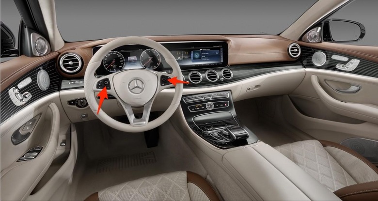
The left controls the driver display, paging through various screens of information about the car in the instrument cluster, as well as changing drive modes and navigation instructions. The right, meanwhile, controls the center stack display, which in turn handles all the infotainment settings.
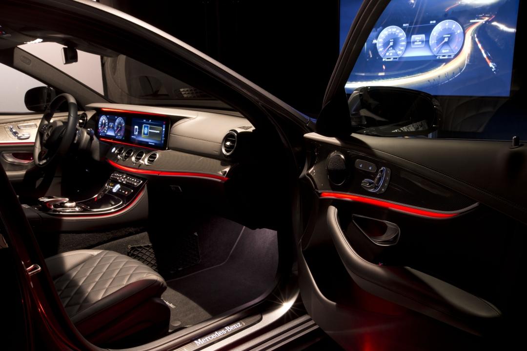
You're not limited to the wheel, mind. There's the standard touch/scroll wheel in the center console – useful if your passenger wants to take charge – and that's also where you activate the various massage settings for both driver and passenger. Since personalization is a big theme for the E-Class this time around, there are 64 colors for the interior lighting, which can again be selected using the scroll wheel.
For anyone who's ever used a modern smartphone with a touchscreen, swiping up, down and side-to-side should come as natural gestures. To select, you push down and get a nudge of tactile feedback in return.
Great in theory, but since fingers get dirty from greasy food, dirt, or whatever else you might encounter on your travels, I was a little concerned about what could sneak between the openings on the two touchpads. According to Mercedes, though, it's a non issue, since the gap is sealed pretty much tight, and I'd imagine not much of anything can get past and seep into the innards.
Mercedes-Benz's other point of pride is the second-generation Burmester 3D Surround-Sound system. Once an option limited to the flagship S-Class, it's now making its way down through the range to more affordable – relatively speaking, mind – cars.
Yes, with more than twenty speakers embedded at various points through the cabin it's hard to miss the extra money you've spent, but more importantly – even in my limited experience – it adds up to an ear-popping listening experience. Burmester and Mercedes cooked up a special 3D-Sound algorithm, just for the S-Class and E-Class, and it lends even traditional, stereo-encoded tracks a cabin-filling dimensionality unmatched by what you find in most other vehicles.
In addition to 3D-Sound, there are four other preset sound modes that I got to sample. Frankly, I'm left with a yearning for more after listening to Hello by Adele in first Pure mode and then 3D-Sound.
With Pure, as the name suggests, there's absolutely no additional processing; it's intended to be the most unadulterated listening experience, and there's a transparency that certainly suits vocal-centric tracks. Switch over to 3D-Sound, however, and it feels like you're in a whole new space. Mercedes had a sample playlist including acoustic tracks dominated by drums, and though it's a cliche you really do feel like you're right there on stage. Lastly, there's the Easy Listening and Surround modes, which fall somewhere in-between the two processing extremes.
You're not just paying for speakers and amps, mind; how they're installed is important too. That includes what Burmester and Mercedes call "Frontbase", which sees the woofers integrated right into the car's firewall so that the space in the cross-member and side-member can be used as resonance chambers.
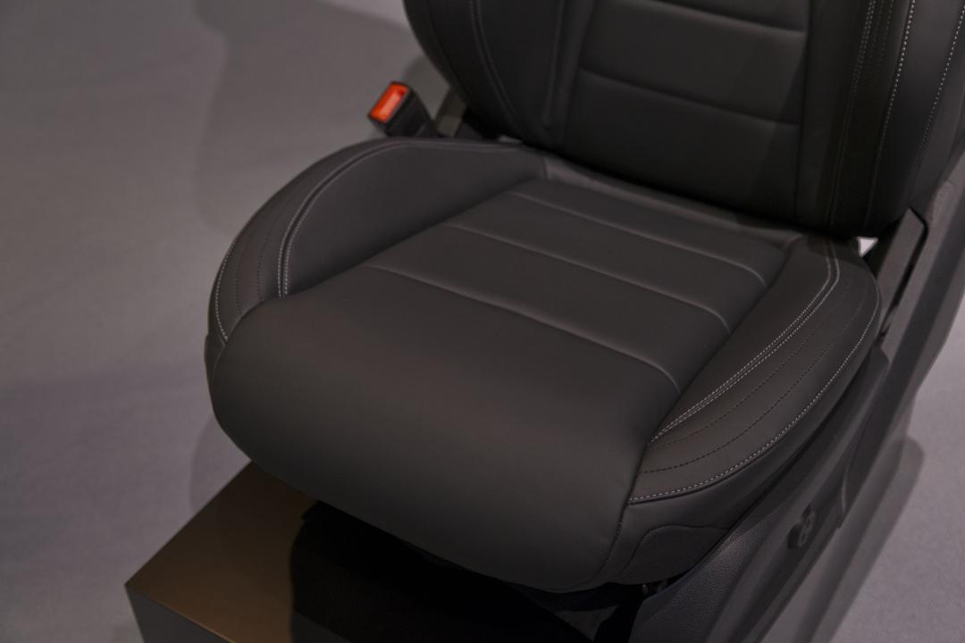
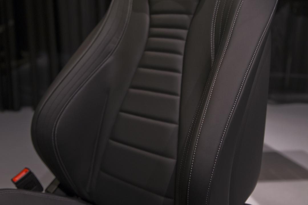
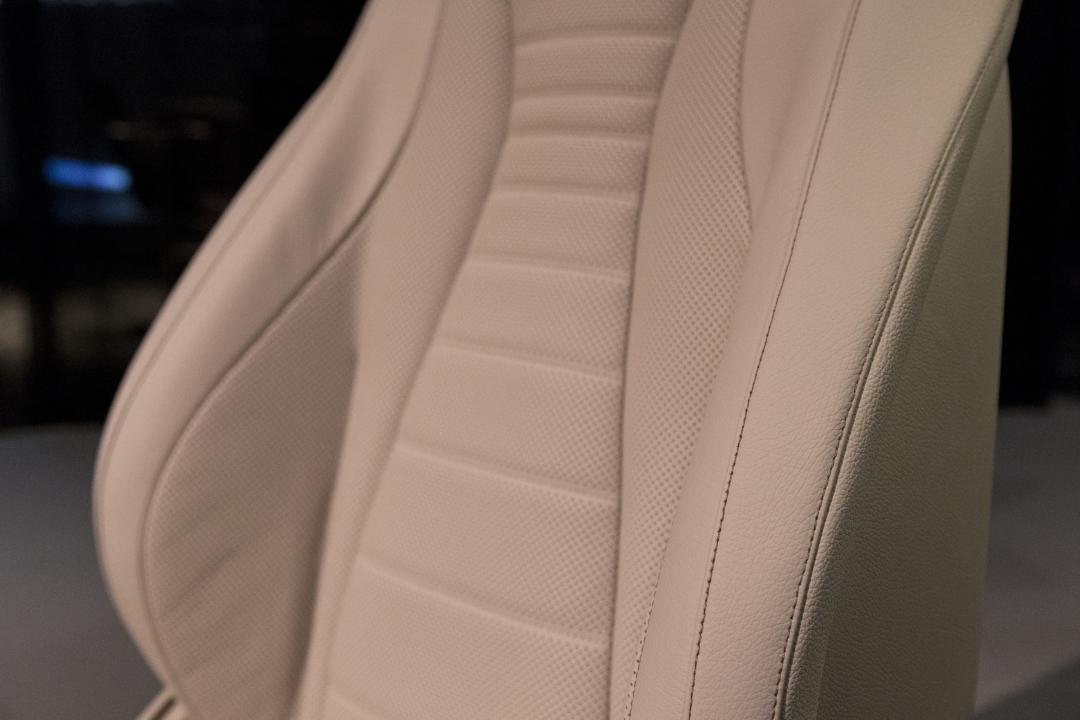
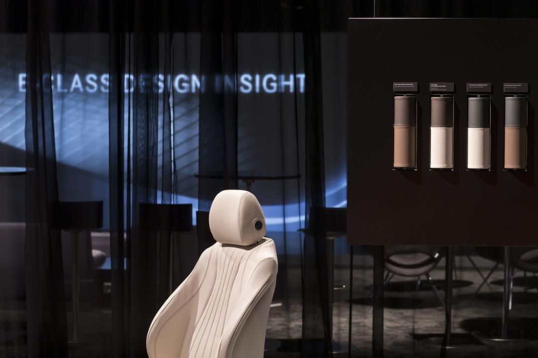
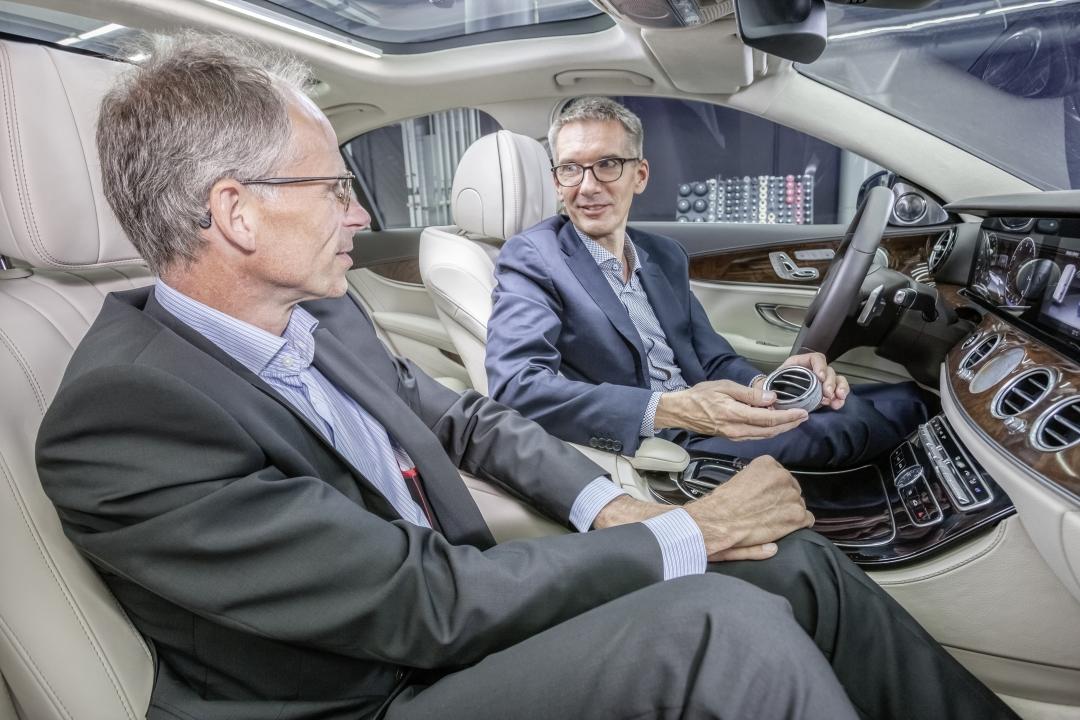
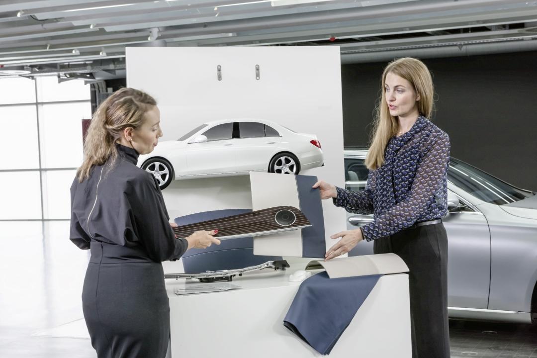
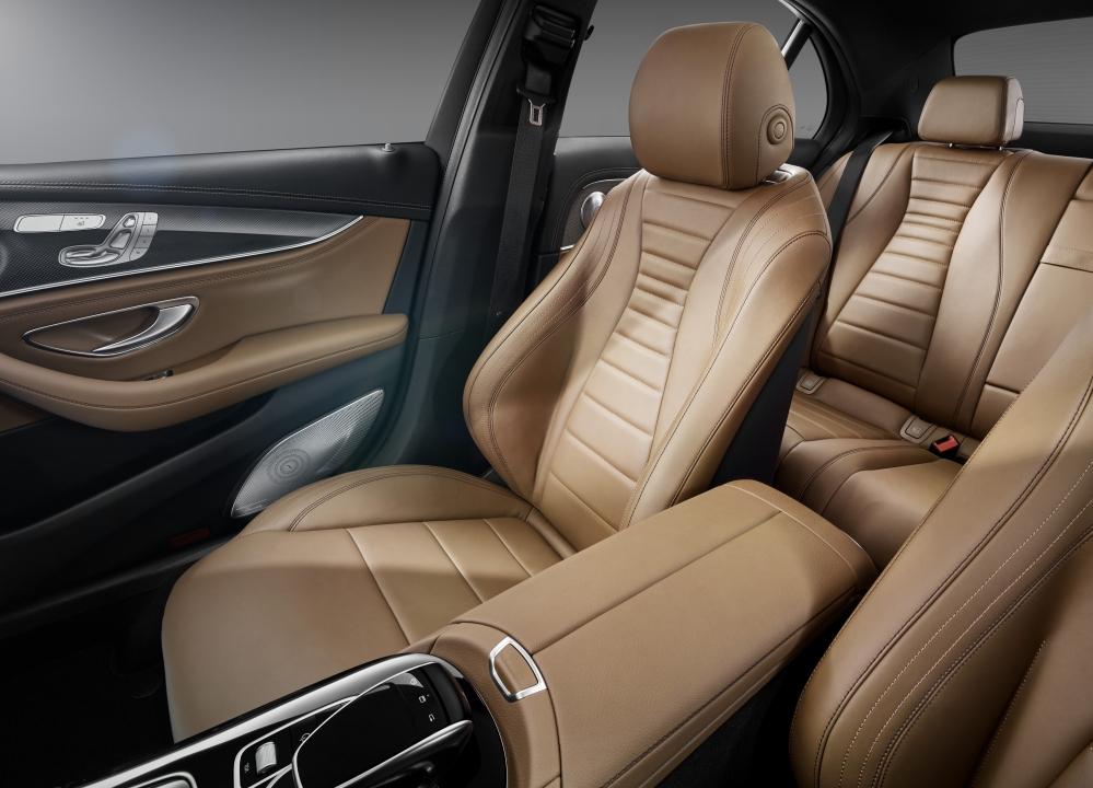
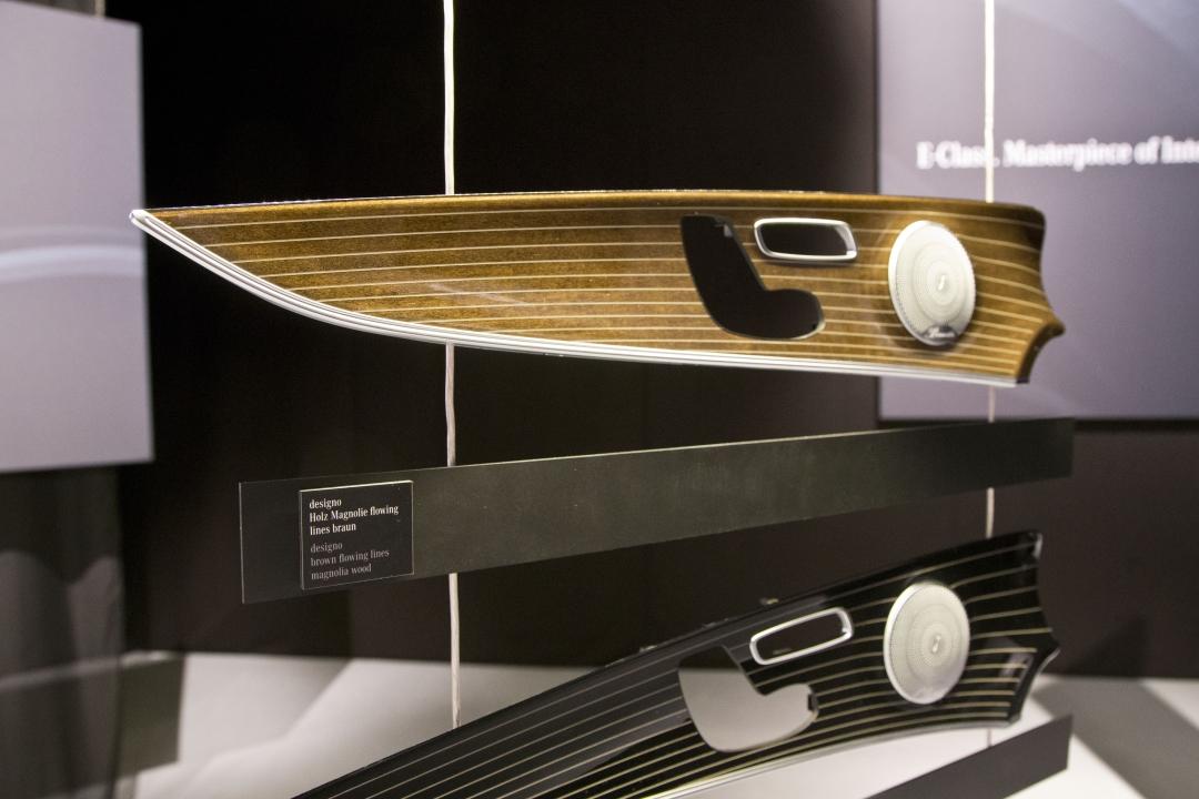
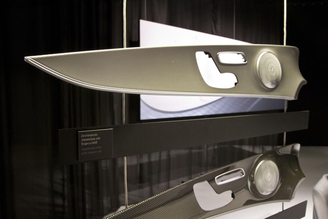
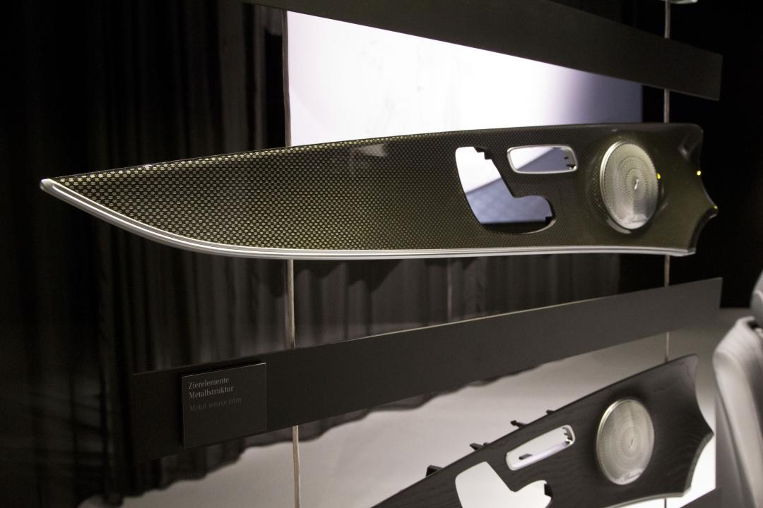
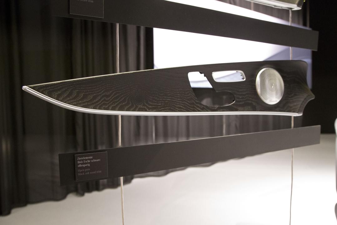
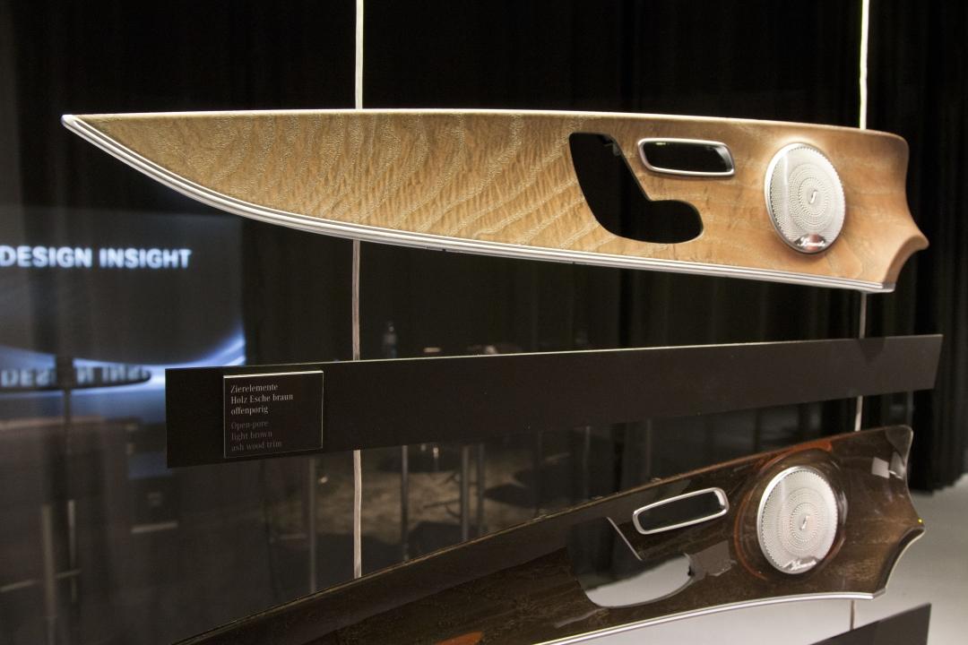
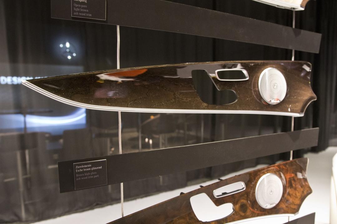
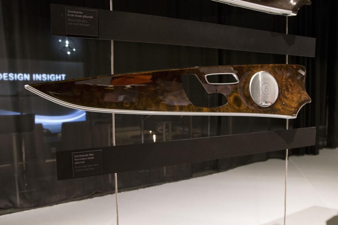
All this new tech, eye-candy, and amazing sound would be for nothing if the rest of the cabin didn't come up to scratch. Happily Mercedes hasn't stinted on its materials, and there are lashings of piano black, open-pore wood trim, leather, and aluminum to keep you suitably cosseted.
My overall impression is that the menu system has become far, far more straightforward to use. That'll be of particular use while on the move, with the UI structure flattened out considerably. Even in my relatively short experience, it proved a whole lot quicker to get to the settings that matter, without masses of scrolling and clicking.
The proof will be on the road, though, and that particular test will have to wait. We'll know more and report back when the new Mercedes-Benz E-Class arrives Stateside for a more in-depth drive experience.
