Netflix Rolling Out Its 'First Major Update' In Years
Netflix announced today that it is rolling out a big update, something it says is its 'first major update' in the past four years. It is making its way to users now, and involves a complete rehash of the user interface that brings with it easier and faster ways to find the content you want. The previous interface (which is still the current one for many users) was white and introduced last summer, and not well liked among users. This latest interface is more akin to what some smart TV and set-top box users have enjoyed.
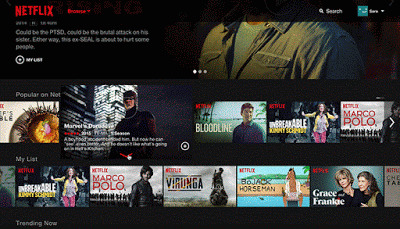
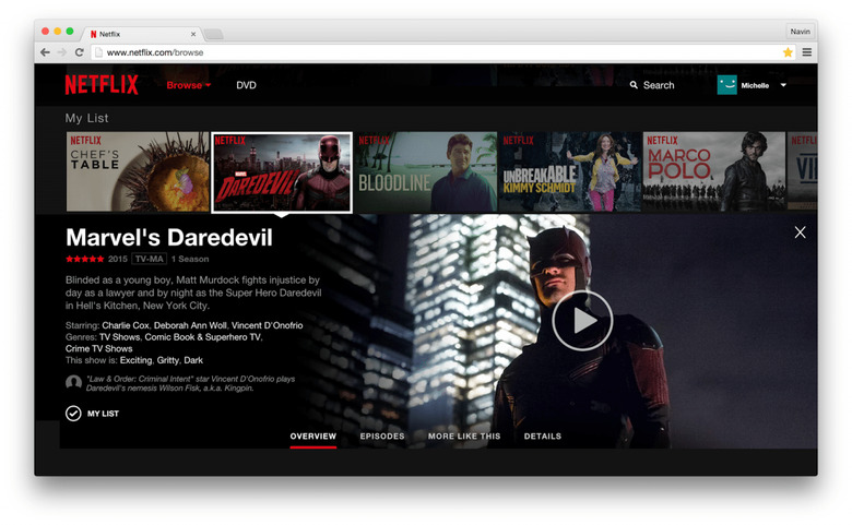
You can see the new interface in the GIF below, which includes the same carousel of content with some notable updates — links to different aspects of a series, as an example, are located near the bottom of the display for things like "Episodes" and "Overview".

This new interface has been built from the ground up, says Netflix, and it works more like an app rather than the past interface. This eliminates the separate-page arrangement and makes everything feel more smoothly linked together. There are slideshows, in-line details pane, recommended titles and more.
Mouse clicks are used to navigate, and perform actions similar to what you'd get with tapping on a touch screen. A touch screen will work too, though, if you have one. The update will be going to users across the globe — Netflix says it could end up taking two weeks to get to everyone, so stay patient. Also, if you're running an old Web browser you might have to update to see it.
SOURCE: Netflix Blog
