Netflix Redesign Appears With New Logo
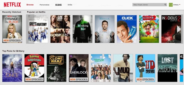
Hop onto Netflix on your mobile and you won't notice anything is off. Log on with your laptop, however, and you'll be met with a new color palette — or, rather, a mostly desaturation of colors. Gone is the old logo, and in its place stands one that is subtly different, if not more modern.
Nothing has fundamentally changed about the Netflix interface: you're still presented with scrolling rosters of movies and a top-aligned menu. The background has changed from its darker predecessor to a lightly gray color, and the rest of the boxes and banners are now white.

Among them all is a new Netflix logo, which drops the 3D design aspect for a flat (and shorter) rendition of the name. The streaming videos company hasn't said anything official about this change, but it would seem the original design has finally passed away.
Reception for the new logo hasn't been terribly positive. The original logo offered that special classic cinema look and feel — a design that compels one to pop a bag of popcorn and settle in for a movie. The new logo, with its flat generic look, offers nothing of the sort.
SOURCE: Fast co.Design
