My Biggest Toyota And Lexus Complaint Is Finally Being Fixed
The new 2022 Lexus NX looks slick, gets a welcome plug-in hybrid option, and an uptick in power, but it's the dashboard tech that I'm most excited by. It's fair to say that Lexus' infotainment systems haven't exactly been the most popular over the past 5-10 years, and while there have been multiple reasons for that, a lot of the blame can be placed squarely on the touchpad or joystick.
Lexus has flirted with both control methods over the years, and in different models. The idea is the same – swipe your finger around a trackpad, or nudge a joystick around, and move a cursor on-screen – and so, too, is the intention. After all, being able to keep your eyes on the road rather than looking over to hunt down a touchscreen button seems like an excellent idea when you're also piloting an SUV down the highway at 70 mph.
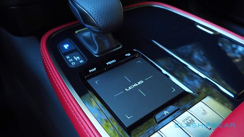
The reality, though, was always a lot more frustrating. Overshooting icons and buttons while you were swiping around on the old NX's touchpad, or laboriously paging through menus to hunt down simple comfort or connectivity options.
It's not like touchpad interfaces, or indeed joysticks, can't have a place in vehicle cabins either. Mercedes has long offered a touchpad in most of its models, typically in tandem with a touchscreen; Acura's Precision Cockpit lacks a touch-display, instead mapping every point on the screen 1:1 to a point on the trackpad in the center console.
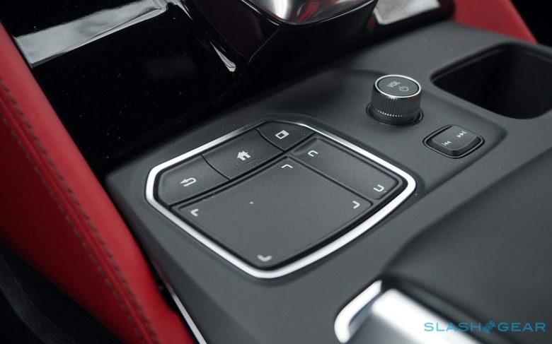
BMW, meanwhile, has its iDrive controller, which can be pressed around like a joystick as well as being spun like a jog-wheel. Mazda and others take a similar approach. In short, these sort of interfaces can work, if they're delivered in an intuitive way.
That was always where Lexus' system fell short. It was never quite easy enough to make the cursor on-screen move exactly where you wanted it to move, and without the backup option of reaching out and just touching the desired button or menu, it quickly got annoying.
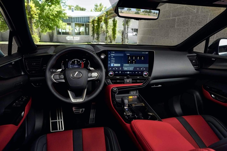
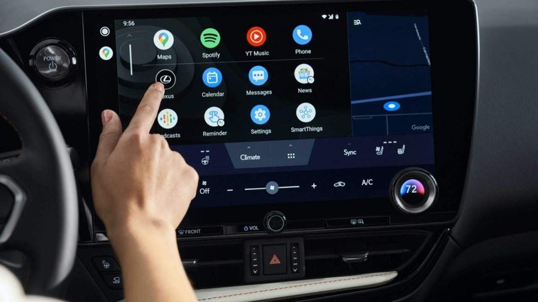
Lexus seems to have finally conceded the point, and the new Lexus Interface is the result. Running on a standard 9.8-inch touchscreen – with an expansive 14-inch version available – the NX debuts a whole new UI built atop a similarly brand new software stack. The latter, Lexus parent Toyota says, was built by Toyota North America, with the tastes of American drivers in mind.
Toyota doesn't have the aggravating joystick or twitchy touchpad, but its bland UX feels like a hangover from another era. Blocky graphics, sluggish reactions, and an at-times infuriating menu structure always felt out of place in even its cheapest cars, never mind those targeting drivers with deeper pockets like the Avalon sedan. Yes, you can interact with its touchscreen directly, but you'd be forgiven for not really wanting to.
This new version fixes all that. There's a fivefold increase in processing power, Toyota says, and new optically-bonded, glare-treated touchscreen displays for a more tablet-style feel. Cellular connectivity is included for cloud-based navigation, Google-powered points of interest search, and OTA updates, while wireless Apple CarPlay and Android Auto are both standard, too.
In addition to the new touch support, there's also a new voice control system. That combines in-car and cloud-based processing, so that even if you don't have a connection it should still be able to handle the basics. Dual microphones and seat detection should also allow the new Virtual Assistant to better hear past background noise, and figure out who is making each request. Voice commands won't just be for media and phone, either, with vehicle features like the HVAC and even the power windows able to be operated by voice.
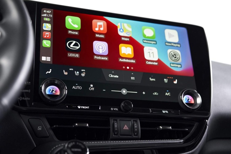
To be fair, a lot of this we've seen offered before, on different cars from different automakers. Where Toyota and Lexus get credit is for how thoughtfully implemented their system looks to be.
Offline mode, for example, promises to detect if you're driving into an area with low or no connectivity, and proactively download maps and other services you might need in advance. Driver profiles are stored in the cloud, and downloaded to any other Lexus Interface-based vehicle so your preferred settings should be ready and waiting for you. When Apple CarPlay and Android Auto are on-screen they don't squeeze out all the other essential controls, such as seat-heating and HVAC.
The proof of the pudding is, of course, getting behind the wheel and seeing how all this holds up while you're actually on the road. We'll find that out when the 2022 NX 250, NX 350, NX 350h, and NX 450h+ plug-in hybrid arrive this fall.
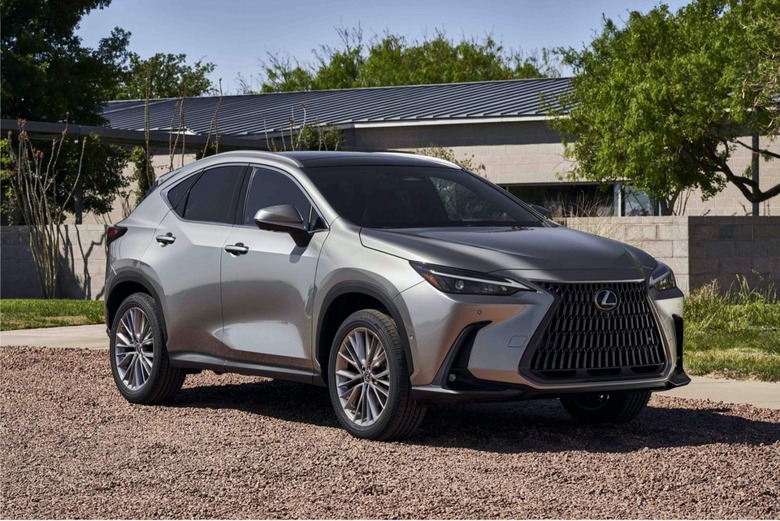
What makes the stakes higher, though, is that this won't just be the preserve of those on Lexus budgets. Toyota plans to use its new infotainment platform on its own cars, too, with the first new Toyota multimedia system vehicle to debut in Q4 2021. There are signs it won't just be reserved for the most expensive trims, either: Toyota says its software is designed for touchscreens from 8- to 14-inches, meaning more humble dashboards needn't be left out.
It's an aggressive strategy, not least because we've seen other automakers take an arguably easier route and partner up with companies like Google on their digital, connected dashboards. Android Automotive OS – as on recent Volvo and Polestar models and set to spread to other brands' dealerships imminently – trades some core control of the platform direction in return for Google's undeniable software heft.
For Toyota, which long resisted allowing Apple CarPlay and Android Auto onto its dashboards, that prospect must've felt uncomfortable. That it opted to go its own way still is a bold decision, then: we'll see just how wise it was as the first Lexus and Toyota cars and SUVs to use this rebuilt infotainment arrive later in the year.
