Moto 360 Sport Hands-On And First Impressions: Just As Nice
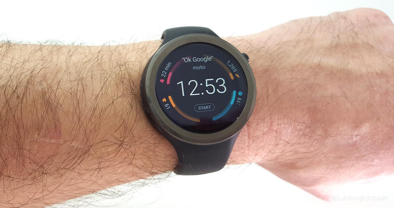
The Android Wear smartwatch Moto 360 Sport from Motorola has arrived on our review bench this week and we've taken it on a stroll. Before our full Moto 360 Sport review begins, we've got a few points we need to go over, starting with our initial impressions. As it turns out, this watch isn't the "lesser" version of the Moto 360 that we expected it to be. In fact, the design of this piece of equipment makes us feel as though Motorola's somehow kept the finer points of the non-"sport" model Moto 360 (2015) whilst adding a more robust bit of body in its rubbery silicone "sporty" watch band.
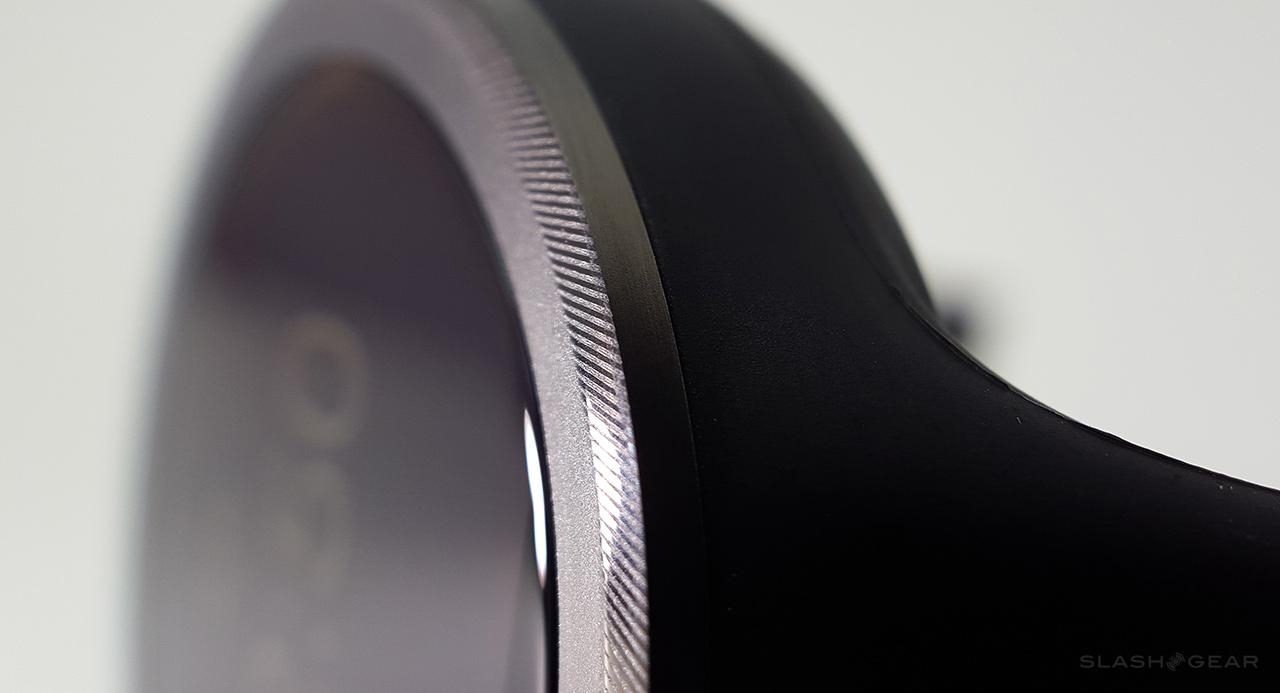
We've got the black version of this watch. Also available will be the white version and the red (called "fire orange") version, all with the same watch display and abilities. You'll even find the bezel to be largely the same – though you'll get a slightly lighter gray in the metal of the white version.
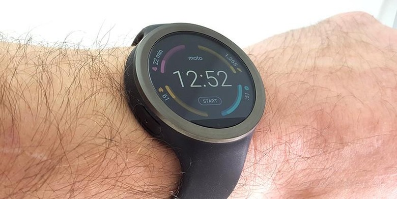
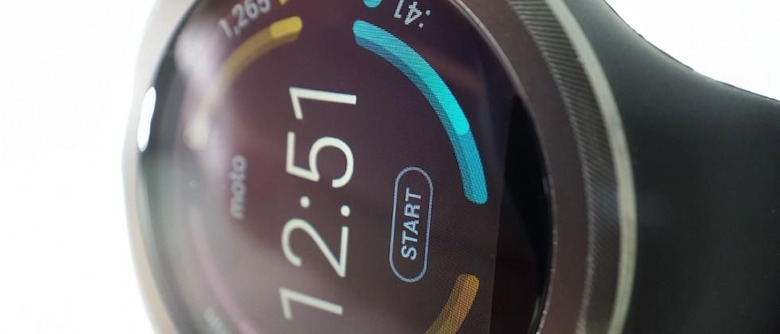
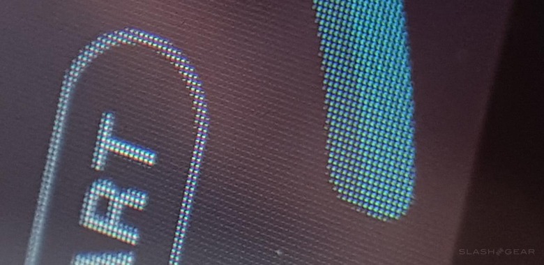
What's interesting about the display on this device is that Motorola brands it "AnyLight". Motorola suggests that their Motorola AnyLight display (which they don't advertise about the standard Moto 360) uses standard LCD tech indoors, then when you're "out for a run," the watch "reflects natural light, making the screen clear and sharp."
Display
• AnyLight Hybrid Display
• Corning Gorilla Glass 3
• 1.37" (35mm), 263ppi (360 X 325)
Believe it or not, the light reflectiveness Motorola is claiming to have implemented seems to be real. Not that Motorola wouldn't be telling the truth, its just... surprising to see such a neat technology so under-sold.
With an overcast yet extremely bright day outside today, we've had no trouble reading the watch face at any time. More on this in our full review.
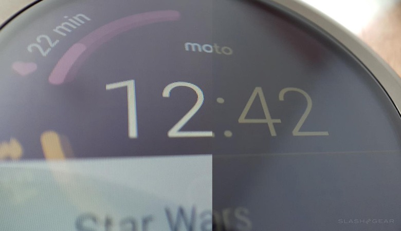
ABOVE: LCD vs reflection of natural light. It becomes SORT OF like eink, but not completely. You'll have to really see this display in multiple settings to understand how the reflectiveness is taking shape. Indoors and outdoors with more than just overcast, that is to say.Moto 360 Sport – pre-display first look
This watch has a 300mAh battery, not unlike the standard Moto 360 and most other smartwatches, a heart rate sensor, wireless charging, IP67 dust and water resistance, and an ambient light sensor (so it knows when you're outside or in the dark).
You've also got Wi-fi connectivity so you'll be able to connect even when you're not right next to your smartphone – just so long as you have a wi-fi connection, of course.
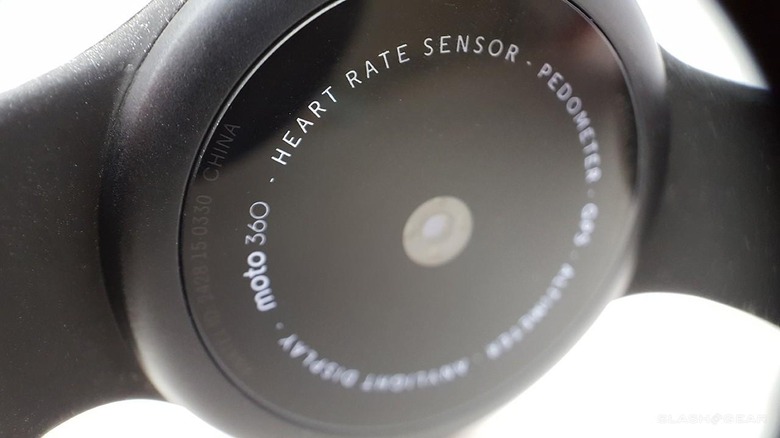
On the back you'll read Moto 360 and you'll be confused about which watch you just purchased. Again, much of this watch is the same as the Moto 360 (2015) – it's just sportier.
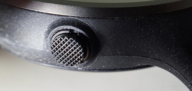
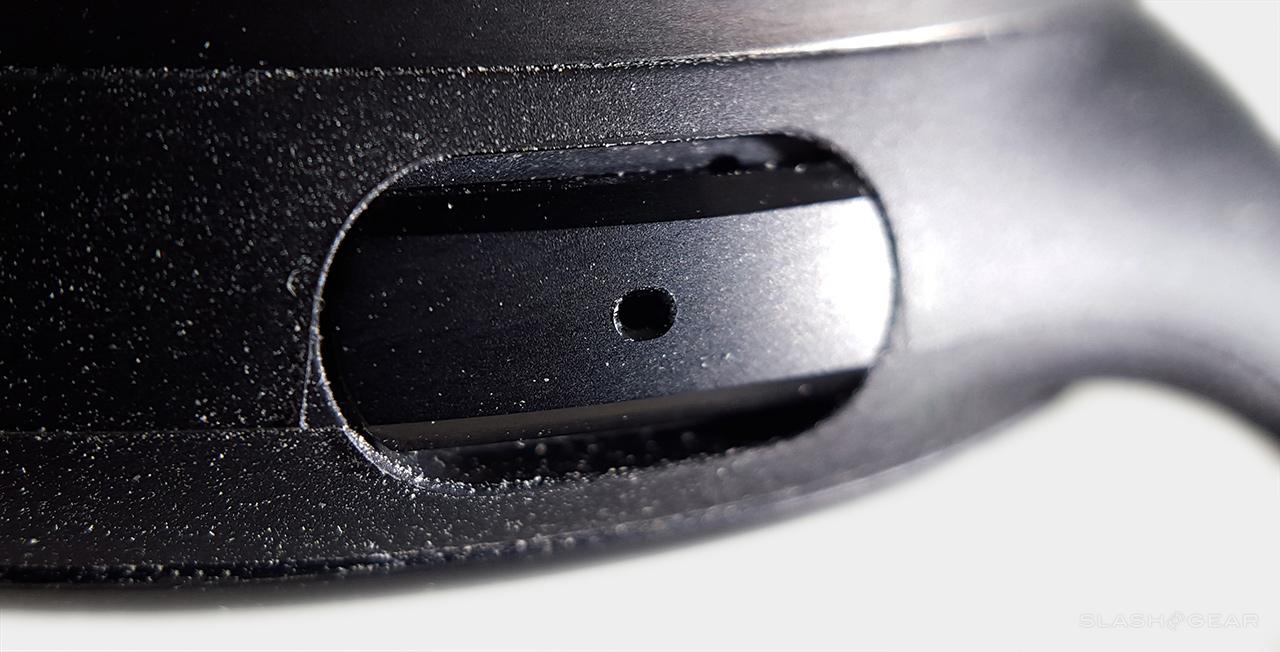
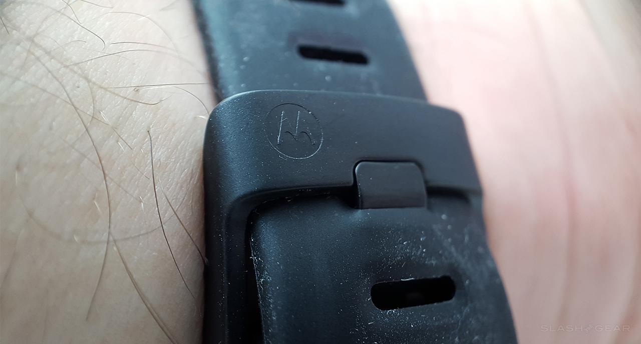
Yes, this watch is a dust magnet.
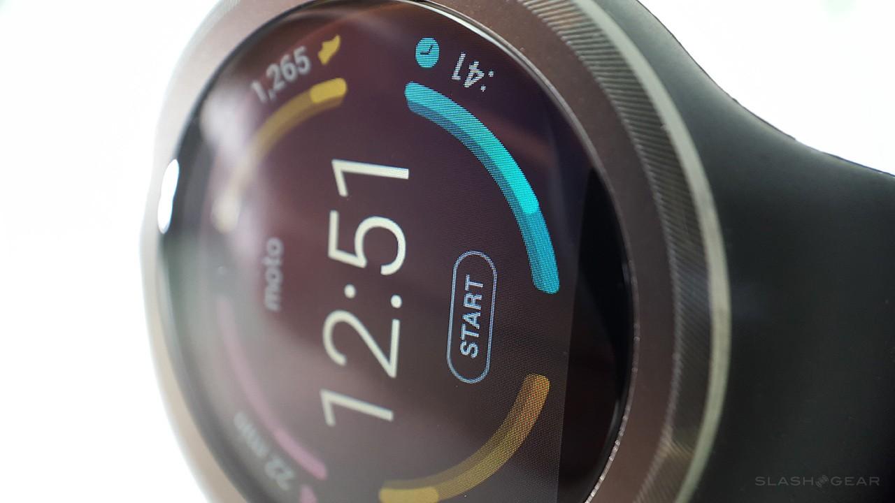
Above you'll see a photo of the now-textured home button. The button on the Moto 360 (2015) is decorated with the Motorola "M" logo. Below you'll see a super close macro shot of the display.
Stick around for our full review. In it we'll be showing you all the ins and outs of this surprisingly unique piece of work.
And of course don't forget to check the Moto 360 (2015) review below. It's a strong contender for most excellent smartwatch of the year.
