Moto 360 Review: Flawed Charm
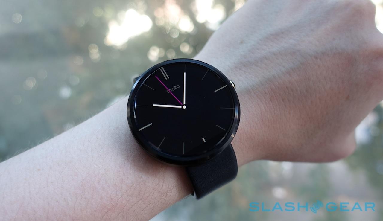
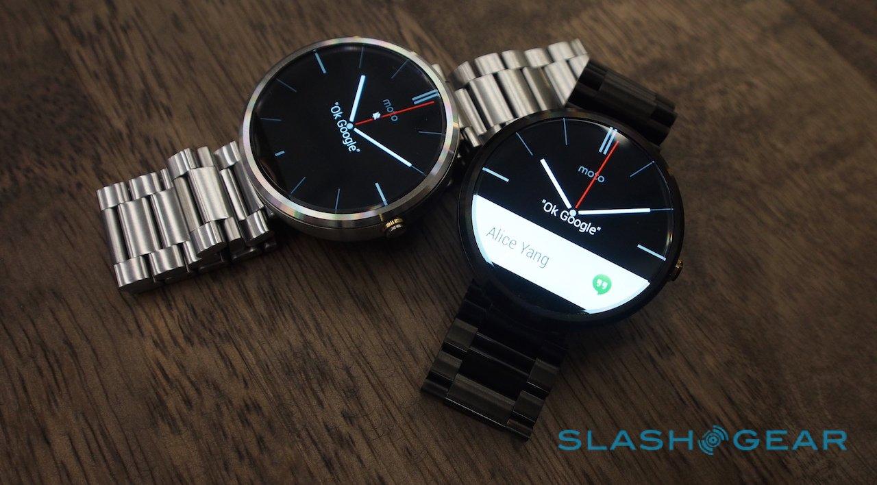
The Moto 360 has a lot to live up to. Motorola's wearable spoiled our first taste of Android Wear smartwatches back in July, leaving the first square-faced examples to run the platform looking hopelessly geeky in comparison. Arguably the closest to a regular watch in design we've seen so far, and – though the Apple Watch may respectfully disagree – quite possibly the most handsome, the Moto 360 certainly has the style box ticked, but is that enough to earn a place on the wrist?
Design
Until now, wearing a smartwatch has effectively singled you out as a geek. Options like Pebble Steel have shifted the needle away from "Dick Tracy" and closer to something more akin to a high-end Casio, but it's still a long way away from the sort of timepieces traditional watch fans would opt for.
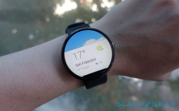
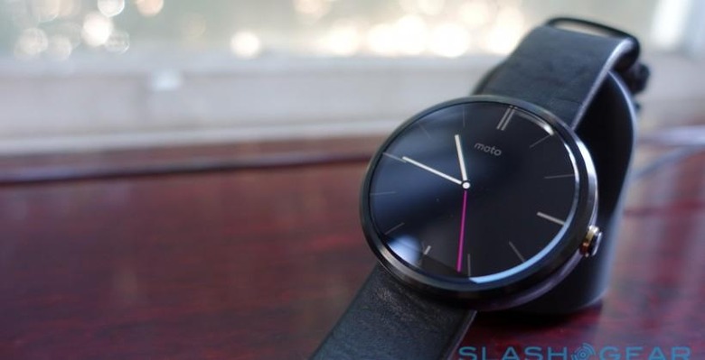
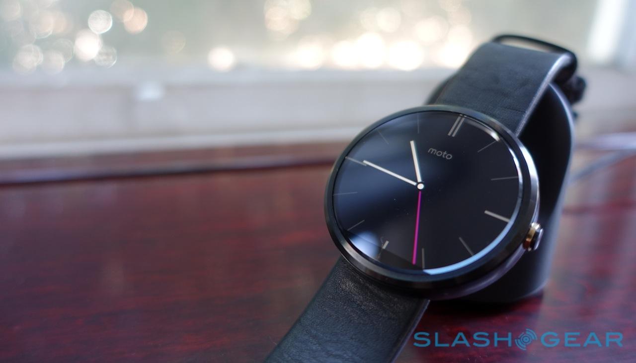
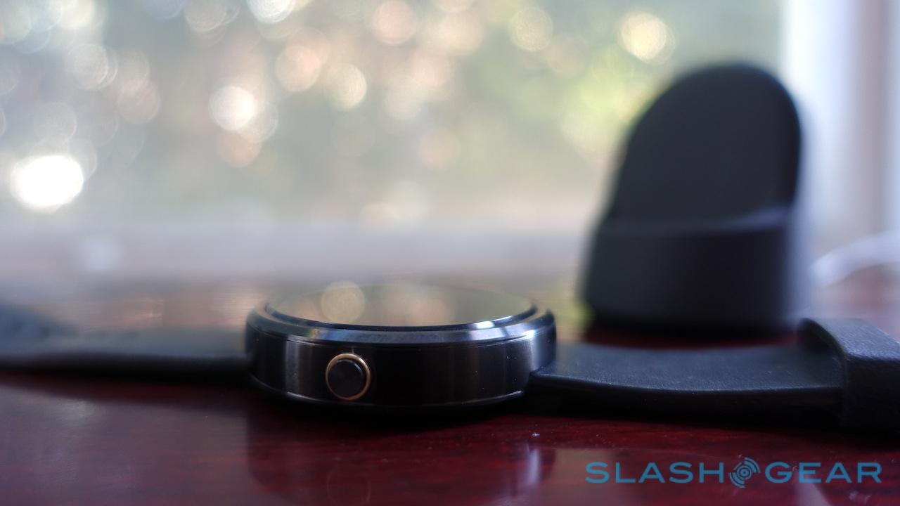
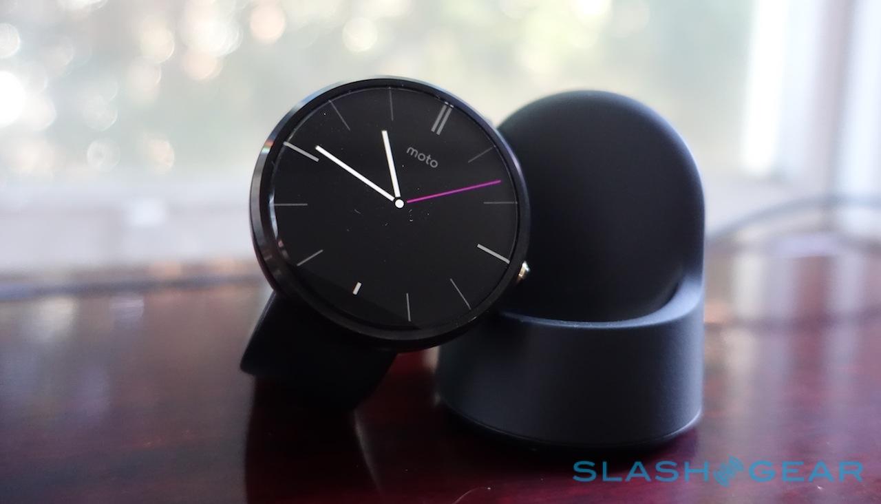
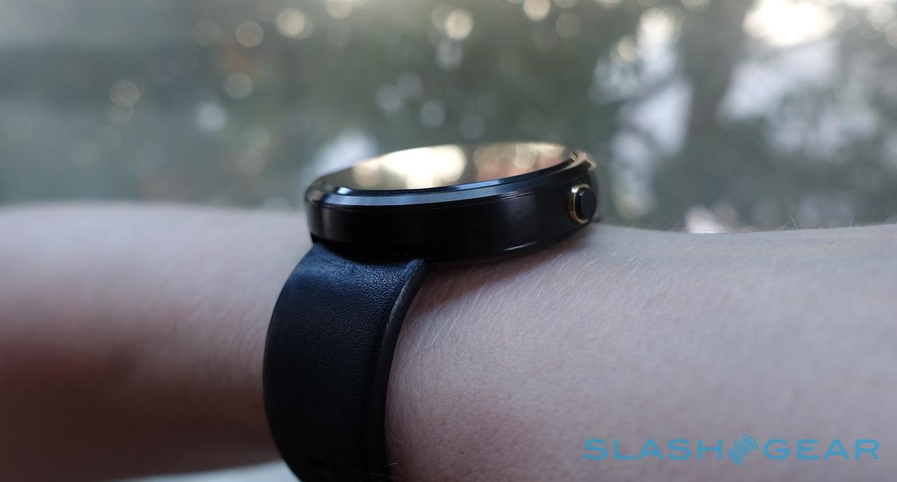
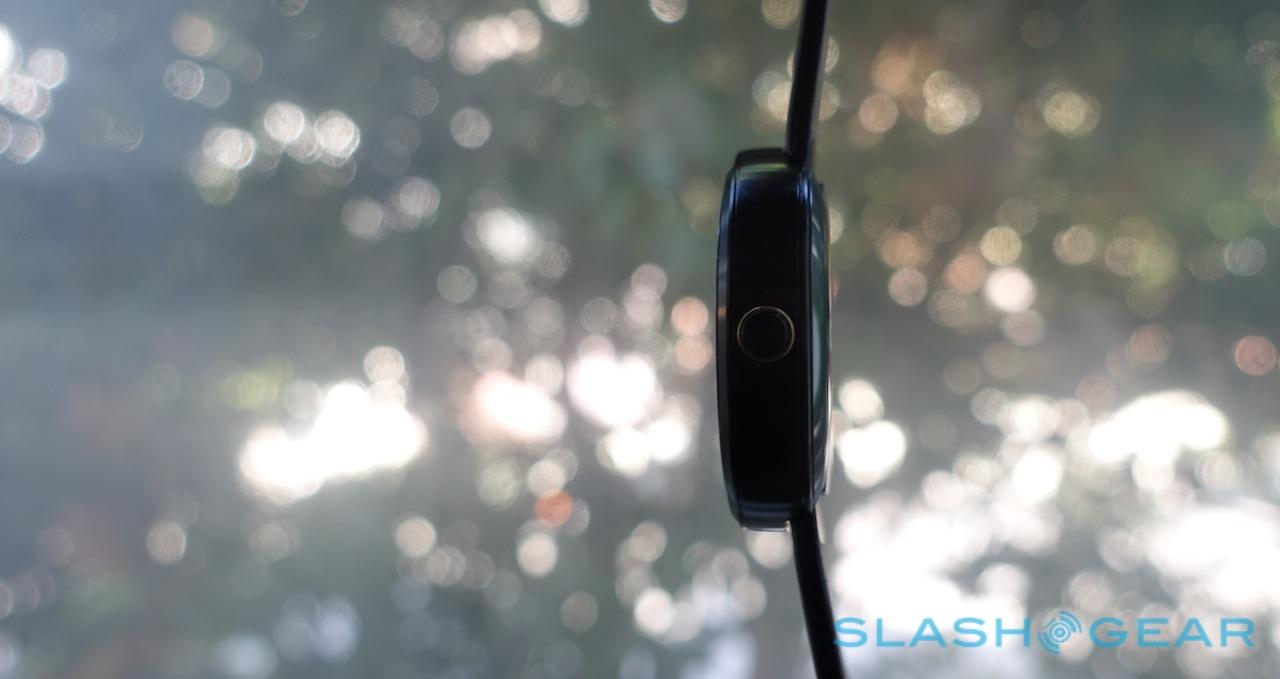
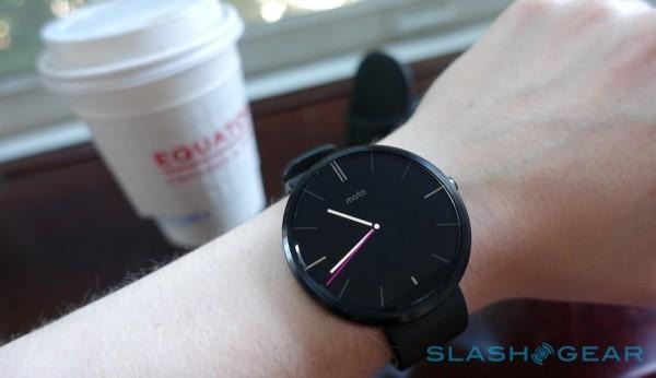
Round changes all that. The Moto 360 works as much because of what Motorola avoided as it does what was included. The stainless steel body – finished in black or brushed silver – is unmarred aside from a single button on the right and a microphone hole on the left. It looks and feels more expensive than the actual $249 price tag.
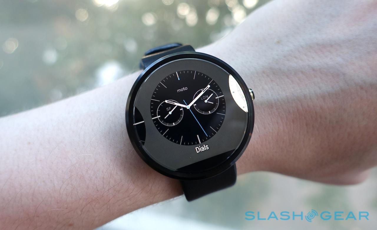
Its 1.56-inch touchscreen is topped with a slab of scratch-resilient Gorilla Glass 3, with a bevelled edge where it reaches the body. That chamfering catches the light as well as refracting the periphery of the LCD; it's not to everyone's tastes, but I really like the way it frames the display.
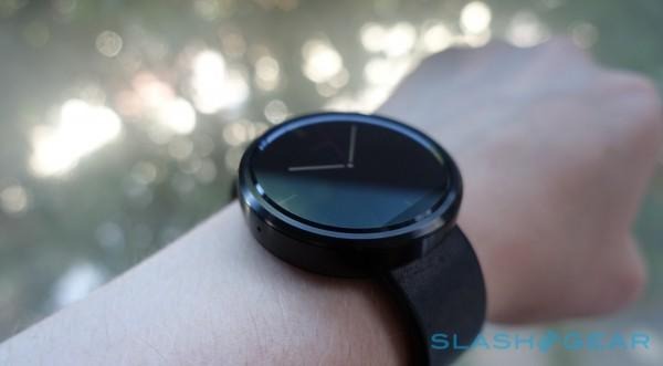
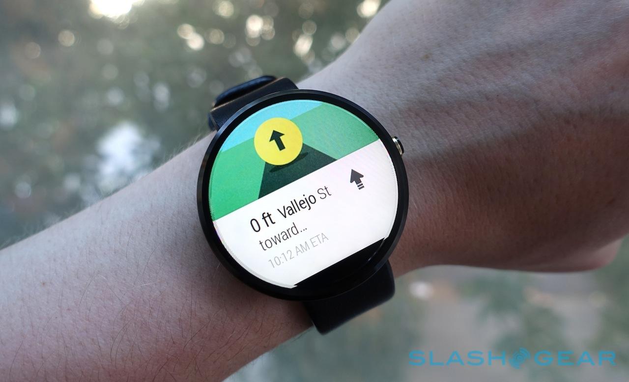
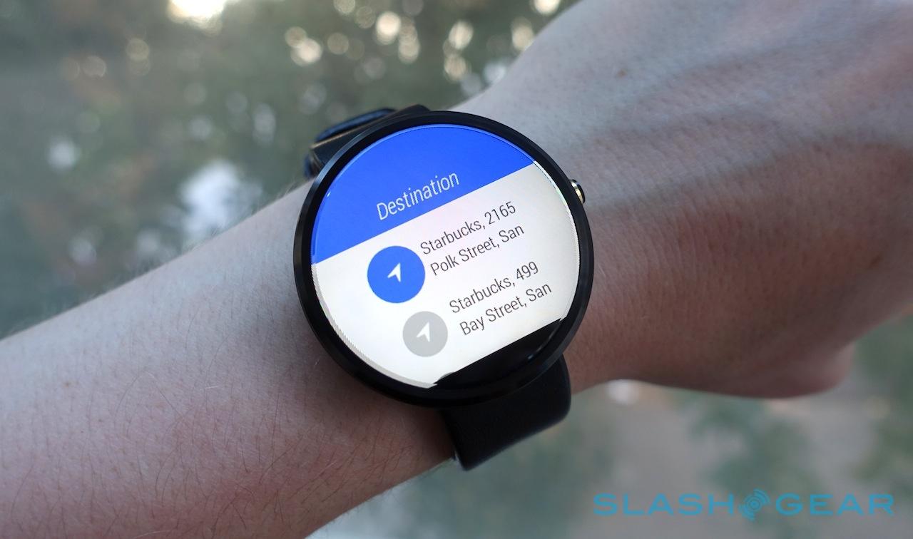
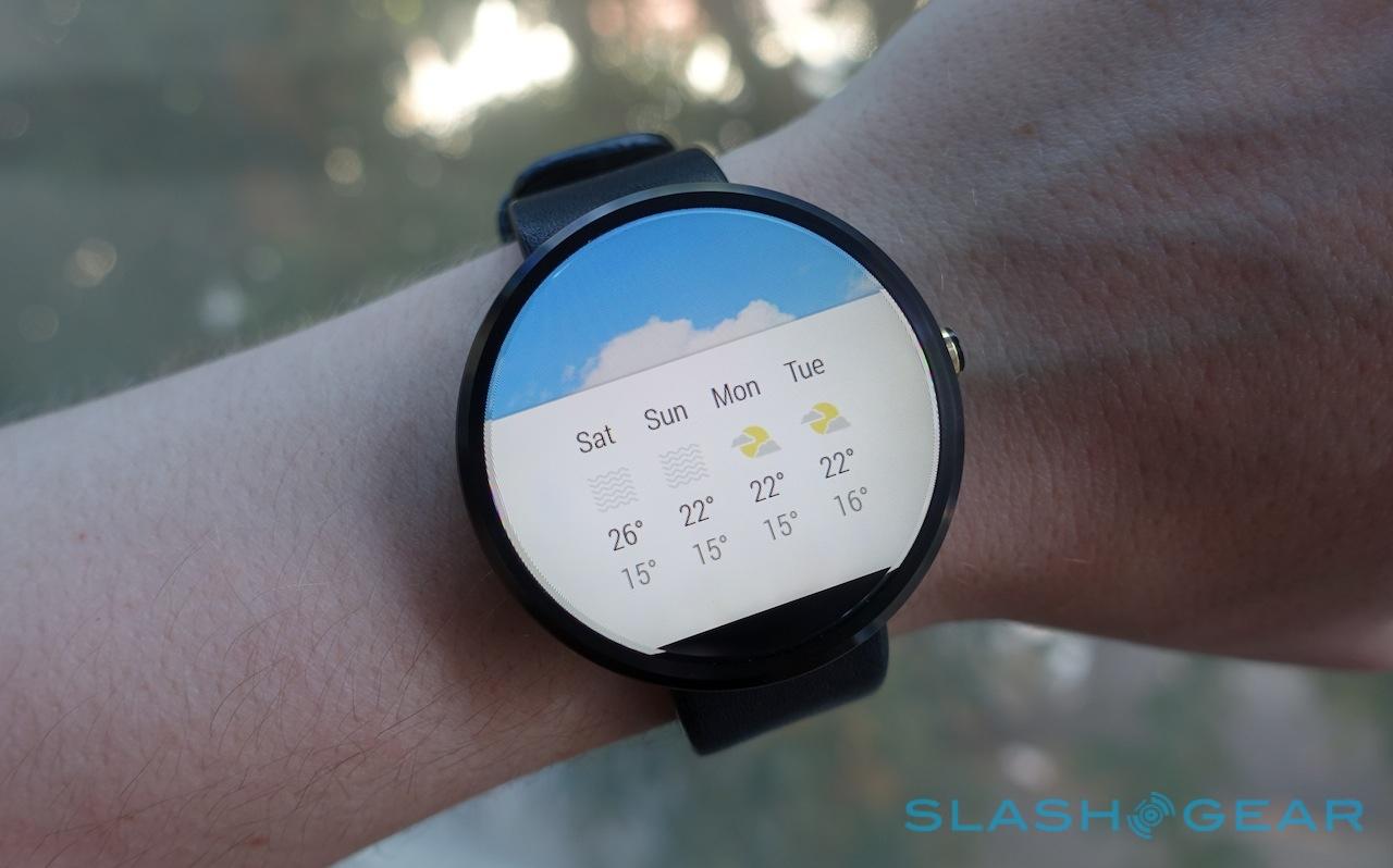
Despite Motorola's claims, it's not quite a fully circular screen. Running along the bottom edge is a notch of black, the inevitable compromise – so Motorola claims – of trying to accommodate the LCD driver and an ambient light sensor without forcing them out, into the bezel. The company did flirt with a complete circle, the Moto 360 design team tells me, but then the watch as a whole got bigger, or would've been lopsided with a bulge at the bottom.
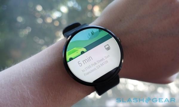
You notice it, initially, especially when you're using light watch faces. After a day or two, however, it becomes much less obvious, and I have to agree with Motorola's thinking: you'd lose some of the round charm had they taken a different route.
You'd also have ended up with something even larger on your wrist. At 46mm in diameter it's broad, and at 11.5mm thick it's certainly no slimline Swatch. The clean lines and absence of sharp corners help disguise some of the bulk, and the 49g weight is surprisingly little on the arm, but if you've got a smaller wrist or your tastes don't run to eye-catching timepieces then you might find it simply too chunky.
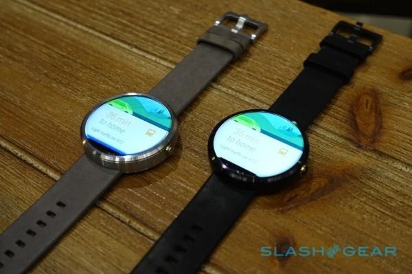
That's a matter of personal taste, then, though most people I've shown the Moto 360 to have been impressed. It probably helps that I normally wear a larger, non-smart watch, but there's something about the fact that circular screens are still unexpected which charms more often than it dissuades.
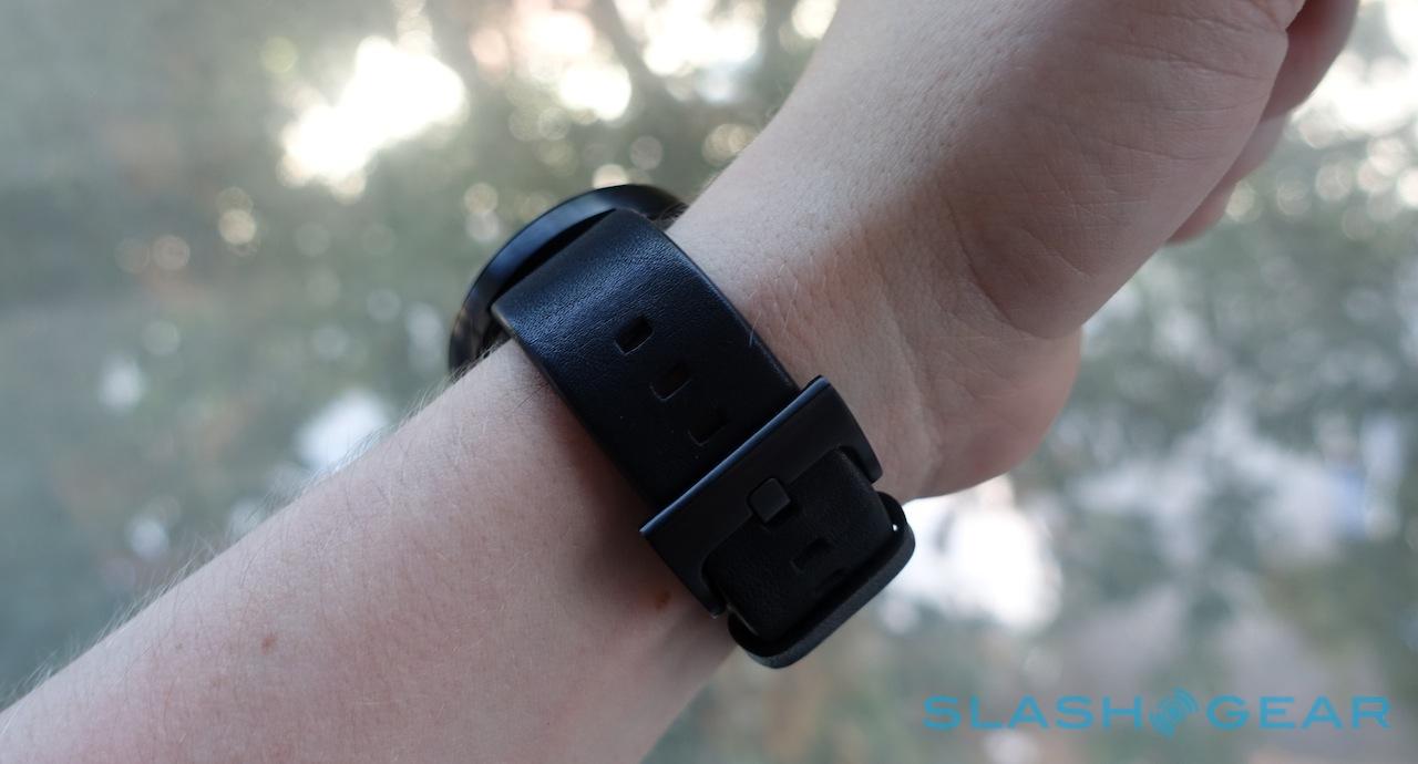
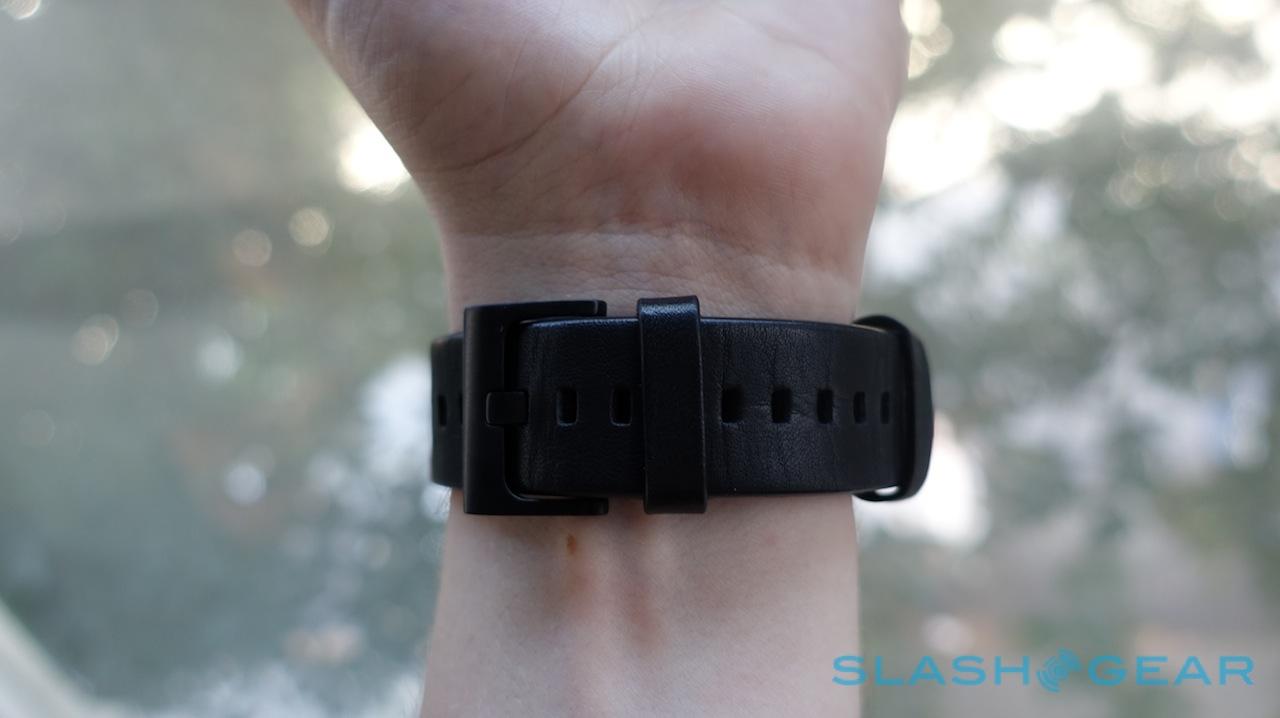
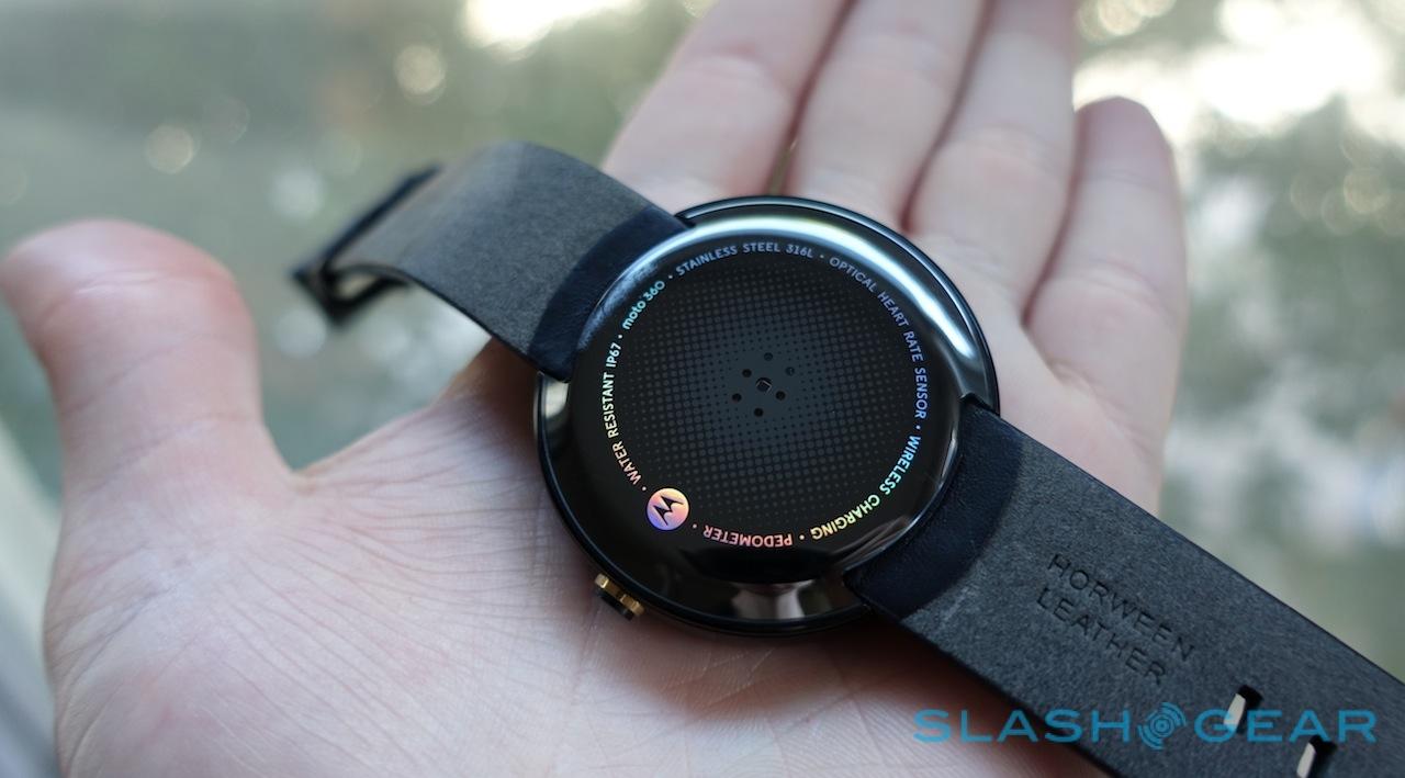
Motorola's choice of straps helps. The company partnered with Horween, a local Chicago tannery, for the default bands for the Moto 360, and from the get-go there's the black band which comes with the black casing, and either suede-effect stone or gray leather for the silver casing.
They look good, though I do have some early concerns about longevity. Horween's leather is very soft, and while that's comfortable I'm not convinced it'll prove as resilient as you might like. Similarly, the buckle is serviceable but falls just a little short of reassuring heft.
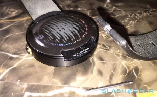
Happily Motorola has opted for a regular 22mm strap design, and with a little patience and the right tool (or a friendly jeweler) you can switch out the default for something more of your choosing. There'll be a range of different leather options from Motorola itself later in the year, too, priced at $29 each as well as a black or silver metal bracelet
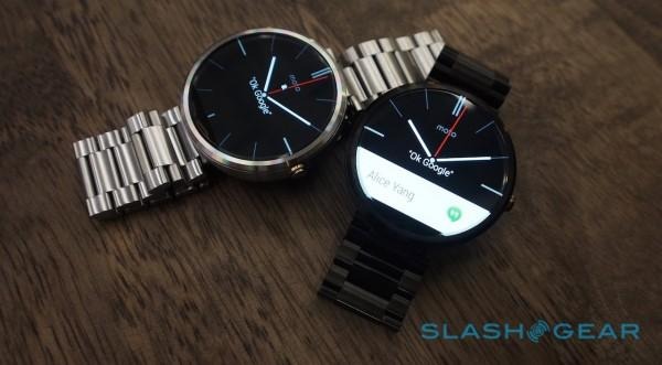
The latter will be available both for $299 for the full watch and bracelet, or at $79 individually. Motorola warned me that third-party metal bracelets might cause interference with the antennas built into the casing, however, so your mileage there may vary.
Hardware
If you thought it was all sounding too good to be true, then here's where the Moto 360 story starts to stumble. Some of the issues are simply the result of physics, but others can firmly be placed at Motorola's feet.
The big complaint many have about the Moto 360's display is a compromise I've already covered: you simply can't have a fully circular display and a super-skinny bezel without the LCD driver intruding some. A higher resolution than the 320 x 290 on offer would've been great, too, but it's certainly sufficient for showing text and the sort of basic graphics you'd expect on a smartwatch. Just don't expect a Retina display.
More inexplicable is Motorola's choice of processor, however. The LG G Watch and Samsung Gear Live both run Qualcomm's APQ8026, not the fastest silicon in the SoC spectrum but a good balance of power frugality and performance. The Moto 360, however, runs TI's OMAP 3630, the exact same chip in fact that powered the MOTOACTV fitness watch, all the way back in 2011.
I can only assume TI either had a fire-sale on chips or Motorola still had a stockpile from its previous devices (the 3630 was also the slow-beating heart of 2010's DROID 2), and that the decision was based on price. It's certainly possible that opting for the OMAP 3 helped offset some of the costs involved in the circular display, too.
Otherwise, it's the same Bluetooth connectivity – with no shortage of range, either; I was able to stay paired across my apartment with the Moto X, with a few walls in-between – 512MB of memory, and 4GB of storage as we've seen in other Android Wear devices, though Motorola uses dual microphones rather than just one. No speaker, mind, only a vibration alert.
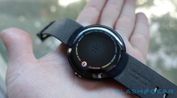
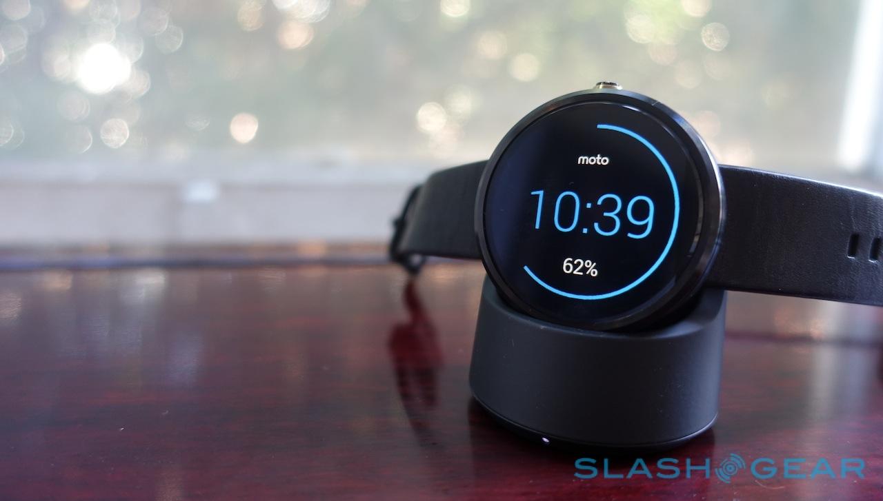
On the back, there's an optical heart-rate sensor and an integrated inductive charging loop; Motorola supplies a neat little desk cradle, but it'll work with any Qi-compliant charger you might already have. The absence of a charging port means Motorola can make the Moto 360 water-resistant, meeting IP67 ratings for splashes and brief periods of immersion (up to 1m of water for up to 30 minutes).
So, you can wear the smartwatch in the shower or while you're doing the washing up, but not while swimming. It's also worth noting that Motorola advises against exposing the leather straps to water.
Software and Performance
Android Wear is Android Wear. Google is, perhaps burned from its early experience with Android on phones and tablets, taking a far more hands-on approach with its smartphone version, and so manufacturers like Motorola have far less flexibility in what they can change.
That means the overall experience is, for the most part, identical to how it would be on an LG G Watch or a Samsung Gear Live; our full Android Wear review can bring you up to speed there.
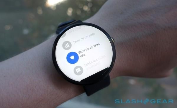
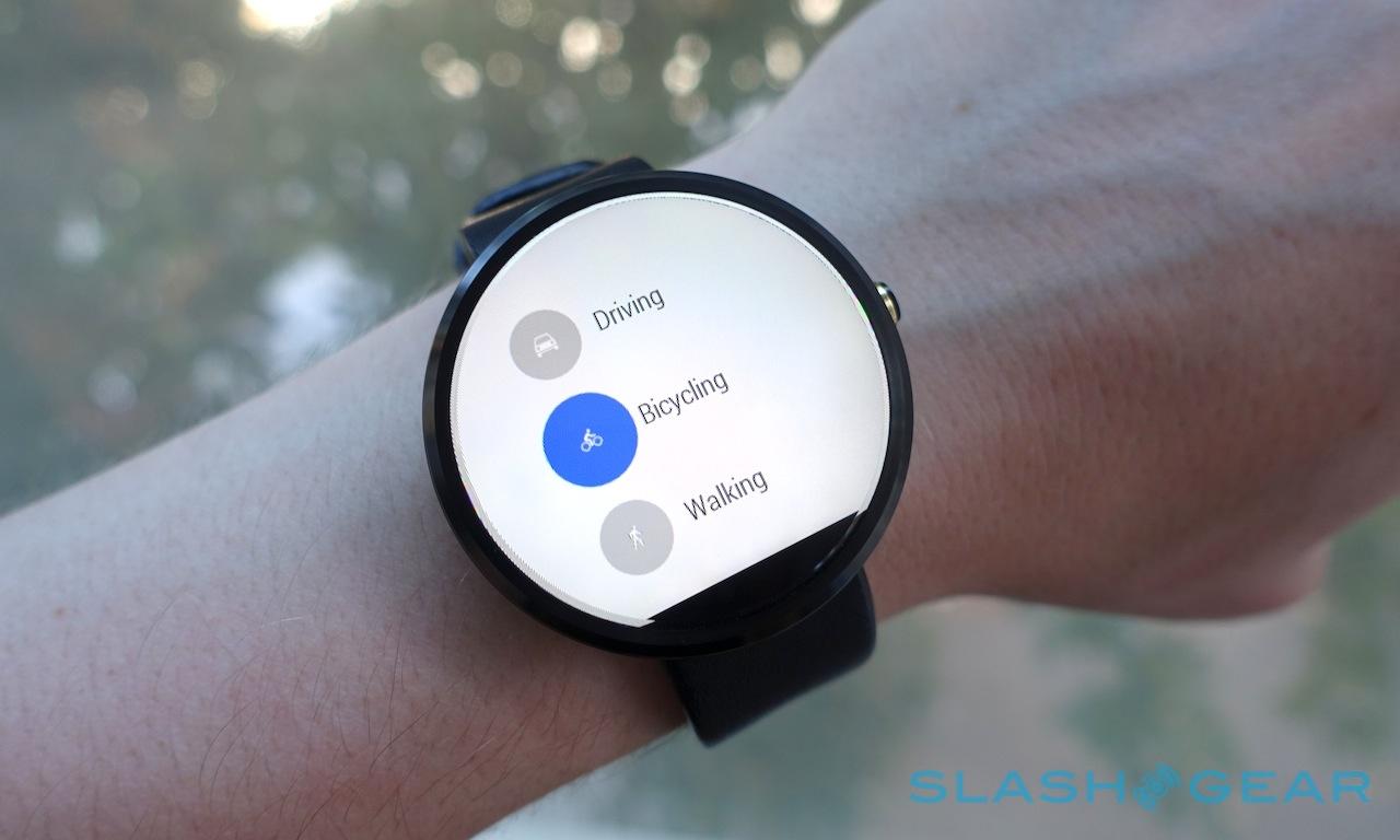
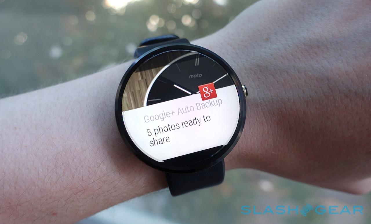
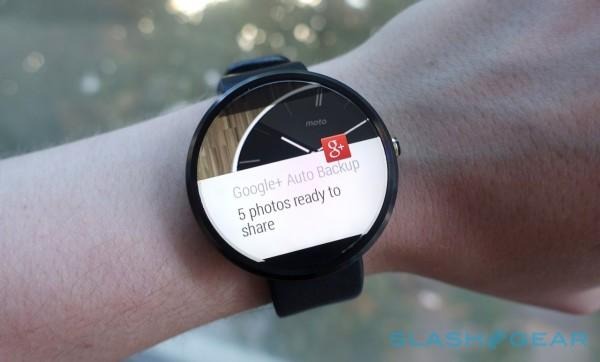
In brief, though, it's about bringing notifications from your Android 4.3+ smartphone, along with the contextual power of Google Now, straight to your wrist. Any app that pops an icon into the notification drawer will also have it pushed to the Moto 360; exactly how much you can then interact with it depends on how much thought to wearables the developer has given.
The better apps let you do things like respond to instant messages and get navigation instructions, all from your wrist. The lesser ones basically inform you that something has happened and then expect you to switch over to your phone to actually do anything in response. That's not as entirely redundant as it sounds, though; there's time to be saved in simply triaging notifications at a glance from your wrist, rather than having a Pavlovian response to every buzz and ping and yanking your phone out of your pocket or bag.

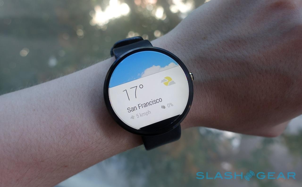
The Google Now integration is just as brilliant and frustrating as ever, with Google's contextual pop-ups proving somewhat unfathomable. In theory Google Now sifts through your recent searches, your email inbox (with permission, of course), considers your location, and checks your calendar to decide on what it reminds you; in practice, it can be hit & miss.
Never in my time with an Android Wear watch has it picked up a confirmed flight from my Gmail inbox and shown me its timings on my wrist; as soon as I do a single Google search for a flight code on my desktop, however, I get regular pop-ups reminding me about it on the Moto 360. Reminders to leave if you want to be on time for your next appointment are handy, but if you swipe them off the smartwatch's screen, there's no way to generate them again.

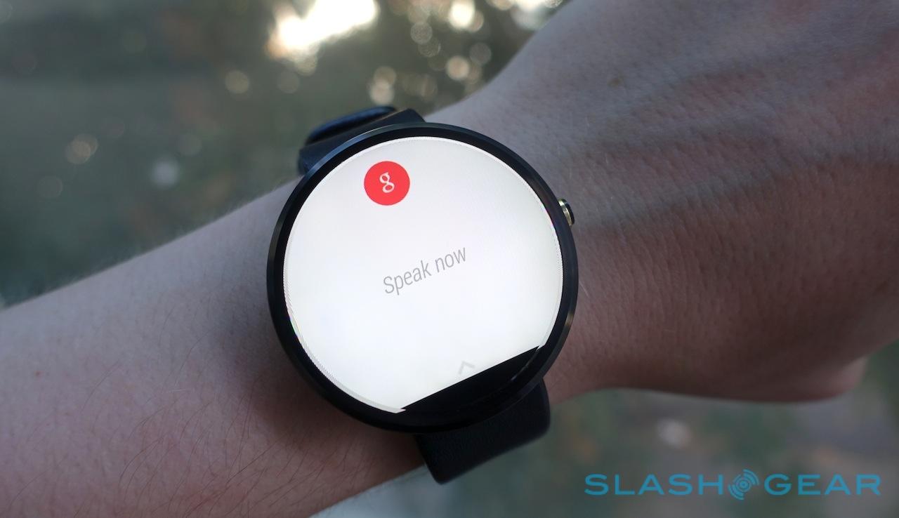
Instead, you need to have memorized the address so you can say "OK Google, navigate to..." Simply asking to "navigate to my next appointment" doesn't work, even though Google clearly knows when and where that is.
Meanwhile, though third-party apps are slowly getting onboard with Android Wear, there's still a paucity of software for the platform. Some titles are more obviously crafted with a square screen in mind, causing a few rare odd layout issues in the corners, but I'd expect that to be cleaned up as more circular smartwatches arrive.
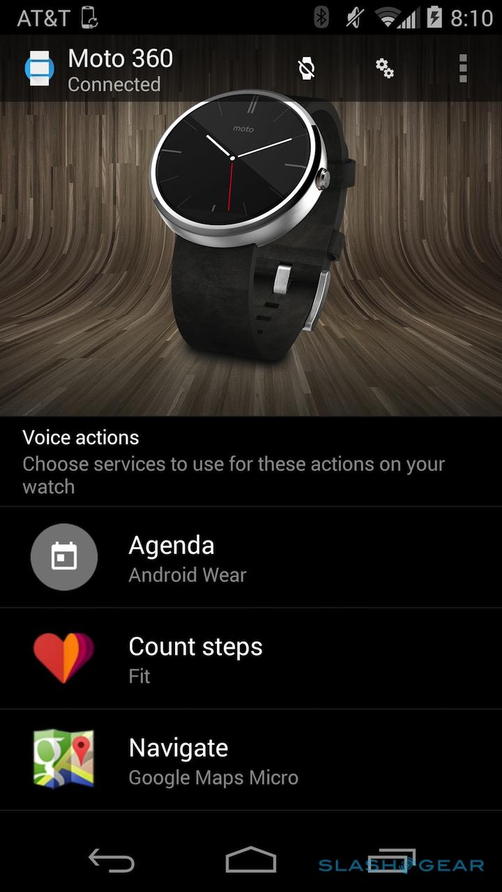
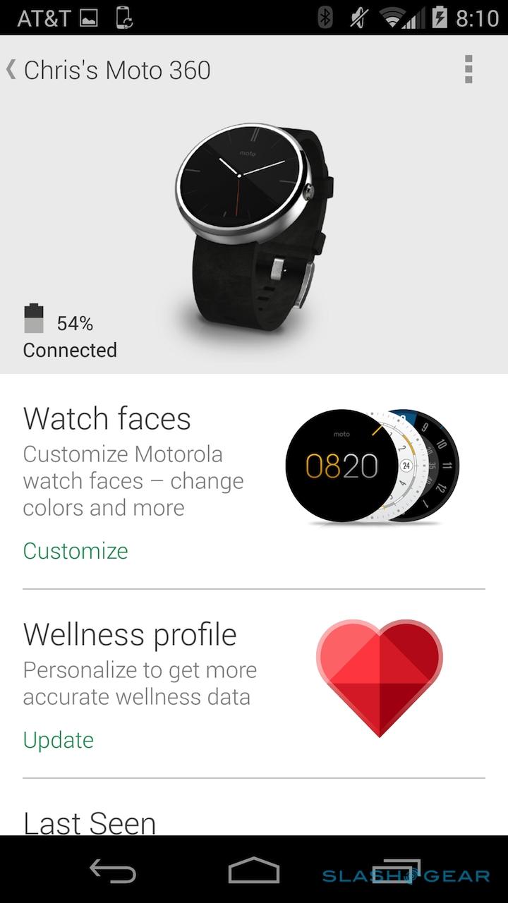
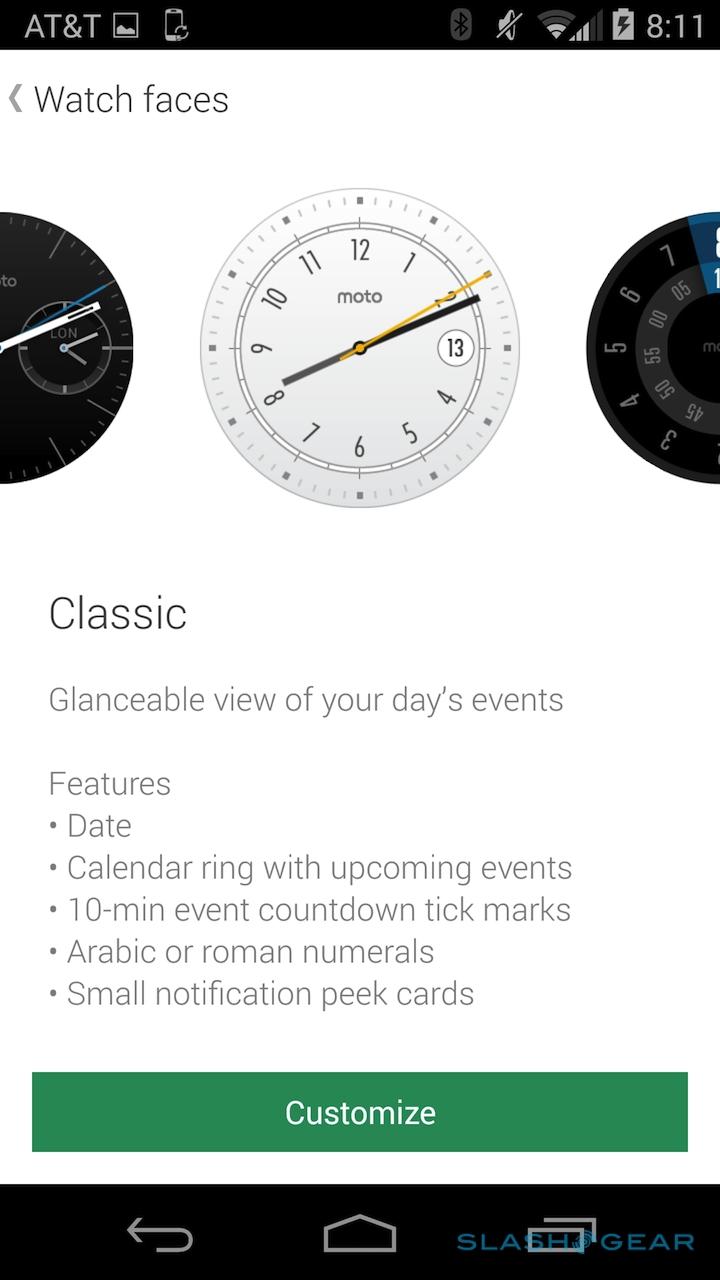
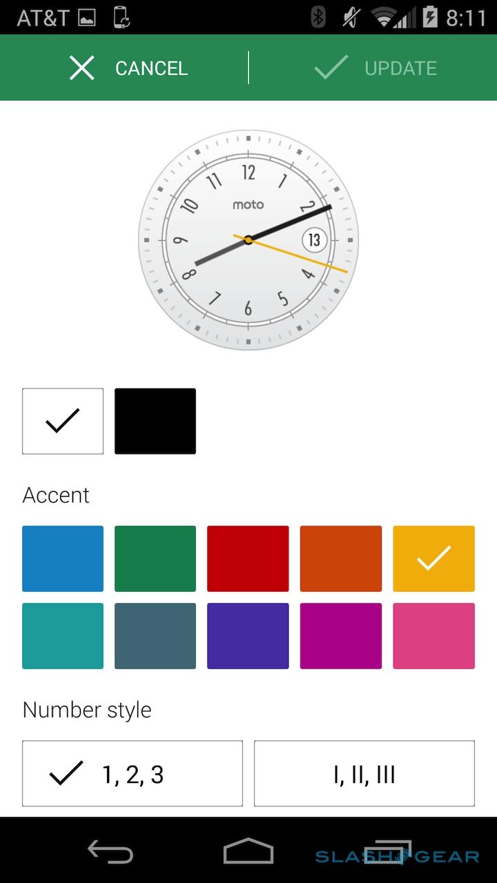
The regular Android Wear app is used to control most of the settings, such as which app handles different actions by default, but Motorola's own Connect app is also available for customization. It's there you can change the color and make some minor layout changes to the various circular watch faces that come preloaded on the Moto 360 and, presumably, where in future you'll be able to add third-party faces.
You needn't actually dig into the app, though: a long-press on the current watch face pulls up a side-scrolling gallery, though you can't change colors from there. Similarly, a long-press on the side button pulls up the settings page, which is useful, though I wish it opened the "Start" menu (currently buried several taps and swipes away) where most of the third-party Android Wear apps lurk.
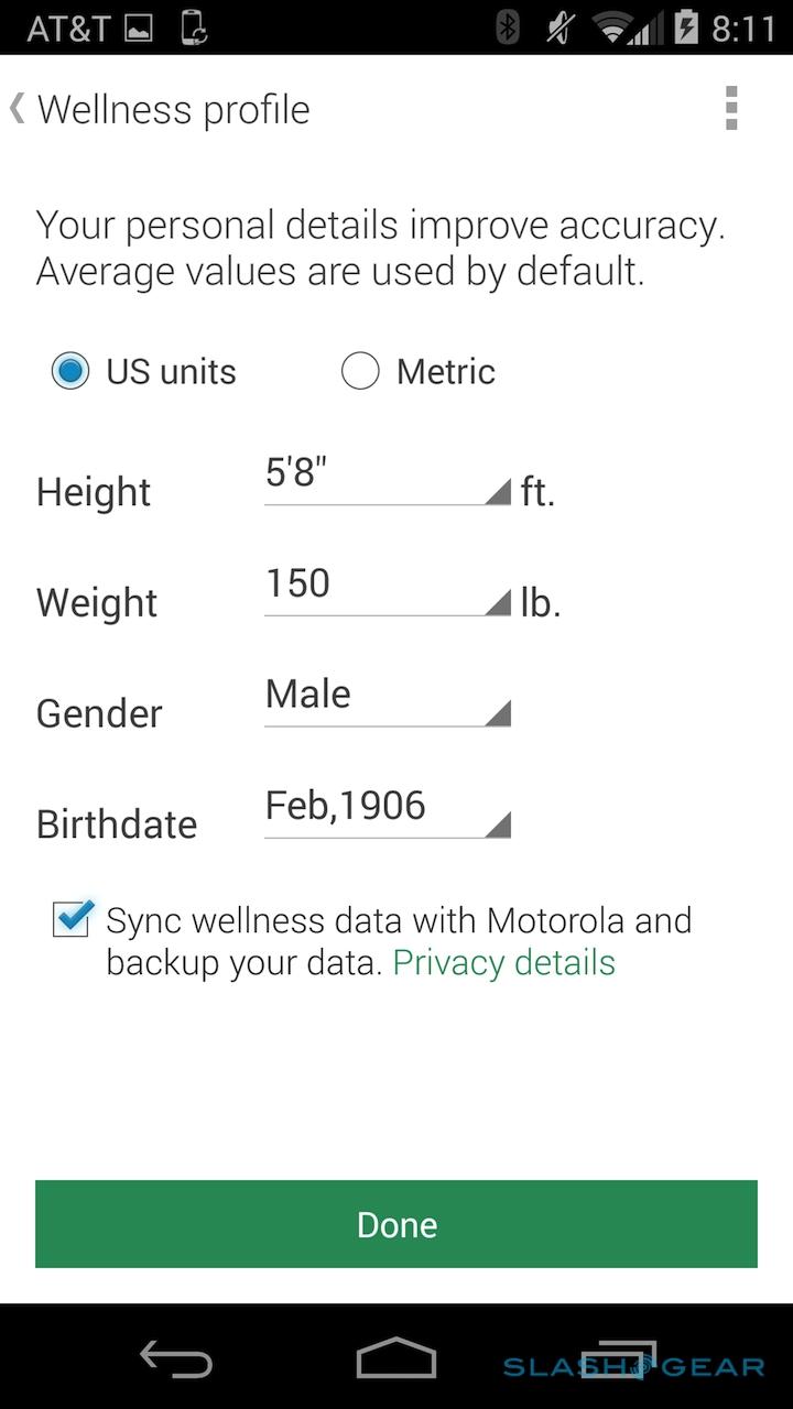
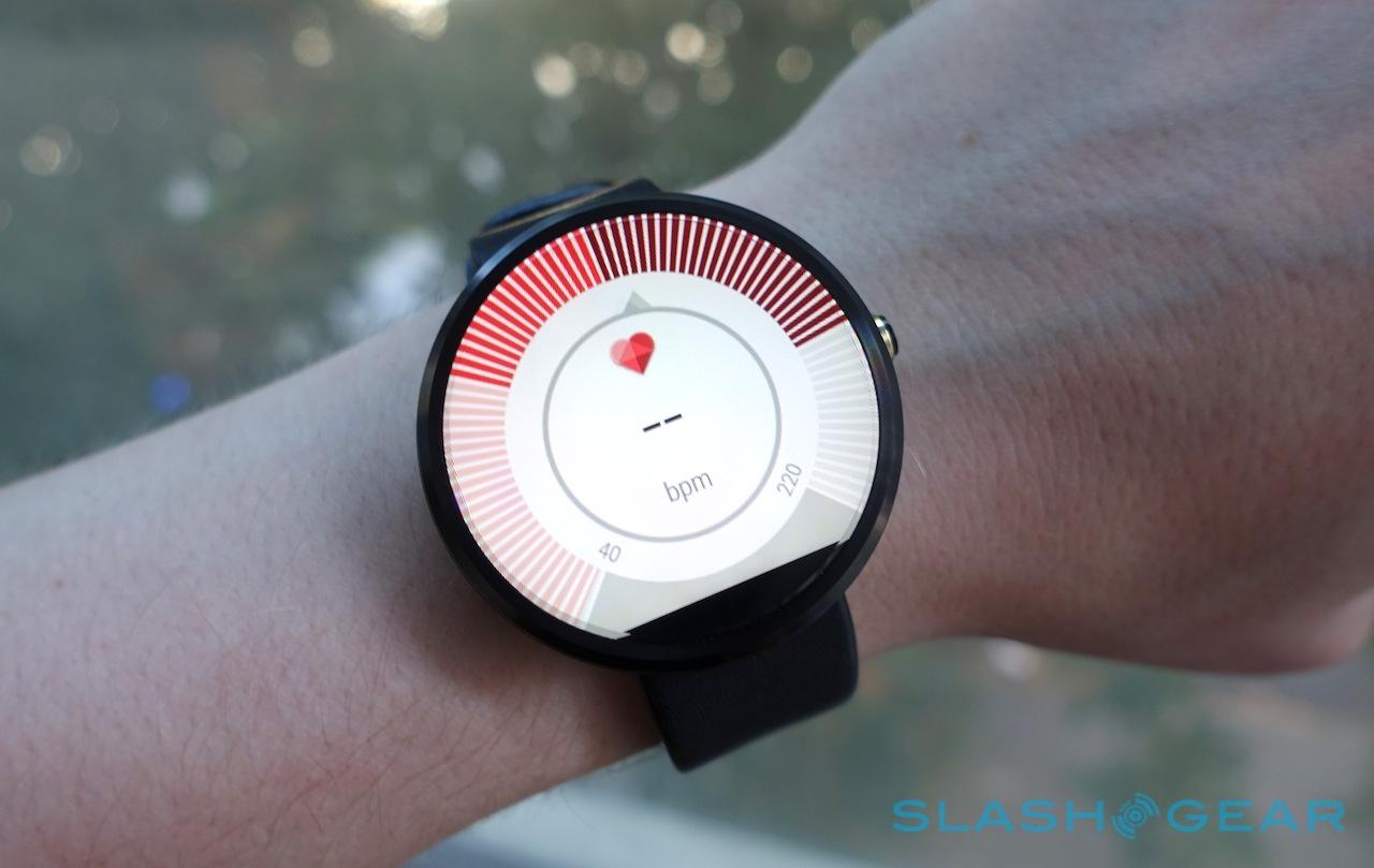
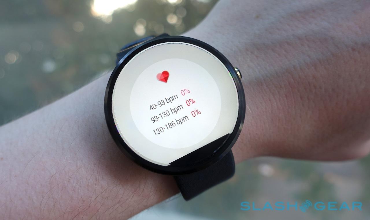
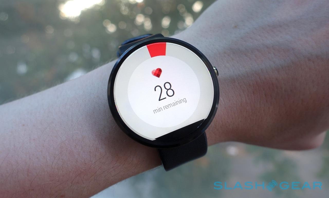
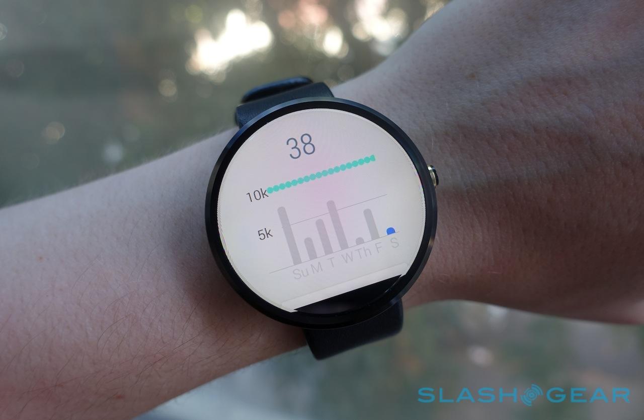
Motorola Connect is also where you set up your wellness profile: punching in gender, height, weight, and age. The heart rate sensor and pedometer work as you'd expect, but Motorola's special heart activity tracking interface not only has a far more attractive circular gage layout, but will periodically measure your pulse and grade you on whether you're hitting the recommended 30 minutes of "moderate aerobic activity" each day.
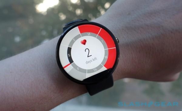
As is the case with the similar sensor on the Gear Live, the Moto 360 needs to be tight against your wrist in order to get a reading, and you need to be standing very still; on several occasions, it simply failed to register. There's also no way to change the daily goal. Even with my woefully desk-centric lifestyle I'd usually achieve it in relatively short order, and so the option to make it a little more stringent would be welcome.
Performance overall from the OMAP 3 processor is fair, though at times there was a little more lag in how voice commands were translated into action than I saw on other Android Wear watches. Nothing close to being a deal-breaker, however.
Battery Life
I described some of Motorola's troubles as being the handiwork of simple physics, and battery life is a good example of that. Like all smartwatches, the balance to be struck is one of bulk, weight, and longevity: the Moto 360's compromise is a 320 mAh battery and simple inductive charging.
To be blunt, it's often insufficient. Motorola claims a full day of use, something I never managed. You can, however, work around it depending on what sort of compromises you're willing to make.
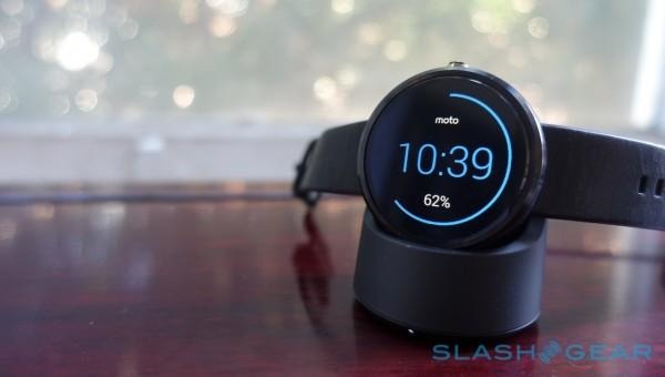
Out of the box, the Moto 360 comes with "ambient screen" turned off. If you've not used Android Wear before, that's the setting which makes a smartwatch feel more like a regular watch, by keeping a time display on – albeit without the backlighting – at all times.
Turned off, you need to move the Moto 360 up in a more stereotypical "oh, let me just check the time on my watch" way, press the button on the side, or tap the screen. The gesture doesn't have to be entirely pantomimed, but it does need to be more than a quick tilt of the wrist; if you often check your watch during dull meetings, you may find you're a lot less surreptitious at it wearing the Moto 360 with ambient off.

Part of the issue is unpredictability. I managed on average 8-14 hours of use from the Moto 360 with ambient display turned on, a surprisingly broad range , and 14-18 hours with it off. Friends who I know with the smartwatch have seen more, or less; it's very much dependent on how you actually use the wearable.
The solution is an occasional top-up. If you're sitting down for a mammoth typing session (at which point I, like several other people I know, prefer to take off a watch rather than have it clack against the desk) it's probably a good idea to drop the Motorola onto its inductive charger. It's one of those times when the couple of seconds saved versus plugging in a USB plug does make a difference to how frequently you do it.
Wrap-Up
Charming but flawed is perhaps the kindest way to describe the Moto 360. Motorola's circular smartwatch looks better than any other on the market, feels great, and is eye-catching in the way that an indulgence gadget arguably should be. Nobody really needs a smartwatch, so if you're going to strap one to your wrist, it may as well be more interesting than the norm. (For a similar reason I don't see the price difference between the various Android Wear models as too much of a deciding factor.)
On the downside, its battery life underwhelms, the one-size-fits all may not actually fit you right, and some of the fitness features like the heart rate monitor pale in comparison to dedicated health wearables. Meanwhile, Android Wear is still very much a fledgling platform which needs to grow in order to make its case compelling.
That's before you even mention the Apple Watch, still several months away but already a specter looming over the segment. Personally, I think that few Android users will jump ship to iOS simply because of Apple Watch, and few iPhone users will do the same for Android because of Android Wear. Even if Apple's wearable is incredible out of the gate, Google has plenty of time (and, from the sound of it, motivation) to improve its own platform.
And yet... even today, the Moto 360 has an appeal which lifts it above its raw specifications and rough edges. With its unusual display, and sleek design, it feels legitimately different from the squared-off chunks of wrist-worn tech we've seen so many times before. Yes, rationally, I know it's flawed in several ways, but it makes me smile when I glance at it.
If you felt a pang of uncontrolled gadget-lust when you first saw the Moto 360 then, like me, you may well be able to look beyond the mundane shortcomings that become clear when you spend more time with it. The more rational among us will probably want to hold out for v.2, but the Moto 360's personality earns it a place on my wrist and makes it my pick of the current smartwatches.
