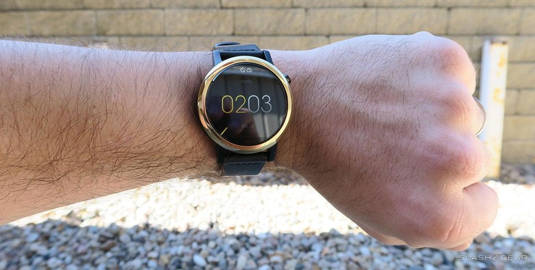
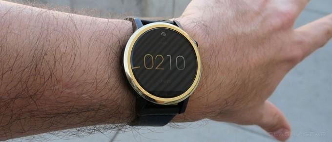
Moto 360 Review (2015)
Today we review the second generation Moto 360 for the year 2015. This is a follow-up to a winning design from Motorola for the year 2014, they being the first creators of a "round" watch for the Android Wear platform. This time around, their design becomes ever-so-slightly more traditional. This time the device has arms (or lugs, if you prefer), and can be custom-ordered like its Moto X smartphone brethren. There's also two different "Designed for Men" models and one "Designed for Women" model for whatever reason.
Watch Size
The model we have is the 42mm Moto 360 with 34.8mm display diameter, the same size watch as the "Designed for Women" model. There's also a 46mm model in the "Designed for Men" category whose face is the same size as the first Moto 360 at 39.624mm.
NOTE: An earlier version of this review erroneously listed some display sizes as watch sizes. Both sizes have been added now for clarity. Thank you NBMTX for pointing this out!
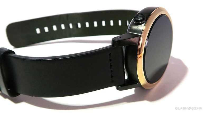
The display on the Moto 360 (2015)'s 42mm model is smaller than the sold Moto 360 from 2014, but still not as small as the LG Watch Urbane or the LG G Watch R, both of which come in at 33.02mm for display size with a watch size of 46.4mm.
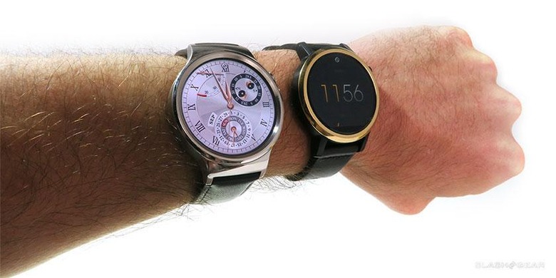
Then there's the exceedingly similar Huawei Watch, a device that sizes in at 42mm with a display at 35.56mm, but whose case has many of the same cues as this year's Moto 360. Don't be fooled by the placement of the single hardware button – these two devices are very different when you get up close and personal with them. Have a peek at our Moto 360 (2015) vs Huawei Watch hands-on for more photos and detail.
While one of the most major differentiating factors in a traditional watch is its face, with a smartwatch it's a whole different ball game.
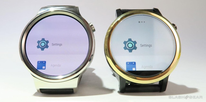
Here you can argue over pixels – but unless you're comparing this smartwatch to the far less sharp Pebble Time Round, the difference between smartwatch pixel densities is negligible.
Software
The Moto 360 (2015) runs the newest version of Android Wear, the same platform you'll find on the LG G Watch Urbane and the Huawei Watch – but markedly different from what you'll find on the Samsung Gear S2.
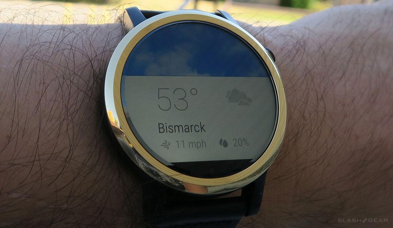
The Samsung Gear S2 sizes in at 42mm with a 30.48mm display, the smallest display in the whole collection of round-faced smartwatches on the market this year. The Samsung Gear S2 runs Tizen – an entirely different operating system – certainly one we'll be taking a closer look at when the device is released later this year.
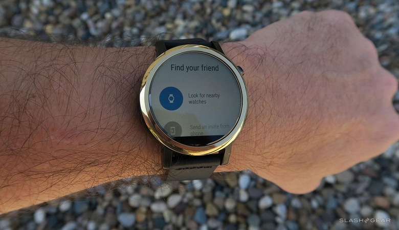
Because the Moto 360 (2015) runs Android Wear, it has access to thousands of watch faces, with more being developed and released every day. If you want to know all about Android Wear.
Motorola provides an app that allows you access to a number of Motorola-designed watch faces that are neat. Nothing that'll make or break your decision on whether or not to buy the device.
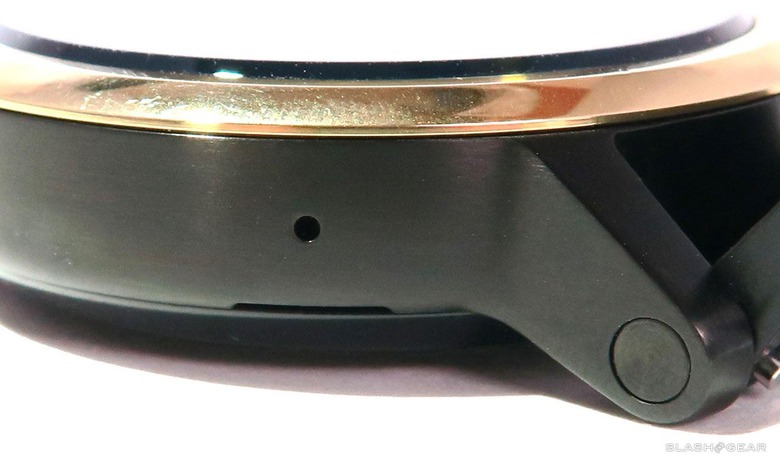
This device also has a single mic hole for hearing voice commands with Google Now. This mic is essentially the same as last year's model – perfectly fine for what it's made for.
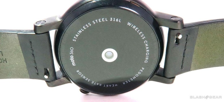
There's also an optical heart rate monitor (PPG) that, as far as we can tell, works the same as last year's model – totally fine. Motorola provides fitness software by the name of Moto Body that does the basics: heart rate, step tracking, and daily activity goals. You're able to set the watch to send you notifications for your heart rate and goals, too.
Battery
The battery in this watch is good enough to be a non-concern. If the smartwatch lasts a full day – between waking up in the morning and going to sleep at night – then I'm not going to be worried about it.
As it stands, if I charge this smartwatch up to 100% overnight, wear it and use it all day, then leave it (not charging) overnight, using it again as normal the next day, the watch lasts about 34-hours, give or take a few dependent on how much I'm using the device on Wi-fi as opposed to synced with my smartphone in the same room.
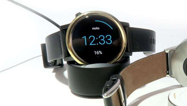
While competitor devices are working with magnetic chargers with charge pins, the Moto 360 (2015) works with Qi-standard wireless charging technology. While this does mean that you'll technically be able to charge on any Qi-standard wireless charging stand, you're still going to want to keep the Motorola-made Moto 360 stand around if you wear the watch while traveling.
Because the arms of this watch do not allow the back of the watch to lie flat on a flat surface, placing the device face up on a flat charging pad results in the device getting caught in a charge loop – the watch can detect the charger, but can't quite begin to take a charge.
Community Support
The most important thing about Motorola's release here, in my mind, is the support the device has from the developer community. It's very clear – if you look at developer forums like XDA, that the Moto 360's community is the strongest amongst any single Android Wear device so far.
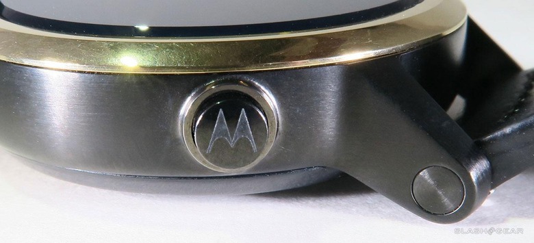
Here you'll see the Motorola "M" logo on the Moto 360 (2015)'s one hardware button. This button is able to rotate so the emblem can be any angle – while some might consider this a flaw, others might consider it a perk.
The fact that Motorola released a second-gen watch with the same design (not quite round) may have come as a shock to those wishing for a full round face, but for those designers that've already spent the time creating watch faces and apps that work with the odd shape of the first Moto 360, their task in adding new support is nonexistent. Everything made with the Moto 360 (software-wise), works with the new Moto 360.
Of course the display is slightly more dense at 360 x 330 (for the 46mm) or 360 x 325 (for the 42mm) than the original Moto 360 at 320 x 290 (at 46mm). Again, you won't notice the pixel density difference – unless you hold the original Moto 360 right next to the 42mm Moto 360 (2015), but the difference is insignificant with real-world use.
Real World Fit
The big difference in this watch isn't the software. It's not the colors of the display. It's not the watch bands.
The big difference is in the more traditional shape of the watch. The Moto 360 (2015) does not get as near the "this just looks like a regular, not-so-special watch" as the LG G Watch R did with its printed-on chronograph-style markings.
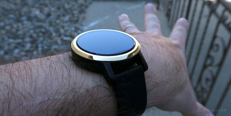
Instead, the Moto 360 (2015) has what feels like just the right amount of unique aesthetic quality to it, just before you get to the point at which the device simply says "I'm here to stand out."
That's what the Moto 360 from 2014 did, and does.
It's massive and unique and it knows it.
With Motorola's Moto Maker process of allowing users to select their own unique combination of watch colors and materials, the company selects exactly the right door to watch-wearer's hearts: personalization.
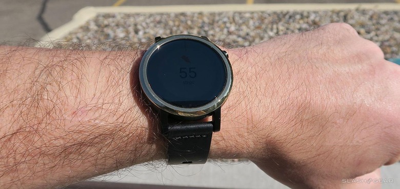
Here you're seeing the Moto 360 (2015) in direct sunlight. The display is obviously put at a disadvantage here, but remains viewable.
While all other smartwatch makers – Apple included – require that you stay within their strict device design guidelines for the body of the watch, Motorola seems to trust you more.
It's your watch, after all. It's going on your wrist where everyone can see it.
If you're going to choose to take the time to put this wearable smart device on your body every day, what better way to motivate you than to let you decide exactly how it, and therefore you, look?
Wrap-up
Motorola does smartwatches right again, for the second year running. The company has created what's sure to be one of the most sought-after models of Android Wear watch on the market – not because of pixels, not because of straps, but because of the following the Moto 360 (2014) already has AND the trust Motorola places in the hands of consumers.
The Moto 360 (2015) is available for pre-order immediately starting at $299.99 USD through Motorola online.
