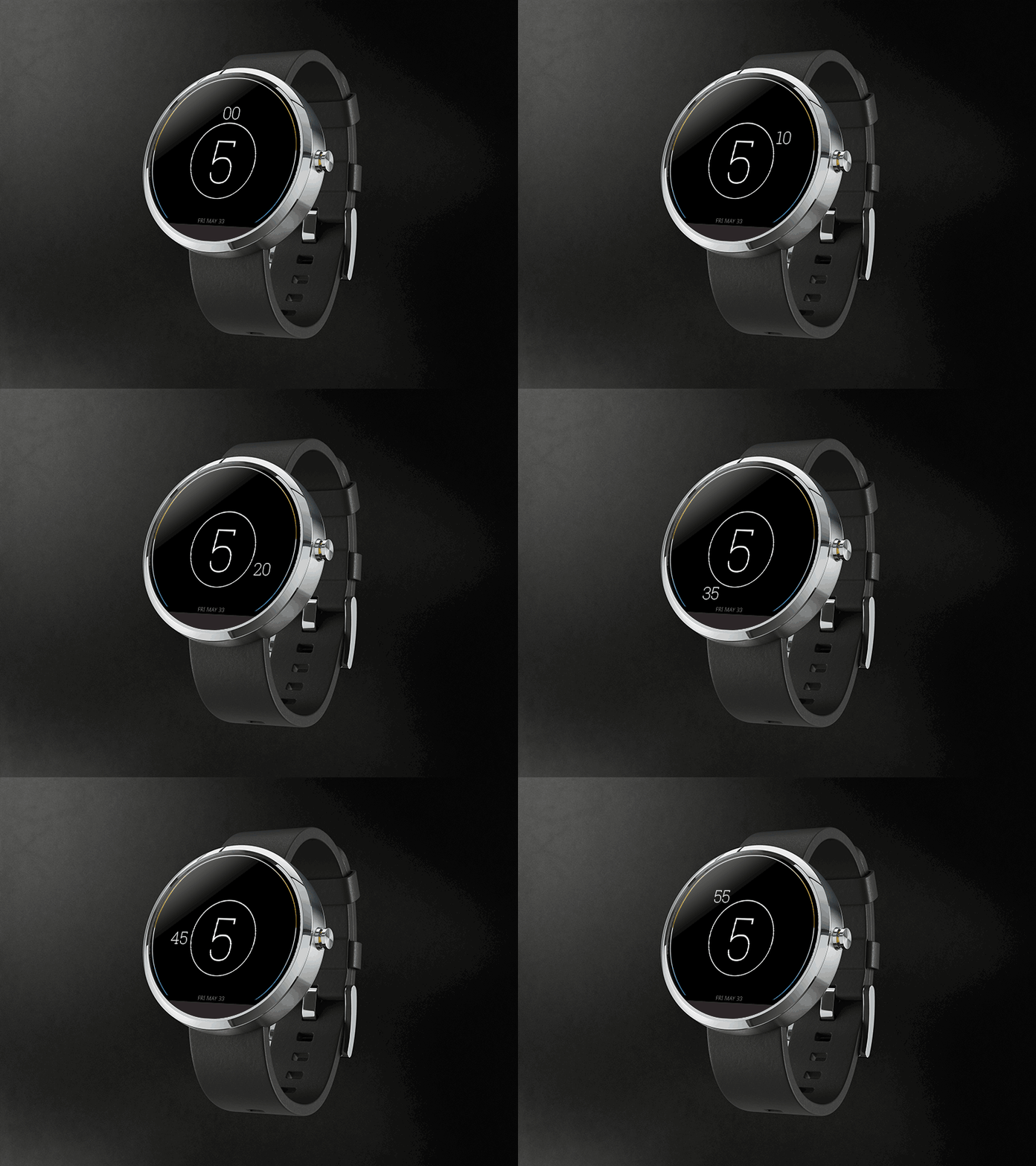
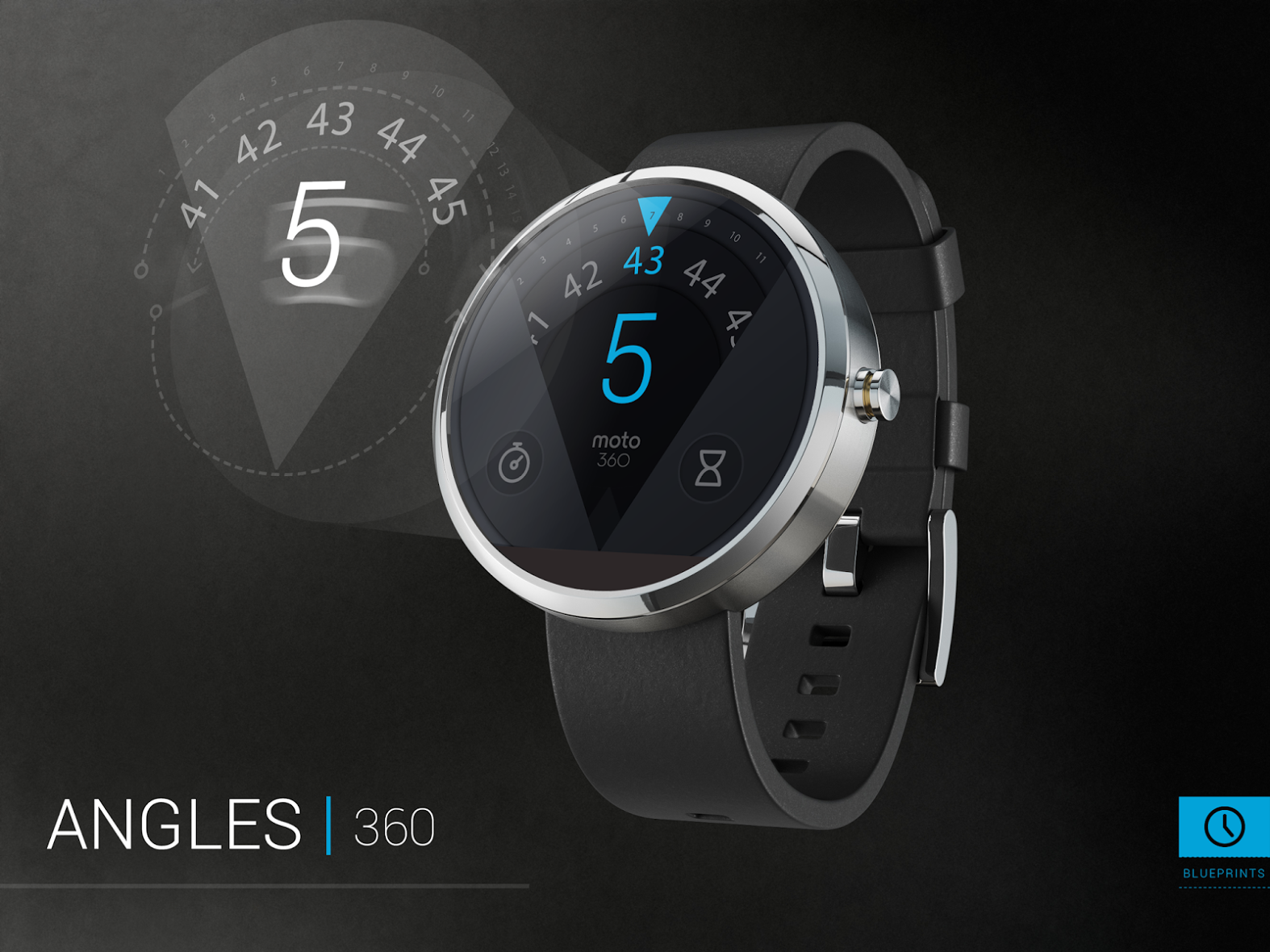
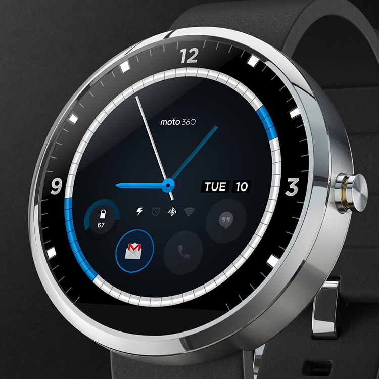
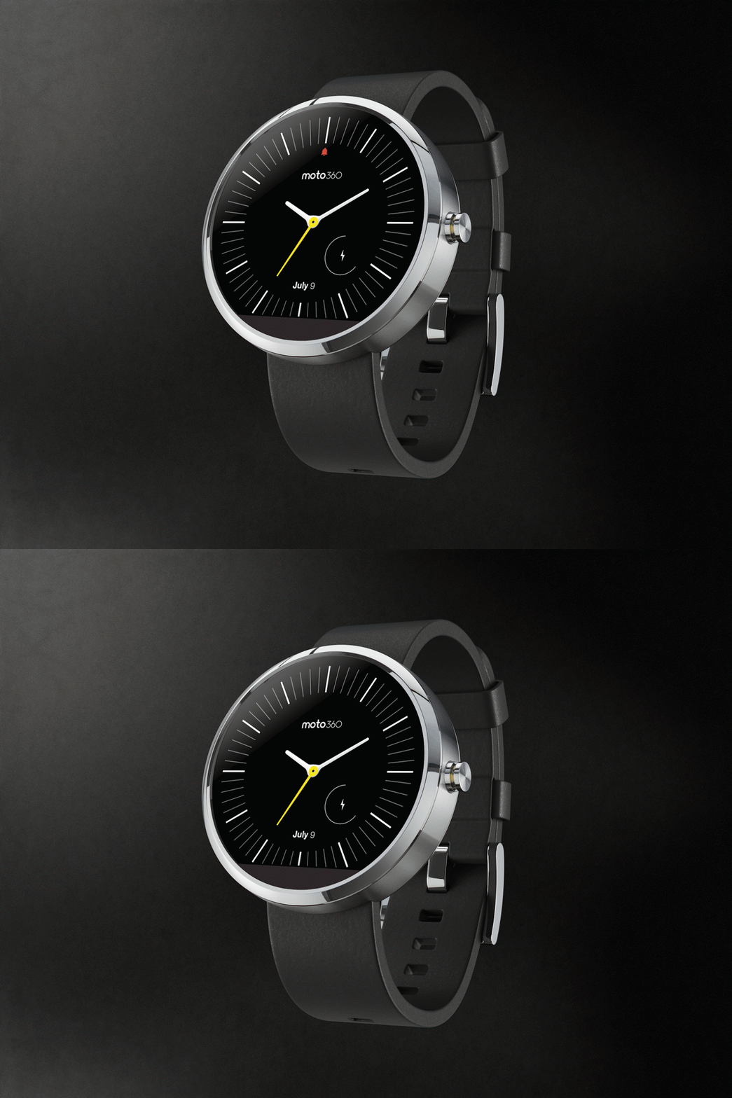
Moto 360 Design Contest Finalists Revealed
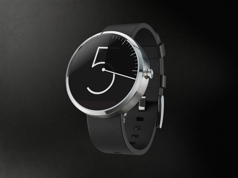
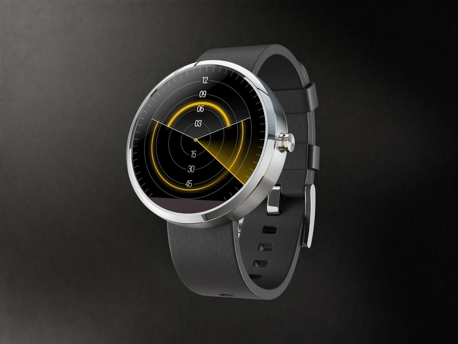
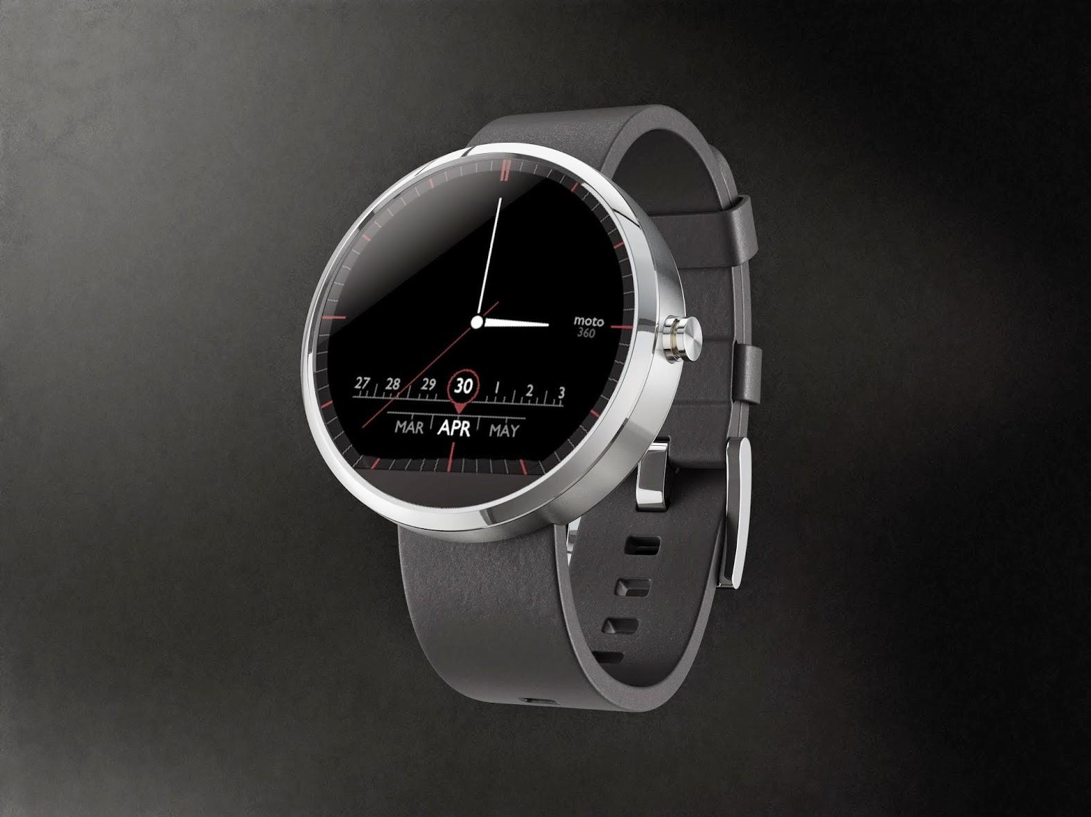
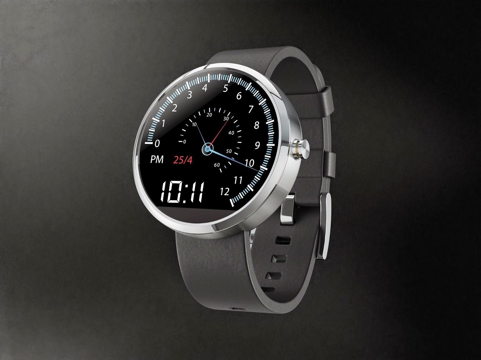
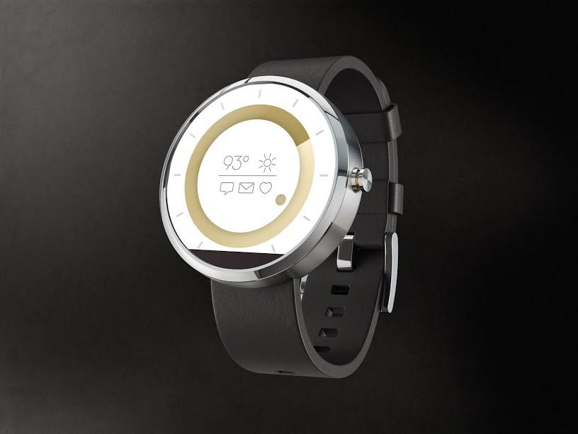
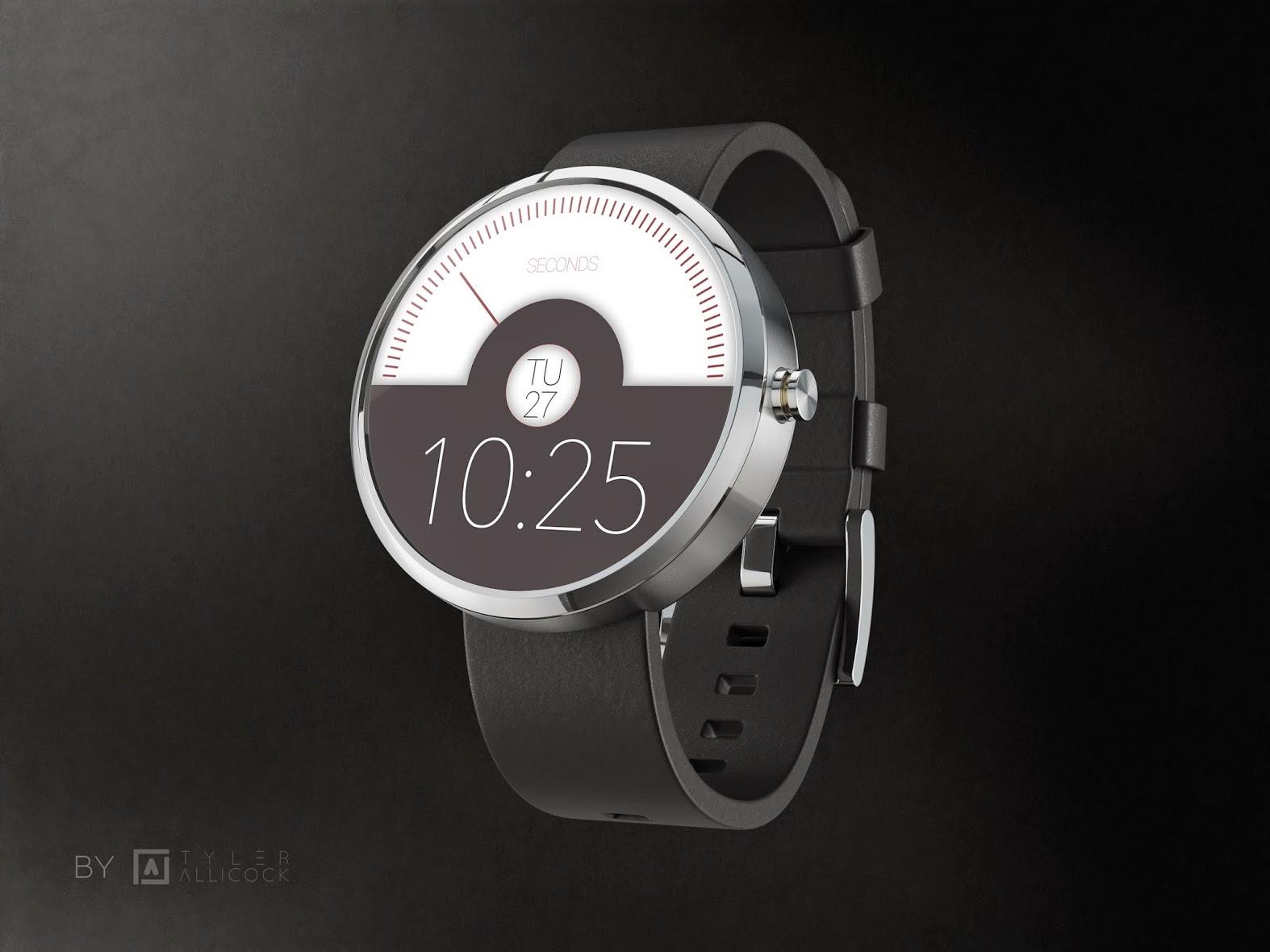
Android Wear is open source, and Motorola wants design to be as well. The company recently held a contest to discover who could come up with the best face design for their new wearable. The ten finalists have been revealed, and we have to say — deciding a winner won't be easy.
All designs are stellar, providing a subdued, modern look to the incoming wearable. We like the timeless, round design of the Moto 360, and the contest finalists do the hardware justice with their designs. From disappearing graphics to a sensorial challenge of a straight calendar on a round face, the finalists have submitted stunning designs.
The contest was designed to entice smart design, as Android starts to make a push for design balanced with usability. These submissions are meant as the face you'll see more than any other, and we'd not have a problem glancing down at these any time (pun!) of the day.
Maybe our lone issue is that only one of the designs aims to provide more than the time. There is one that has a compass feature, but only one aims to give you notifications of incoming messages and such. We'd have hoped for more variety in that regard, but the designs are beautiful nonetheless. Check them out in our gallery above!
Source: Motorola
