Microsoft Zune HD Review
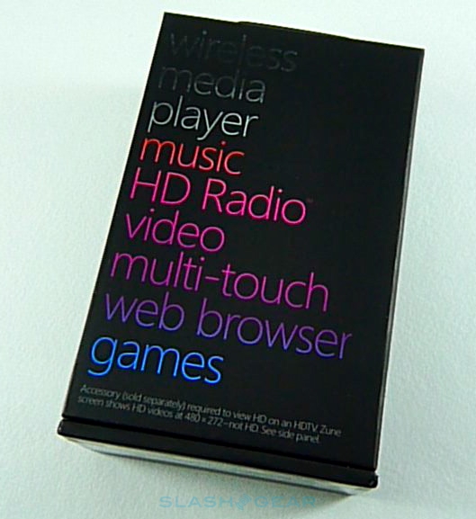
Microsoft's first Zune attempts won it a few dedicated users but a whole lot of criticism. In the face of Apple's all-conquering iPod touch there was only really one way to go, and that was touchscreen; the Zune HD marks not only the transition to being finger-friendly, but packs the latest OLED display technology, HD radio and by no means least 720p high-definition support. Clean reboot or BSOD? Check out the full SlashGear review to find out.Zune HD Unboxing:
[vms ff6858afd2723755ff79]
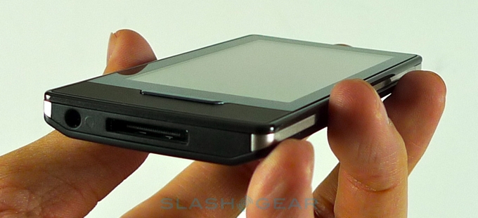
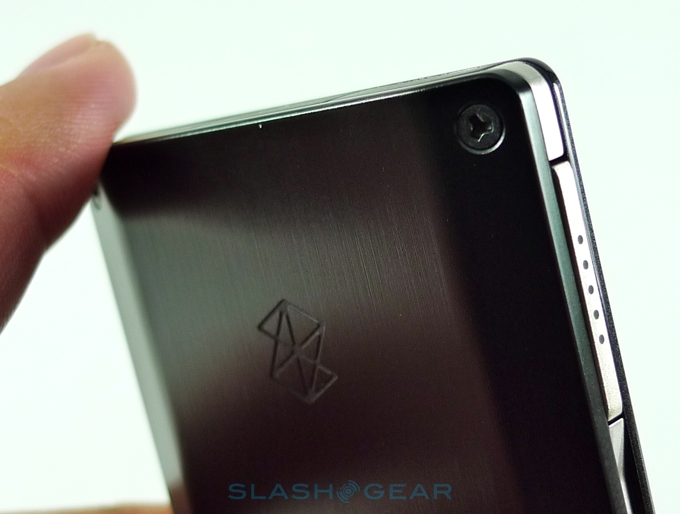
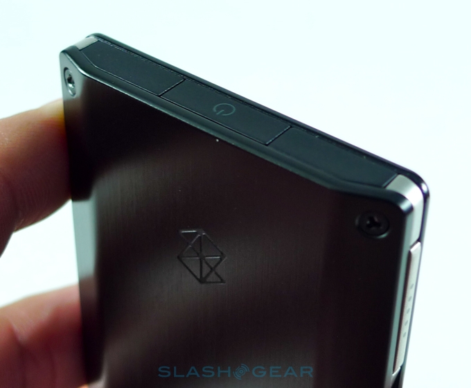
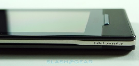
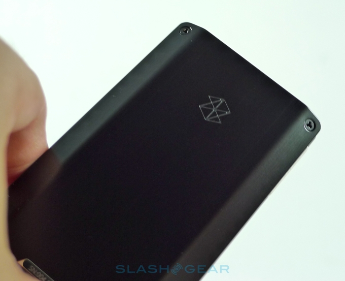
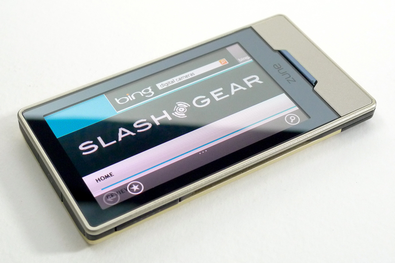
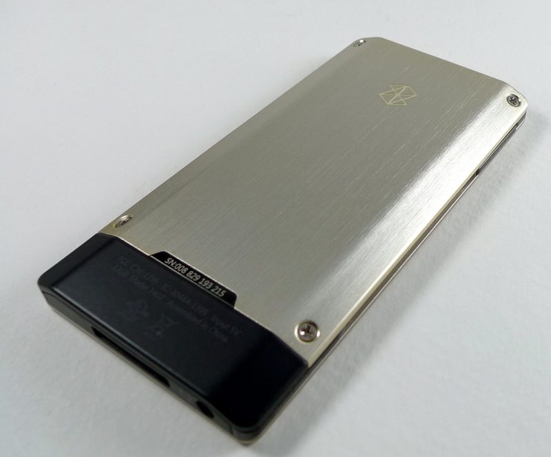
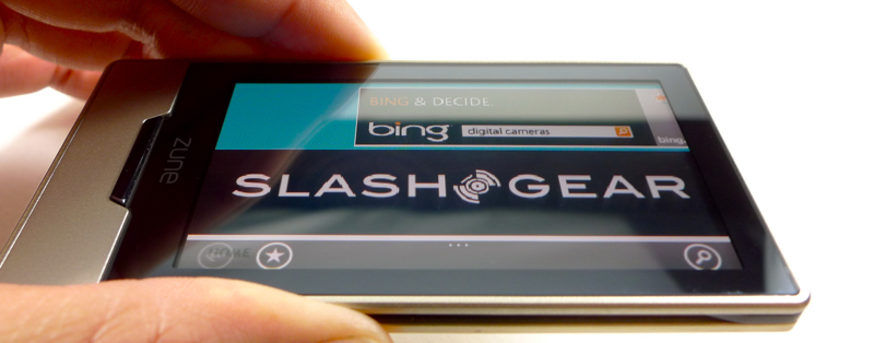
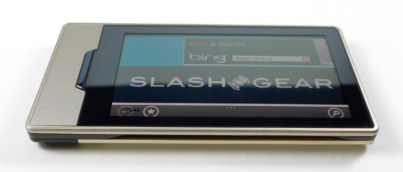
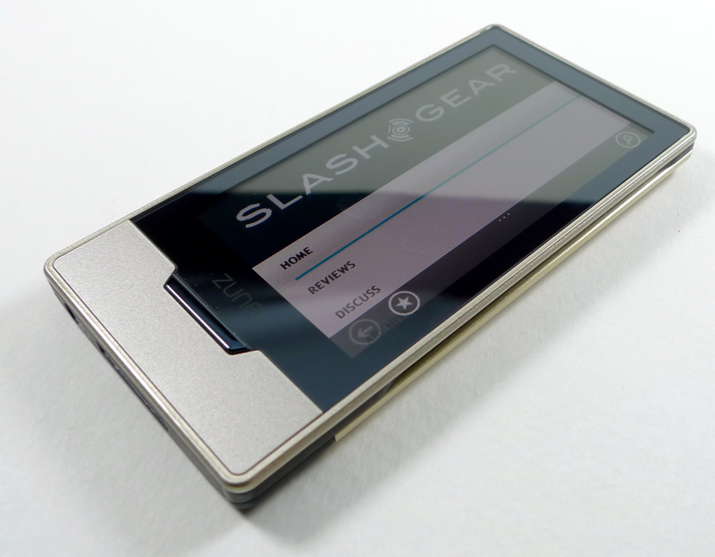
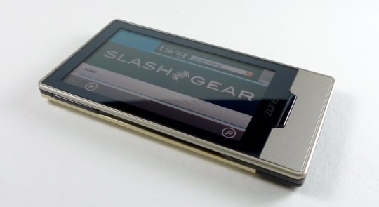
If apple have gone with the worn-smooth-pebble look with their iPod touch, Microsoft have taken the engineering route. The Zune HD teeters just on the attractive side of distinctively industrial, with an angular casing, exposed screw-heads and slab-like controls. Physical buttons are limited to the long, thin home key on the front, a power/hold key on the top edge, and a shortcut button on the left-hand side that triggers the Quickplay menu. In a sea of identikit touchscreen PMPs and cellphones all quietly borrowing Apple's style, it's great to see a distinctive design.
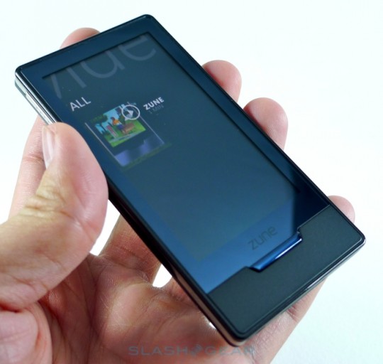
Excellent build quality and an awesome display – with one frustrating flaw – certainly don't hurt, and it's handy that the Zune HD's construction and materials feel as sturdy as they look. Lashings of aluminium, glass and rubberized plastic in a slender form-factor are great, and once the 3.3-inch OLED touchscreen lights up the whole thing gets even better. While Windows Mobile smartphones may have languished up until now with resistive panels, the Zune HD snaps neatly into the capacitive camp with an accurate and responsive display. Side by side with the iPod touch the Zune HD's display is, at 3.3-inches, 0.2-inches smaller diagonally, and that shaves off some pixels, too; 480 x 272 versus the touch's 480 x 320. Still, it's true 16:9 widescreen, which makes sense for video content compared to the letterboxing on the iPod touch.
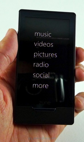
Microsoft have certainly come up with a distinctive UI, and though as a first showing there are some issues still to be ironed out, it's generally easy to use. Rather than attempting to replace everything with pictorial icons, there's plenty of clear white text on a black background. Herein lies the OLED display's key drawback, or at least that of the glass and color scheme. Screen reflections are very noticeable, occasionally to the point where some experimental angling is required in order to see the screen clearly; a matte-finish screen protector would clear this up quickly, though.
The Zune HD's homescreen is, like Windows Mobile 6.5, made up of a list of functions – videos, pictures, radio, etc – but there's also a slide-out Quickplay menu triggered by the side button. That offers speedy access to favorites – here called "Pins", and which can be made up of music tracks, videos, photos and more – as well as play history and most recently added content. It also shows details of the currently playing track, complete with album art. Like with the iPod touch there's kinetic scrolling to navigate through lists of media, though as you do so there's no side list of letters to jump to a particular title or artist; instead, you tap any of the letters which are in-line with the list, and that pops up the full alphabet to choose from.
Zune HD User Interface:
[vms d6cf08c11a970fbe0e2a]
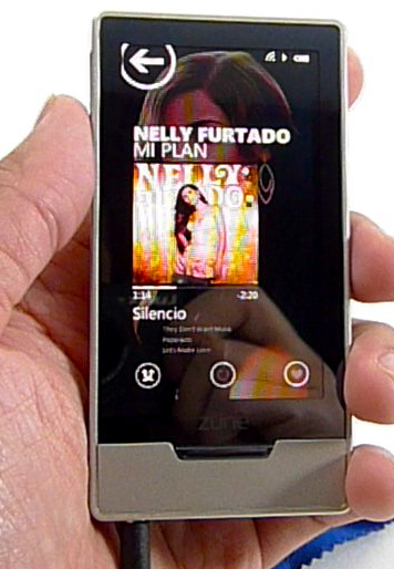
While that works, certainly, it suffers from not being alike any of the other major PMP platforms that have come before it. Similarly the now-playing page at first glance lacks playback controls; these are hidden on the Quickplay menu, triggered again by the side button or by tapping on any point of clear space. What makes it confusing is that Microsoft have scattered a few less important controls – to trigger repeat or shuffle, or rate the track – on the now-playing page itself. The consistency of the side button is good, and we like having fast access to playback wherever we are in the menu structure, but the now-playing page does seem one place where a little duplication could've been allowed. Still, what you do get is not only album art but an image of the artist that the Zune HD automagically locates and uses as the wallpaper. Happily sound quality is very high, especially when you drop the bundled headphones and replace them with a decent aftermarket set.
There's a feeling that the PMP is so image-heavy because Microsoft want to show off the quality of the OLED display, and that's no more so than in video playback. Having reviewed the Sony Walkman X, another OLED display mediaplayer, we had high hopes for the Zune HD's visual performance, and we certainly weren't let down. The Zune Store is packed to the gills with 720p HD content, and while the Zune HD itself can't natively play it back at full resolution, the end result is so impressive we can see how it could fool many. Blacks are inky and colors rich and vibrant, with little bleeding or blurring during fast-moving scenes. Again, either tapping the display or the Quickplay button pulls up the controls to play/pause, skip and stop playback.
In terms of codec support, we fear Microsoft missed a trick by leaving out any of the current online favorites – Xvid, DivX or MKV – in preference to the more mainstream WMV, MP4, H.264 and Media Center's DVR-MS native recordings. It's a vast shame, as paired with either the $89.99 AV Dock – which gets you a remote-control, HDMI and composite cables, and radio antenna – or merely the AV pack for the original Zune, the Zune HD makes for a very capable big-screen playback device. The distinctive UI makes even more sense with a few dozen inches of screen real-estate to play with, while the 720p content is very impressive; it's easy to forget that this is a pocket-friendly PMP driving the show, rather than a full HTPC.
Zune HD demo video:
[vms d244975439c612459277]
While Apple impressed a few people by bundling FM radio support into the iPod nano recently, Microsoft are still one step ahead with their HD Radio playback on the Zune HD. There's also no facility to record radio broadcasts, though you can pause live transmissions and then resume them afterward, useful for when the phone rings and your listening is interrupted. As for tuning, the Zune HD does a decent job of picking up various stations automatically, though the choice will depend very much on where you are at the time. Track identification is done via RDS, complete with station and album name, though we wish Microsoft had tied this into their ZunePass unlimited subscription-based download service so you could easily queue up a download having heard it on the radio.
Speaking of ZunePass, Microsoft's music service continues to split opinion with some decrying subscription-based downloads and others welcoming the breadth of choice on offer. We're tentatively looking at it as an expensive single album a month – for the $14.99 ongoing fee, you get 10 tracks to download and keep forever – with the bonus of unlimited access to the rest of the catalog that lasts as long as you can stomach the price. Microsoft have integrated their own version of Apple's Genius suggestions engine, Smart DJ, into ZunePass, which means you can tap "Related" on any existing track you have and see what artists they reckon are similar; the Zune HD automatically turns on WiFi and, if it can get a connection, immediately downloads a new tracklist and starts playing. While we can't always say we agreed with Smart DJ's choices, it's a very easy way to find new music and of course there's no extra fee above and beyond ZunePass. Neatly, the prediction functionality will also work – only with just your existing music catalog – if you haven't opened your wallet for ZunePass access.
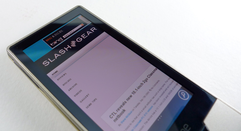
Microsoft have made good use of the Zune HD's WiFi connectivity, and while you can no longer flick tracks between PMPs, it does support wireless synchronizing. Not something you'd want to use the very first time you load your library onto the Zune HD, but for adding a few new tracks it works well. WiFi also stretches its legs in the Zune HD's browser, and here's a piece of software that really shines. While the display may be slightly narrower than that of the iPod touch, the new browser – which we're told is based on the same Internet Explorer Mobile technology that will make a showing in the next-gen version of Microsoft's smartphone OS – handles content very well. No Flash support, nor even a standalone YouTube player as Apple provide, but pages render as they would on a desktop and the integration of Bing for search is slick and fast. There's also pinch-zooming and the usual multitouch support.
WiFi should also get to flex its legs with application downloads, but they'll be a little longer coming than we've seen on smartphone platforms. Preloaded are a few games and some simple usability apps – weather and a calculator – while Microsoft have confirmed that Twitter and Facebook clients will follow on in November, but there seems to be less impetus to get third-party developers involved. There's no true Zune HD SDK, though there is a new XNA Game Studio 3.1 add-on which will allow developers to create software.
Time will tell if that holds the Zune HD back compared to its PMP brethren. Audio quality and video playback are particularly strong, and in fact the Zune HD's media functionality edge ahead of the iPod touch in many ways. While a lot of people still aren't convinced about subscription-based download services, ZunePass works exceptionally well with the Zune HD's suggestion system. We'd definitely budget for a subscription – along with the AV Dock – if it was our own money and we'd decided on Microsoft's platform.
Given the lackluster appeal of the original Zune models, it's come as no small surprise how much we like the Zune HD. There's a sense that the Zune team really love digital media, and put above and beyond the usual effort into crafting a PMP capable of not only showing that off to its best, but doing so in a way that endears and pleases with its creative UI. Yes, boosting native codec support and ironing out the few confusions in the control structure would make it even better, but if you think of the Zune HD as the first generation of Microsoft's new breed of PMPs then you have to admire everything they've achieved. Even the pricing is reasonable: $220 for the 16GB model and $290 for the 32GB, though we wish Microsoft offered a 64GB version too. Those buyers looking for broad mobile flexibility – apps, media playback and everything else – should stick to the iPod touch for the moment, but anybody wanting an excellent PMP should definitely be considering the Zune HD.
