Microsoft Courier UI Details Leak: Perfect Pen/finger Balance?
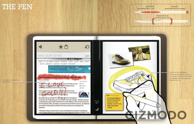
Microsoft's Courier project – a dual-display "book" style electronic journal – has been intriguing us since it first leaked back in September, and the latest spillage of UI details courtesy of Gizmodo's mysterious tipster is doing nothing to temper our interest. The twin screens are both multitouch-capable and respond to fingers and the special stylus, the latter having two side-buttons (the upper one being an "undo" key), an eraser on the other end, and a rotating barrel that flips between different pen modes.
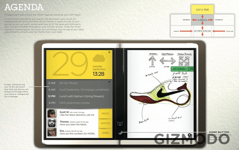
The core concept of the Courier is the Infinite Journal, and that's kept under control with the Smart Agenda that pulls out pertinent calendar entries, to-do lists, messages and indexed pages so that you're not left browsing the whole database mindlessly. Information is snapped from the browser or the external camera on the back, or via sketches or handwriting recognition, and can be "tucked" under the center spine as you find the right place to store it. That center spine also has a single Home button, similar to that on the iPhone.
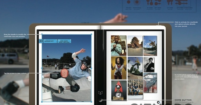
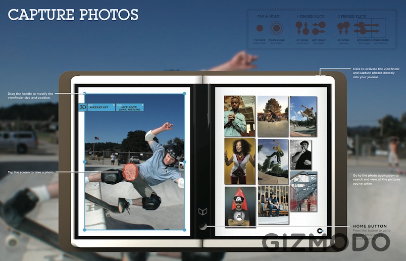
It sounds as though Microsoft's Courier team have been making some sensible design decisions – photos can be cropped before they're actually snapped, for instance, in the viewfinder; there's a hardware camera button; and a Library feature suggests ebook consumption is on the cards too, no matter what Steve Ballmer might say – and the gesture support looks like a great balance between the finger-use of the iPhone and the pen-centric interface of a Tablet PC. We're really hoping this is something destined for production, and that the rumored mid-2010 launch gets pulled forward.


