Meizu PRO 6 Review Part I: The Galaxy iPhone Missing Link
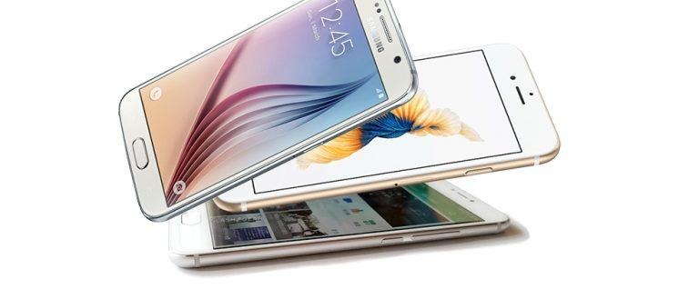
We have a smartphone here that exists in the space between the top two mobile device makers in the world: Samsung and Apple. This is the Meizu PRO 6, a device whose hardware and software find themselves at a point near smartphone singularity – where all of the most high-end smartphone details meet. This is a cross-breed if ever we have seen one. At the same time, the PRO 6 is indeed a pretty great phone in its own right.
Today we're doing this close-up look in lieu of a proper "unboxing" article. Not that we do those that often anymore, but here we're getting up close and personal with a device that could very easily be mistaken for either an iPhone 6 or a Samsung Galaxy S6.
No trouble at all.
Sure, it's missing a Samsung logo up front.
Sure, on its back it has a big ol' Meizu logo.
But look:
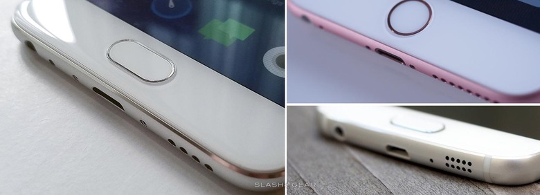
Notice the glass is curved around the edges and sits just up above the metal side. On the left you've got the PRO 6, on the right you've got the iPhone 6s. The Samsung Galaxy S6 is there too – see a button shape similarity or two?
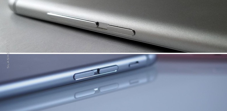
In the volume button department, the PRO 6 keeps it a little bit more unique. Away from either of the other phones we're looking at today, anyway.
The volume button sits on the right side of the phone right near the power button and exists as a rocker rather than two separate buttons. Both the Galaxy S6 (and 7) and iPhone 6 (and 6S) have their separate volume buttons on the left.
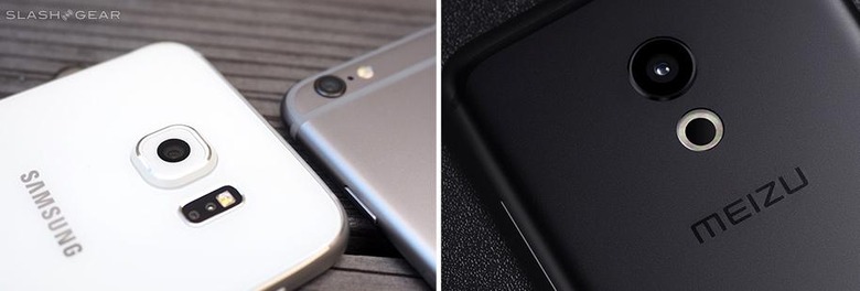
The PRO 6, iPhone, and Galaxy smartphones each hold their own when it comes to back-facing camera designs. Samsung has a centered lens like the PRO 6, but the PRO 6's design is far more flat – closer to absolutely flat than even the Galaxy S7 ends up being.
The iPhone, meanwhile, has its camera in the upper left-hand corner of its back, as always.
The software on this smartphone is called Flyme – it's based on Android 6.0 at this point and runs Meizu's own app store. One feature we'd like to point out specifically here is what Meizu calls "3D Press". It has EXTREMELY similar functionality to that of Apple's "3D Touch".
Meizu's 3D Press also looks VERY, VERY similar in its software implementation to Apple's 3D Touch. Highly, highly similar.
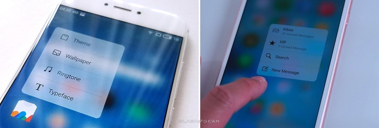
Unless you knew the specific details of any of these devices extremely well, you might not be able to pick one of them out of a lineup with the other two.
For example the following photos:
1. Which device is this?

2. How about these two here, two together?

3. And another – which is this?
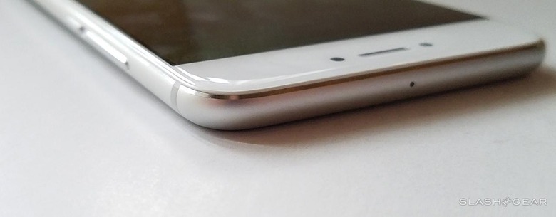
4. And this one?
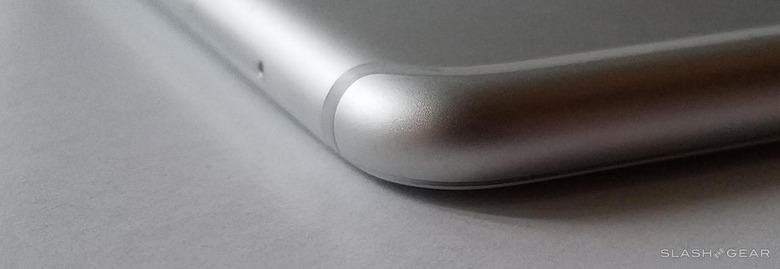
5. Here's an easy one – which is this?
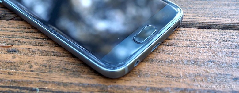
6. One more – we've not mentioned this phone yet in this article at all. Imagine that!
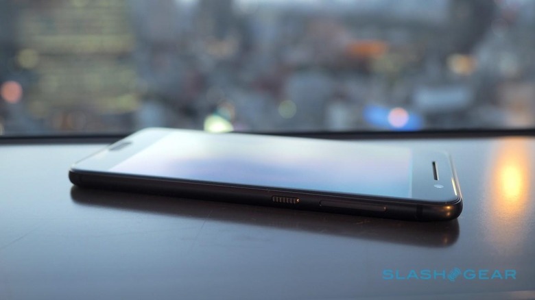
After you've figured them all out, have a peek at a history lesson on HTC vs Apple design and how their newest phones have come to look strikingly similar.
Below you'll see the HTC One A9 and the iPhone 6.
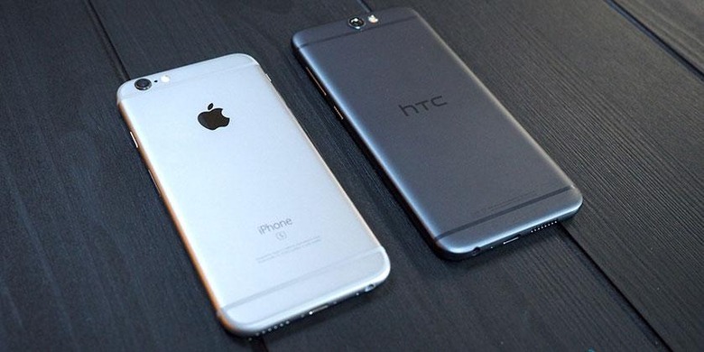
Have we reached Smartphone Singularity yet?
Or have we got a ways to go before we get there?
Stay tuned for the rest of our Meizu PRO 6 Review action here on SlashGear's Meizu tag portal now that we've got this "it looks like X" business cleared out of the way!
