Meizu PRO 5 Ubuntu Edition Review
Despite Nokia ex-CEO Stephen Elop's boasts, the smartphone market has indeed become a two-horse race between Android and iOS. Of course, just because those two have pretty much cornered the mobile market doesn't mean there is no room for others, especially those that aren't aiming for world domination. At leat not yet. We're talking here about more unconventional, more "experimental" platforms like, say, Ubuntu Touch. Although already in the commercial market for more than a year, Ubuntu Touch's smartphone promise reaches its full potential in the more muscled Meizu PRO 5 Ubuntu Edition. But does this so far most powerful Ubuntu smartphone live up to the expectations it has set up for itself? It's time to buckle your seat belts and join us for another ride into the somewhat alien world of Ubuntu on Mobile.
Hardware
Specs
Let's get right down to the nitty gritty of the hardware. Previous Ubuntu Touch smartphones, both those from Spanish OEM bq as well as Meizu as well, have mostly been in the entry-level to mid-range tiers, though the Meizu MX 4 admittedly was also the higher end among that first batch. The Meizu PRO 5 definitely trumps them all. Powered by a Samsung Exynos 7420 Octa, with 3 GB of RAM, the Meizu PRO 5 sported 2015 flagship specs. After all, it was Meizu's 2015 flagship. Well, almost flagship specs. Here's a quick rundown of those hardware features:
• Operating System: Ubuntu• CPU: Exynos 7420 Octa• RAM: 3 GB• Storage: 32 GB• Display: 5.7-inch 1920x1080 AMOLED• Main Camera: 21 megapixels, Sony IMX230, f/2.2, PDAF, Laser AF• Secondary Camera: 5 megapixels, f/2.0• Battery: 3,050 mAh, mCharge 2.0 fast charging• Dimensions: 156.7 x 78 x 7.5 mm• Weight: 168 g
If that list looks somewhat familiar, it's because the the Meizu PRO 5's hardware looks like the Samsung Galaxy S6 generation, including the Galaxy S6, Galaxy S6 edge+, and Galaxy Note 5. Give or take a few features, with the display being one of the biggest. While the main Android version of the Meizu PRO 5 came in memory configurations, the Ubuntu Edition only came with the base 3 GB of RAM and 32 GB of storage. Other than that, the only difference between the Android and Ubuntu Editions are purely in the software department.
Display
Despite almost having the same specs as Samsung's 2015 champion, the Meizu PRO 5, both Ubuntu and Android editions, come up short when it comes to pixel count, ending up with only 1920x1080 pixels spread out over the 5.7-inch screen. That said, there is strong belief that even a 1080p Full HD screen is more than enough for common use and 2K QHD is just gravy on top. Of course, that does mean missing out viewing 2K content in their full resolutions, but for some, that might not be such a big loss.
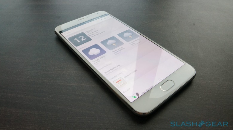
Despite the relatively lower pixel count, the Meizu PRO 5's screen doesn't exactly fail to deliver. The screen is bright and colors are accurate and crisp, thanks in part to the use of AMOLED display technology instead of LCD. Viewing angles are good and the screen is mildly usable outdoors. That said, like any other screen, extremely bright ambient light, like the sun, will make you try to max out the brightness instead of relying on the auto brightness function.
Audio
While the display might be a strong point of the Meizu PRO 5, audio is the weak link, at least in the Ubuntu Edition. The speakers are obviously capable of very loud output, but, uncontrolled, it becomes a bit too much. The volume controls, in particular, seem a bit unreliable in properly modulating the volume in gradual steps. Imagine the volume going from 0 (mute) to 10 (loudest). The difference in volume from 6 to 10 is barely negligible but then takes a sudden dip once you tune it down to five. Same goes for the span between 1 and 4. In short, you are practically left with 3 to 4 volume choices of mute, soft, medium, and extremely loud.
Sadly, putting on earphones doesn't remedy the situation. Your mileage may vary depending on the particular headset you plug in, but, using the same pair on an iPhone 6 and a Samsung Galaxy Note 5, the Meizu PRO 5's output comes out as quite soft and low even at max volume.
Arguably, much of these issues, especially volume control, is dependent on the operating system, in this case Ubuntu. It is, unfortunately, not the only case where otherwise capable hardware is hampered by less than ideal software.
Camera
The Meizu PRO 5 flaunts a rather decent main camera. Sporting 21 megapixels, the Sony IMX230 sensor is the same component used in the HTC One M9+, the Moto X Style, and the Huawei Honor 7. The Moto X Style, in particular, scores 83 on DxOMark's charts, landing it at 13th place. Completing the feature list, the camera has an f/2.2 aperture, Phase Detection Autofocus, and Laser-assisted Autofocus.
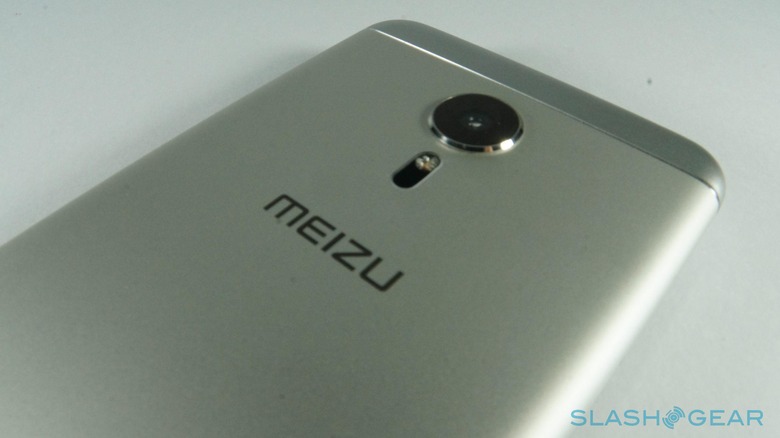
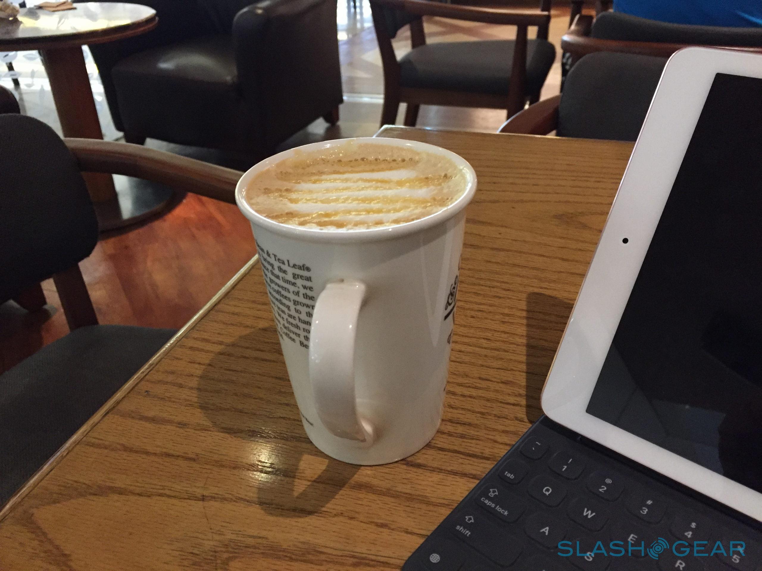
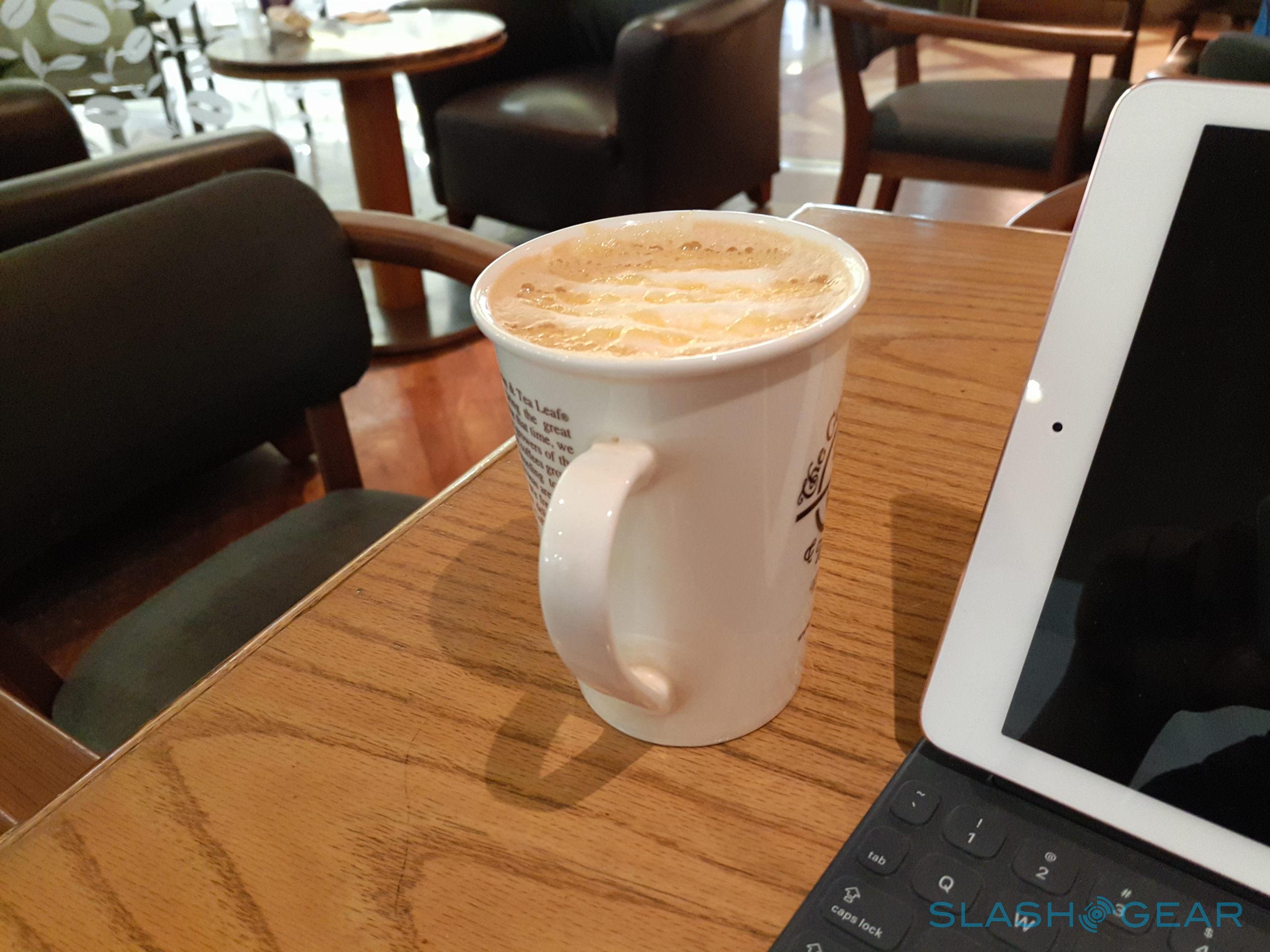
All of these translate to a respectable main camera, at least in theory. In practice, it unsurprisingly falls short of more recent flagships, most of whom boast larger apertures and higher quality sensors, despite having less megapixels. While the PRO 5 does produce quality photos with great preservation of detail in regular to bright scenes, the camera seems to overdo things a bit when it comes to color and white balance, ending up with images that are brighter than reality and more saturated colors. It's not a glaring flaw but could be a liability if you intend to use the PRO 5's photos in a more professional manner. Autofocus is there but is sometimes slow to catch up, taking up a second or two. Fortunately, the camera app does allow you to touch to focus so you can quickly set up your desired focus point instead of waiting for the AF to kick in.
(Meizu Pro 5 on the left, iPhone 6 on the right)
(Meizu Pro 5 on the left, iPhone 6 on the right)
(Meizu Pro 5 on the left, Samsung Galaxy Note 5 on the right)
Sadly, the PRO 5's biggest problem when it comes to the camera is Ubuntu's default camera app. It is as basic as basic can be, which might be okay for a tablet like the bq Aquaris M10 but definitely not for a high-end smartphone like the Meizu PRO 5. For starters, the app takes too long to launch, almost 10 seconds, unless it was already running in the background. That will surely make you miss some of life's fleeting moments. In fact, you can't even use the camera directly from the lock screen without unlocking the phone first (presuming you set up a passcode), a limitation that both Android and iOS have overcome a few versions ago. The camera app's features are quite bare. You have the usual geotagging, flash, timer, aspect ratio/resolution (limited to two), and quality options, as well as the choice to save to internal memory or external microSD card. Video recording options are even less. It is also very unfortunate that the camera app's options only allow for 1080p video recording at the highest, when the camera itself is capable of 2K, even 4K says Meizu, videos.
In a nutshell, the Meizu PRO 5 Ubuntu Edition has a powerful main camera limited by very basic software. It produces great images and videos, but it could probably be greater.
Battery
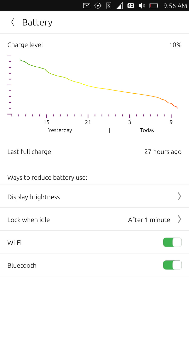
In contrast to the camera, you will barely find any fault with the PRO 5's battery performance. The large 3,050 mAh pack, though non-removable, is adequate to get you through a day and more, of course depending on your usage. With mixed Wi-Fi and LTE use, an hour or so listening to podcasts, and syncing the Notes app with Evernote, it took more than 30 hours to drain the battery to an inch of its life. On pure Wi-Fi and with background app syncing kept to a minimum, the battery lasts a good 48 hours at least.
But when it does come time for you to plug in the PRO 5, Meizu tries to make sure to make it as painless and quick as possible. Presuming you have the requisite charger, that is. Meizu implements its own brand of fast charging called mCharge and it does what it says it does. It can and does juice up the PRO 5 from 0 to 60% in 30 minutes, provided you actually don't turn the device on just yet. When turned on, it naturally takes longer. At the farthest extreme, it can take 60 minutes to get up to that 60% when on an LTE network. Like most fast charging technologies, the first few minutes charge the PRO 5 in full blast but then starts to trickle as the meter gets closer to full.
Fingerprint Scanner
Yes, the Meizu PRO 5 has one
Performance
All in all, the Meizu PRO 5 is no slacker when it comes to the hardware. At least, in theory. Even by this year's spec standards the PRO 5 would still be able to catch up in terms of processing, multi-tasking, and whatnot. The one caveat is that performance isn't just a factor of the hardware. The software plays a crucial part as it is the one responsible for managing and limiting resources. Like in the case of the bq Aquaris M10 Ubuntu tablet, it is difficult to find a reliable benchmark for the Meizu PRO 5 given its condition (Ubuntu OS, ARM, read-only system partition), so we'll just have to play it by sight again.
Design
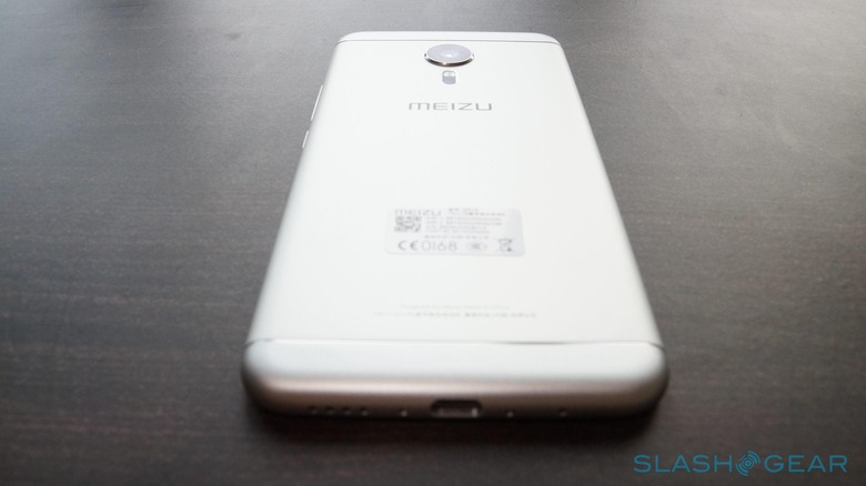
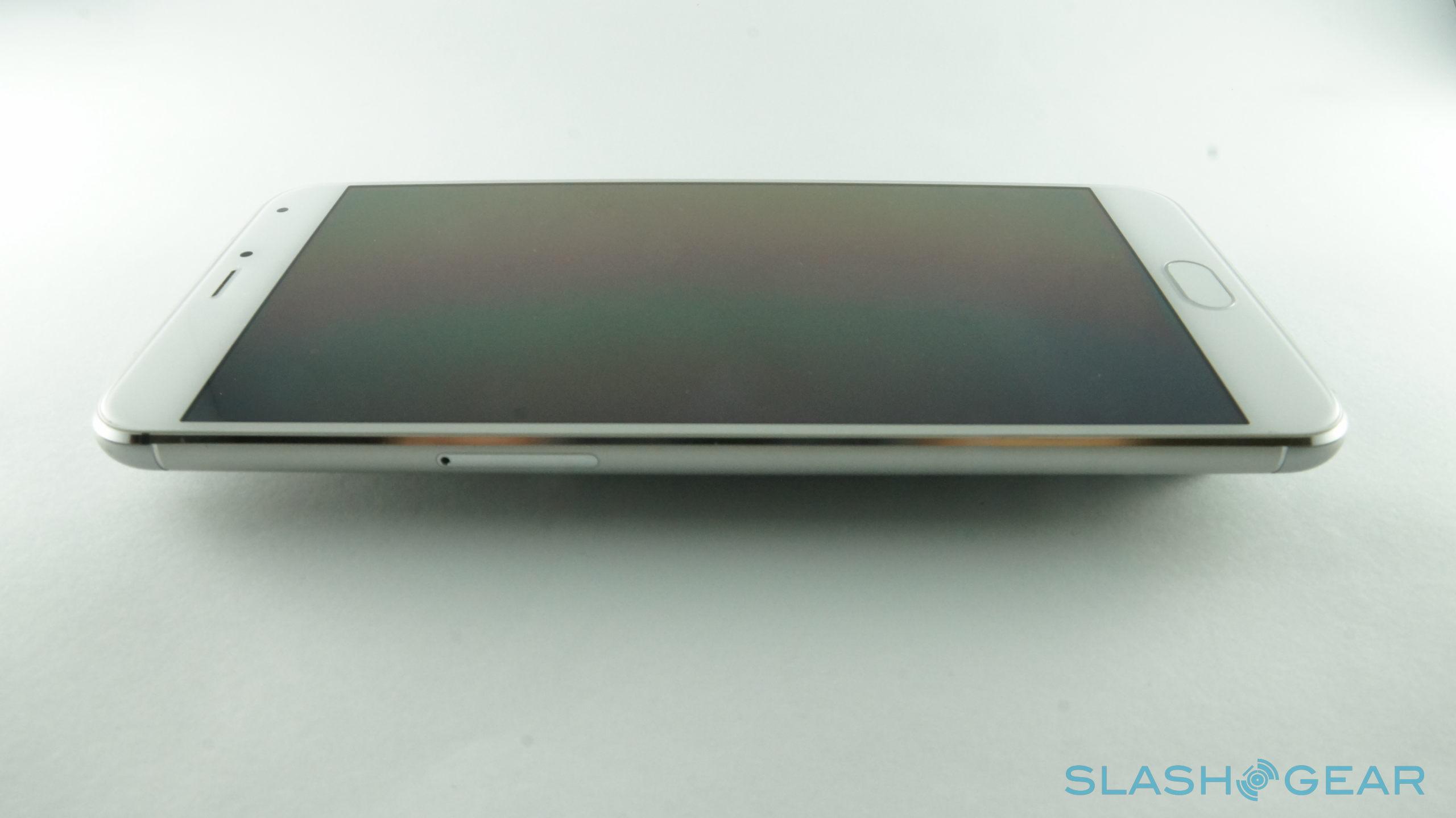
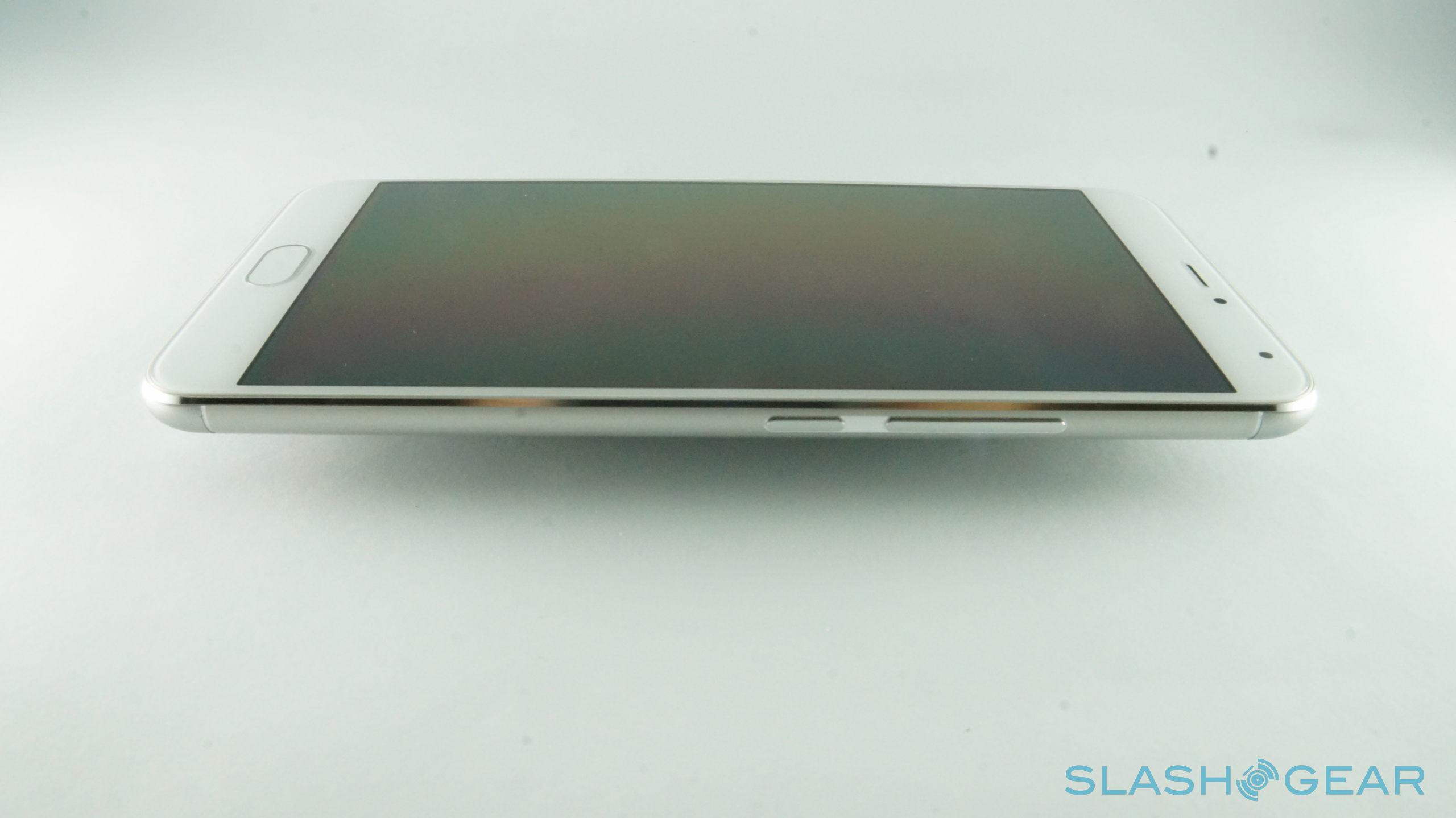
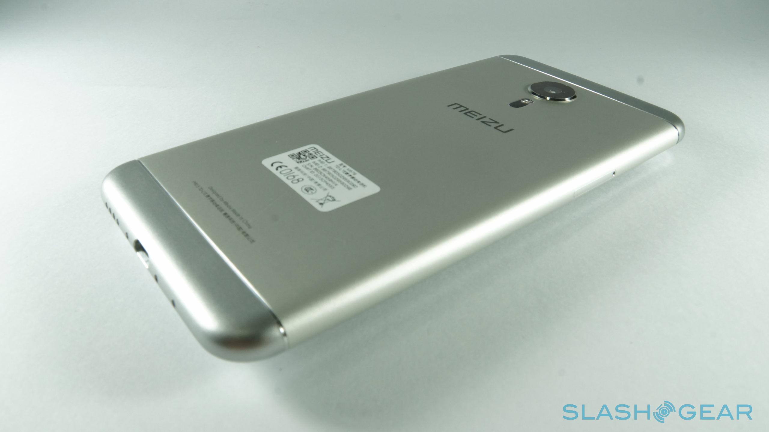
Gone are the days when "cheap" meant "plastic". Chinese manufacturers, at least the major ones, have leveled up their game and have started sporting full metal bodies for their flagships. The Ubuntu edition of the Meizu PRO 5 is, thankfully, no different from its Android brethren. The smartphone is quite premium to behold and cool to touch. Despite its metal built, it's quite lightweight, lighter than most of its contemporaries, including the iPhone 6/6s, almost making it feel as if there were nothing inside. That may either be a good thing or a bad one, depending on preferred heft for smartphones.
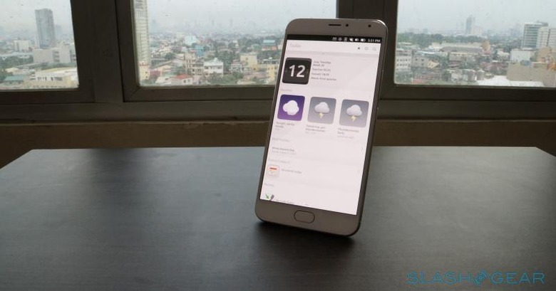
That said, those casting a look at the Meizu PRO 5 for the first time might, in the beginning, they will most probably mistake it for or compare it with existing popular brands, specifically Samsung and Apple. And admittedly, they won't be that far off. The front, with its elongated home button, pretty much looks like a white Galaxy Note 5. Viewed from the sides, the soft rounded edges will be easily equated with Apple's most recent iPhone design. Flip it on its front, and the back will be a bit more reminiscent of a flatter HTC. To be fair, these days it's hard to come across a totally unique design that won't get compared to the bigger players, especially Samsung and Apple, or doing something that hasn't already been done before.
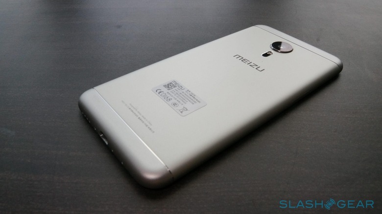
To its credit, the design does work. In all but one aspect. The sleek and smooth metal design and rounded edges make for a very slippery device. Throw in its large size and light weight, and you pretty much have an accident waiting to happen.
Software
Just like the bq Aquaris M10 that we reviewed before, it is the software running inside that really defines this Meizu PRO 5. After all, it isn't called the Ubuntu Edition for nothing. Ubuntu Touch is Canonical's and the Ubuntu community's attempt at bringing the famed Linux distribution to mobile devices, smartphones and tablets in particular. To that end, Ubuntu employs some completely new software not used anywhere else, even in the Linux world, like the Mir windowing system. It shares some things in common with Android, like drivers and the lower stacks of the operating system, but is closer in relationship to traditional Linux systems in terms of file systems and components.
While Ubuntu Touch is what made the mid-range Aquaris M10 a more interesting tablet, it sadly fails to have the same pull on the Meizu PRO 5. Make no mistake, it's practically exactly the same OS on both tablet and smartphone, just as Ubuntu intended it to be, differing only in presentation. However, their hardware context makes a world of difference. A tablet is, more often than not, a secondary device that isn't as used as often as a smartphone. To that extent, Ubuntu Touch's current limitations may be forgivable. Those flaws, however, are magnified on a primary device such as a smartphone, where every poor design or missing feature is felt in its entirety.
Scopes
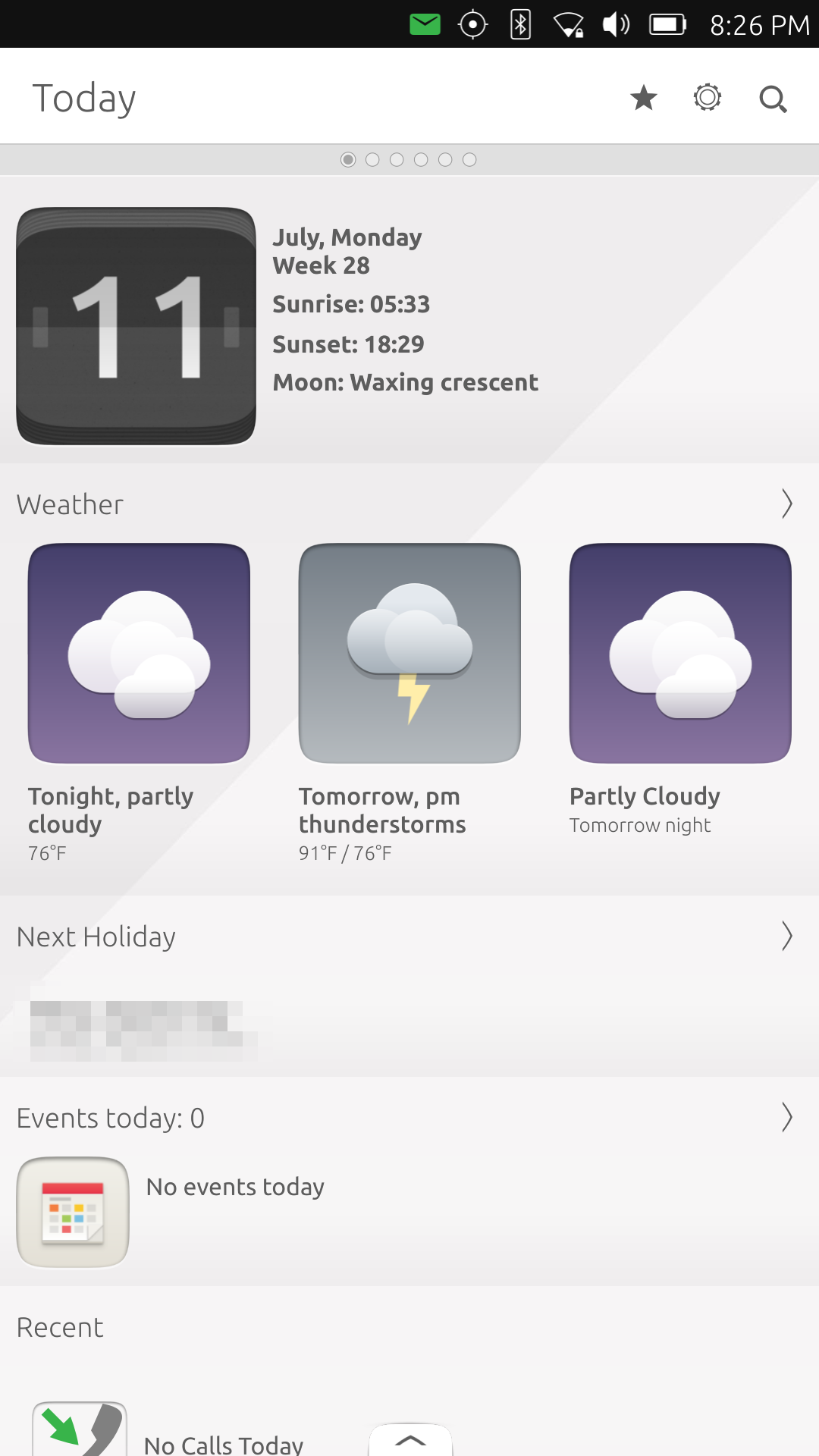
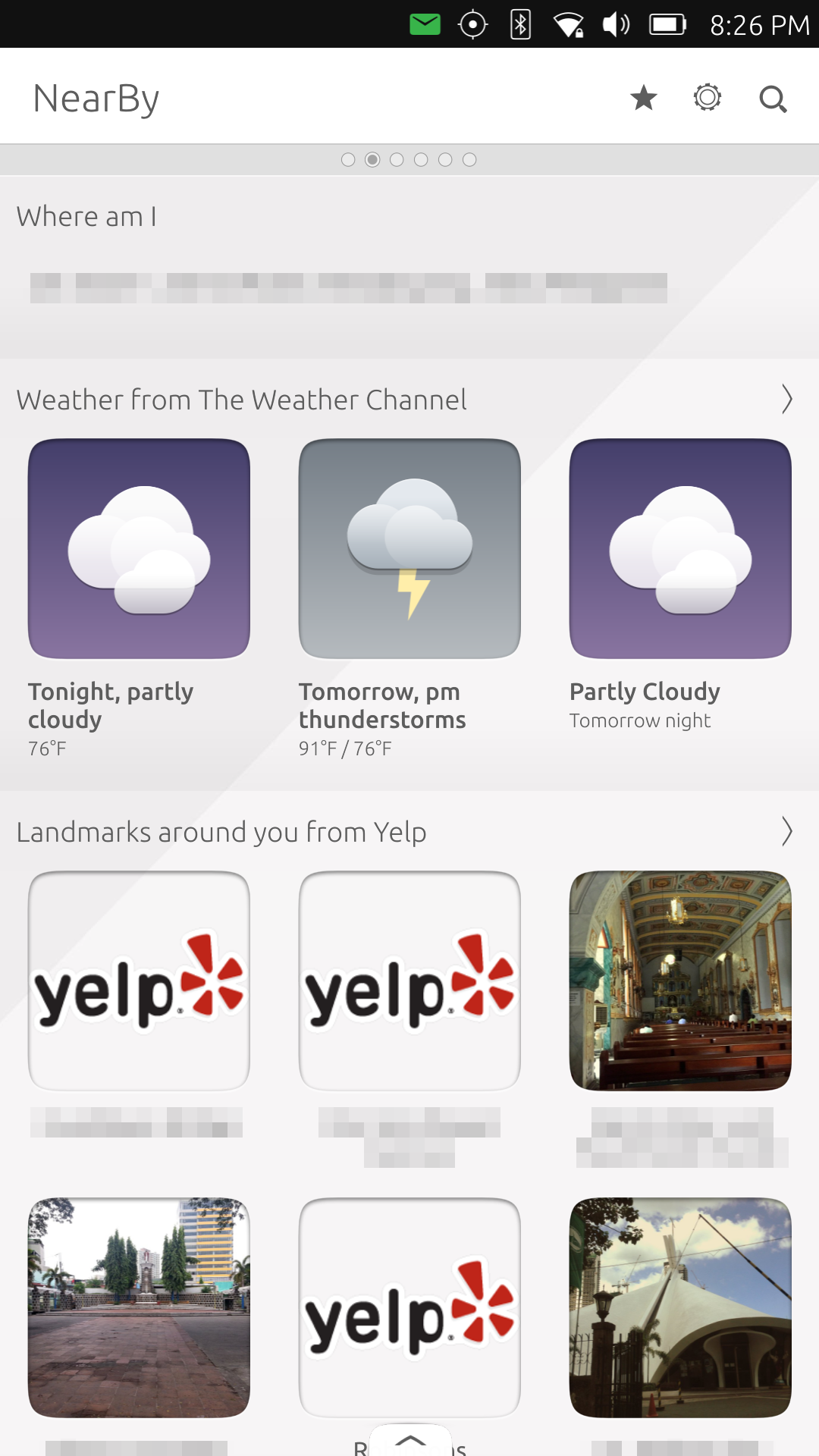
Scopes are the gateway to your device and content, but they are also one of the hardest concepts to grasp because of its unfamiliarity. Comparing it to Android homescreens and app launchers is a bit of an injustice to either, but it has to do for now. After all, both let users access apps and data, so it's not exactly that far off.
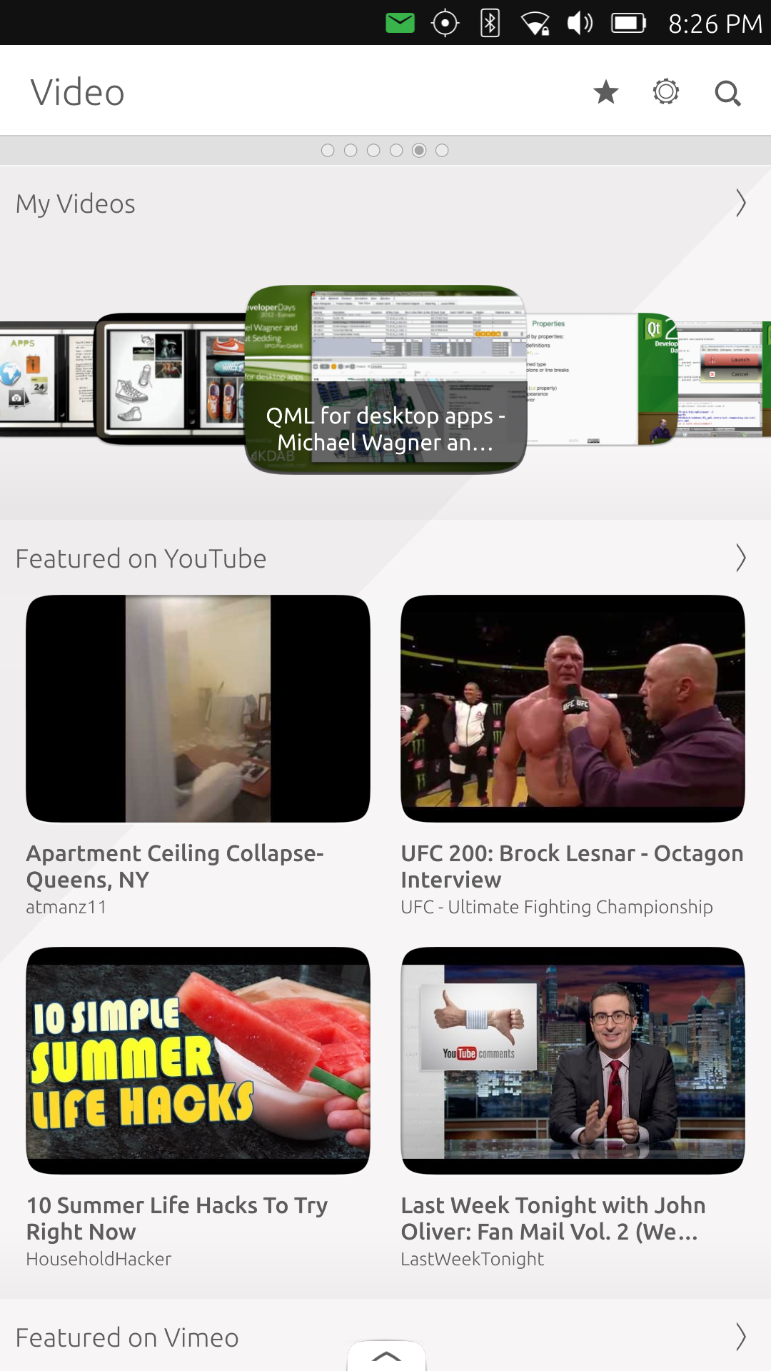
While traditional app launchers are, well, app-centric, Ubuntu Scopes are more context and content centric. While there are indeed scopes that revolve around a specific app, most of the pre-installed ones mash content from different sources together to meet a particular theme. One thing that sets Scopes apart, however, is that it doesn't discriminate between data from local native apps as well as those coming from the Web. For example, the Video scope not only shows the videos stored on the Meizu PRO 5 but also the top hits from YouTube or Vimeo. Photos, on the other hand, go through youur local album as well as Facebook, Flickr, Instagram, and Telegram.
Scopes are almost like home screen widgets, each one taking up an entire page of the Scopes app. You can install more scopes from the Ubuntu Store, add ones to the main view, or rearrange them to your taste. What makes them different from widgets is that you can "launch" a hidden scope, pretty much like a standalone app. In fact, that's pretty much the case for Scopes that are based on a single application, like YouTube or Twitter scopes. The Ubuntu Store itself is also just a Scope.
There isn't really anything wrong with the concept and goal of Scopes, but in practice, it might impede users rather than help users. Aside from the unfamiliarity, there are aspects of the implementation that I have found to be quirky, even annoying at times. The biggest flaw I've found is how Scopes are tied to the "page" you are viewing them. Take for example the Ubuntu Store scope. Imagine you are looking at search results for a particular app. Then imagine accidentally making a swipe gesture or button press that takes you immediately back to "Home", which by default is the Today scope, though you can re-arrange it however you wish. Since you've just switched scopes, the context of the previous scope, Ubuntu Store, is completely lost. You can simply switch back, since it's not an app. Technically, it's like a page of an app, but its app-like nature gives you the misplaced confidence that it is an app. You'll have to navigate back to the Ubuntu Store scope and do your app search again. All because you made a wrong gesture. Which brings me to the next nitpick.
UI Navigation
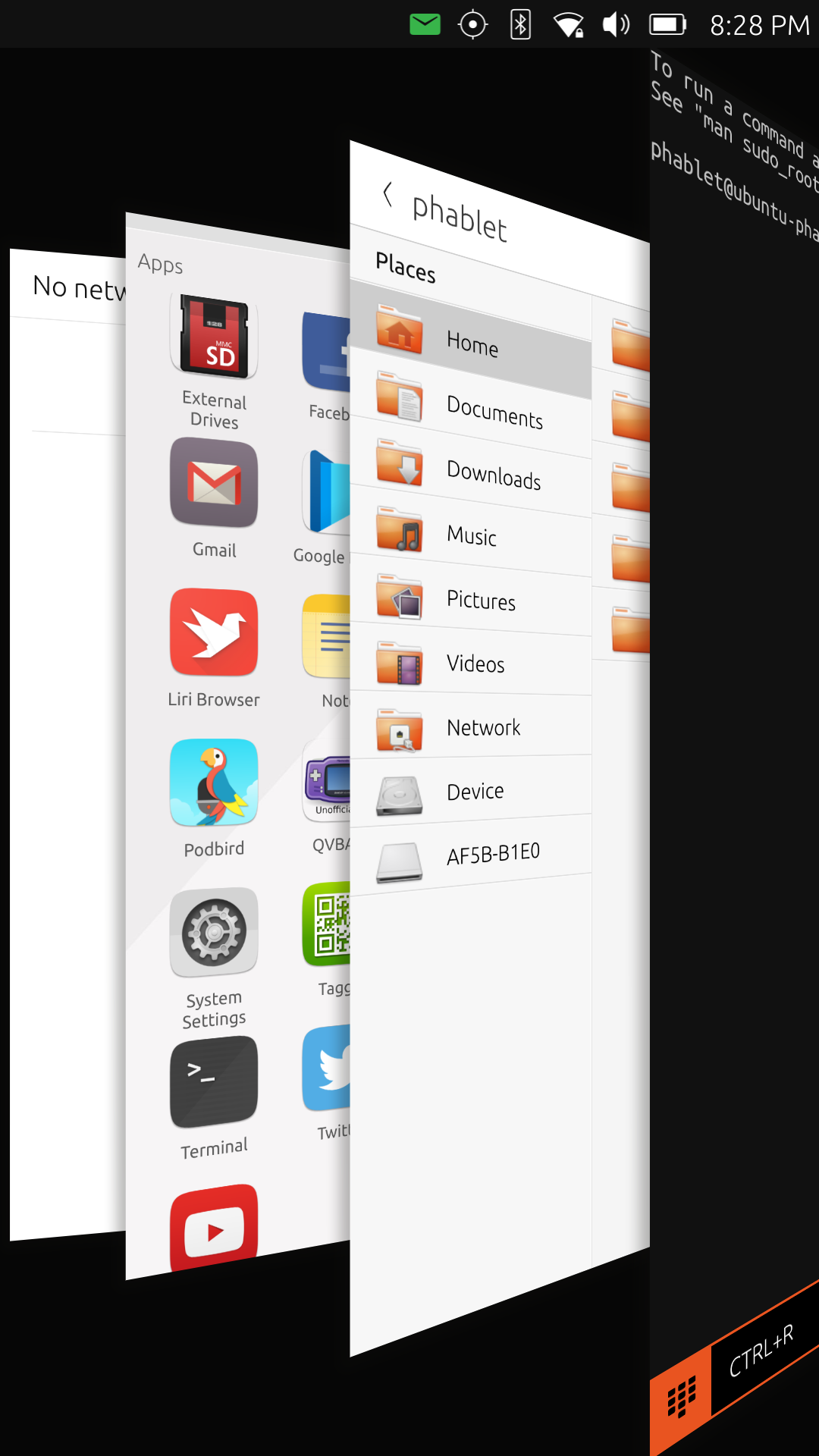
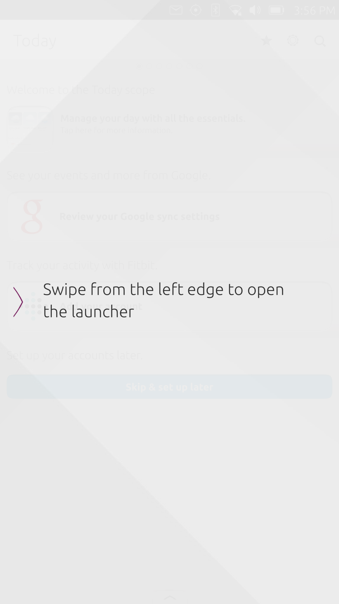
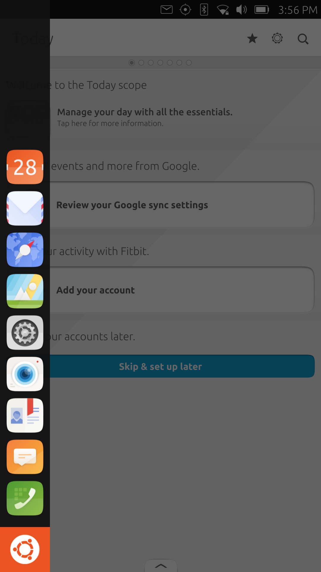
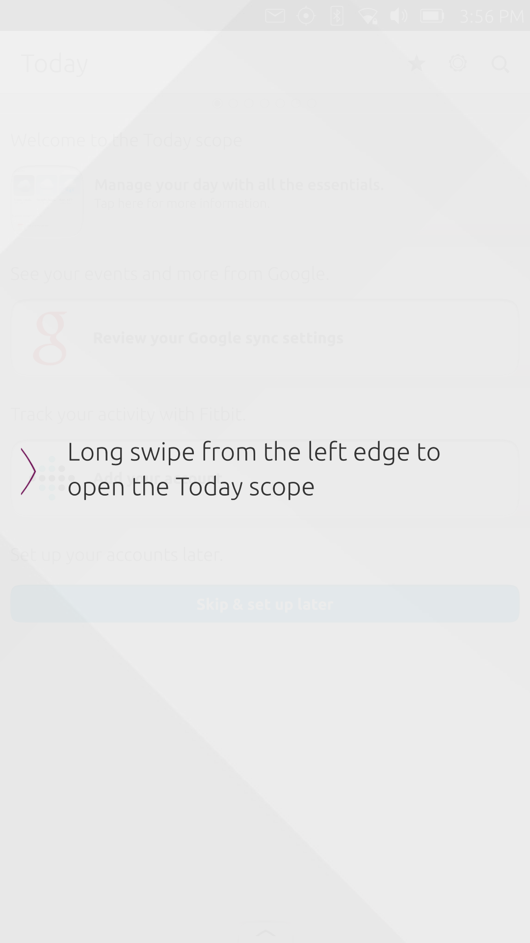
It's actually easy to make those wrong gestures. Ubuntu Touch is heavily dependent on swipe gestures to navigate the "global" app space. A swipe from the top reveals the notification panel. Swiping from the left pops up the app launcher panel. A swipe from the right switches between recent apps. And, depending on the app, a swipe from the bottom brings up menus or options. But there are nuances here as well. A longer swipe from the right edge to the middle of the screen brings up the window list, stacked behind one another. From there one can close apps as well. A long swipe from the left edge to the center of the screen immediately takes you to the Today (or whatever is your first) Scope, pretty much like pressing the home button.
And that's exactly where things get a bit hairy. It's actually so easy to accidentally make that long right swipe that will take you home, whether you want to or not. When using a regular app, no big deal. But when you're another scope like narrated above, you lose what you were previously doing. Plus Meizu PRO 5 is no small phone, so making the left swipe gesture when holding it with your left hand is near impossible without employing your other hand. On a tablet, it isn't an easy because you can't use that with one hand anyway. While you're also unlikely to use a phablet with one hand, it would be nice to minimize use of the second hand.
There's also the problem global swipe gestures conflicting with local app gestures or vice versa. Some apps, particularly those with lists, employ the iOS behavior of swiping on an item to reveal options for that item. No problem there. The problem comes in when you try to use left or right swipes from the edge to, for example, switch between apps. Most often than not, that trigger's the app's internal gestures as well. Ubuntu needs to do a bit of fine tuning its gesture system to prevent those accidental activations.
Apps
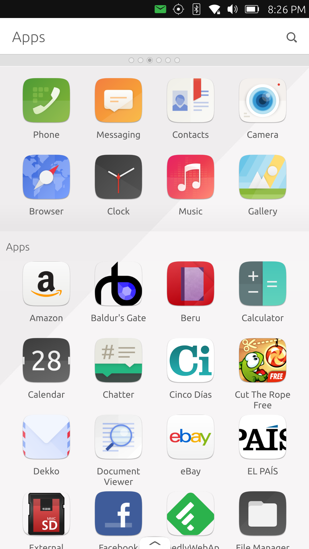
The biggest problems facing any new mobile platform that isn't Android or iOS is the app selection. That is the case with BlackBerry 10, Jolla's Sailfish, and even Windows 10 Mobile. It is also definitely the case with Ubuntu Touch. Although in theory it shouldn't be, given Ubuntu Touch's deep Linux roots, implementation details and established conventions prevent it from becoming just a Linux distro on mobile. For now, we'll accept the fact that you can't easily install traditional Linux (X11) software and take a look at the native apps found in the Ubuntu Store.
Truth be told, there isn't a lot of them, and the ones that can be found there won't exactly make you want to sing in praise. Even the default apps that come from Ubuntu developers themselves leave much to be desired. Some are even broken as of this writing. Some of the criticisms we encountered in the Aquaris M10 review mostly still stand, like the lack of a pre-installed Document reader or even a File Manager. Some, like the Browser, are sometimes worse.
The Browser app identifies itself as a mobile browser, at least in smartphone mode (versus desktop mode), which isn't really that unusual. The problem is that it specifically identifies itself as an Android browser. That apparently trips up some sites that have Android apps available. Feedly and Slack for example, keep you caged and preventing you from accessing the service's contents normally. Of course, it's not the browser's fault if services configure their websites like that, but there isn't any "Desktop Mode" option for the browser as a way out. That limitation will also bite user in some other ways.
Ubuntu Touch makes up for its lacks of apps by inviting developers to write web apps instead. Indeed, if you try to search for your favorite app in the Ubuntu Store, chances are you will find not one but three apps that are all just web app versions of a particular app or service. It's a good way to fill in the gap, but at times it also feels like a cop out. Web apps aren't always designed to integrate with a particular platform, and even those that are designed with mobile use in mind don't exactly behave properly in that context. Layouts can be broken, touches can be misinterpreted, and facilities aren't complete. A YouTube web app, for example, will never let you save videos offline.
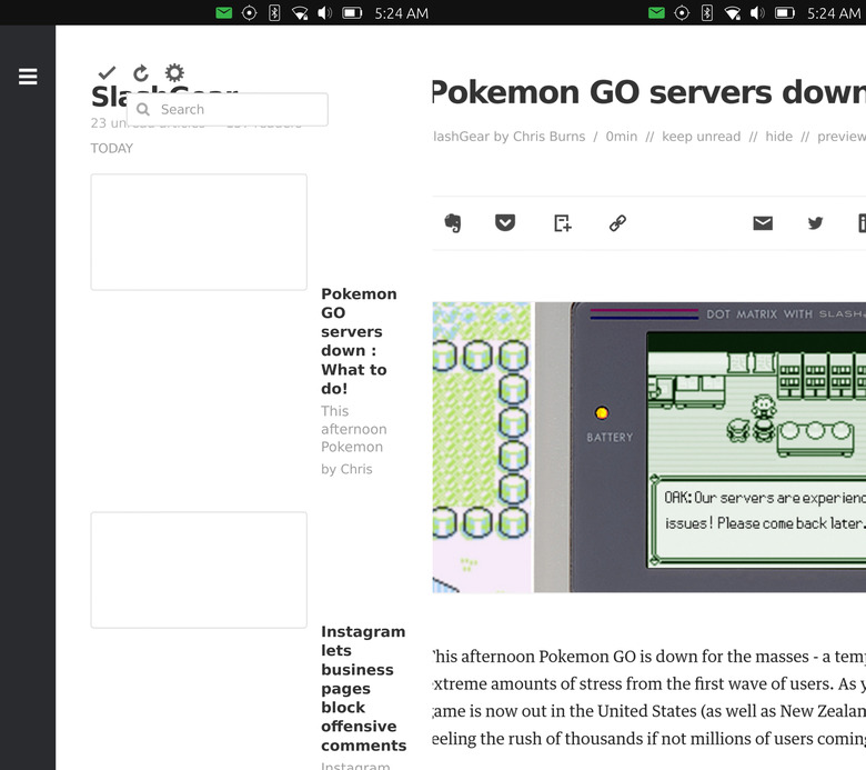
And that's when the web apps do work. Remember the web browser user agent problem above? That also happens in those web apps. Web apps for Feedly and Slack, for example, behave the same as on the browser. They just don't work. Web apps are a stop gap measure to temporarily address the lack of apps in the Ubuntu Store, but poorly done ones that fill the app store also leave a bad taste in the mouth.
Convergence
All hope is not lost, right? Convergence, the prime feature of Ubuntu Touch, can save the day, right? Almost, but not quite. Like with the above, Ubuntu Touch's limitations are all the more magnified here on the Meizu PRO 5.
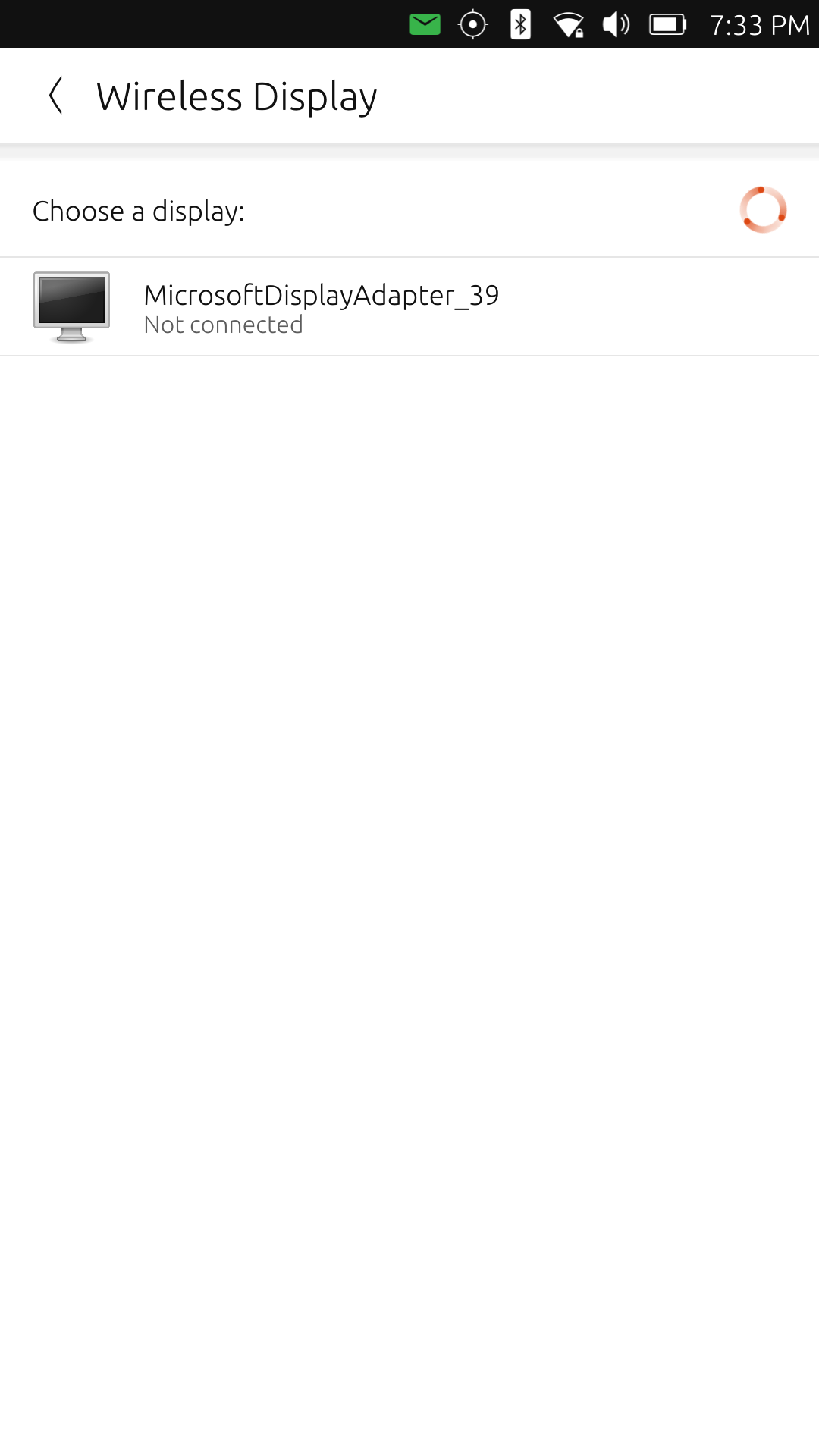
But first, it is even a miracle that we got Convergence at all. The PRO 5's USB-C port technically isn't capable of video output required for making Convergence work. But thanks to Miracast technology and the hard work of Ubuntu developers, the smartphone did get wireless display output and, therefore, Convergence as of OTA-11. Provided you have a Miracast adapter, like, say, Microsoft Wireless Display Adapter originally intended for the Surface Pro tablets.
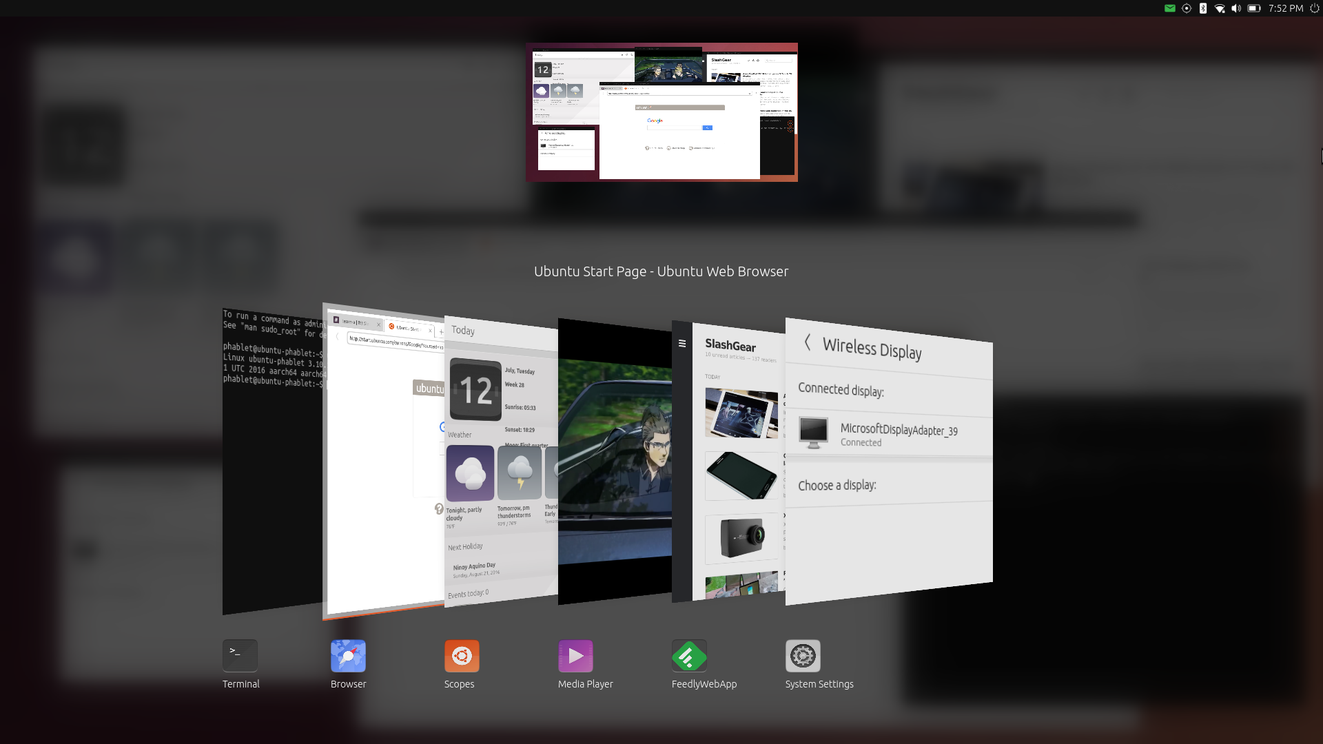
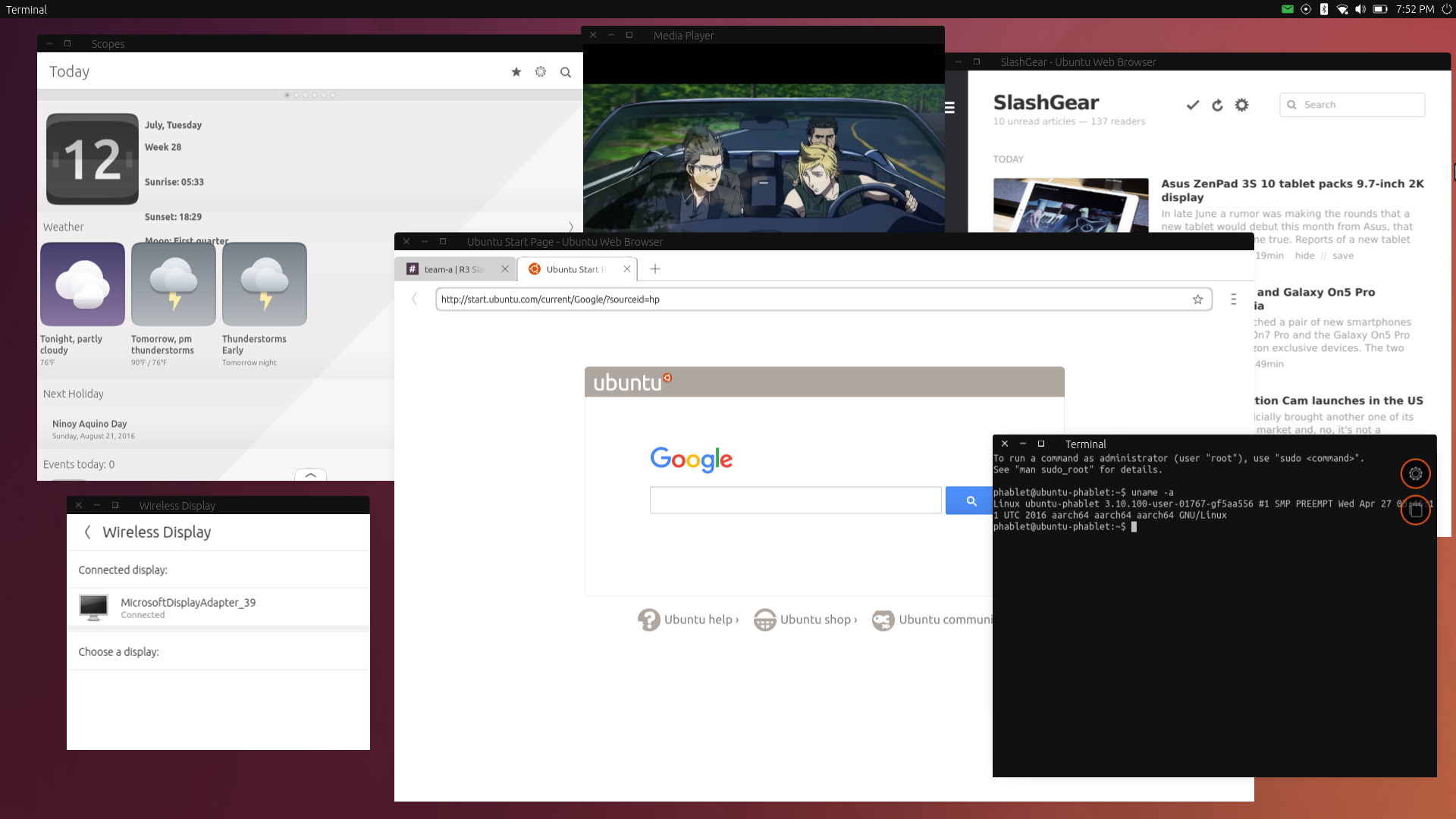
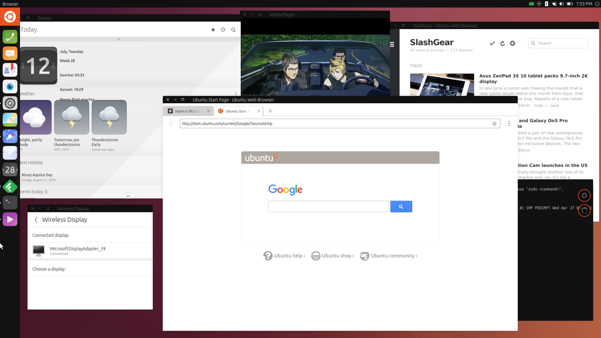
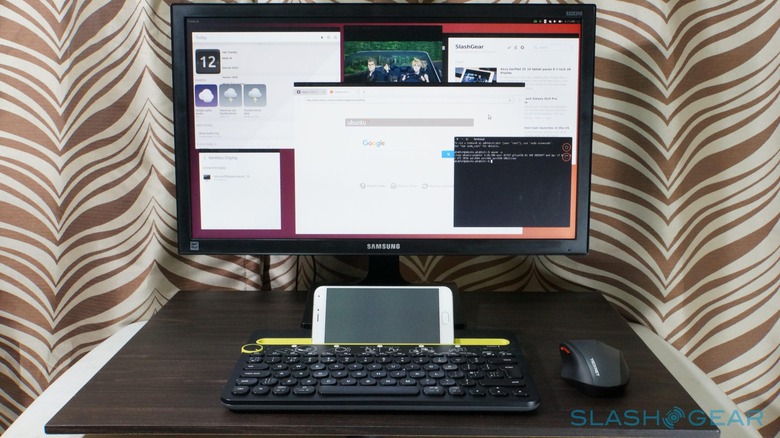
In a nutshell, Convergence turns any mobile device into a desktop computer. Just add an external display and keyboard. You might not even need a mouse since the smartphone converts into a touchpad while in desktop mode. It's pretty much like Microsoft's Continuum, except you're not limited to a subset of compatible apps. In Ubuntu's Converegnce, every full screen mobile app becomes a resizable, windowed app.
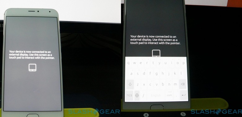
In this mode, it is easy as pie to use traditional Linux desktop apps like Firefox, LibreOffice, or GIMP. But here's the catch: they're not available. Unlike the bq Aquaris M10, the Meizu PRO 5 doesn't come pre-installed with those apps. In short, you are left using the same mobile apps as before, but just in a different form and setting. You can't install those desktop apps, not without some serious modification, but there is hope yet. They're coming soon!
Also, it's not exactly all for naught. Remember that web browser user agent problem above? That actually disappears in desktop mode, because then the browser (and all web apps) identifies itself as a desktop browser. So you can use Slack, Feedly, or any other web service to your heart's delight. A funny side effect is that one Feedly web app actually remembers this even though you've switched back to mobile mode. So simply sign into Feedly on the app while in desktop mode and you've got a working but not so good Feedly web app. Not so for Slack, unfortunately.
One thing about Convergence that concerns me is performance. On the bq Aquaris M10, the sluggishness of operating in desktop mode is noticeable. I simply blamed it on the less than capable hardware. The Meizu PRO 5, however, should have performed a lot better, and yet it is almost the same. Moving and resizing windows are just as slow and feels like you're dragging them through molasses. Fonts tend to also be a bit more blurred on the PRO 5 compared to the Aquaris M10 when connected to an external display, though that could probably be the Miracast connection's fault.
Wrap-up: there is no end to this story
If I were to grade the Meizu PRO 5 right here and now, I'd probably have to very unwillingly give it a barely passing mark, or even flunk it. It has actually decent specs and a sleek design, but most things go downhill from there, whether you judge the entire smartphone against Android or iOS or by itself. It is possible, but very painful, to use Ubuntu Touuch as it is now as a primary mobile platform, much less for professional use. Unless your work or life has, from the beginning, revolved around Ubuntu. But even then, it isn't the Ubuntu you might have come to know, but a very limited incarnation of it. It is usable as a basic smartphone for browsing, email, maybe even reading and viewing videos as long as they don't have subtitles. Sooner or later, however, you will arrive at limitations, either in the apps or in the platform.
It would be a very tragic story if it ended here. But it doesn't.
Ubuntu is both a commercially funded and a community developed project, and so is Ubuntu Touch. What that means in practice is that it is evolving at a rapid pace that not even Microsoft can race against. Development is done in the open and more hands can pitch in to help improve things. Some of the complaints in this piece getting fixed or already in the process of rolling out even. Camera startup, for example, should be faster in a latest update. OTA-11 was just released last month, but OTA-12 is already around the corner, with some pretty tasty treats. For one, it will finally allow for the installation of those three Linux desktop apps from the Ubuntu Store. And it will also bring support for the fingerprint scanner!
So, yes, Ubuntu Touch's story is far from over, and neither is the Meizu PRO 5's. Given time, and some serious development work, it could even step up to be a serious smartphone not just for open source fans but even for more experienced users.
The Good
• A solid performance smartphone with a premium design
• Fast, continuous updates
• Convergence remains a promising future
The Bad
• Lack of native apps, especially for popular services, is more pronounced on a smartphone than on a tablet
• Browser and web apps don't always work or work poorly
• Global swipe gestures are tedious to use with one hand, app gestures sometimes conflict with global ones
The Ugly
• Missing conventional desktop apps like Firefox and LibreOffice weakens the Convergence premise (coming soon in OTA-12!)
