Mailbox Review: Mobile Email Disconnects Again
This weekend we've had the pleasure of trying out one of the most beautifully simple looking apps ever made for iOS: Mailbox. This app is made to make your email experience simple, striking first for the Gmail crowd who otherwise would be working with the built-in iOS mail app or the Google-made Gmail app (or Sparrow, also owned by Google). It's not easy entering this space successfully when the actual creator of the service you're trying to vampire has their own app on the market – let's talk about why Mailbox might do it – starting with the never-fails strategy called keeping a line outside.
Design
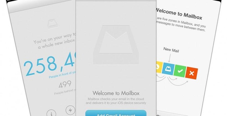
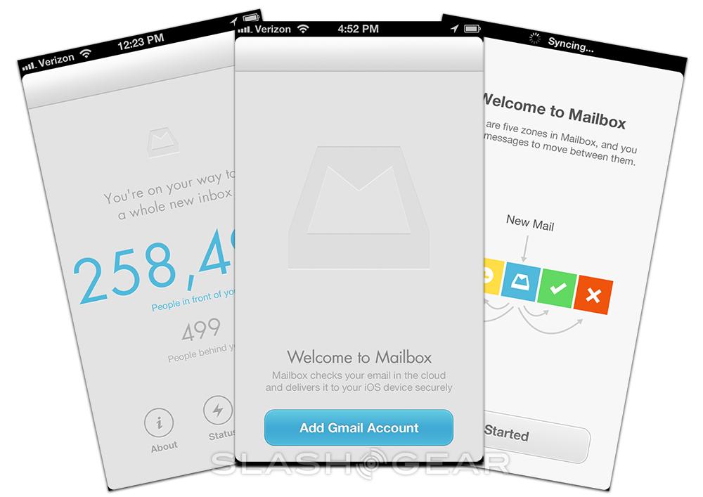
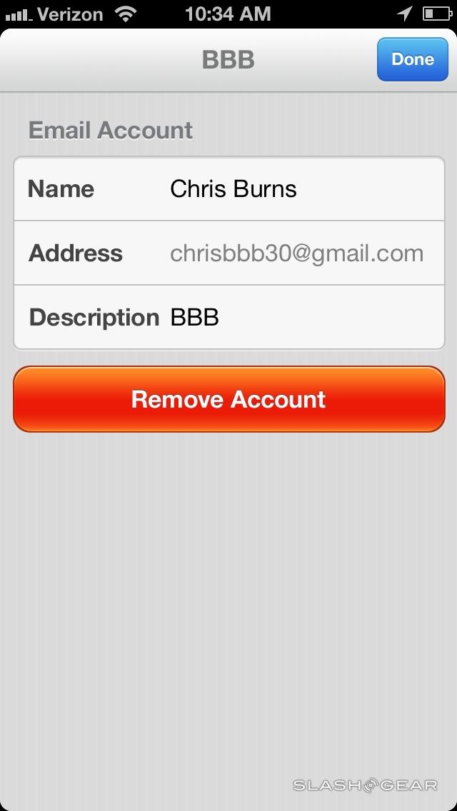
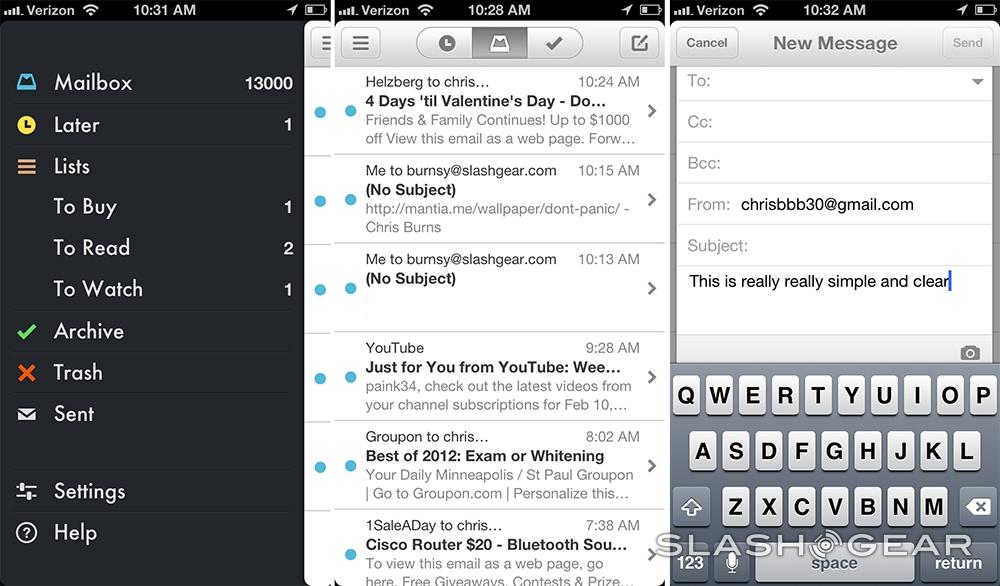
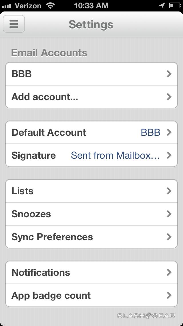
When you open Mailbox, you find that you're either standing in line or you're allowed to start your Gmail-connected journey in only a few extremely simple steps. Once you're inside, it's all about swiping left or right. You can add multiple Gmail accounts, your whole user interface is just lovely, and both writing and reading is perfectly tuned. Typographers clearly had a hand in creating this app, that much is absolutely clear.
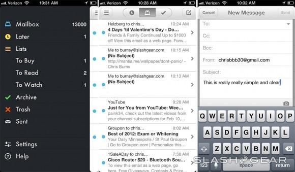
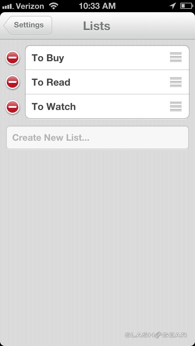
From a graphic design standpoint, there's nothing wrong with how Mailbox works. It works great, it acts quick, it connects perfectly fine. The only problem here is the disconnection you'll feel when you head to your desktop. If you use your iPhone for Mailbox and use its many features to create lists and read-it-later pushes, you'll be glad to see that mobile experience working fabulously.
Usability and Compatibility
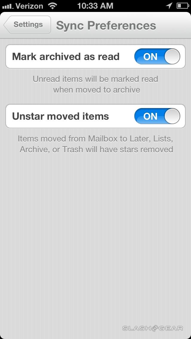
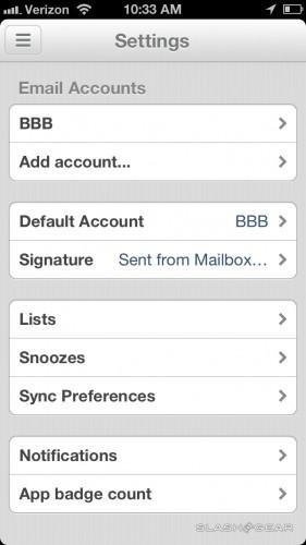
If you expect to see these same lists and read-it-later features when you get to Gmail, you'll be out of luck. Most of the features you see inside Mailbox – stay inside Mailbox. One exception is the toggle between read and unread – once you open an email inside Mailbox, it'll show up as read inside Gmail no matter where you are.
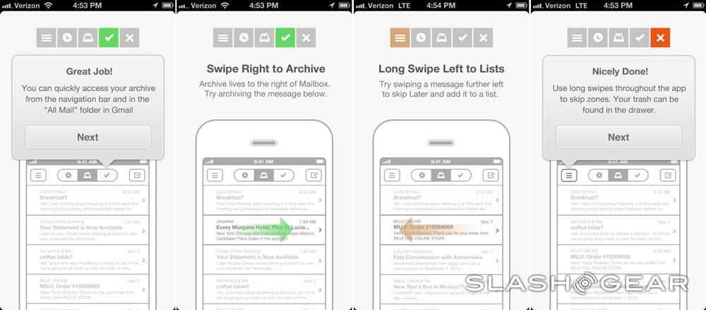
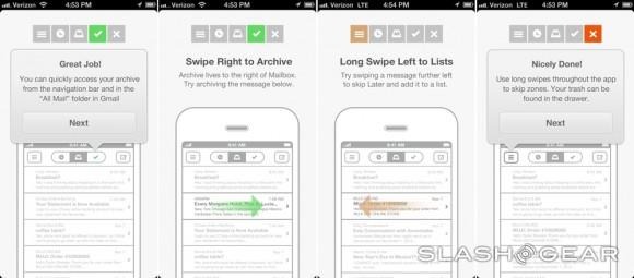
If that limit isn't a problem for you – that is, if you use your iPhone for most of your Gmail reading, you'll be good to go. With Mailbox you'll be using a series of simple gestures to work with all of your email – as outlined in our first Mailbox is alive! post from last week.
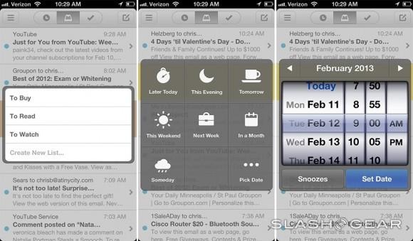
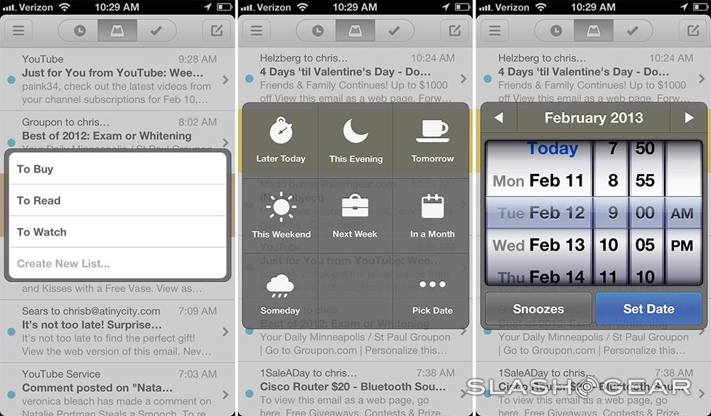
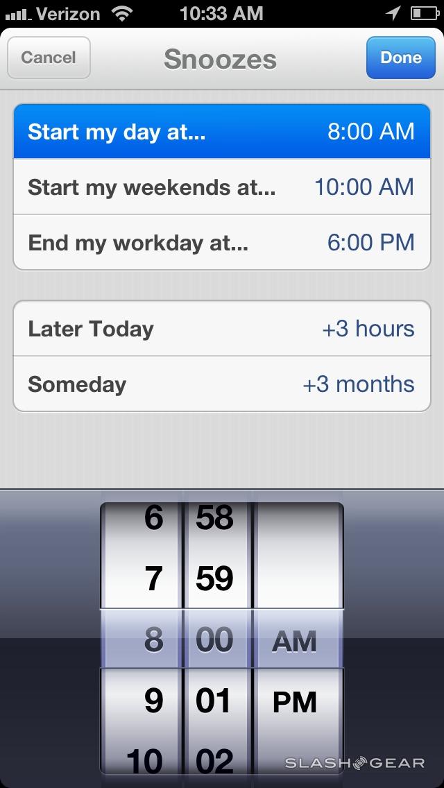
One of the finer points in this app is the ability to put off reading an email with a series of timed periods. You can make that email return to your mailbox "later today" or "in a month", or even "someday." Of course there's no "random" button – you'll be adding in the specifics with each tap – but this is just about as easy putting off work has ever been – and did I mention it looks nice, too?
Verdict
The Mailbox app from Orchestra is absolutely free at this very moment, and until we hear otherwise from the developers, we expect it to remain free into the future. Because of this alone, this app deserves a try by you at least. It'll introduce you to a whole new way of working with your email and you'll be part of the "cool crowd" working with this app right this minute.
Orchestra is benefitting from a whole lot of press coverage and forum talk this week, this making it downloading and using their Mailbox app a super hip thing to do. It's not the sort of thing that you'll be using to take special fancy photos with, nor is an exclusive club, but it is an important step in the evolution of app development – it's not often that an email app grabs this much attention.
