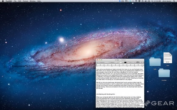
Mac OS X Lion Review
What you're about to experience is a trip down the rabbit hole with Mac OS X Lion, Apple's newest desktop operating system. With yours truly you'll be both exploring and judging the way this nearly radical new system is set up and what it means to you, the consumer and me, the tech news publisher. What you're going to find is Apple's most innovative release since the original Mac OS X, the first big departure from the known paradigm inside the Mac world. In one gesture, (literally one gesture, as seen in section 2 of this exploration,) Apple has both bridged a gap between what's been called mobile OS, (or in their case, iOS), and desktop OS, further turning what it means to own a computer into what owning a computer will or does mean to you.
Before we begin, know that although you do not have to upgrade to this newest Mac OS, I do recommend it. Things like the pushing and pulling of pages instead of scrollbars, massive moving screens, and extra desktops made me hesitant to go further into the system when I first laid eyes upon them, but after a bit of use, everything comes together nicely. And better yet, if you don't like some of the features, switch them off! This system allows for much customization and de-evolution, if you know what I mean. And it looks nice and smells good. Now, on with the show!
Installation
If you end up purchasing an Apple computer from here on out, you'll already have Mac OS X Lion (or above, depending on when you're reading this) installed for you automatically. If you're like me, and have a MacBook Pro from the newest generation NOT to have Lion, you've got to head down to your local Mac App Store sitting in your dock (or your applications folder.) From here you'll be downloading a 3.74GB file. You'll have a perfectly simple time installing the system with a rather simple looking installer app that give you the option of either installing by choosing an install disk or not doing so, no customizations anywhere.
We did run into one small snag, that being that if you're using an older router for your internet connection or are in a place with a connection that the App Store does not like, you'll have to move to somewhere with either a hard line or a perfectly speedy hookup. Once we connected to the hard line, the download took less than 30 minutes.
For a look at the hardware end of this equation, head to our MacBook Air 13-inch core i5 Review (mid-2011), courtesy of Vincent Nguyen!
Starting with Scrolling
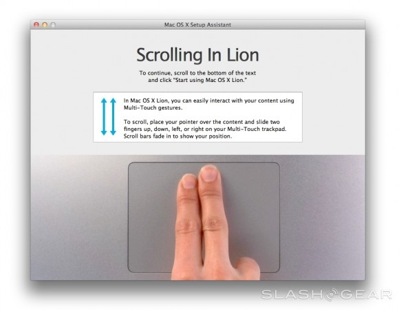
When your computer starts for the first time after having had Lion fully installed, you'll be presented with a window that's got some flawlessly looping fingers demonstrating how your entire scrolling world has been suddenly flipped upside down. "Scrolling In Lion" shows you that, like what you're very likely used to in iOS, Apple's mobile operating system for iPhone, iPad, and iPod Touch, you'll be pulling on your content to move it rather than using a scrollbar to move through your browser. In other words, where you may have used two fingers to pull DOWN when you wanted to go DOWN in a window before, now you'll be pulling UP. The scroll bar is no longer king.
Swiping with All Your Fingers
Things have changed a little bit in the swiping department. There's a whole slew of different actions you can take now with a simple two or three-finger swipe to the left or the right, and with your Trackpad Settings in your global Settings app you'll quickly understand what you're going to be able to be working with. Much in the same way you've seen a few fingers flying around in the initial scrolling screen when you restarted your computer for the first time after installing, so too will you see some excellent and relatively seamless animations showing you the ways of the force here, right next to your options to turn them off or on again.
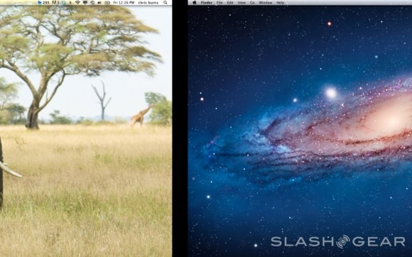
When you're on the desktop, swipe left or right to get to your Dashboard or any one of your multiple desktops. What's that? You don't know what's new about your Dashboard, and you didn't know you could have multiple desktops now like you've been able to have on your iPad or iPhone for several years now without a second thought? It's true, it's all true!
Multiple Desktops
You're able to create multiple desktops here in the new world, each one of them with their own desktop wallpaper, open windows, docked apps, and open apps. The things that stay the same are: settings of all sorts, icons on your desktop, and icons in your dock. Basically what this Multiple Desktops function does is it allows you to have multiple places where you can do your work. In other words, if you're going to do a blog post and you want to make a nice photo as edited in Preview, plus you want to edit a video in Quicktime, and type out your post in TextEdit before you paste it in WordPress on the web, you can now do each of these on a different desktop without having to flip through a bunch of windows on a single desktop. My whole world has suddenly, actually, really become a lot less cluttered.
Dashboard
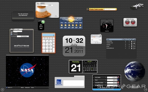
Where before you were working with a Dashboard that floated in from beyond the edges of your desktop, it's now it's own window that can be accessed with your Dashboard button, by three-finger-swiping all the way to the left, or by clicking it in Mission Control. This Dashboard is one that, if I'm not mistaken, will encourage people to download Widgets like never before. I must admit that beyond using a widget once in maybe a month before this upgrade, I've already been checking out which widgets I'm going to fill up my Dashboard with because the default wallpaper is the sort of bubbled rubber that makes one feel as though they've got a real desktop sitting there begging to be filled with awesome widgets. Simple visual stimulation for what I'm certain Apple hopes will be giant results. Look for Widget development to increase in the next few months significantly.
A strange thing that's happening in this environment is that Widgets are not yet integrated in the Mac App Store. Where in your Launchpad and in your Applications you'll be filling the ranks straight from the Mac App Store, for Widgets you're in a web browser-based download space. If Widget production is going to increase, Widgets will have to be placed in the Mac App Store.
Launchpad
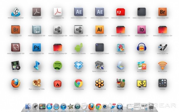
When you see the Launchpad, you'll instantly understand why this version of Mac OS is being called a bridge between Apple's desktop operating system and mobile. Apple's iOS, as seen on iPhone, iPad, and iPod Touch is the original place you'll see this layout of apps, and much in the way the iTunes App Store has garnered a MASSIVE amount of development and downloads, so too may this setup allow the Mac App Store to blossom. Launchpad is a set of screens where all of your desktop apps are set up in a series of grids placed across several screens. Just like in iOS, you're also able to take one app and place it atop another to create a folder with the two inside, this folder then up for additional apps in the future.
Just like inside your Safari browser, two-finger swipes advance you to the next page or the previous page of apps. You may also click one of the several dots at the bottom of your screen to advance to that page. Your dock remains visible the entire time you're in Launchpad, this encouraging you once again to populate your world with apps galore. In that Launchpad now exists and that the Mac App Store has existed for some time now, Apple has finally created an environment where desktop apps can become as desirable to download as apps on mobile platforms. Several times since I installed Lion I found myself searching for more apps to put on my computer here so that I'd be fully stocked. That comes from the mobile device user in me, without a doubt. Whether or not its because I despise using mobile web browsers or not is still up for debate.
Mission Control
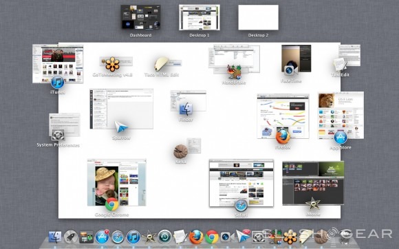
The screen known as Mission Control is accessible by you by clicking the Mission Control icon in your dock, or by swiping three fingers upward on your trackpad. Once you're inside you can exit again with the same three finger swipe but down instead of up. Mission Control is your overhead look at every page you've got open at once. You can see your Dashboard on the left, each of your many desktops on the right, and your full-screen apps in between. Front and center is the screen you've currently got open. In the case of this being your desktop with several apps open, it'll separate the apps into smaller windows with their app icon displaying what app they come from.
It's here that you travel about your computer, here that your compute becomes many computers at once. If you've never used a computer that had more than one monitor attached to it, you're in for a treat. You can now do things like have a Photoshop project open on one screen, save an image to your desktop, open your other desktop, upload the image to your blog, and swipe back to the first desktop to continue editing without having closed or opened any new windows. This will be extremely helpful for those people like your humble narrator who has trouble not opening 1,000 windows a day in multiple apps and browsers. It's essentially a much, much bigger desk space for all your junk.
Another use you might consider for Mission Control and your multiple desktops is giving each member of your family a different desktop to work with. This of course would only make sense for one-computer families, of which there are a surprisingly small number of in the USA today, but hey, what if you're on vacation? Mission Control takes your windows separation and the rest of the commands for quickly changing apps or moving them out of the way, these features that came with Snow Leopard, and moves them to the next level. This is a great way to divide and conquer. Another great thing this Mission Control does is make you WANT to use a lot of windows at once. In this way you'll perhaps also want to upgrade your computer to a strong one so that you might make the best use of the operating system's abilities. Truly it is a strong system for sales, as well as productivity.
Finder
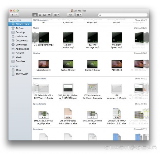
Each time Apple changes the way the basic Finder window works, I have a little heart attack. This newest version adds "All My Files", that being a separation of every single file you have on your computer in one place, separated by filetype. Being someone who has an inordinate amount of apps in my computer, this screen is straight up useless to me. There is a "Show All" button for each category, this being a viable option for me to separate videos, for example, but beyond that, I won't be using this feature at all.
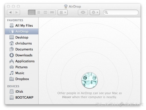
Next there's AirDrop, an extremely simple system in which you can connect peer to peer with people running AirDrop on computers near you. You can drop a file in AirDrop, your friend sees it, accepts it, and you're transferring. Extremely simple and it works really well. Apple notes that this functionality works out to about 30 feet, this being the range that these most modern models of MacBooks can see one another. This system is not connected via Wi-fi, again, it's peer to peer, meaning you don't need the internet at all to make it work, just two Apple computers.
Versions and Resume
The user interface you may be used to if you've ever used Time Machine before (or since you started Lion) is back with some awesome work in the saving department. While saving files has been a conundrum for many since the dawn of computers, here again it's innovated upon, with versions of your work being saved instead of just the newest iteration. Saving your work automatically saves it to this Versions, you able to go back to ANY version you saved in the past if you wish. Developers will be able to add this to their apps with Apple's SDK tools of course, with OS X working on the file system allowing developers to forget about worrying on the way they're working it.
Saving happens whenever you want it and automatically at regular intervals while you're working. In addition to this, the auto-save function in apps seems to have been improved, allowing you now to start documents off where you left them if you close an app without saving PLUS now upon starting up your computer (or restarting it) you have the option of having it load up everything you had open before you closed – note though that it might not come up in the same order as you left it, but it'll all be there.
Spotlight
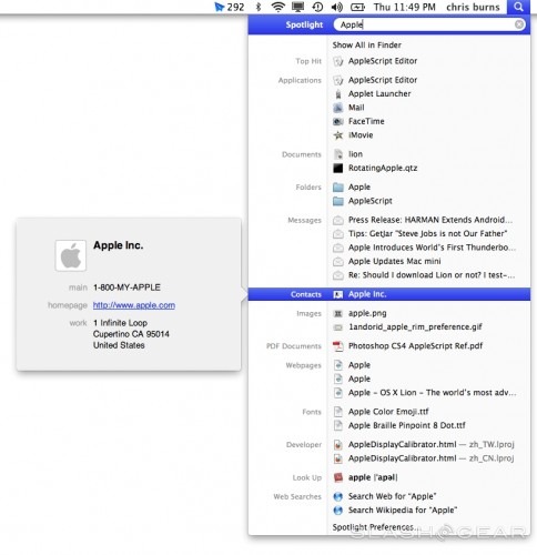
Up in the very top right of your display you'll see a magnifying glass. For those of you that've never used this bit of magic, it's called Spotlight, and with it you can find anything and everything. This newest iteration of the app shows you not only results on your computer, but webpages, music, web searches, and more. Mouse-over any result to see a preview. Very simple and a very viable option for opening apps, browsing the web, and finding old emails.
Safari
It is Safari that stands to gain the most at first in this operating system as far as web browsers go. Of course this makes sense as it is Apple's browser, but be careful you don't have a heart attack when you realize that your Chrome browser can no longer use a three finger swipe as it's been taken instead by the operating system itself. Inside Safari you'll be able to swipe back and forth, or forward and backward, if you will, with two fingers. That is, instead of clicking the back button or the forward button, you have only to swipe with two fingers to the right or to the left.
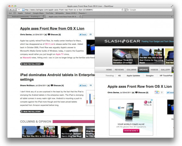
You're also able to pinch to zoom or double-tap to zoom. This is an ability I use constantly from my mobile devices because the displays are too small to read tiny bits of text. Why you'd want to zoom into a webpage from your already correctly sized desktop I'm not sure, but it's nice to have such a feature. Another feature that's nice to have is the ability to sandbox webpages to stop malicious attacks on your computer, this and the ability to remove all website data via your cookies (that you can also view individually) is another welcome change in its implementation (however slightly different.) Extensions have been further highlighted in your settings, so we're pumped up about what's to come there also.
Promotion of Apps
You may find that you're prompted to add your email account associated with certain accounts online to your Mail, iCal, and iChat account. It's here that Apple draws you back in if you've stopped using these apps as I have. Now with iCal I'll be sure to keep up to date with my appointments, my iChat allows me to connect to all my Google contacts, and Mail I'm still hesitant on because the mail app "Sparrow" still has me enthralled enough to win. Will you tie yourself in deeper with your own computer? This is what Mac asks you here, in so many words.

Mail, Contacts & Calendars
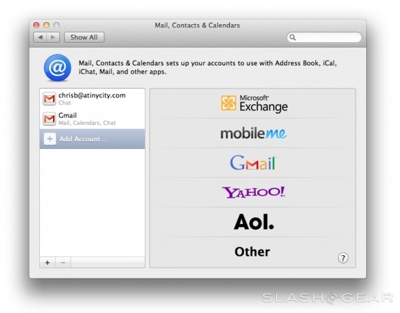
In Settings there's a pane called Mail, Contacts & Calendars. In this you're able to have a central location for all of your accounts to be added or subtracted, tied then to apps such as Address Book, iCal, iChat, Mail, and more. What the more is and if how and when other connections will be able to be made (Twitter and Google+ come to mind) is still a mystery, but having a more central place for all of this account business again promotes Apple singularity and use of the apps the big A intends for its users to use.
iCal and iChat
Both iChat and iCal have been bumped up a bit, both receiving upgrades in several places making them desirable to use once more. We expect very much that iCal in particular will see a giant boost in users once iCloud is active and running, and iChat being promoted by the in-browser connection to your accounts is a massive potential plus. Note: the first place I saw the promotion window pop up was whilst logging in to Google+. Very enticing.
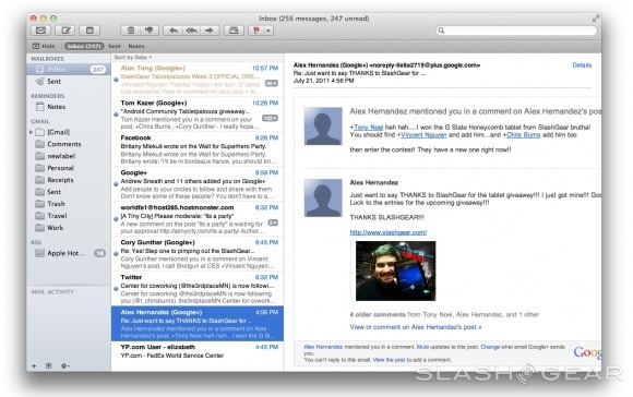
This update to the app is more of a user interface change than a functionality change, if that makes sense. Some of the elements have been pushed around a bit, and there are some improvements to the search function in that you've got the stacking of terms and the ease in finding messages you need, but for the most part, this is an upgrade to a place where, again, Sparrow has already been for a while.
Address Book
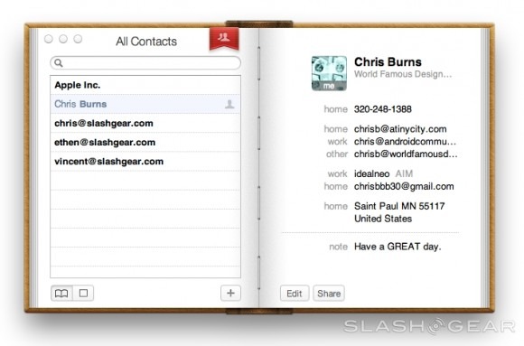
Not a whole heck of a lot of change has happened to the functionality, again, of Address Book, but it looks a whole lot more enticing. This seems to be the trend in OS X Lion, re-invigorate your interest in the apps the Apple intends for you to use. Address Book stores all of your contacts in an easy-to-access format that can be used in a large variety of apps.
Quicktime
There's a single element in Quicktime that makes Lion worth the $30 by itself: screen record. You can simply open up the recording window, hit the record button, and your entire screen is recorded for all your directional needs. This isn't a new function, but in that Quicktime has done it in such a simple manner here, it'll be something I use often. Quicktime also offers some excellent simple drag-and-drop video editing with sound, making editing of clips so very easy that it might be time to drop the whole iMovie thing, if you would so dare to do so.
Dictionary
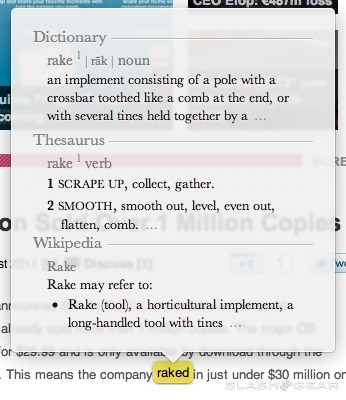
Auto-correct continues, and in that it's not nearly as harsh as the iOS version (or any other version that comes to mind, come to think of it,) it's a winner. You've got the option of switching auto-correct off, but be sure to keep the Dictionary on. The ability to control-click any word and have it spell-checked or looked up in Apple's Dictionary changed the way I do work – this set of functions is bumped up with a three-finger-tap on a word, this bringing up a bubble that identifies the word. This takes out a whole step from my day, therefor it's a win.
Preview
It being one of my most-used apps, Preview is always the first app I check out when I do a full update such as Lion. The update to Preview that corresponds with Lion here is the greatest change to Preview in its history. In that you can use your two-finger gestures to push photos back and forth, info is added, notes, simple editing of photos, painting, different choices for viewing images, and more have been added, Preview has a full-on great update going for it.
Full-Screen Apps
You'll notice a new button in the upper right hand corner of many of your day to day apps – this button sends your app into full-screen mode. Once you are in full screen mode, it's quite intuitive to use your three finger swipe up to get to Mission Control and switch between apps (and desktops). It will be a bit of time before many apps besides your basic Apple apps are able to make this move with ease, while apps like Firefox have had the ability to go fullscreen for a while, though now don't automatically have the button until they're actually in full-screen mode, at which time Lion is more than willing to allow you to minimize them once more.
Windows users have had similar abilities for some time now, but in that they don't have a central unit for control as nice as Mission Control in place, I must say this seems to be the nicest solution presented thus far – multitasking ho!
Recovery Disk
For those of you who've ever had a big fat problem happen with your software that's required a full wipe of your system, or for those of you that've inherited your computer from your kids who have moved on to greater things (like a new MacBook Air with Lion, for example,) you know that it's rare that you're going to want to use your original install disks of your computer's OS, but when you do, it's usually to trash the whole works, starting from blank. In other cases, it's nice to go back to the point at which all of your apps were installed but there wasn't a whole terrible mess going on with all of the Reddit pics you've downloaded. In either or any case, you're going to like what's going on in Lion.
There's no Lion install disk, so what do you do? Lion has its own bootable recovery partition. Because of this, if you hold down option while booting up your machine you're able to select your recovery partition and recover your system from a Time Machine backup. You've also got the option to reinstall Lion or run Disk Utility from here. You can also browse the web with Wi-fi using Safari in recovery mode if you're part of a one-computer household and need to browse Q&As or help documents online to help make your computer live again. This is one of those things that should have been in place years and years ago on all operating systems, but we're glad to see it's arrived finally!
Will my old apps work?
You might be asking yourself if apps you've been using for many many years will be fully functional with this new system. The answer is: maybe. It appears that most apps that haven't been updated since the year 2004 and before are not working the best in this new world, while essentially everything inside the past 5 years is working just fine. For a rather comprehensive look at what works and what doesn't, head to Roaring Apps and click around a bit.
Little Things
The Red/Yellow/Green buttons in the upper-left of your windows have been sized down – not by much.
You've lost the ability to use three finger swipes in several apps because this function has been bogarted by the OS. You'll have to figure out new solutions for Chrome, Reeder, and the Mac App Store if you want to keep on swiping.
One of the swipe commands you'll more than likely not be apt to perform is the three finger and thumb pinch. You open your fingers opposite your thumb up to get into Launchpad, pinching to get out. I've been much more apt to click the Launchpad icon in the dock myself. Similarly, a long-hold of an app starts the whole bunch jiggling, just like in the iOS version of your apps screens, showing you they're ready to stay or ready to go, directly to the trash bin.
Performance
The only time I've felt like there was a hiccup in the system here now that I'm upgraded to Lion on my newest generation MacBook Pro is when I'm attempting to use gestures to get to Mission Control or the Launchpad. While this could very well be because my fingers weren't working correctly, but I do dare to say that gestures aren't perfect- especially when I need four fingers to perform what one could do with a simple move and a click. The software works fine, is the compatibility with the human brain that might not match up so well.
Booting apps appears to be at least slightly quicker. The old go-to test for this is opening Photoshop, and I'm glad to say that before I updated, Photoshop (version CS4 is the one I'm using here) booted in about 30 to 40 seconds while now it's down to about 20 or 15. Compared to 10 years ago that's an absolute miracle. Compared to pre-Lion that's a few extra bonus points. Furthermore moves seem swift, everything seems smooth and nice, animations appear flawless.
Wrap-Up
When I first laid eyes on the notion that Mac OS X Lion would be like iOS for desktop, I was majorly hesitant. I'm not the biggest fan of iOS, it being a system I find slightly small and limited compared to the capabilities I know my MacBook Pro here is capable of, so thinking my computer would be all app screens and one app at a time or nothing iOS business, I was certainly thinking that maybe I'd skip this version of OS X. So I asked my Google+ posse what they thought. Their responses told me that there are certainly some problems that THEY were experiencing, but that overall it's a massively awesome system. So I took the plunge.
Now here I am using Lion and it's quickly becoming a system I'm not sure how I could work without. Similar to the ability to move all windows out of the way given to me in Snow Leopard, my swipes will never be taken away from me lest a better solution present itself. I'm using Mission Control on the regular and LaunchPad has made me want to download a slew of new apps.
OS X Lion combines iOS and Mac OS in a way that, above all else, makes me wonder what they're going to do to innovate on iOS when the time comes for the new iPhones and iPads to be released. It's remained, if I may be so bold, relatively unchanged since basically the start of this Apple mobile revolution – is this combination with desktop going to show the way to a bright new iDevice mobile operating system? For now we've got the Lion roaring in on the Pro here in the office, and it's going pretty well. While I was hesitant to adopt many of the new features, it quickly became apparent that the ones I didn't want to use could be switched off and the ones I got used to I really ended up enjoying.
Ultimately the verdict is this: OS X Lion has the functions I need to do my day-to-day work as well as the abilities to drive software innovation and growth through the future. I'll be using Mac OS X Lion for the foreseeable future.
