Living With Ford SYNC 3
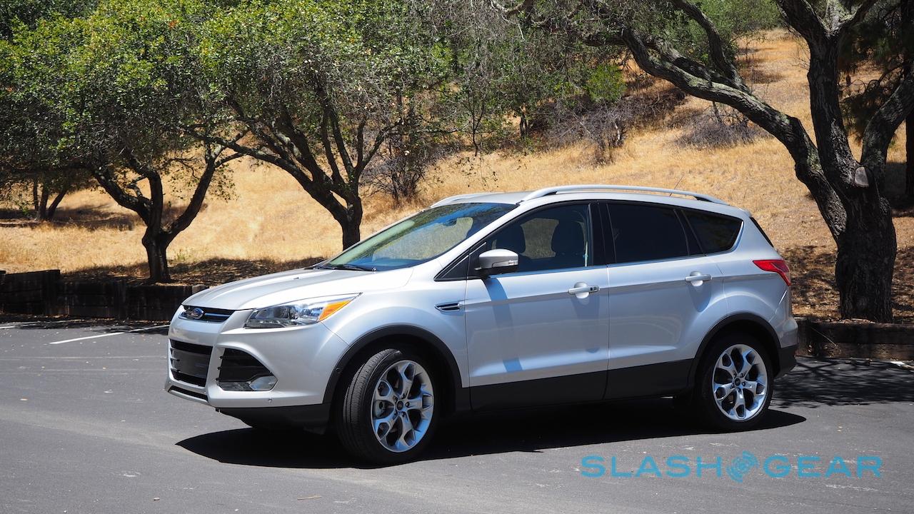
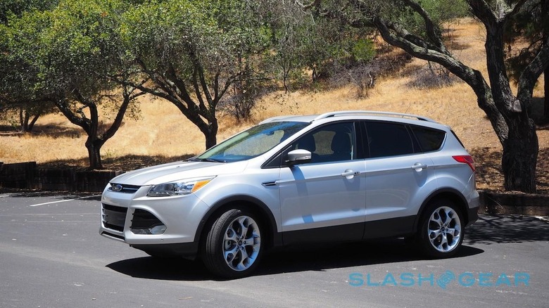
There's a war going on for your dashboard, and while Apple CarPlay and Android Auto might have designs on your digits, homegrown systems like Ford SYNC 3 aren't giving up. Latest iteration of Ford's infotainment platform, SYNC 3 raises its game in touchscreen responsiveness, voice recognition, and third-party app support. That makes a whole lot of difference behind the wheel, as I discovered when I took it for an extended test-drive in one of the first 2016 cars to offer it, the new Ford Escape.
The 2016 model year escape, along with the 2016 Fiesta, will be the first cars to offer SYNC 3. However, Ford expects to have its entire North American range upgraded to the new platform by the end of 2016.
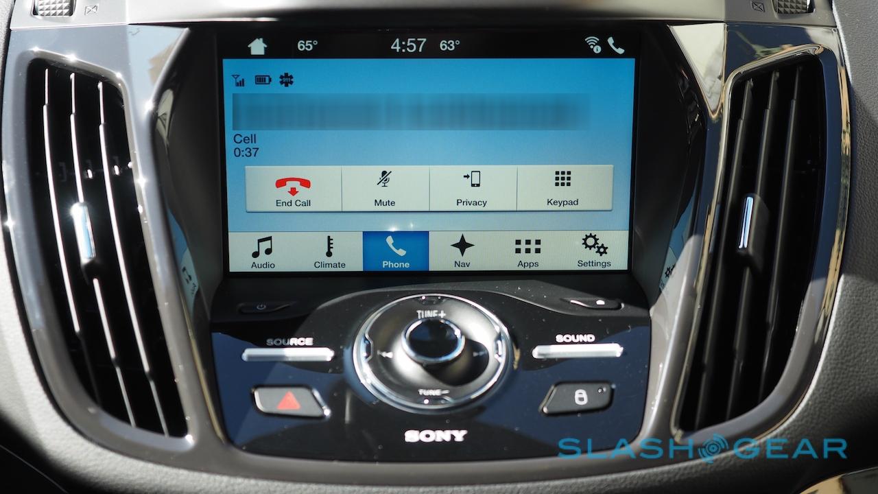
The face of SYNC 3 is the touchscreen in the center stack, either 6.5- or 8-inches in size, and now thankfully using a capacitive panel than the awful resistive touchscreen the old MyFord Touch system was lumbered with. It's now responsive to a light tap, rather than demanding an angry stab – or, more accurately, several stabs, since the old screen had a habit of ignoring your fingers – though Ford does warn that it's not designed to be used by those wearing gloves.
Another of MyFord Touch's foibles was its occasionally ponderous speed. Happily, that too has been addressed for the most part in SYNC 3: along with the architectural change, switching from Windows to QNX under the hood, the UI is far more responsive.
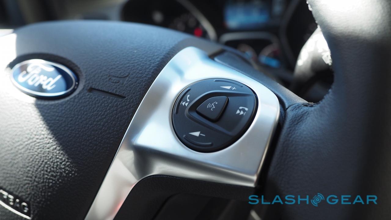
There's less time spent waiting in switching between tabs, and map redraws are quicker, too. The voice recognition system is faster as well, still triggered with a dedicated button on the steering wheel.

That's a good thing, since Ford expects a whole lot of interaction to be done via voice. Not only has the list of supported commands been increased, Ford says SYNC 3 should be better at getting the gist of your instruction rather than insisting you stick to the command as-written.
For the most part that turned out to be the case, though it did mean I was sometimes confused whether I was getting the speech prompt wrong or whether there simply wasn't such a feature. A good example is asking for "Recent destinations" in the Navigation app, which seems like it should be an obvious feature, but which SYNC 3 consistently rejected.
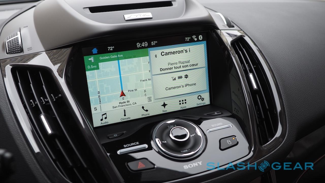
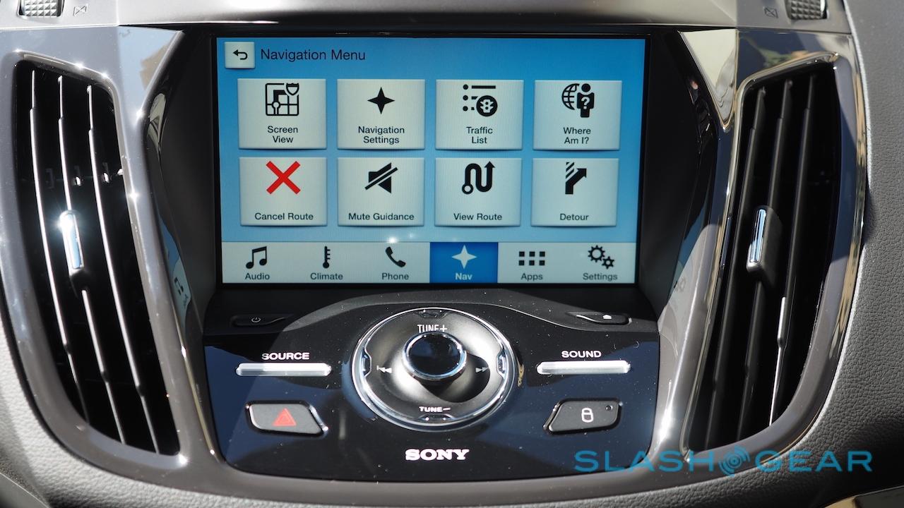
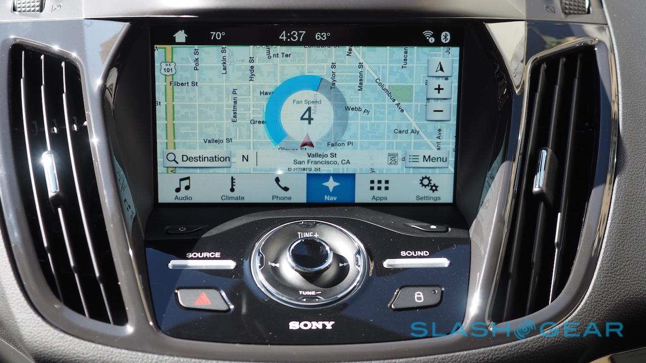
SYNC 3 organizes itself into a homescreen and multiple tabs. On the homescreen – for models with navigation installed – you get a large map preview and then smaller boxes for audio and details on a connected device. Buttons are big and easy to press, and the blues and grays, though not the most inspiring of color schemes I've seen, are at least clearly legible and inoffensive.
First tab is Audio, with the Escape offering an AM/FM radio, Sirius XM, CD, or music from a USB device or paired over Bluetooth. External sources are indexed every time they're connected, after which point you can in theory ask for a certain artist or track. Ford fits a dedicated Source button to the Escape, one of the few physical controls SYNC 3 gets, though I'd have liked to have seen a Home button either instead of it, or in addition to it.
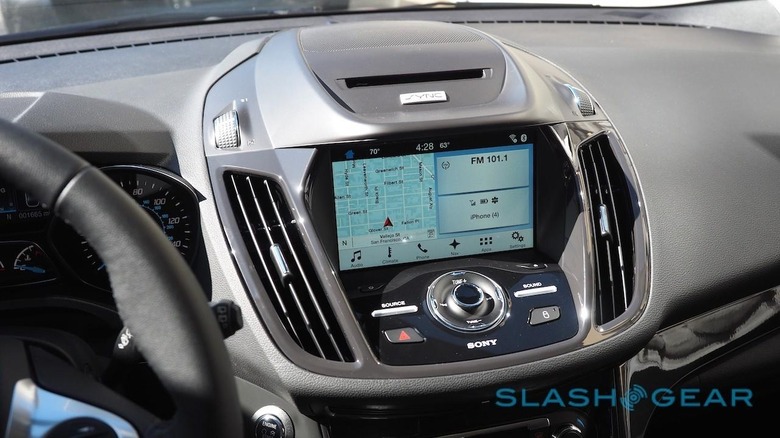
Next over is Climate, and while there's a panel of HVAC buttons lower in the center console, you can also adjust all the settings through the touchscreen. It's even possible to adjust temperature – though not for the dual-zone system this particular Escape was equipped with – by voice: press the button, say "Climate set temperature to <60-85> degrees," and after checking it understood the number right, the HVAC will change.
All well and good, but by the time SYNC 3 has briefly thought about what you've said, and then clarified it heard correctly, you'd probably have been quicker simply reaching down and twisting the actual control.

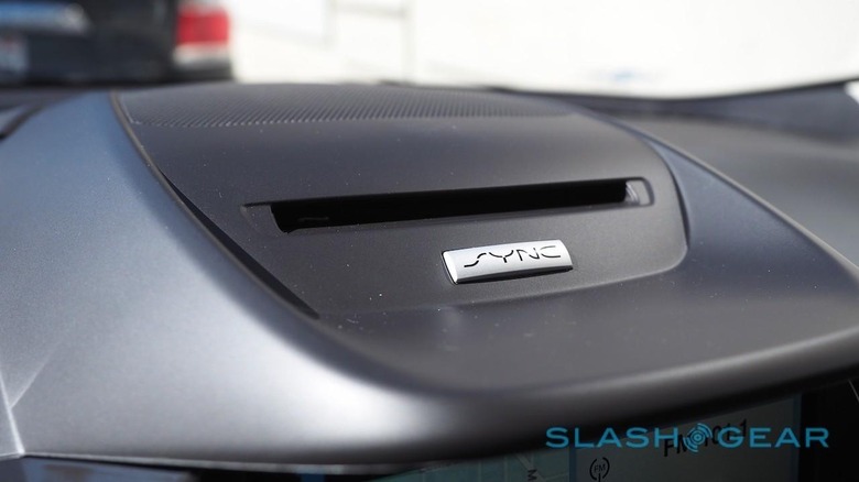
Instead, voice really comes into its own when paired with AppLink. Ford's system for hooking up smartphones to its dashboard, it's a way for third-party developers to integrate their software with the various options SYNC 3 provides.
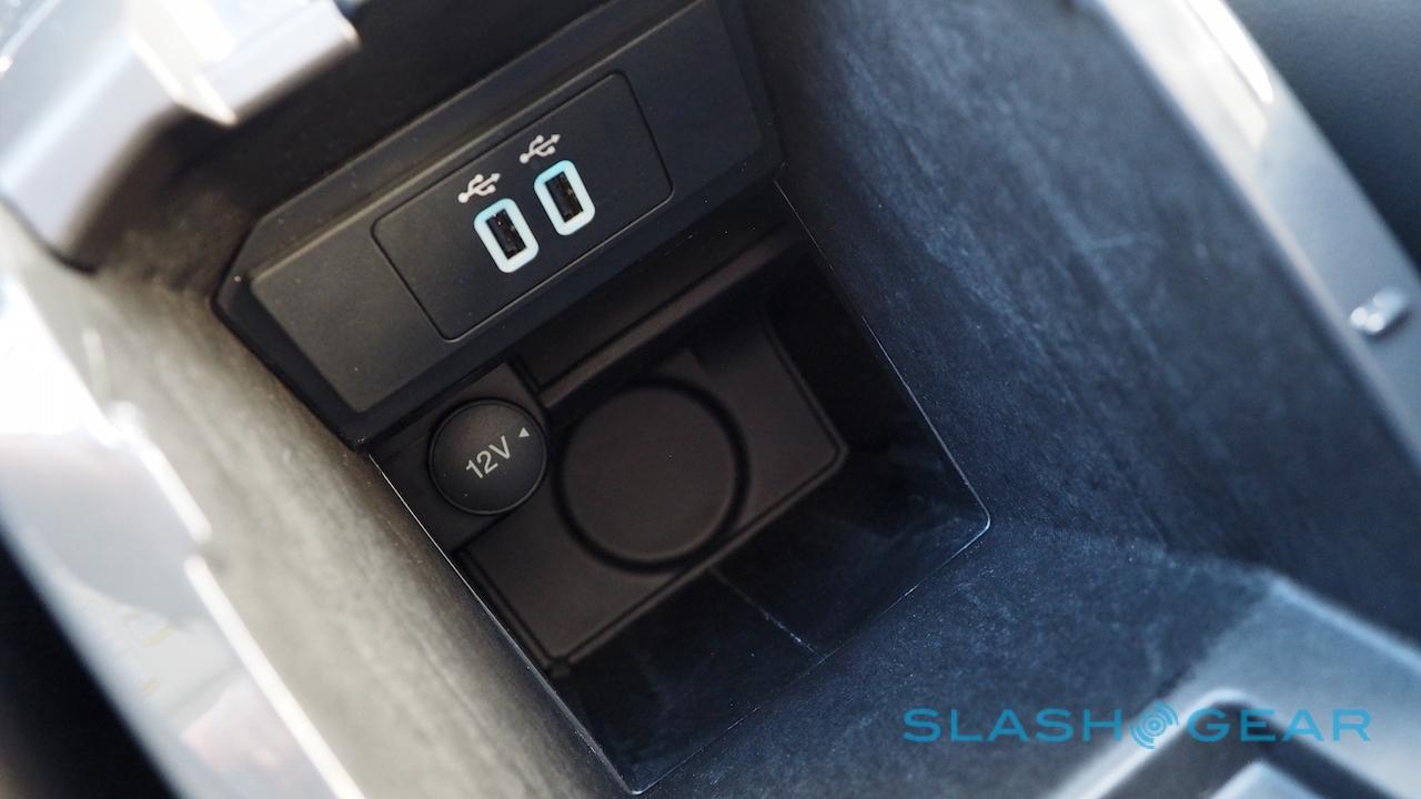
If you've an Android device, AppLink will work entirely over Bluetooth. Those with an iPhone, however, will need both a Bluetooth connection (for audio) and a wired link using one of the two USB ports under the driver's armrest. To make up for it, holding down the speech button on the wheel summons Siri if you're an iPhone user, in the special Eyes-Free mode designed to reduce distractions.
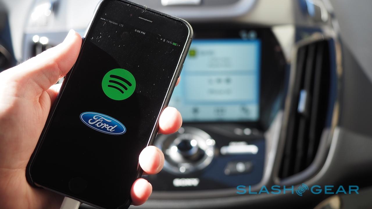
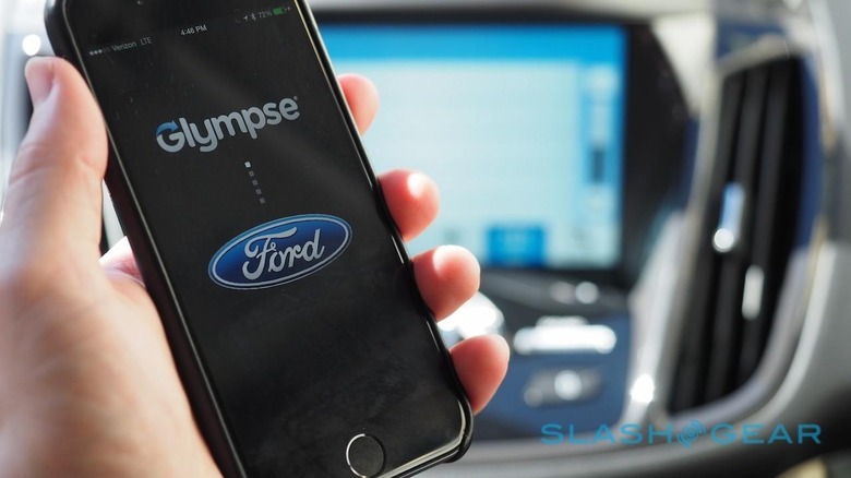
I tested three AppLink-enabled apps out, Spotify, Pandora, and Glympse. Each shows up in the App tab but can also be summoned by a voice command; each offers some subset of its features for access through the car's touchscreen.
Exactly what you can do depends on the developer. Spotify, for instance, is surprisingly full-featured in SYNC 3. Not only can you access your playlists, but you can start Spotify Radio stations for instance. Jump back to the homescreen and what's currently playing shows up in the audio box, complete with album art.
It's not entirely smooth-sailing, however. When I tested AppLink with an iPhone 6, for instance, I had to make sure the apps were running on the phone before they'd show up in the Apps tab in the car. They didn't need to be in the foreground on the iPhone, but they did need to be in recent memory.
AppLink's main problem, though, is that developers need to explicitly support it, and right now that list isn't especially long. It may begin to pick up pace if Toyota decides to use AppLink's underlying SmartDeviceLink system, but it still leaves a rather meager selection to showcase alongside SYNC 3's debut.
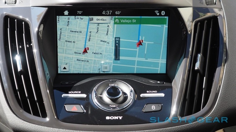
Not every SYNC 3-equipped car will have the Navigation tab, but for those that do it's probably the most rewarding place for voice recognition. While I couldn't simply hit the button and tell the car an address, after a prompt or two I was able to say the whole location – street number, street, and city – all in one fell swoop, rather than having to dole them out piecemeal as with some rival systems.
Points-of-Interest are handled sensibly, too. SYNC 3 asked me if I was looking for somewhere in a specific city or simply nearby, handy if you get lost as much as I do, and then allowed me to search by category or location name. Despite probably expecting an American accent and getting a British one instead, something which has tripped up voice command systems in other cars, the Escape didn't have any issues hearing me and finding where I was looking for.
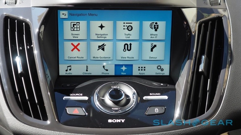
Neither did it take so interminable a length of time to do through speech that I gave up and resorted to tapping out on the (mildly sluggish at times) onscreen keyboard.
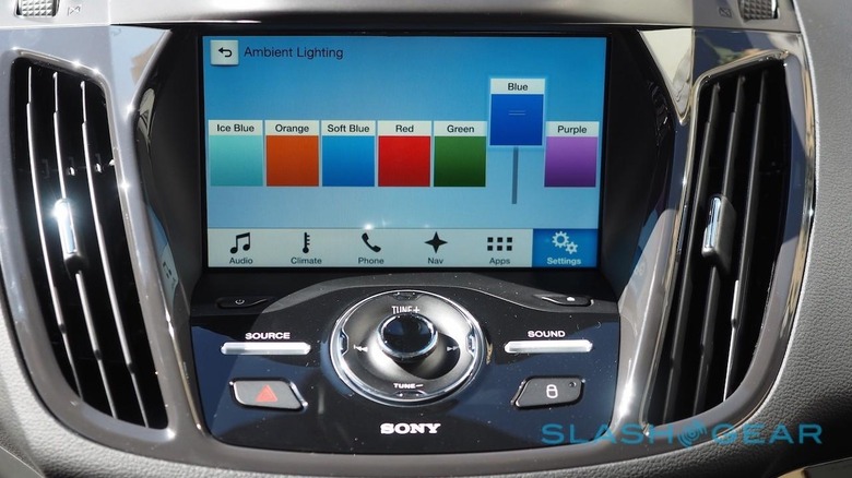
SYNC 3 has other charms. No-Charge 911 Assist, for instance, automatically calls 911 and optionally two personal contacts should the car be in an accident, while on the opposite end of the whimsy spectrum, if your particular model is fitted with ambient lighting, you can tap through and switch colors via the touchscreen.
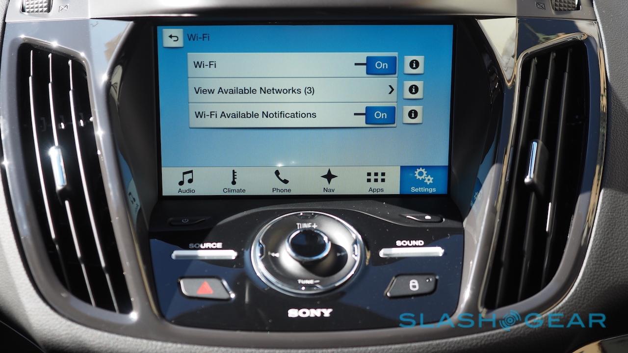
Updating the infotainment should be easier, too. SYNC 3 can log onto a WiFi hotspot, so you could connect it to your home wireless network and it will automatically update itself when Ford pushes out a new version. Previously, you'd have to either pay a visit to your local dealership, or alternatively mess around downloading firmware packages onto USB drives and install them manually.
The infotainment space is becoming fiercely competitive, and SYNC 3 is a much-needed upgrade. Ford may have been one of the first to smarten up the dashboard with the original SYNC, but its rivals have stepped up in the intervening years. Meanwhile, Google and Apple have set their voracious appetites on the automotive space, counting on smartphone-addicted owners themselves driving car companies to a place of acquiescence.
Sure enough, SYNC 3 looks likely to eventually gain CarPlay and Android Auto support. Even then, though, it will have some advantages over the phone-based systems. Their dependence on the cloud, where Ford's platform is self-sufficiently local to the car, means you'll need a decent connection, and there are some things CarPlay and Android Auto – in their current iterations, anyway – can't deliver, like HVAC integration.
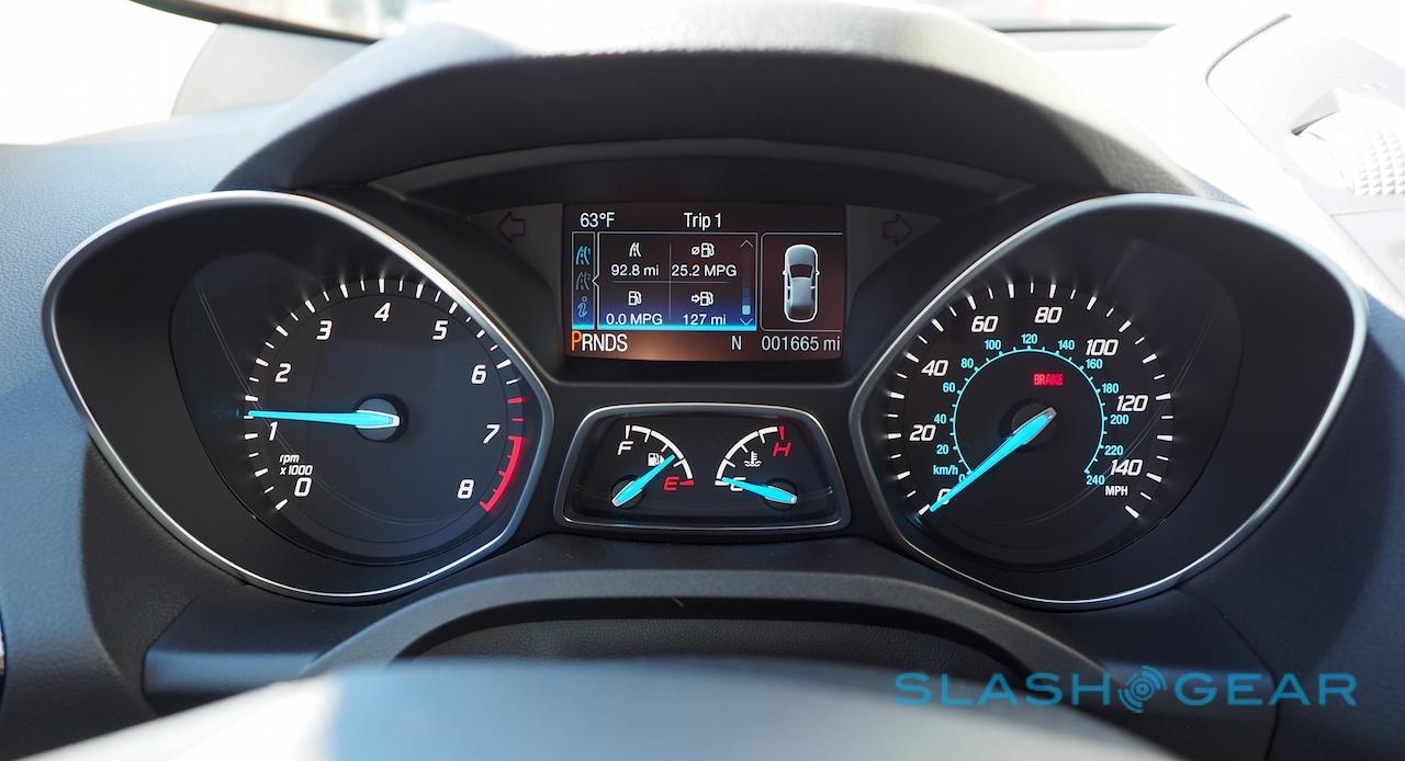
Nonetheless Ford can't rest on its laurels. AppLink works well but is lacking in scale, while I really wish the new center touchscreen had also brought along a revamped panel for the driver's instrumentation, rather than the piddling little LCD that looks comically small compared to what other cars are fitted with these days.
Ford gets the basics right. To survive the Interesting Times the automotive industry faces, however, it'll need to persuade developers to get onboard with AppLink before SYNC 3 can become a serious selling point.

