LG Watch Urbane Review - All That Glitters Isn't Gold
You can understand why Android enthusiasts might be resentful of the Apple Watch. Android Wear has been around long enough for manufacturers like LG to release several generations of smartwatch, but listen to some and you'd be excused for thinking Cupertino had invented the segment. Into the fray wades the LG Watch Urbane, promising genteel luxury instead of geek chic, and first to offer the very latest version of Android Wear itself, complete with a number of hotly-anticipated updates. $349 is a lot to ask for an Android smartwatch, though: is the Urbane worth it?
Design
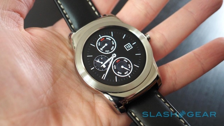
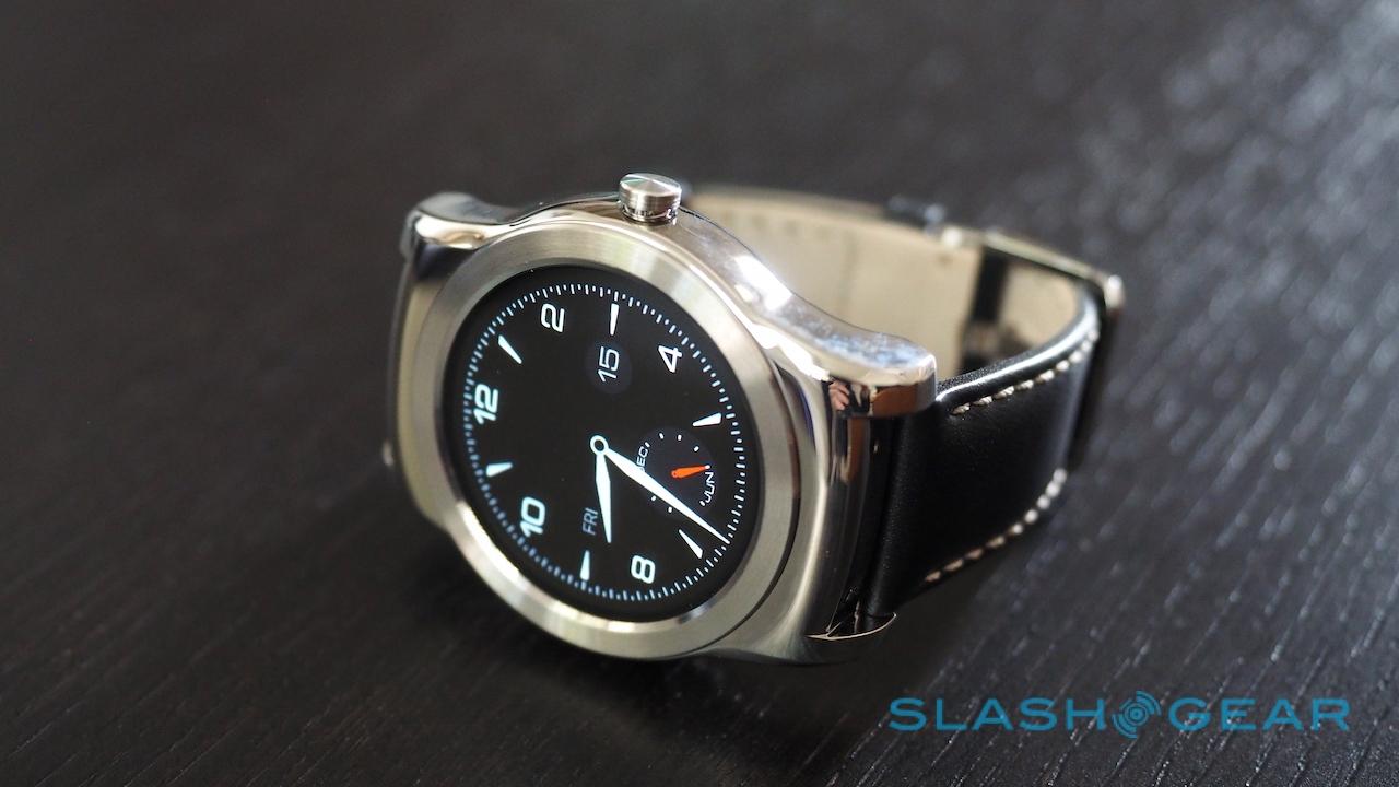
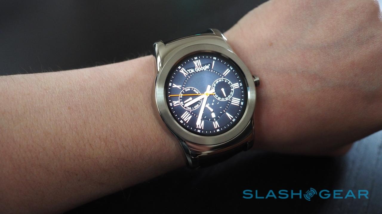
Back when LG first revealed the Watch Urbane in February, its metal body and less obviously geeky looks set it apart from most of the Android Wear alternatives. Taking the core of the existing G Watch R, but doing away with some of the more contentious design elements like the chronograph dial, it seemed like Android's smartwatch platform had finally grown up.
The reality isn't quite so clear-cut, but a big part of that is subjective.

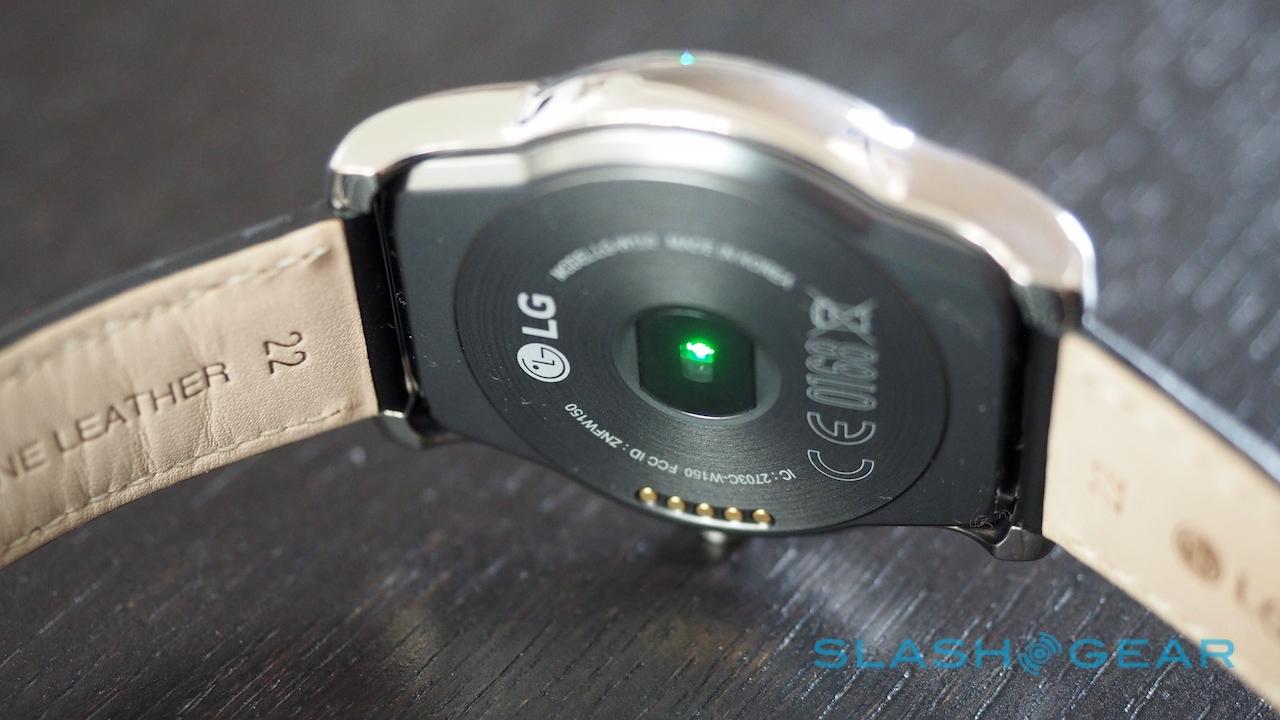
So, first the facts. At $349.99 the Urbane is the most expensive Android Wear watch around. It's a sibling of the LG G Watch R, not a replacement: fronted by a 1.3-inch, 320 x 320 circular OLED screen of LG's own making, and containing a 1.2 GHz Snapdragon 400 processor, 512 MB of RAM, and 4GB of storage.
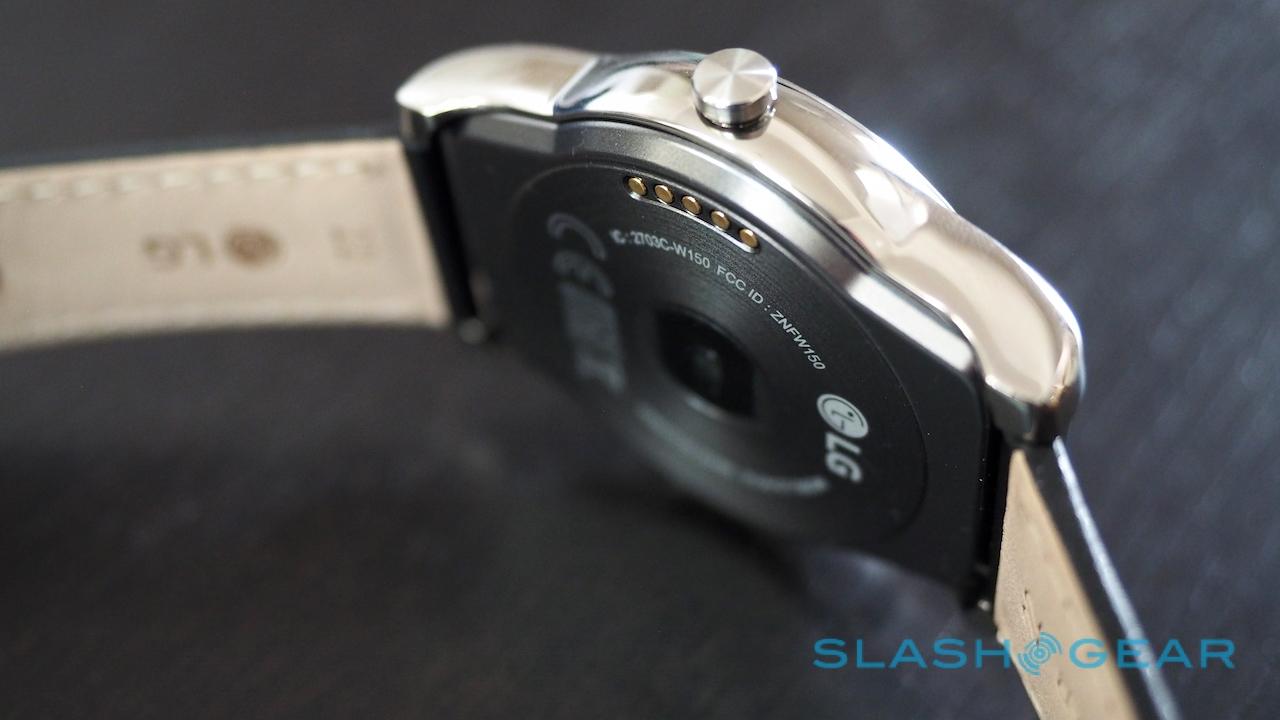
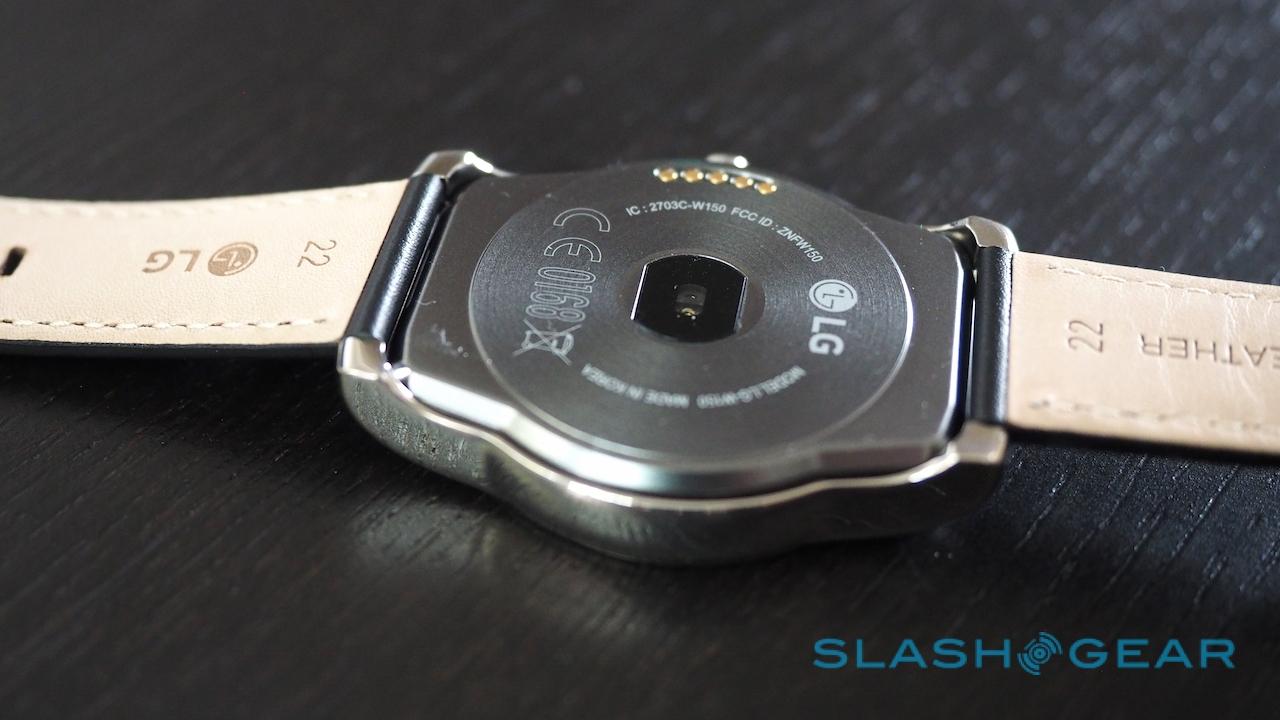
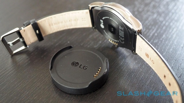
There's an accelerometer, barometer, compass, gyroscope, and heart-rate sensor, along with WiFi that – thanks to Android 5.1.1 – is actually of some use; more on that in a moment. The 410 mAh battery is charged using a magnetically-clinging dock that plugs in via microUSB, though while the G Watch R used the same system, the chargers aren't interchangeable.
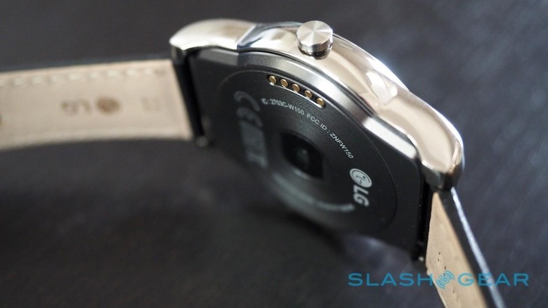
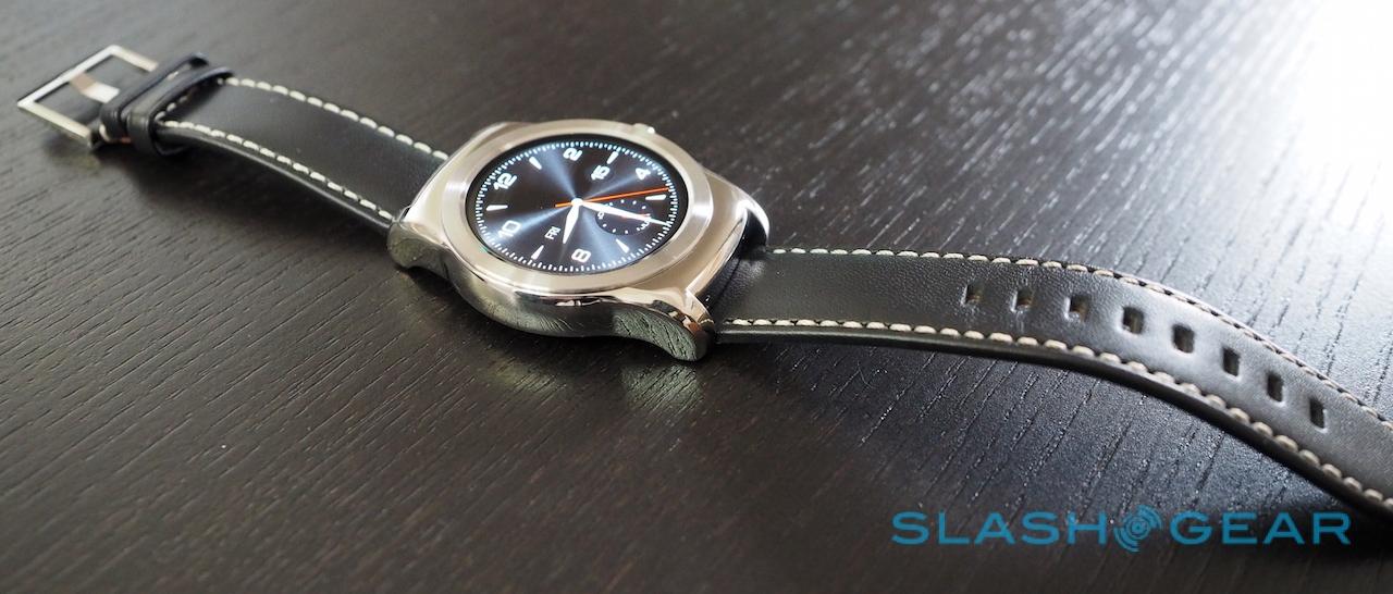
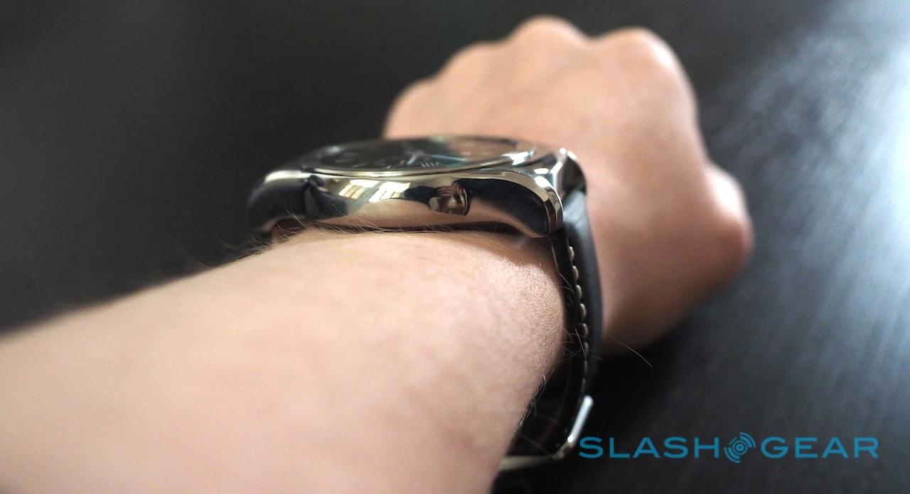
At 1.8 x 2.1 x 0.4 inches it's the same size as the G Watch R, and at 2.3 ouches just a fraction heavier. Here's where things start to get subjective.
Style is a personal thing: what I find attractive, you might think ugly, and vice-versa. Watches are inevitably even more prone to the whims of individual taste. So when I say that I don't particularly like the aesthetic of the Urbane, you're well within your rights to call me a blind heathen and think entirely differently.
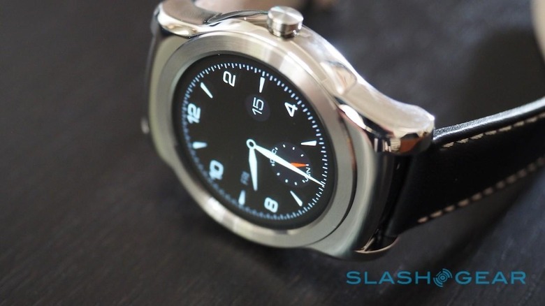
My key criticism of the G Watch R was always those chronograph-style markings around the angular bezel. They were too explicit a design detail: they meant that, even with a more classic watch face, the G Watch R always felt like it was a sports watch only masquerading as something else.
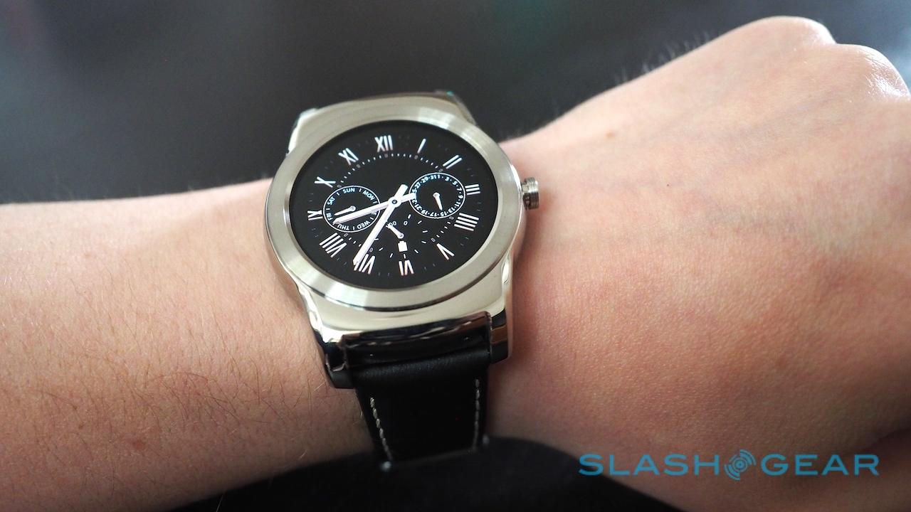
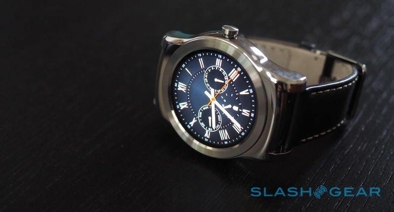
LG got rid of those markings for the Urbane, but it replaced them with... nothing. The high-gloss metal casing is available in either silver or rose gold finishes, but both look too simplistic in their molding to my eye.
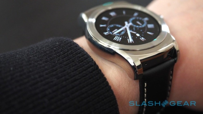
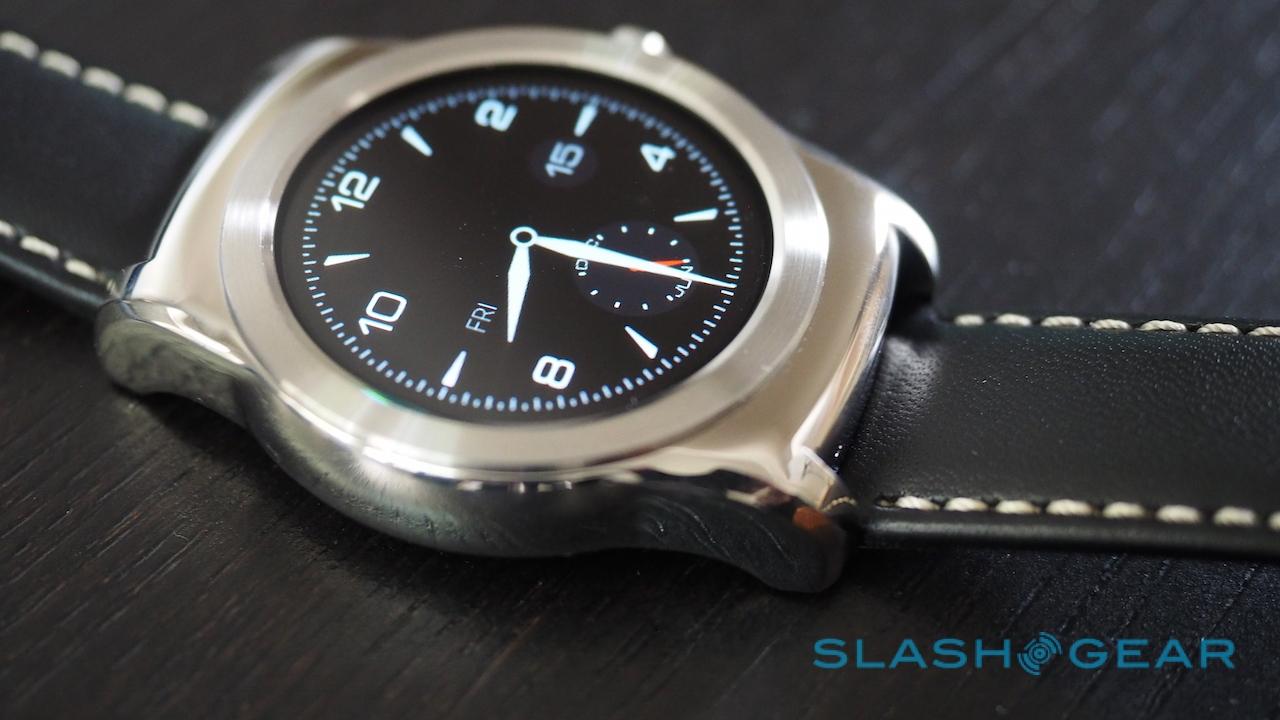
The big, round bezel which looks just that little bit too thick, and then the huge lugs top and bottom; it's like an altogether perkier watch got stuck under the broiler and melted a little. The fact that the circular touchscreen is recessed only adds to the ship's porthole look.
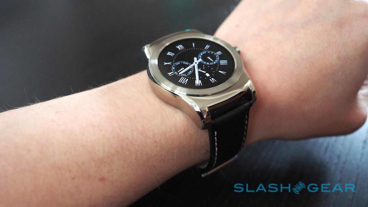
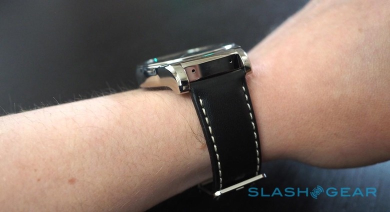
Then there's the size: the Watch Urbane is big. I'm generally a fan of bold, chunky watches, but the LG is a whopper. The thickness doesn't help, but neither do the long lugs which dwarf my fairly average-sized wrist. Everybody I showed it to was surprised at quite how large it is, and while it may not have the cut-out notch like the Moto 360's circular display, the Urbane is miles away from Motorola's crisp, minimalistic lines.
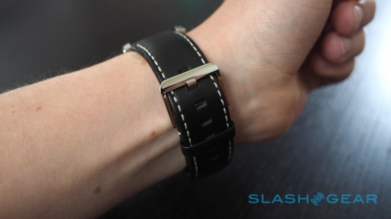
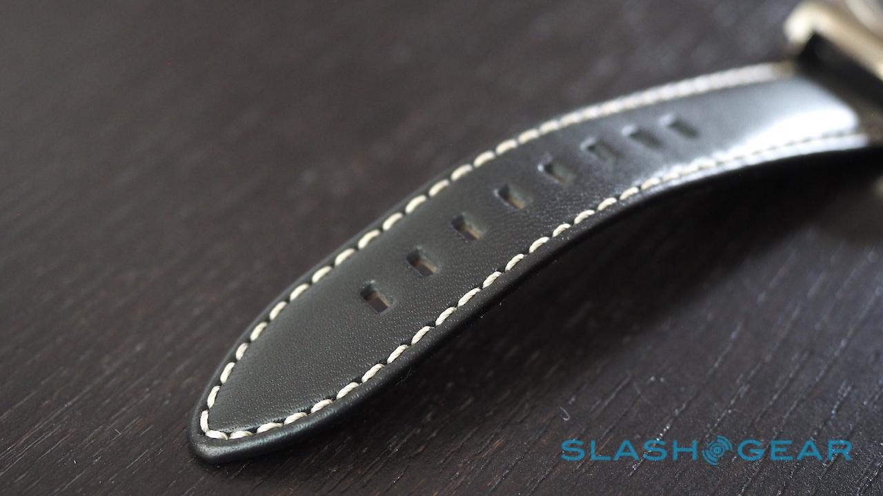
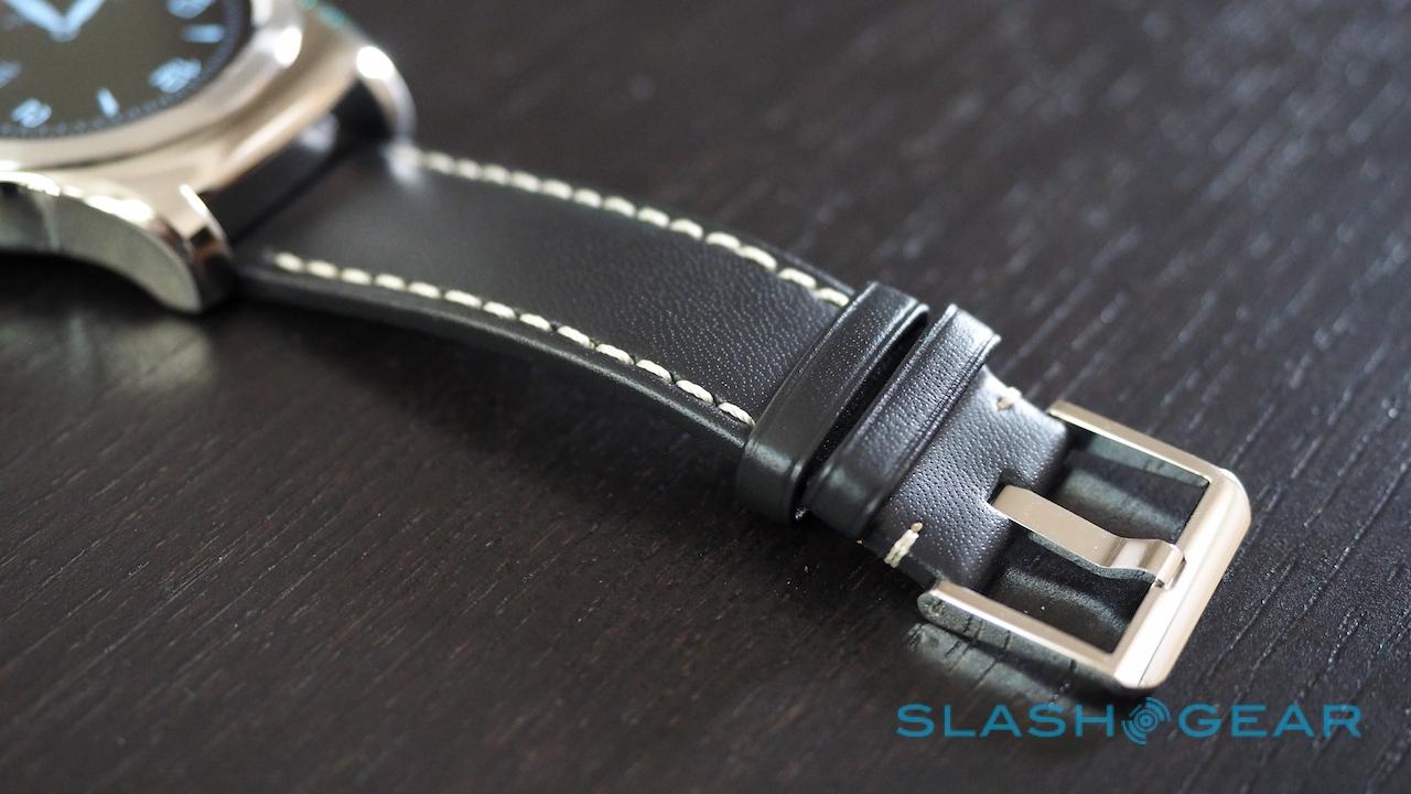
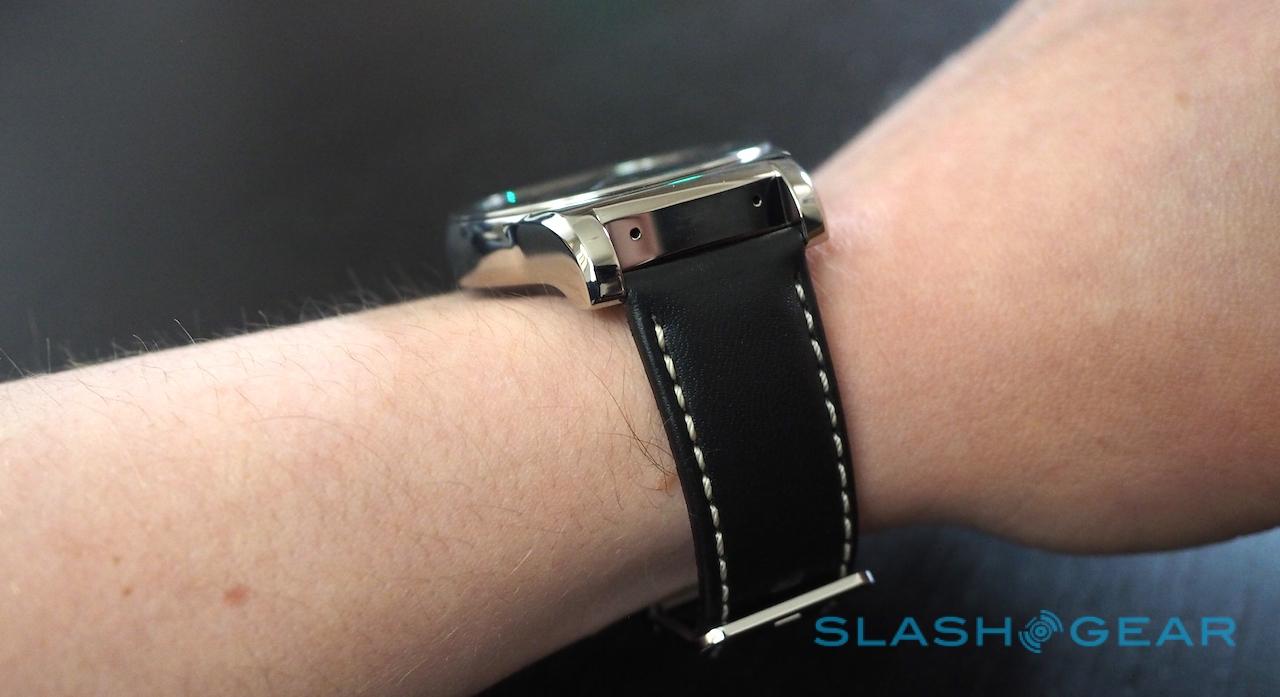
LG has been doing some interesting things with leather recently, notably on the back of the G4 smartphone, and the strap supplied with the Urbane has promise. It's very, very stiff out of the box, though while that can be uncomfortable at first I've a feeling it will age more gracefully than, say, the softer and more readily scratched leather Motorola opted for. The contrast stitching isn't to everybody's taste, but since it's a standard 22mm strap you can swap it out for a different one if you have the right tools or access to a jeweler.
That's something you'l have to do if you want to take advantage of the LG's IP67 water resistance. The Watch Urbane will handle immersion of up to a meter for up to 30 minutes, but that's only the body: the leather strap isn't designed to get wet.
Software
Software is where the Watch Urbane stands apart from its Android Wear compatriots, but it's not going to be a lasting differentiator. While LG may be first to market with a smartwatch running this latest version of Google's platform, software updates to existing models will bring them very nearly in line with what the Urbane offers.
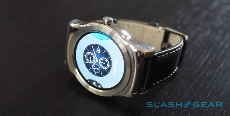
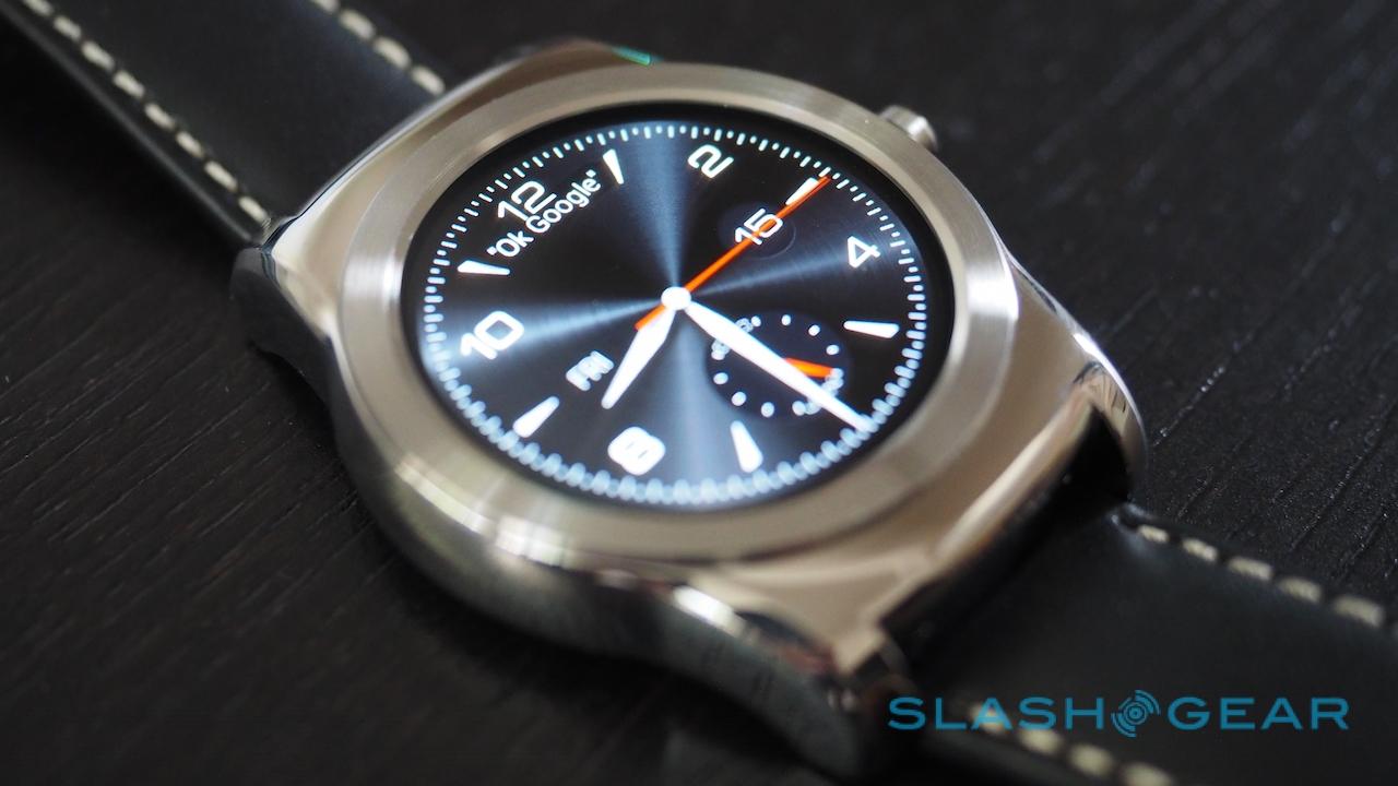
Android 5.1.1 builds on its predecessor in a few key ways. The core UI is the same, a long chronological timeline of cards that are swiped up and down, while swiping right on a card dismisses it and left opens it up. Further swipes to the left reveal the various related options – replying to an email, for instance – and there's voice control triggered by the "OK Google" command for searches, dictating messages, and more.
The first change is the menu structure. Previously, swiping to the left from the watch face opened up the actions pane, a list of tasks like "show me my heart rate" and "send a text"; if you wanted to load a specific app, Android Wear really preferred you to summon it by voice, burying the list of installed software in a menu several levels down.
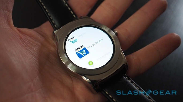
Now, that left swipe takes you straight to the app list instead. It's organized alphabetically, and whatever is actually included is controlled via the companion app on your Android phone. There's no way to adjust the order in which apps show up, to have more frequently-accessed titles nearer the top.
A second swipe brings you to your favorites, just as on your phone. Tapping them gives the option to send a text, email them, or call them, depending on what contact details they have saved. Finally, a third swipe brings the list of actions.
Google has also added flick gestures to Android Wear, in an attempt to make smartwatches more usable one-handed. I can't argue with the motivation, though I'm not quite convinced by the implementation at this point.
Tilt your wrist, or lift it like you're glancing at the time, and the Watch Urbane wakes up, just as before. However, from that point on, if you give your wrist a sharp flick up or down, you'll step through the notifications cards in order.

It's a good start, but Google didn't finish the job. Yes, you can see the card preview, but you can't open it with a gesture: you still have to tap if you want more than the first line or so of a new email, for instance. The flicks don't work to navigate through the menus, either, and the Urbane demands a pretty aggressive movement each time. Forget discretely paging through alerts while you're in a meeting or class.
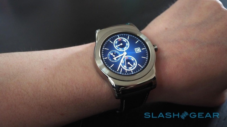
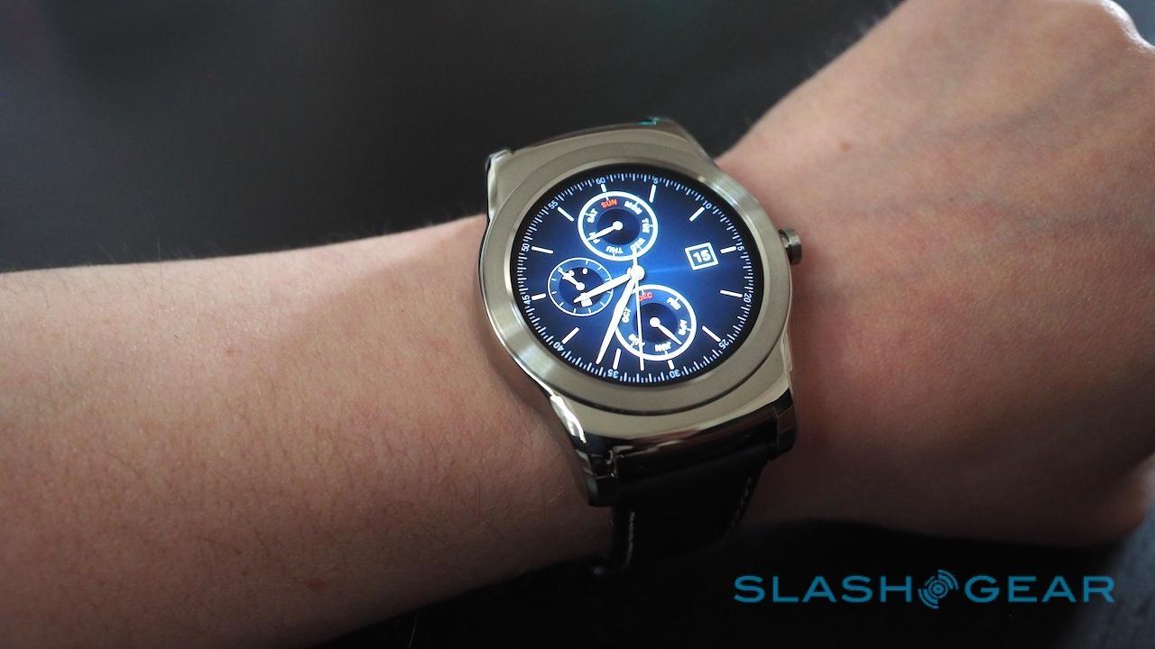
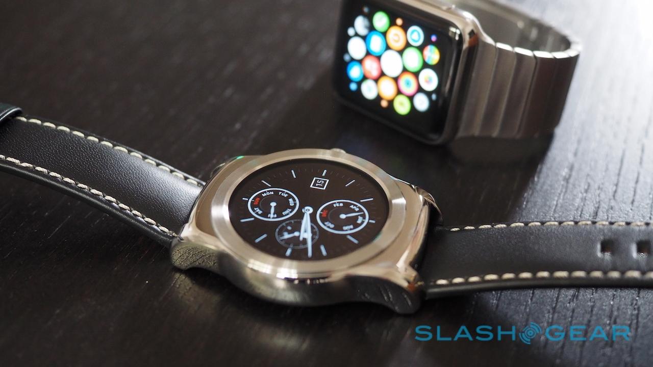
LG has added a number of new watch faces to the Urbane, pushing the traditional analog look with a range of sub-dial complexity. There's none of the individual customization that Apple Watch allows you to do with "complications" on-screen, but then again Android Wear's support for third-party faces means you're probably going to find an alternative layout to your taste somewhere.
There's also a useful low-power version of LG's faces, which drop the more intensive graphical niceties like the second hand in favor of remaining always-on, albeit at a dimmed brightness. Being able to tell the time at a glance and without having to move your arm first seems a no-brainer for smartwatches, but the Watch Urbane is one of the few that allows it. Even with that turned on, I generally got 1.5 days of very active use from the wearable, and if I'd pared back on the notifications piped through I could probably have stretched that to two full days.
Unfortunately, while the OLED screen has great colors and the sort of rich blacks we've come to expect from the technology, LG still refuses to fit an ambient light sensor. If you want to tweak the brightness, you have to do it manually in the settings.
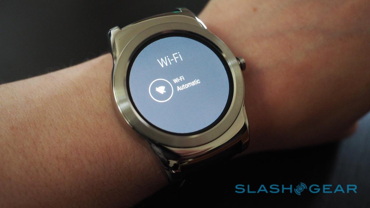
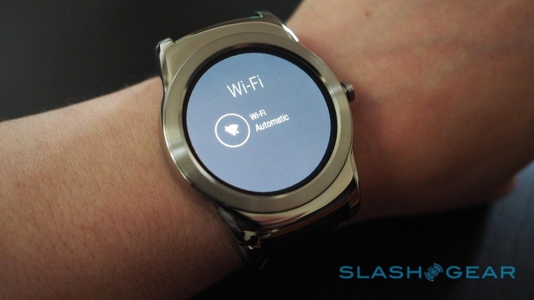
Normally, the Urbane connects to your Android phone via Bluetooth 4.0, but if you wander out of range it can now switch to WiFi instead. Basically, any network your phone knows already, your smartwatch does too. While Apple Watch can do something similar as long as both wearable and iPhone are on the same WiFi network, Android Wear 5.1.1 goes even further, with notifications continuing to pop up from your smartphone even if you're on two separate networks.
How useful it is really depends on how wedded to your phone you are. I can't recall the last time I left the house without mine, to be honest, but I suppose if you thought you had it in your pocket but discovered it missing when you got to the office, being able to continue to get alerts on your wrist could be very useful.
That is, assuming you've already set up the WiFi. You can't join a new network directly from the Urbane, only via establishing the connection through the phone first. Nor can you agree to the terms and conditions on so-called captive portal connections, as in Starbucks and most hotels, where you have to manually accept by clicking a button before you get online.
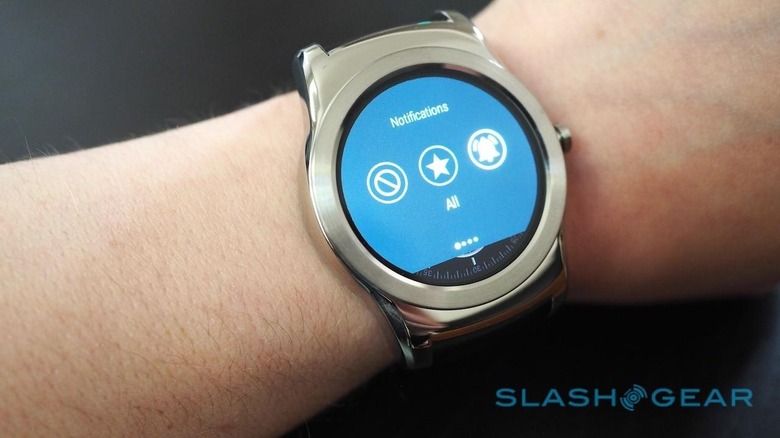
The obvious use for WiFi support would have been pushing voice calls over to the watch for when your phone is out of reach, but even with LG's own Call app – a circular dialer that requires a companion app be installed on the phone, too – you can't talk into the Urbane as you can with Apple Watch.
Android 5.1's remaining notable feature is emoji sketching. Rather than just dictating replies to Hangouts messages, for instance, you can now scribble out a pictorial reply. However, don't expect the Digital Touch sketches Apple Watch wearers can send each other: this is effectively handwriting recognition but for emojis, presenting a grid of possible matches after you've filled the screen with your finger-scratchings. Most of the time, I found it was quicker to open the emoji gallery and just pick from there.
The Competition
Everywhere you look, there are cheaper Android Wear options. If you're determined to have LG's round screen, the G Watch R is functionally identical and can be had for $100 less. I personally prefer the Moto 360's design to either of the LG pair and, with a second-gen version waiting in the wings, you can find the original for around $179, even if the Urbane battery will likely last longer.
Those who don't have their hearts set on a circle might find the sleekly classic ASUS Zenwatch more to their taste, offering excellent style for $199. Alternatively, Pebble is a perennial favorite, though lacks the voice control Android Wear offers.

Wait a little longer, and the upcoming Huawei Watch offers what to my eyes looks a classier metal casing than the Urbane, but still delivers the round display. Pricing hasn't been finalized yet, however, though some retailers are indicating similar figures to the Watch Urbane's $349 tag.
Then there's Apple Watch. Again, personal opinion (though echoed by everyone I asked), but Apple's wearable feels more high-quality than LG's. The Urbane has that eye-catching circular screen, though, and Google Now is a better contextual engine than Siri, but it's all academic really. Very few people are going to jump smartphone platform because of a watch, and – at this stage of the wearables game, anyway – neither should they.
Wrap-Up
I'm all for more choice in smartwatches, and designs that look more grown-up than geeky can only increase the appeal among those who might like the convenience features but not if they have to wear a geeky toy to get them. Google continues to iterate on Android Wear, and 5.1.1 proved more usable and more stable than previous versions; with Google I/O just around the corner, mind, further updates can't be far off.
[amazon B00W3E5FYW] I can't quite bring myself to declare the LG Watch Urbane the luxury Android wearable we've been waiting for, however. I don't really begrudge the price – viewed from a fashion watch perspective, it's pretty competitive – but I can't warm to the aesthetic. It looks, to my eyes at least, under-designed, and the chunkiness counts out those with smaller wrists.
Its cardinal sin, though, is that it doesn't feel quite as good in the metal as it looks in photos. "Try before you buy" is always a sensible strategy, but it's one I'd say is fairly vital with the Watch Urbane. LG gets credit for broadening its line-up of smartwatch options, but when it comes to bulk, I'd really have preferred to get less for my money.
