iPod Touch, Nano And Shuffle Review - Apple's Best iPod Lineup Yet!
Apple may not have invented the MP3 player, but with its iPod range it certainly defined it. Every year consumers and rivals alike wait for the company's September music event, to see what the must-have functionality and hardware is this season. SlashGear has been playing with the new fourth-generation iPod shuffle, fifth-generation iPod nano and fourth-generation iPod touch since Apple's unveil last week; check out our group review after the cut.iPod shuffle
The shuffle was originally Apple's attempt at a budget, simplistic MP3 player, and one where they could sell the concept of a screen-free device as a bonus rather than a cost-cutting exercise. Since the gum-stick first-generation its flip-flopped in form factor between that and a boxy clip design, and with the fourth-gen shuffle we're back to a small square.
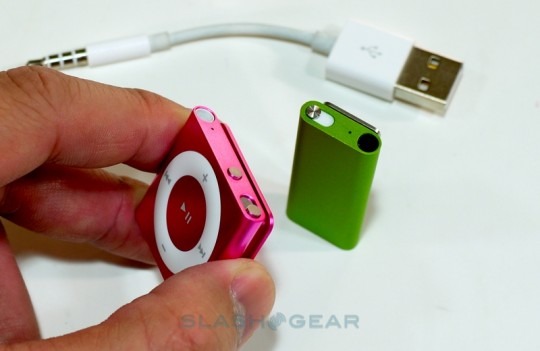
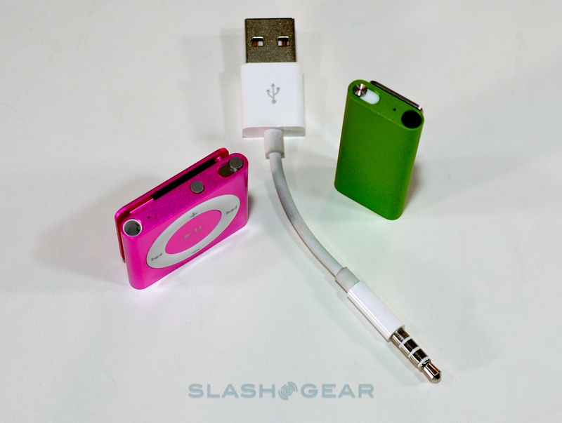
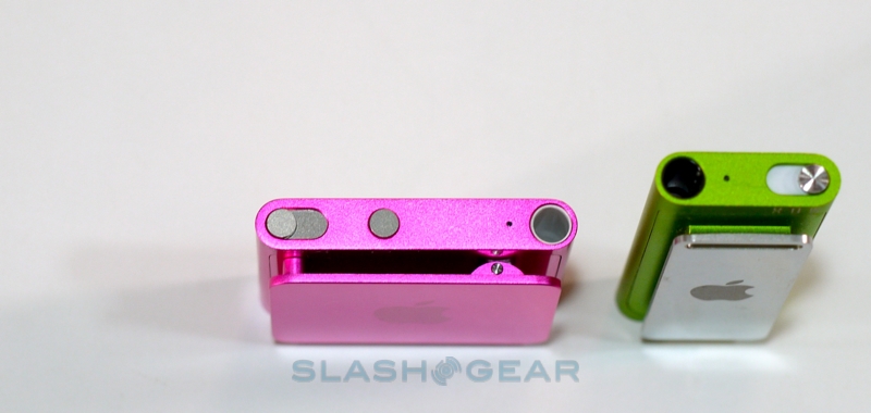
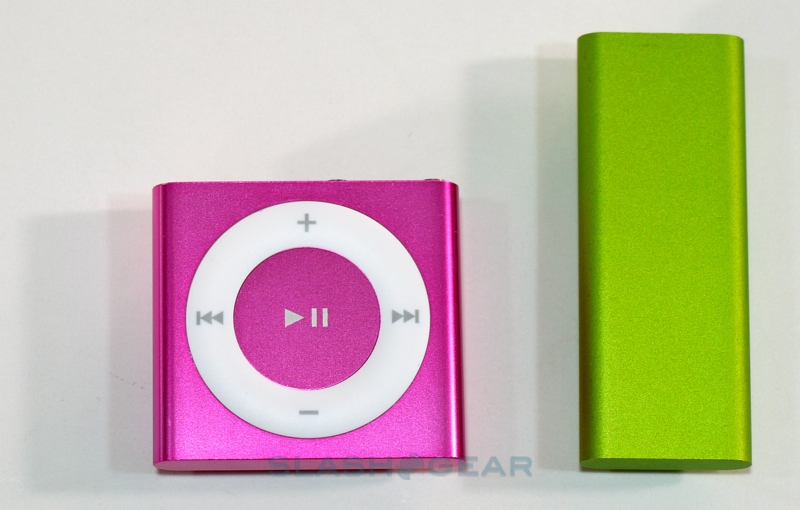
Measuring 1.14 x 1.24 x 0.34 inches, the new shuffle gains back the hardware controls its most recent predecessor did without. Apple still includes VoiceOver, their text-to-speech engine that can announce track and album names, playlists and battery status, but primary playback control is down to the clickable control pad that dominates the front of the iPod. Despite the apparent similarities, it's bigger than before – 18-percent larger, Apple tells us – with a center play/pause key, volume up/down on top and bottom, and skip/rewind on left and right. Up top there are two further controls, a three-position switch which powers the shuffle on and into either regular play-in-order mode or into the eponymous shuffle mode, and the VoiceOver button.
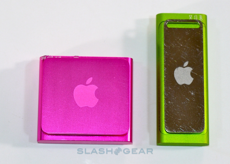
Finally there's the 3.5mm headphone socket – which doubles as the data port for synchronizing with iTunes with the included USB cable – and a small LED that shows battery and sync status. The whole thing measures 0.44 oz and is crafted out of anodized aluminum in one of five colors: silver, blue, green, orange and pink; on the back is the by-now traditional clip, complete with Apple logo (and where any optional engraving is positioned) to hook the iPod shuffle to your lapel, purse, bag strap or anywhere else.
As you might expect, using the iPod shuffle is pretty straightforward; general playback is handled by the buttons, while clicking the VoiceOver key once announces the currently-playing track and artist, pressing and holding lists the available playlists, and clicking twice reads out the status of the battery. Apple only offers one model – with 2GB capacity – so it's unlikely that the contents will ever get to the stage where managing them is too unruly with audio as the only guide.
Of course, with iTunes the shuffle is a more flexible PMP than rivals, with the software being used to set up playlists, create Genius Mixes that – presence of tracks on the shuffle itself assuming – can then be played while on the move, and even load new languages via the VoiceOver Kit. If you've always wanted your Italian MP3s to be announced with an authentic accent, the shuffle can do it. Finally, you can use the shuffle as a basic flash drive.
It's hard to go wrong, and Apple's lengthy battery claims – up to 15hrs of solid audio playback – panned out. Considering the iPod is recharged whenever you plug in to re-sync, we found we were more likely to exhaust our particular batch of tracks before we exhausted the battery. At $49, we can forgive the absence of a USB dock – a neat inclusion with the second-gen shuffle – though it's always worth remembering that there's an Apple premium to be paid: if you don't mind losing the fashion appeal, the sturdy casing and VoiceOver, you can find more capacious rivals some of which have LCD displays for less money.
iPod nano
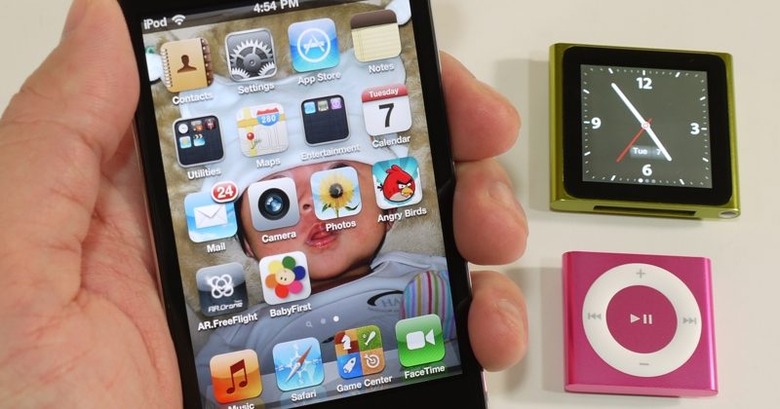
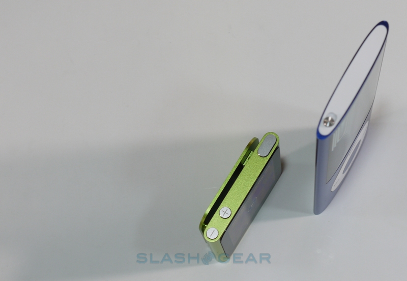
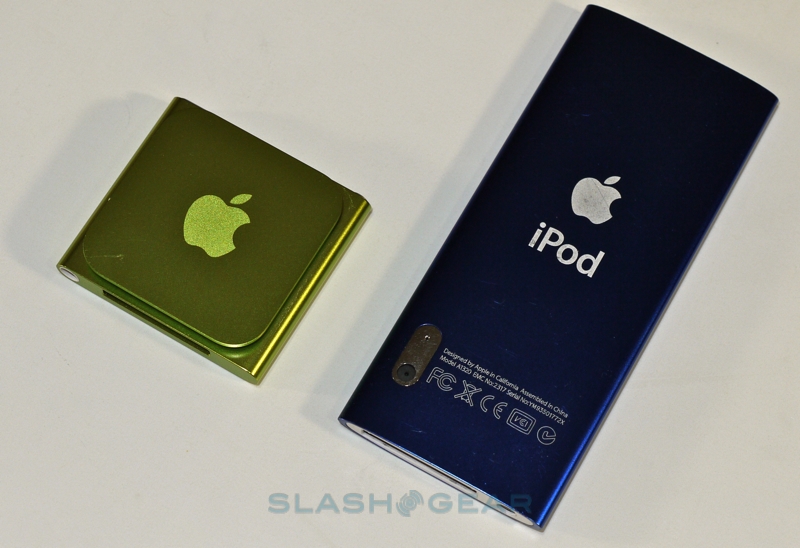
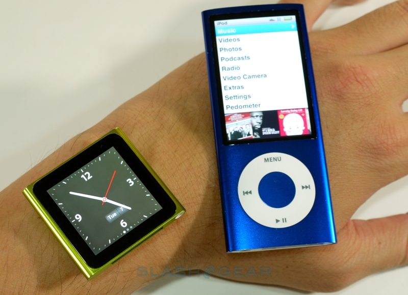
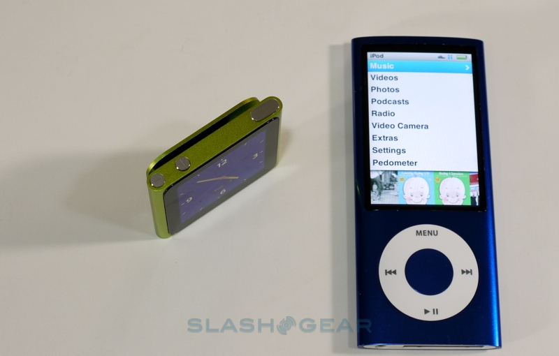
The fifth-gen iPod nano has seen the biggest changes of this season's new models, ditching its predecessor's long-and-thin aesthetic for a shuffle-like squareness. While it may look like the shuffle with a screen, it's actually significantly larger: 1.48 x 1.61 x 0.35 inches and 0.74 oz. That allows for a 1.54-inch 240 x 240 multitouch-capable color display to be included on the front, as well as a standard Dock Connector on the bottom. At the back is a spring-loaded clip, again with the Apple logo and space for engraving, while the only hardware controls run across the flat top edge: volume up and down, and the sleep/wake stud. On the underside, next to the Dock Connector, is the 3.5mm headphone jack.
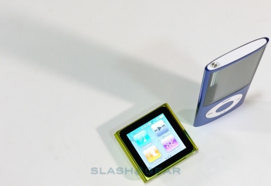
Apple is known for their iOS software – as found on the iPhone, iPod touch and iPad – and unsurprisingly they've borrowed the UI theme for the new iPod nano. That's not to say it's actually iOS running on the PMP: there's no App Store or on-device iTunes downloads, for instance. Still, it makes for a straightforward usage model for anybody familiar with the company's other mobile devices. Neat touches include swiping left to show the full artist, track or album name if it's too long to be shown all in one go, and large letters superimposed on the display as you finger-scroll through a long list.
The compact display shows four icons at a time, with four different screens that can be swiped through; as usual, pips at the bottom of the screen show which pane you're looking at. Time, playback status and battery status run across the top, though there's a full-screen clock app with stopwatch and timer but no alarm. You can also set the iPod to briefly show the analog clock when you initially hit tap the wake button.
By default, the first screen shows Playlists, "Now Playing", Artists and Genius Mixes (generated by iTunes and synchronized across) while the second screen has Radio, Podcasts, Photos and Settings. Drilling down into more specific tracks is handled by the third pane, which has Songs, Albums, Genres and Composers, while the last screen offers Fitness and Clock. Tapping and holding on any one of the icons eventually sets them "jiggling", as on the iPhone's homescreen, and you can then drag them around to reorder the panes according to your own preferences.
You might have noticed that video is conspicuous by its absence, and that's because Apple has made some feature sacrifices in order to slim the nano down to its compact dimensions. Gone is the fourth-gen nano's video playback and camera; now, if you want to shoot photos or video with your new iPod, you'll need a fourth-gen iPod touch. To be fair, the smaller display of this new nano doesn't especially lend itself to video content: it would be too small to enjoy even a TV episode, never mind a feature-length movie. The average YouTube clip might be more manageable, but then Apple would have to add in WiFi, pushing up price and bulk.
We were never entirely convinced by shooting video with our nano; doing so with a cameraphone always seems more useful, what with their ability to instantly upload the footage for sharing. This audio-centric focus has given Apple the room to better explore the music experience, too. Cover art looks great full-screen – there's a rudimentary photo viewer as well, which eschews multitouch pinch-zoom for a simpler double-tap-to-zoom system and swipe navigation – and the addition of VoiceOver from the iPod shuffle means you needn't retrieve the nano from wherever you've clipped it in order to check the currently playing track.
Navigation takes a little getting used to, especially since there's no home button: instead you press and hold at a point in-between any onscreen controls. It's certainly possible to cradle the nano in the fingers and thumb away at the touchscreen, though we had better results doing things two-handed. An accelerometer not only flips the display orientation – useful if you've clipped it on upside down – but also allows you to shake-to-shuffle for randomized playback. The various EQ settings, audio crossfading, volume limits and other settings have been carried over from the previous model, as has the TV-output support (with the appropriate adapter, and of course you can't play video).
Integrated is a pedometer – for simply counting steps – together with a Nike+ receiver for the more ambitious exerciser. As before, Nike+ automatically tracks your workout routing, announces feedback over the top of your playlists, and then lets you sync the results to an account at nikeplus.com. If you replace the standard iPod headphones – and you probably should – with a set that includes a microphone, you can record voice notes, plus there's an FM radio with "Live Pause" for pausing or rewinding up to 15 minutes of the broadcast (though not save that clip and turn it into an MP3).
Audio quality is as good as the content you provide the nano with: high-bitrate files obviously sound better than their lower-bitrate counterparts. A bigger difference can be had by swapping out the headphones for an aftermarket set, though thanks to the Dock Connector you can drop the iPod nano into your existing speaker-dock and play back music that way. Two versions are available – with 8GB ($149) or 16GB ($179) of flash memory – while Apple suggests up to 24hrs of audio playback from a full charge. That presumes the display is switched off; if you're browsing cover art or flicking through photos, you'll see less.
iPod touch
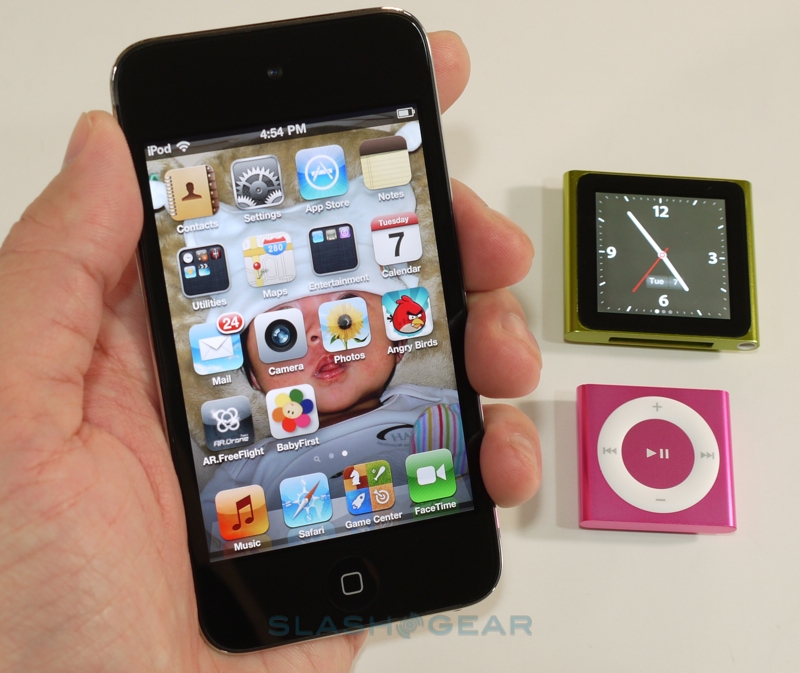
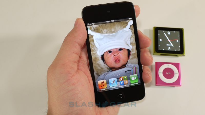
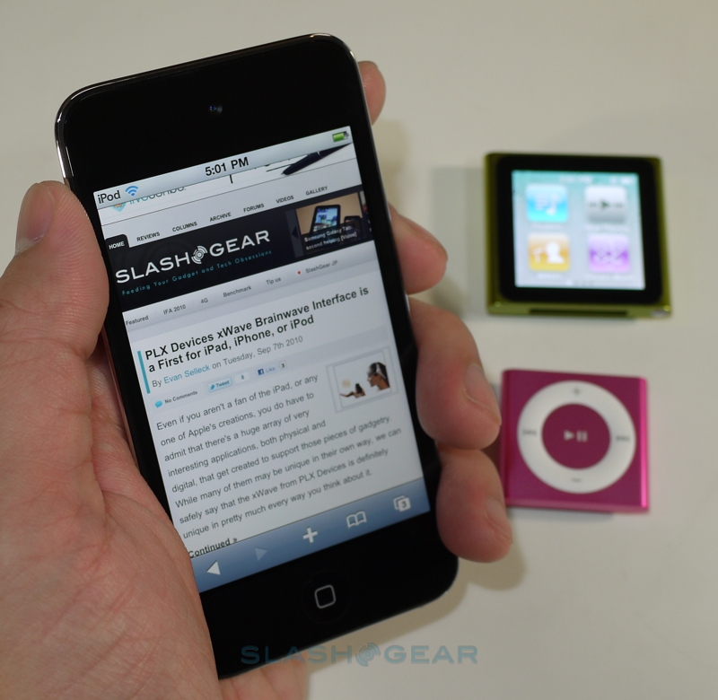
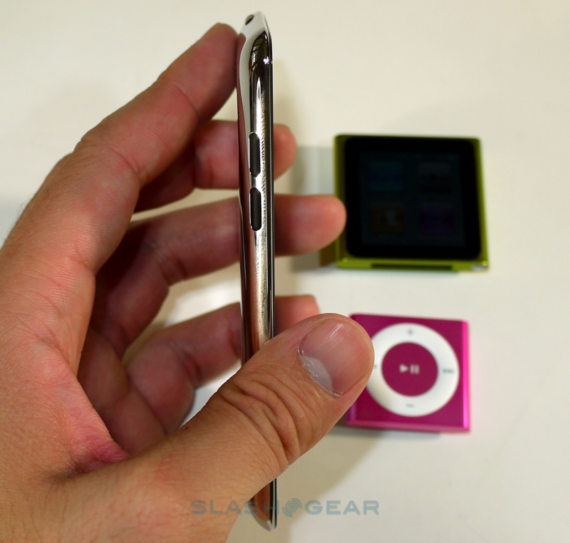
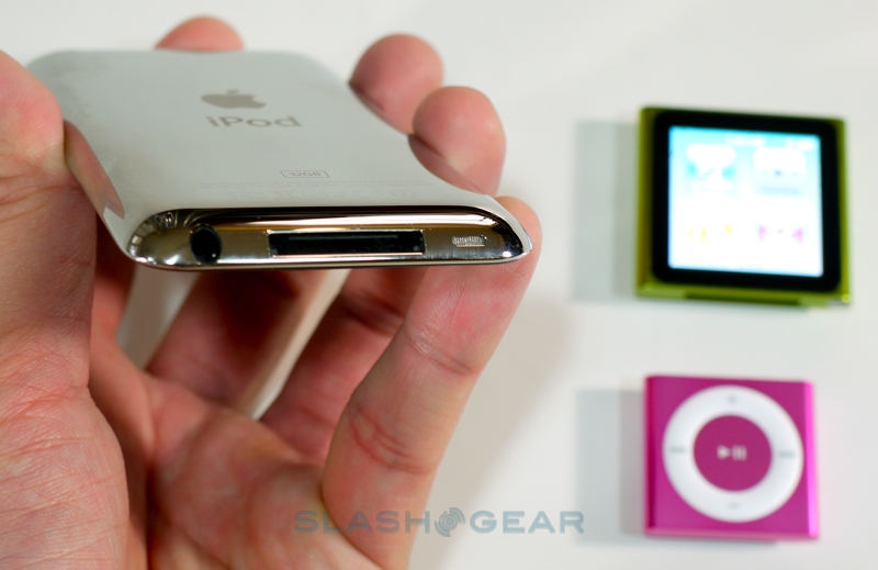
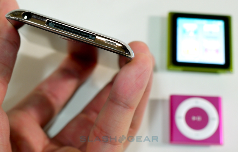
The gap between the iPod touch and the iPhone continues to decrease, with this fourth-gen version of the Apple PMP gaining the headline functionality of its fourth-gen cellular sibling. Amazingly it's even thinner than the waifish model it replaces, down to just 0.28-inches and 3.56 oz, still with a premium-feel stainless steel back plate and black glass fascia. Controls are as before, a home button under the display, sleep/wake on top and volume on the left hand side; the Dock Connector and 3.5mm headphone socket are on the bottom.
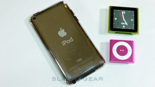
Most eye-catching is the 3.5-inch Retina Display, carried over from the iPhone 4 and just as impressive on the new iPod touch. At 960 x 640 resolution – totaling a luxurious 326 pixels per inch – it's everything Apple's hyperbole could say about it. Color-rich, with fonts as smooth as print and bags of contrast, it's tough not to fall in love at first glance. Multitouch support is obviously present, as is WiFi b/g/n (802.11n using the 2.4GHz band only) and Bluetooth 2.1+EDR: no GPS, though the touch can triangulate position using known WiFi networks nearby. Finally, gamers should be excited by the new three-axis gyroscope, which offers vastly more accurate positioning information.
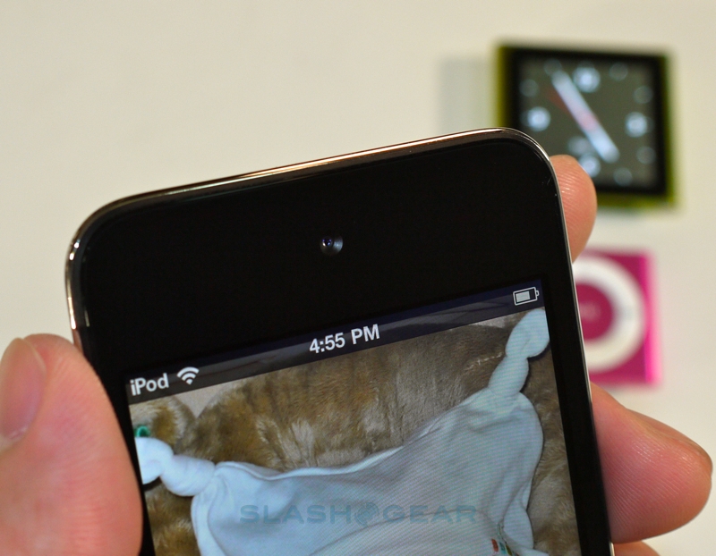
Once you've gotten past the Retina Display, you might notice the small lens peering out from where an iPhone 4's earpiece would be. The new iPod touch gets two cameras: one, a front-facing VGA camera for FaceTime calls, and a higher-resolution camera on the back capable of 720p 30fps video recording or 960 x 720 stills. The FaceTime support is something that's been rumored since the service was first announced: offering, as you'd expect, not only touch-to-touch video calls but touch-to-iPhone 4 calls, it opens up Apple's system to a segment unwilling or unable to sign up for a cellular contract, yet who want to get in on the fun. Initiating FaceTime calls remains straightforward, tapping the contact and then flicking between the two camera views when connected by touching the display.
iPod touch FaceTime hands-on:
[vms 3eb46aef576537e9d56d]
That familiarity is because the iPod touch runs iOS 4.1, just like the iPhone 4. Apple's iOS platform has matured nicely, with multitasking, background audio support and plenty more, and of course there's the capacious App Store with its hundreds of thousands of free and paid applications. One of the most anticipated elements of iOS 4.1 is Game Center, Apple's social gaming system that can automatically pair players according to their ability. Unfortunately Game Center wasn't live during our review period, so we'll revisit it and cover it separately later.
The multimedia experience on the new iPod touch is much as you'd expect from the iPhone 4. Apple's cover art enriched UI has become a benchmark for usability among PMPs, and with storage up to 64GB (8GB and 32GB versions are also available) there's no shortage of space for content. Video looks incredible on the Retina Display, while audio performance is also strong; we'd recommend picking up a replacement set of headphones to make the most of it.
Apple integrate their new Ping social networking client into the iTunes app on the iPod touch, allowing you to follow friends and artists, track popular songs and videos, leave comments and talk about content you've just bought. It integrates with iTunes 10 on the desktop, and is a reasonably slick way to find out what new music friends are discovering or re-discovering.
The iPod touch's dual cameras can each be used for video or still recording, unlike the video-only camera on the previous generation iPod nano. As with the iPhone, the rear camera is capable of shooting 720p HD video clips (you can also tap to flick to the front-facing camera, though the quality is only VGA resolution). Video is certainly the iPod touch's primary strength; if you want an Apple mobile device for still photography, then you should opt for the 5-megapixel iPhone 4 since the touch tops out at 960 x 720.
Apple quote up to 40hrs audio or 7hrs video from a fully-charged iPod touch, though what with the PMP's inherent flexibility – don't forget there's a browser, email app, Google Maps and FaceTime on there too, and that's before you start wading through the App Store – it's unlikely you'll be doing any one thing solidly. Still, we found we were comfortably able to get through a couple of days very heavy use, with a mixture of audio and video playback, browsing, some FaceTime calls and third-party applications. Considering the 7.2mm thickness that's highly impressive stuff.
Summary
It's clear with the 2010 iPod range that Apple has gone back to basics with their media players. Music is at the core of the iPod line-up, whether you're looking to simply carry a few albums' worth of tunes on a commute or at the gym, have a bigger audio collection, or prefer the flexibility and – thanks to the App Store – nigh on limitless potential of third-party software. Plus, it's all wrapped in Apple's iTunes ecosystem.
The iPod shuffle is a solid bedrock for that ecosystem: yes, there are MP3 players cheaper, but they don't have the same integration with iTunes and the iTunes store that the shuffle offers. At $49 there's a premium to pay for the Apple brand, but you're also getting superlative build quality, the convenience of VoiceOver and surprisingly lengthy battery life.
As for the iPod nano, that's the most changed of the three new models, and while the omission of video playback and the camera may disappoint some, overall it's a significant step on from the previous generations. Apple's iOS UI – even without iOS actually behind it – is a far more intuitive and effective way of interacting with the nano than the click-wheel before it, and that's before you even get to the gear-lust feel of the hardware itself. The iPod nano is incredibly tactile, well built and a suitable step up from the shuffle; the exercise-friendly pedometer, FM radio and Nike+ integration are icing on the cake.
Finally, the iPod touch, and if ever there was a device to overshadow the iPhone 4, this is it. It's tough to imagine Apple being able to shave anything more from the touch, and a brief hands-on with the PMP is enough to convince most that the Apple premium is worth it. $229 for the 8GB model is a step up from the iPod nano, true, but you're getting a whole lot more potential for your money. Apple's new $0.99 TV shows come into their own on the 3.5-inch Retina Display, which is perfectly proportioned for making the most of commutes, lunch hours or time in-between lectures, or of course there's the A4 processor to drive high-resolution games from the App Store.
That's three tiers each varied by consumer needs, and each with music at its core. As a line-up, it feels more structured than previous generations, and certainly truer to the original iPod premise. Yes, there are cheaper ways to make your music mobile, but Apple's range continues to be the most rounded in terms of hardware, software and content support. In the iPod nano, Cupertino has created a little gem with the usability of larger devices but at a new level of affordability, while the iPod touch has bridged the gap between PMP and smartphone even more. The tough part is choosing between them.
iPod touch, nano and shuffle hands-on video:
[vms 0a577928b76d2fc3edc2]
