iPhone X Keyboard Gap: There's A Reason For That
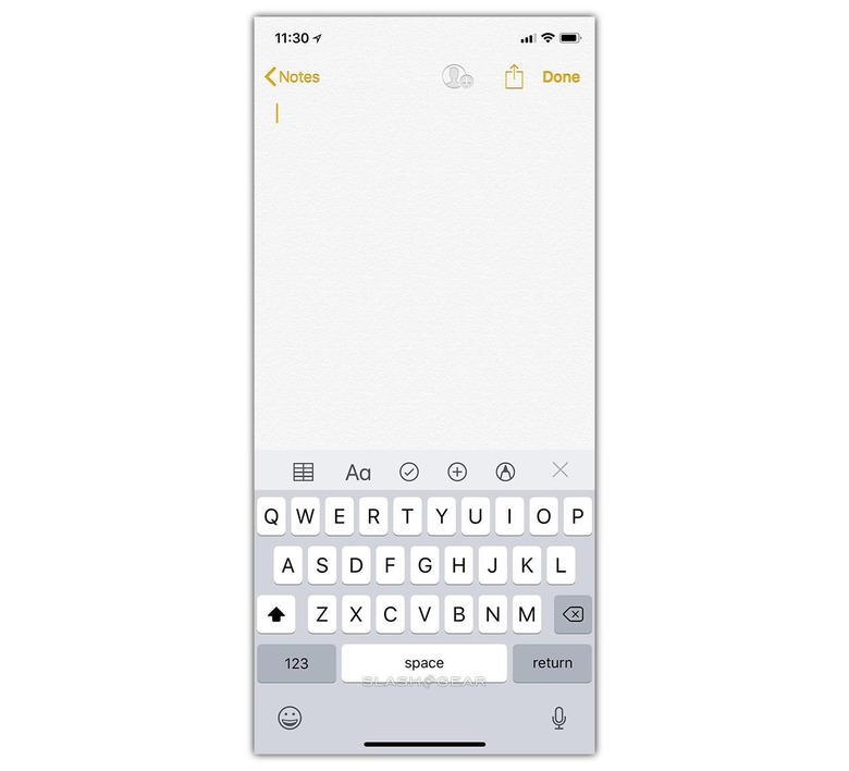
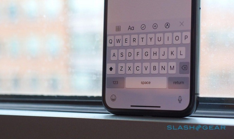
The iPhone X launched last week, and it represents a big change from what iPhone users are used to in a handset. Some of these differences are much more obvious than others – the edge-to-edge OLED display and the missing home button will be the two differences that are immediately noticeable for many. However, there are plenty of smaller changes to be found within the iPhone X, and one that has been getting some attention is the new look of the iOS keyboard.iPhone X users have noticed that their keyboard features a rather large (and rather empty, for that matter) space at the bottom – an area that doesn't appear in iterations on other iPhones. If you're an iPhone X user and this empty space has left you scratching your head, you definitely aren't alone. There are, however, two big reasons why Apple included it.READ MORE: iPhone X Review
The first and best reason is that it brings the keyboard closer to the middle of the screen. Had the keyboard been at the bottom of the display, it would have been more difficult to balance the phone in your hands as you type. When the iPhone X has a fragile glass back that's expensive (and difficult) to replace, that's an important thing to consider.

The second justification for that empty space is that it makes the transition between other iPhones and the iPhone X more seamless for the end user. That space brings the keyboard to about where it is on other iPhone displays, thereby accounting for the bezel that's no longer there in the iPhone X.
So, those are two fairly good reasons for using empty space at the bottom of the iOS keyboard. Of course, that doesn't mean that the space is utilized well – it would be much better for Apple to put something like frequently used emoji there instead of just leaving it mostly empty. Perhaps we'll see Apple utilize it better in future releases of iOS? One can only hope.
