iPhone 8 Concept Asks How Will Apple Embrace OLED's Key Advantage
The Galaxy S8 currently sports the best display on the mobile market, but that may change when Apple unveils the anniversary edition of the iPhone next month. The phone, which is being called the iPhone 8 at the moment, is rumored to sport an OLED display, and with that display will come a new world of potential UI changes. We've seen many renders of the anticipated phone over past months, but this latest one poses a unique question: what, if any, UI changes will Apple make to leverage OLED's key benefit?
All signs, including a recent solid discovery, point toward the iPhone 8 (or iPhone Pro, if you prefer) featuring an edge-to-edge display not unlike what is found on the Galaxy S8. At the same time, the phone is expected to have a large display, and with such large displays come navigation troubles. Trying to stretch your thumb to the top of the display on any large handset, including the biggest current iPhones, is impossible.

A long editorial recently published on Medium highlighted this issue, and posed a question about whether Apple should (or will) replace the iOS navbar design with something more thumb-friendly. That post itself went on to inspire a new set of concept renders imagining different ways Apple may tweak the iOS user interface...and in ways that may be specifically facilitated by the inclusion of OLED.

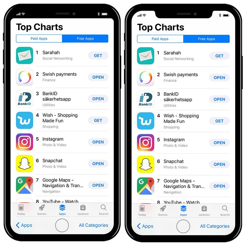
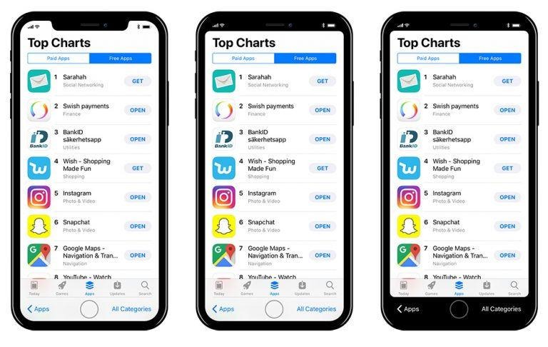
Taking recently to his blog, product designer Max Rudberg published his concept images that show different ways Apple could change up iOS. One, as shown above, features a 'notch' at the top of the phone wherein certain icons, like battery and WiFi, are nestled alongside the front camera and ear piece.
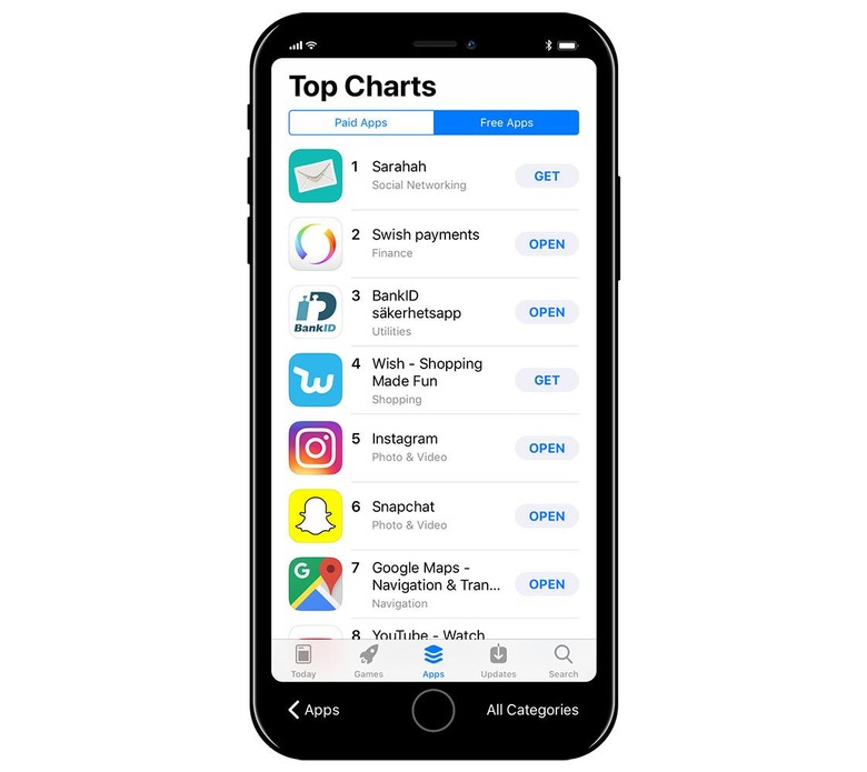
The second shows that same general idea, but with the entire upper portion darkened so that it appears to be solid. Both feature a back arrow and menu/category selector on the bottom where the user's thumb could easily reach them.
The third concept image is the same, but it likewise darkens the bottom portion of the display so that it is seemingly solid, though the back button and category selector remain. Though there's nothing to say that Apple will implement anything that resembles any of these concepts, it is interesting to see some of the popular UI tweak suggestions in a realistic form.
