iPhone 5 More @ Less Concept Phone Cuts The Bulk
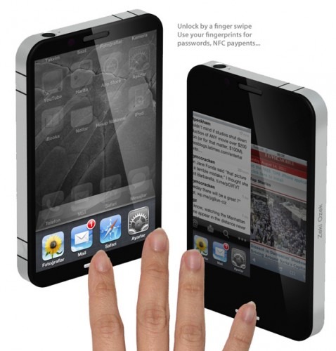
Though you may think your iPhone is already as small as its going to get, industrial designer Zeki Ozek has a different idea: cut MORE off of the non-display hardware off than the already ultra-minimalistic iPhone 4 already has, taking a page out of Android's next OS version Ice Cream Sandwich's book of button-less workings and adding on gestures. Changes in this hypothetical device include OS changes as well of course, including the ability to assign one app to each of your fingerprints – if there's one thing I want in life from a future phone, it's that.
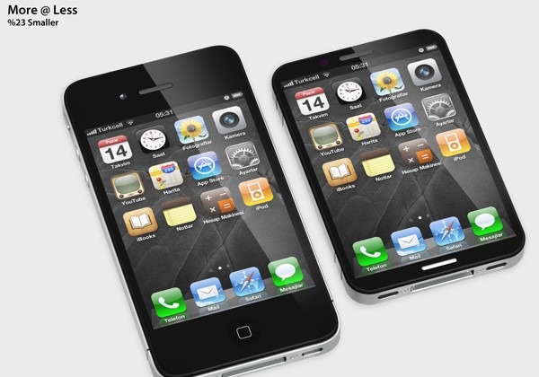
I must remind you, as I always try to, that when we're looking at a concept device like this , especially one with technology that hasn't been invented or finalized quite yet, that it's more of an exercise in wild possibilities made for the sake of inspiring future generations of inventors and scientists, not to mention other industrial designers. This iPhone 5 concept is what Ozek says is 23% smaller than the current model iPhone 4. With the current requirements for hardware inside the device as it is, such a reduction is not possible – but imagine if it was! Someday we WILL have the Zoolander phone, I assure you.

Then there's fingerprint associations – each of your fingerprints can be scanned and assigned to an app, scanning your fingerprint twice revealing a second set of apps like tapping the station button on your car radio. This tech isn't that far off – remember the Motorola ATRIX 4G has a fingerprint scanner on it in place to unlock your device – no big deal! Then there's NFC of course, built in and unlocked again by fingerprint so no-one can run around tapping your phone to tills without your knowledge. That little white bar at the bottom of the device is the scanner for all fingerprint actions.

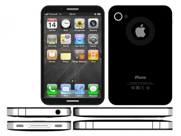
The back of the device has a nearly-invisible ring around the Apple logo, this ring a pinwheel that you can use in a very similar manner to the classic iPod. The squares along the side and top of the device are stealthy buttons for volume (along the side) and gaming if you like – the top button is of course the power/sleep button. The front of the device is flat, the back has a tiny bit of a bump to it, and it appears that the front and back still have cameras.
Seem at all realistic to you? I sure wouldn't mind the volume buttons as gaming controls.
[via Yanko Design]
