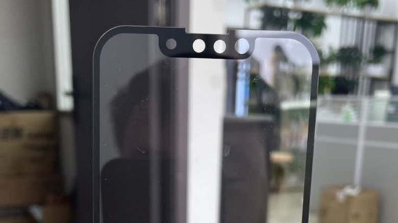
iPhone 13 Notch Size Compared To iPhone 12 Looks Significantly Smaller
Some say you sometimes need a bit of perspective to really appreciate how things are. In the case of subtler design changes, you often need a comparison to really see the difference. This year's iPhone is expected to remain mostly unchanged from last year's design except in one or two aspects, and these latest real-world photos show how the iPhone 12's notch looks almost gigantic compared to the more refined cutout of the iPhone 13.
That the iPhone 13 would have a smaller notch is no longer news. We've heard word about it from numerous leaks, including those that give the dimension of the notch. We've even seen a rough dummy model that tried to put that into perspective but this latest set of photos give a clearer view of those two notches side-by-side.
Twitter user @DuanRui shared photos supposedly taken from Weibo that showed what might be a screen protector for the iPhone 13. It clearly shows a redesigned notch, with holes for the various rearranged from their earlier locations. Most striking, however, is how much smaller that notch really is when compared to last year's iPhone generation, finally giving iPhone users some relief over how much screen real estate the older notch design wasted.
— DuanRui段锐 (@duanrui1205) April 17, 2021
It has also been reported repeatedly how these changes were made possible by relocating the speaker to the top edge of the notch instead of right in the middle. There's also talk about how the TrueDepth camera's receiver was moved also to the edge, helping make that notch narrower as well.
Despite this small but significant change, it is clear that Apple isn't moving away from that notch design any time soon. It isn't moving away from square camera bumps yet either, at least not on the iPhone 13 mini, though it might rearrange the sensors a bit on that side as well.
