iPad Multitasking In iOS 9 Is Surprisingly Simple (But Huge, Too)
Multitasking for the iPad was an iOS 9 feature that prompted whoops of excitement in the WWDC 2015 keynote, but it was quickly followed by concerns that upgrading existing apps might be a nightmare. Turns out, Apple has been eager to explain during its developer event, that couldn't be further from the truth. In fact, if anything the psychological change required is greater than the coding alterations, something which could have big implications for the much-rumored iPad Pro.
For the user, multitasking works much as you'd expect it to. With a full-screen app on your iPad, sliding in from the right pulls in a second. You can leave that in a narrow bar on the side, or drag the divider further – settling on a 50/50 split, perhaps, or shrinking the original app even more – until the second app takes up the whole display.
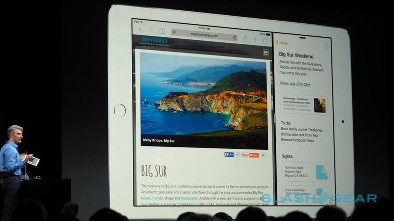
From the perspective of developers, the code changes are small but fundamental, and demand a reconsideration of how space is measured on the tablet. Currently, apps look to the dimensions of the physical screen to establish their boundaries; to be multitasking-enabled, they'll need to instead consider the bounds of the window that they're in.
That window could be full-screen, but it could also be half of the panel, or a narrow column to one side. What Apple is encouraging is that developers stop thinking about screen size as an absolute, indeed to stop thinking of iPhone and iPads as distinct, and instead consider whether software is "compact" or "regular" width.
A "compact" width app is effectively how an app looks on an iPhone in portrait orientation. A "regular" width app, meanwhile, is broader, as on an iPad in portrait orientation. There're also landscape layouts which, on the iPad and the iPhone 6 plus (in certain apps, like Messages and Mail), combine two columns.
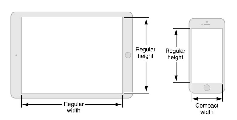
In short, as you drag a secondary app in from the right, it first fills its narrow column with a "compact" app layout. As you keep dragging, that expands until it switches to a "regular" layout.
There are a surprising number of considerations along the way. How external displays are handled, for instance – the primary app, as in that which was full-screen to begin with, gets sole access to a wired or AirPlay-connected TV until the secondary app is expanded to cover the whole panel – or what happens to important elements of your app's UI if the other app it's sharing a display with calls the keyboard.
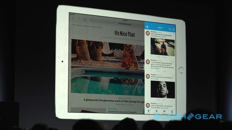
To smooth the way, Apple has thrown in a few helper APIs. iOS 9 is clever enough to figure out when to switch between "compact" and "regular" layouts, and there's a new legibility API that automatically adjusts the margins so that blocks of text are corralled into easily-read columns rather than allowed to go sprawling across the full width of the display. Those columns neatly adjust themselves as you slide in or adjust a second app.
Floating pop-up windows can either be left as-is if there's space for them, or expanded to fill a shrunken column if screen real-estate gets tight. Apple has a selection of button options, both to help navigate when pop-ups are suddenly full-window, and to push important controls up above the keyboard should that suddenly monopolize the bottom half of the display.
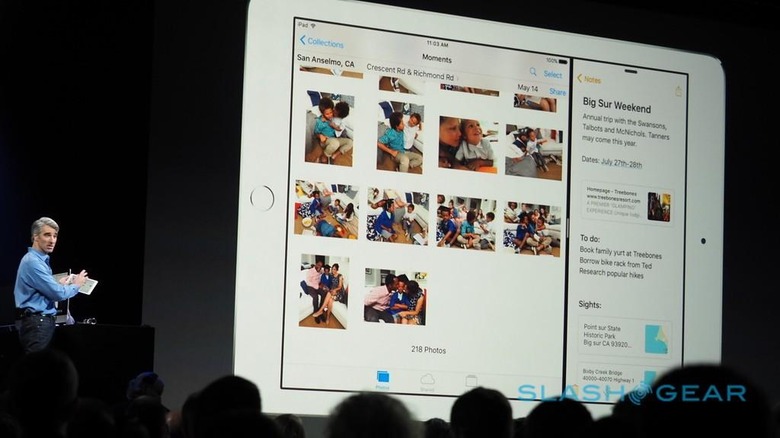
In short, as long as developers have already written their apps in the adaptive manner, then updating it to support multitasking could be an hour's work or so. If you've been slow to embrace adaptive layouts, however, the challenge – and the potential benefits you're missing out on – has just become even bigger.
While nobody at Apple is – publicly – talking about it, it's hard not to see this embracing of multitasking as being another step on the path to a more business-focused tablet, perhaps the iPad Pro that's been so often rumored over the past few years.
Just as last year Apple paved the way for the iPhone 6 Plus and the iPad multitasking announced for iOS 9, so WWDC 2015 opens the door for a potentially even greater range of screen sizes. By encouraging developers to stop thinking of actual display dimensions as the be-all and end-all of app design, and instead to create software that flows at its best across any size and layout, Apple could easily slide a larger iPad Pro into the range with minimal app headaches.
For the moment, though, the advantage will be a far more user-friendly iPad Air 2 – sadly earlier iPads won't, officially, support the multiscreen feature – and a little homework for developers to do before iOS 9 is officially released this fall.
