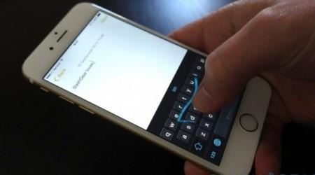
iOS 8 Third-Party Keyboards Aren't Great - Yet
Choice is a magnificent thing, but comes at a price. Sometimes that price is severe, and sometimes it's $1.99. In downloading several popular third-party keyboards for iOS 8, I made several "choices". As it turns out, you might want to hold off for a bit.
Let me first temper this article by saying I consider the option to have keyboards in iOS 8 fantastic. I come from an Android background with iOS, so keyboards are fantastic to me. The problem is... they're the problem.
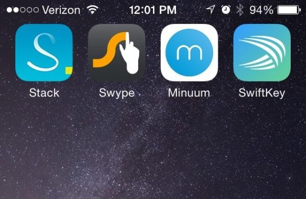
I initially downloaded several keyboards to write a "here's the best new keyboard for iOS" type of article. In testing out the various keyboards on offer, I found that three things were true: how you type should drive the choice, what you use should dictate change, and gimmicks are still gimmicks.
I also discovered that a bit of patience may be the best thing for iPhone and iPad users. Though all the keyboards tested offer a fresh take, none made a significant impact on how I typed. None were particularly faster that what I was using, nor did they offer much in the way of a must-have feature.
Gimmicks suck
I'd like to resist calling keyboards out by name, but it's necessary to illustrate a point here. MyScript is a keyboard that takes your actual handwriting and turns it into text. That sounds neat, and it is — except it's not practical.
On the blank screen, you "write" a letter down, and the app recognizes it. You do it again, and again, until you have a word. Cool, except that you could have accomplished the feat in half the time with a "regular" keyboard. It's also best with a stylus, and who wants to drag a stylus around with them all the time?

What device do you use?
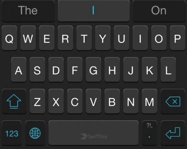
Swiftkey is a fine keyboard — unless you use iPad. One of the things that makes Swiftkey special is swiping, which isn't available for iPad right now. Swiftkey is available for iPad, but the swipe-to-type feature isn't.
So, if you're on the iPad, what's the point of Swiftkey? Sure, an update will fix the swipe issue someday, and that's really the point here. Someday isn't today. Swiftkey, when considered as a cross-platform keyboard, is fragmented. I don't want to remember not to swipe on the iPad.
Type your way
Think about how you type. Now think about how you want to type. Is there a difference? Do you long to actually write, or swipe from letter to letter? Do you wish you didn't have to reach so far for keys? The point is that your choice should be yours, and a big part of that is how you use your device. We don't all type the same way, even though we could.
I, for instance, don't really dig the swipe-to-type stuff. I just plain don't use it much, so I don't seek it out. I'm good at it, and think it's neat, but it's not my thing. For one-handed typing, it can be really helpful. I tried Swype, and it was good for the practice of swiping, but that was about it. The stripped-down nature of Swype left me with no other reason to want to use it.
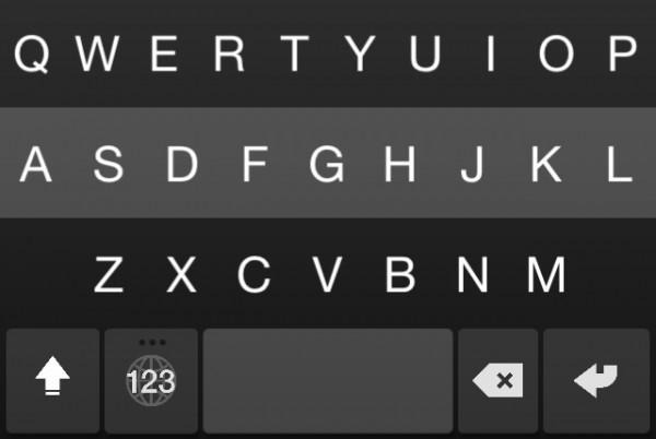
In that vein, I tried Fleksy and Minuum. Neither really do the swipe thing, and both have their own claims to fame. Fleksy is "the fastest keyboard ever", while Minuum makes a home on any device.
Fleksy is super fast — once you learn it. The functionality requires a bit of a learning curve, and a break from intuition. There are some very subtle variances to how Fleksy works, like needing autocorrect to have a double-tap on the space bar for a period to work, or swiping around on the keyboard to make post-typing things like word correction happen.
That typing, coupled with gestures to change words or alter punctuation, are just odd. They take a learning curve, and while I did get the hang of it with dedicated use, Fleksy never quite became intuitive.
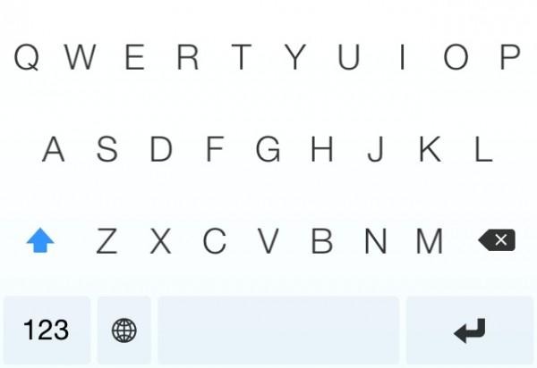
Minuum has one powerhouse move: word prediction. Even in using the minimal feature, Minuum's word prediction was superb. I enjoyed the ability to size the keyboard, but it doesn't size how you want it. Al all-or-nothing proposition means you can either have Minuum full size, or scrunched at the bottom.
If you choose to have it scrunched, expect to be peering around your fingers to find where letters are. You'll end up second-guessing yourself about how to type, which is where word prediction comes in handy, but feeling inferior to a tiny keyboard sucks. Unlike Fleksy, Minuum also lets you tap on a word later on to have it fixed, which was handy for the tiny keyboard experience.
Dance with the one who brought you
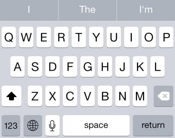
The iOS stock keyboard has grown up, and offers a lot more reason to keep it around this time. Though it lacks the cool factor of swipe-to-type, word prediction and suggestions are fantastic, and emojis are handy when you need them.
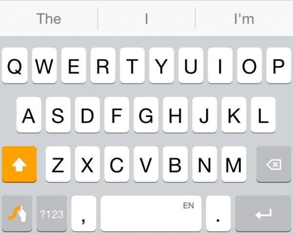
If you're not a swipe fanatic, it's hard to argue against the stock keyboard here. Fleksy has three sizes, which is handy, but using it requires a fairly steep learning curve. Minuum has (arguably) better word prediction, but lacks a polished feel.
What am I getting at?
You have a choice to make. Choosing not to get a new keyboard is also a choice, and that's what I'd suggest you do.
For now.
All of the third-party keyboards mentioned above are good in their own right, please don't misunderstand that. My issue with them is that none of them feel like finished products.
Like email, the keyboard is hard to actually reinvent, so it's not worth thinking anything you can pick up in the App Store does as much. At the end of the day, letters and numbers still need to be tapped or acknowledged in some way, and these all do that in one way or another, with varying levels of success. Cracking on about which iOS keyboard is best doesn't seem fitting, because none of them are great or standout in any meaningful way.
Yet.
