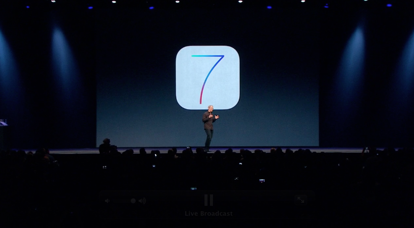
iOS 7 Official With New Multi-Dimensional User Interface
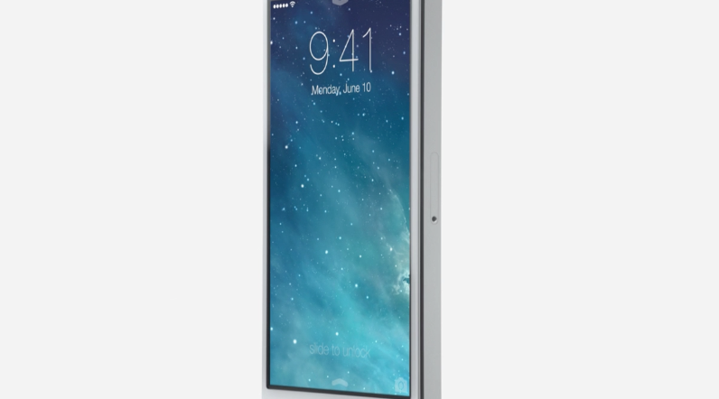
As WWDC 2013 introduced iOS 7, Tim Cook made it clear that this would be the biggest change to the operating system since the introduction of the iPhone. This system update was introduced in kind by a video-based Tony Ive, lead industrial designer at Apple, the man that'd been put in charge of the user experience of iOS earlier this year.
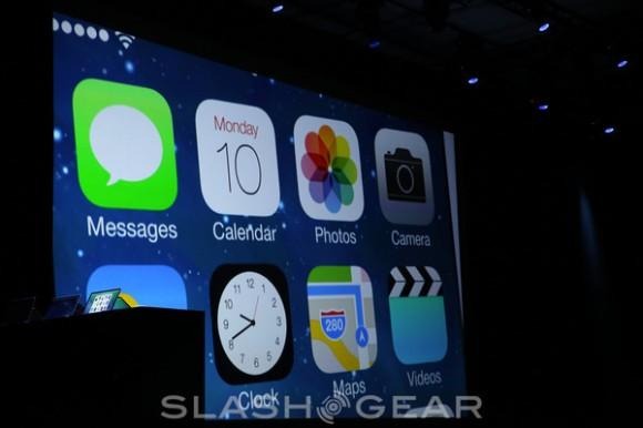
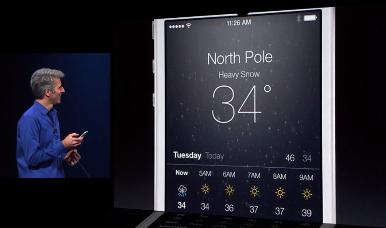
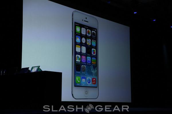
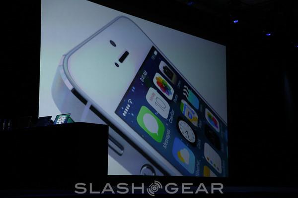
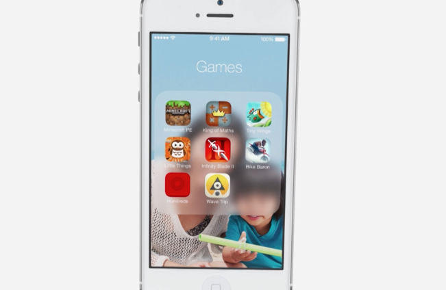
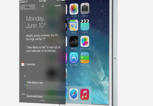
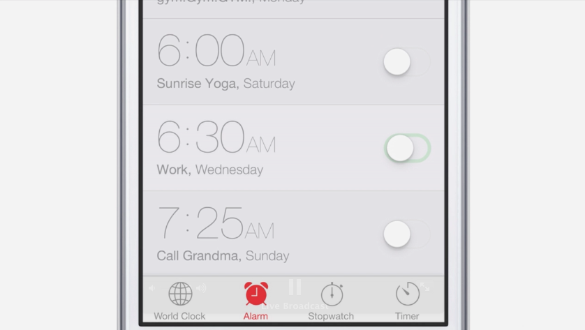
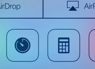
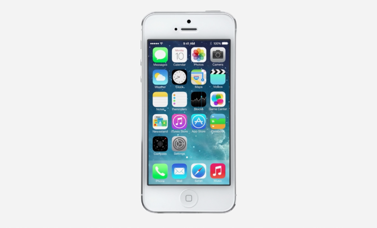
This new system has been refined. Apple's change-over here works at several levels, the first being – yes, you guessed it – a new set of icons. These icons are flatter, work with levels – overlays and transparency – and are made to be a part of a whole new experience for the iPhone.
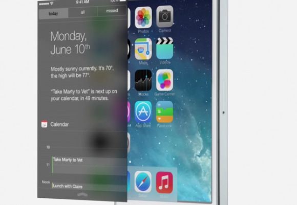
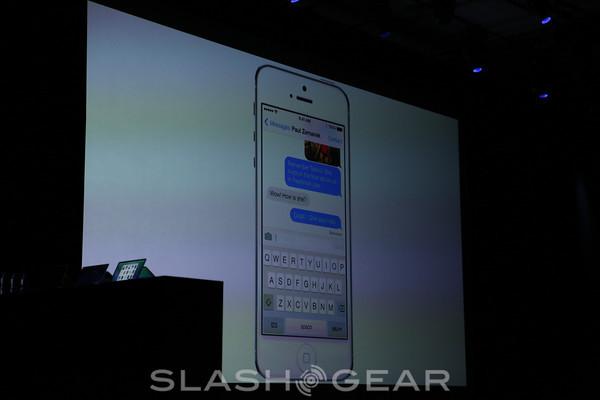
This user interface is made to be "more useful" as well as "more enjoyable" – "from design to engineering". Jony Ive has made it clear that this is "a brand new beginning" for the Apple mobile operating system, taking what Apple had and not just tweaking it, but reworking it on all levels visual.

You'll find iOS 7, the biggest change since the iPhone, in a full guide here on SlashGear imminently – we'll be exploring this system from front to back starting immediately. Stick around in our Apple hub for more all day – and all week – long!
