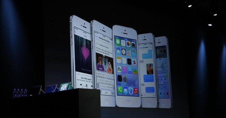
iOS 7 And The Rebirth Of iPhone
WWDC didn't give us a new iPhone, or a Retina iPad mini, but it gave us something far more important: a glimpse of the future of iOS. Opinions on iOS 7 are wildly divided, some iPhone users already converts to the lighter, flatter interface; others shocked by the changes; Android and Windows Phone fans quick to pick apart the elements they see as "borrowed" from their platform of choice. It's still early days – not to mention Apple still has a few months to refine things before the full release – but already I'm confident that iOS 7 will bring me back over from Android, not to mention open the door to some hardware surprises later in the year.
Apple's keynote itself felt a lot more natural and playful than in previous events, the enthusiasm for iOS 7 and OS X Mavericks clearly shining through. In fact, Phil Schiller's "can't innovate" dig aside, hardware news took a backseat to software. The longer-running, Haswell based MacBook Air and the glossy new Mac Pro were interesting, but WWDC is Apple's developer event, and how software would usher in new changes was definitely the core of the show.
iOS 7 is undoubtedly a huge shakeup from every iteration of the platform before it. iPhone and iPad users had been asking for a rethink on how iOS looked, and Apple certainly delivered. It's the biggest example of Jonathan Ive's impact on software to-date, clearing out the skeuomorphism popularized by Scott Forstall.
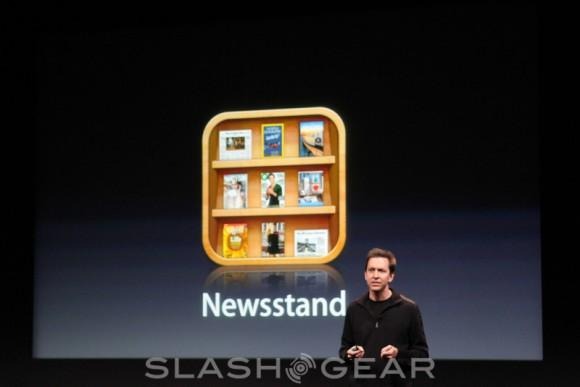
Ive's take on iOS seems to take as its starting point that users no longer need the hand-holding of skeuomorphic metaphor in order to understand their device. Your iPhone doesn't have to work as a mimic of the real world – a paper day-planner, a physical calculator – any more, because today's users are comfortable enough with digital versions. In fact, one of the criticisms leveled at earlier versions of iOS was that its analogs no longer made sense to many of the people actually using the device, who maybe had never actually used a physical planner.
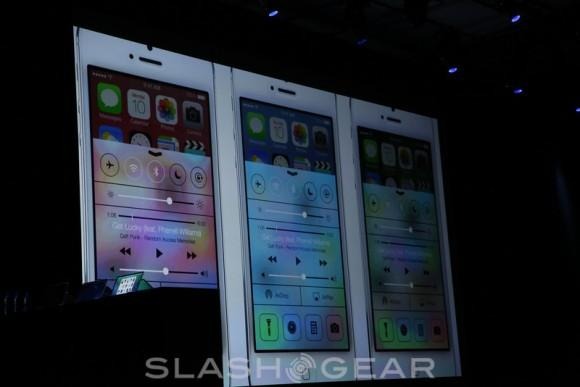
Whatever the motivation, iOS 7 strips away the familiar and replaces it with something brighter, more modern. The new UI manages to look both two-dimensional and three-dimensional at the same time: the icons and newly-minimal chrome are flatter than the fake depth of before, but the different layers of the interface now shift more independently, giving the feeling that you're looking into sliding stacks.
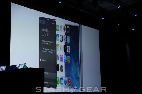
What's particularly impressive, even at this early stage, is how iOS 7 helps address the screen size conundrum. Apple increased the screen size of the iPhone 5 to 4-inches after several generations of 3.5-inch handsets, even then insisted on balancing the expansiveness of the display with what you could comfortably use single-handedly. It's an under-appreciated design decision, especially given the ever-increasing display sizes of rival phones.
iOS 7's new design, color palette, and pared-back simplicity help by making the display feel bigger overall. The slimmer fonts and more minimal UI elements help make more of that 4-inch panel, as unnecessary detail is stripped away to leave more room for the actual information you want. It's still recognizably Apple's handiwork, but it condenses things down so that, while the iPhone 5 may not have a 5-inch or bigger display like some Android alternatives, it doesn't demand such a big screen to accommodate all the information you want to see.
What I'm left expecting, though, is something equally pivotal to run it on. The current thinking is that Apple's next smartphone will be the iPhone 5S, a more subtle update to the existing phone, with a significant refresh waiting until 2014. I can't help but think that Cook, Ive, and the rest of the Apple team won't be able to resist matching the biggest change in iOS since its launch, with a big iPhone hardware change too.
Some of the experience will stay the same. The display is still likely to be a 4-inch Retina panel, since that satisfies that all-important one-handed use issue, but I'd guess at a form-factor that borrows cues from the other eye-catching part of the WWDC keynote, the new Mac Pro. That, with its crisply minimalistic polished aluminum enclosure, is the new pinnacle of Apple's design ethos, and would be a great starting point to build the new iPhone from.

2013 has seen me pulled between iOS and Android like no other year. The HTC One and Samsung Galaxy S 4 each have their strengths, and Google has ramped up on its Android innovation (despite the best efforts of manufacturers to hide it all under custom skins). The arguments over who thought of which design element first, and who did it best, are going to rage well into iOS 7's arrival on the market.

I keep coming back to the question of which device does it best, though. Which phone works most effectively for me; which implements its features in ways that look and operate the most successfully. Already, I'm seeing a whole lot to iOS 7 that signals it will deliver on that; I'm also confident that, as a beta, there will be rough edges that Apple will refine away by the time it's ready for the mass market. Change is never easy, but iOS 7 is the ground-up refresh that Apple needed to keep pushing the mobile envelope. http://slashgear.com/apple
