Instagram Has A New Black-And-White Design In Testing
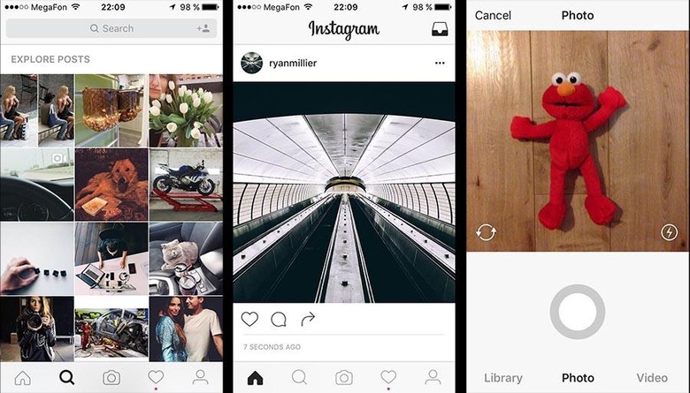
Instagram has seldom tweaked with its design, but that could be changing soon. Screenshots have surfaced showing a black-and-white design that ditches the common blue and other colorful elements in favor of a plain ol' monochromatic theme. Joining the new color scheme are some redesigned icons, as well, indicating that a minor overhaul may be in the pipeline.
The redesign was spotted by Instagram user Anton Abramov; as you can see below, the design changes are simple, clean, and easy on the eyes. Assuming the design shows Instagram's future design intentions, it seems the social network is working its way backward, electing to make the elements as subtle as possible — you'll notice them when you need them, otherwise they're out of the way, making the photos the central content.

Of course, there's nothing that says we'll see any widespread rollout of this design, as it could just be some tinkering going on (mostly) behind the scenes. Instagram hasn't made any official announcement about design change plans, and as expected, has not commented on the screenshots in any significant fashion. In a statement to The Verge, the company merely said it "often test[s] new experiences with a small percentage of the global community. This is a design test only."
As such, don't open up Instagram hoping to find the same design — you'll see the same dark blue bars we've come to love. If you do see the new design (or even if you don't), though, feel free to drop us a note — love it or hate it, or don't really care? Hit up the timeline below for more Instagram news!
SOURCE: The Verge
