Inside The Audi Design Studio
The Design Center houses some of the essential secrets of any automaker. It's rare that outsiders are invited inside to see the inner-workings, let alone see presentations from the designers themselves. Audi invited us to Ingolstadt to tour its new design center, and explain what exactly is involved with bringing the new A7 from idea to production, and how technology has dramatically improved that process.
The center itself is a work of art; indeed, the amount of detail in the structure itself rivals the cars designed within. Audi wanted its designers to be able to work in natural lighting but at the same time keep peering eyes away, since secrecy is core to the development of a new model. To balance those demands, it installed windows that are directional: if you're on the outside, it's impossible to see in, while from the inside there are no obstructions. The materials in the space also remember the finest Audi has to offer, and of course the brand identity is strongly present everywhere.
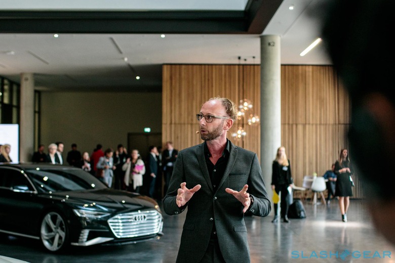
That includes some of the more iconic cars in the automaker's recent history. Entering the building, the two prologue concepts immediately greet us. These cars represent the new identity of Audi, led by Head of Audi Design Marc Lichte. The sharp lines and pronounced grill are what immediately jump out at me, designs that would evolve into the A8, A7, and eventually the A6.
Our first presentation began with an overview of how the initial car design starts with the market orientation and portfolio phase. Is the design right for the current tastes of consumers? Will it be an evolution of an existing portfolio, or something more markedly different? Will it be an SUV, or a sedan, or a coupe, or some combined hybrid? Once those questions are answered they can move on to the vehicle premises and the initial design phase. The designers turn their ideas into something physical. The very rough outline starts with the wheels and greenhouse – the glass of the car, like the windshield and side windows – with the maximum possible scope for freedom of design.
What begins with a sketch on a blank canvas becomes a 3D design extruded from that line drawing. From there, the designers work to refine the shape of the greenhouse and can scale up and down. After that come highlight shaders and light reflections. Indeed, the modeling tools allow the designers to refine the reflections millimeter by millimeter, in the hunt for the most pleasing reflection.
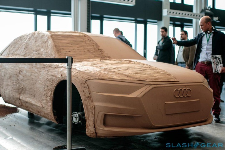
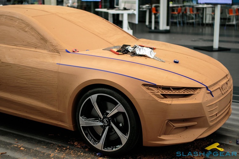
Once the designers are complete with the initial rough drawings, then the drawings are transitioned to the mill. There's an element of surprise once the mill finishes its shaping, since it's sometimes hard to visualize the result until you see in a 1:1 form. It's an iterative process: from the sculpt, the designers will go back to their drawings and refine them until they determine they are complete.
Rendering and modeling can be time-consuming. To help speed up the process, Audi constructed a compute cluster for the designers to use for generating detail and photo-realistic images. Starting with the original 3D model, the material of each surface is defined. From there each pixel is ray-traced within 1.2 seconds to calculate the correct light reflection. This calculation can be done based on the time of day, the environment, color and types of material: there's a virtual courtyard, parking garage, and many other conventional structures, each of which has its own unique lighting signature and within which the virtual car looks different.
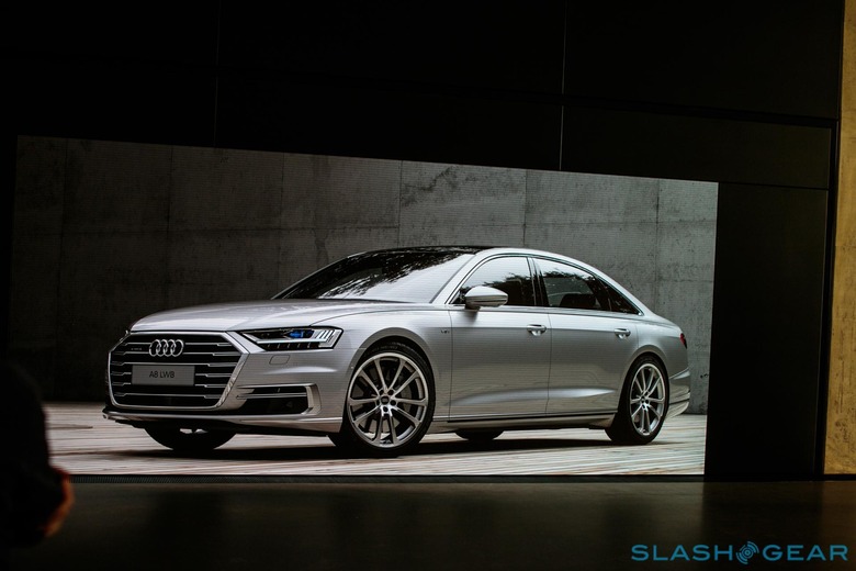
The renders save time as, in the past, this had all been done with models that needed to be constructed and re-fabricated with each minor change. Now, it can be done in real time. Before the cluster was complete, the old way of rendering was inefficient, and it could take anywhere from 2.5 hours to overnight to render a single scene. Today, there's a 360-degree turntable which consists of around 720 photos, allowing the Audi designers and executives to turn the model in real-time to analyze the design. You can start your model at any time during the day and animate the lighting over the course of the day. As the clock moves towards sunset, the car's own lights turn on.
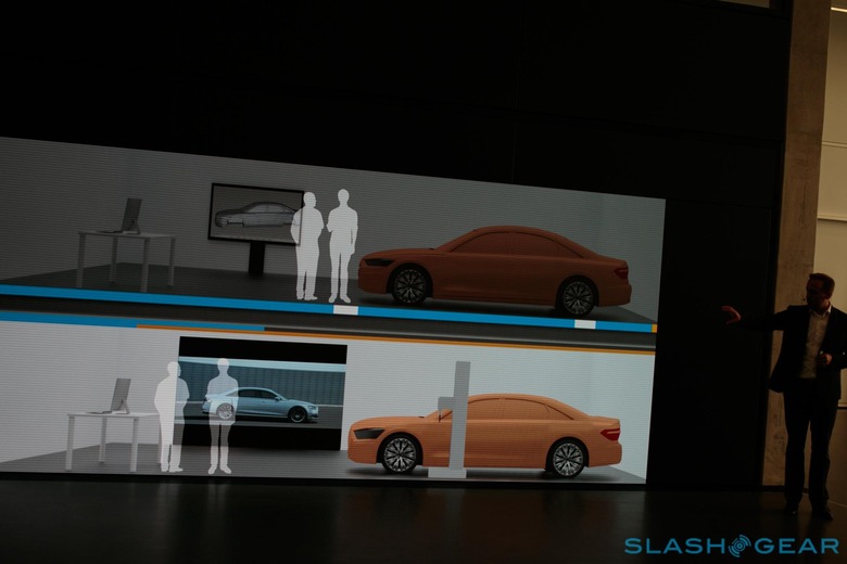
The old process of clay models with a static image on display has been replaced with the 3D image generated by the cluster and a clay model. The 3D model can also been rendered into videos, showing the car within an environment and even alongside another vehicle to help executives visualize how it will look while moving. For the designers, of course, it's essential to choose the best tool for the job. Clay modeling still offers the best results, and it's still what the executives ask for when making final product decisions. Indeed, despite all the investment, Audi feels that VR is not quite ready yet to completely replace the traditional design process.
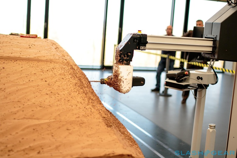
As you'd expect, therefore, the physical modeling process has advanced just as its 3D counterpart has. Designers are now able to perform step by step milling live, for instance: as they draw a body line, the mill moves into position and starts cutting. In the past, complex programming was required to produce such a result; now, the milling process can be fully automated.
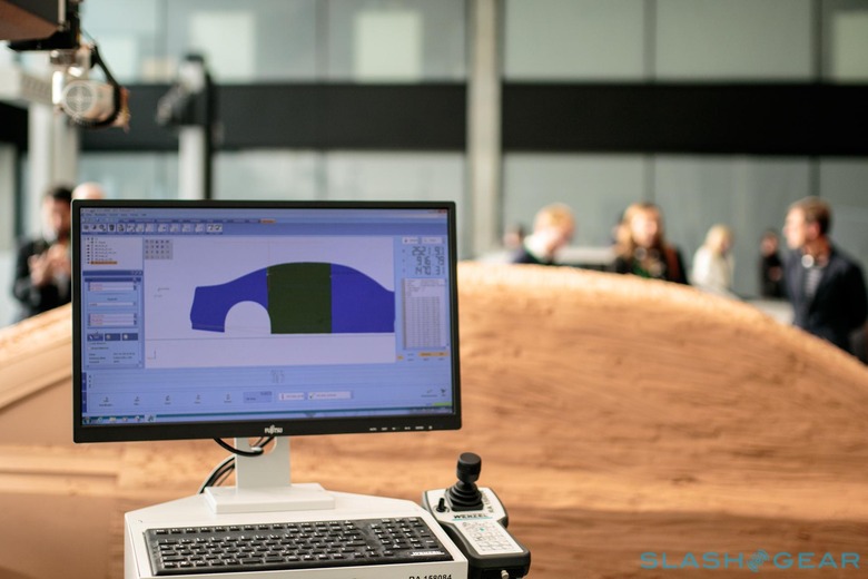
Overall, it means a significant acceleration of how long it takes to get from initial concept to a finalized design. From the physical model, the process progresses to the check-in where the head of design reviews and signs off on the overall exterior of the car. In all, the process takes around 28-30 weeks from the start of the design until engineering.
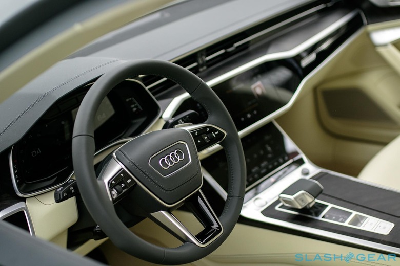
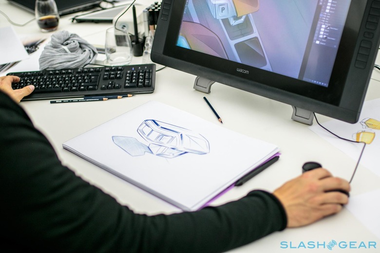
Next comes the interior design, which is just as involved – if not more so – than the exterior. First step is to load the overall exterior design, since the roofline and exterior proportions of the car define the interior space. The artist then begins sketching ideas on paper and bringing the earliest details to life in incredible detail. Using Wacom tablets, those designs can be digitized, and greater detail added.
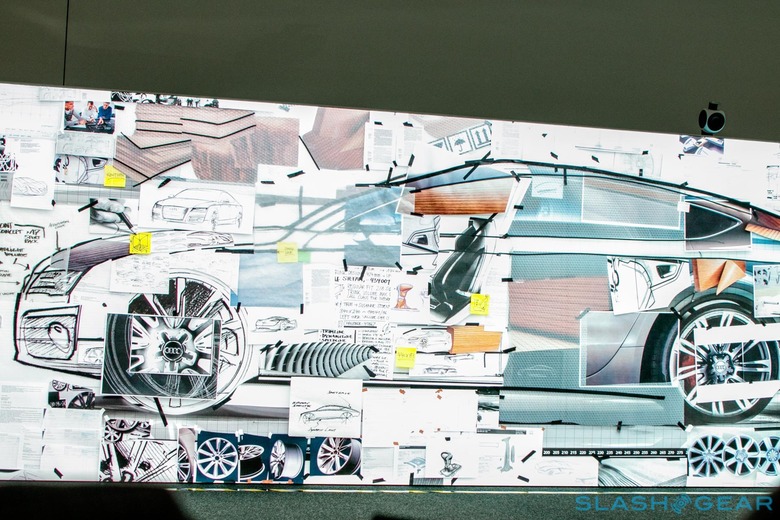
After the initial sketches are complete, the designers move to laying out scaled mockups on rolling walls. Each consists of multiple thin pieces of paper, overlaid on top of each other. A single layer consists of a different element, such as the position of the driver and passenger, critical structural elements, and other measurements. Using thin black tape, the designers start forming the interior lines. They create several different perspectives including the wrap around view, drivers line of sight which shows the continuous integration between the driver and the car, the location of the various trim panels, and the side view.
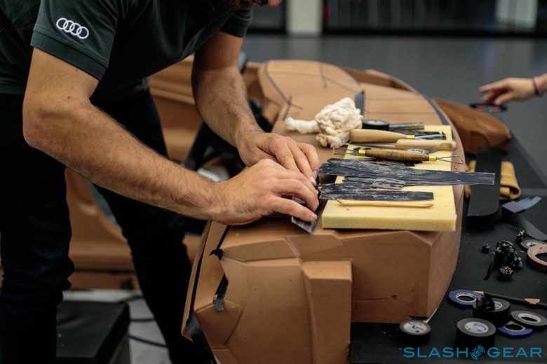
Just as with the exterior, the drawings and layout work progresses into full-size clay models. It takes hours to shape the contours that make up the dashboard and center stack, which are then dressed with trim pieces, mock displays, and even a steering wheel. Driver ergonomics and measurements are verified with each change, some of which demand a millimeter-level of adjustment, while others simply require the whole section being started over. It demands a fierce attention to detail, and I found it incredible to watch.
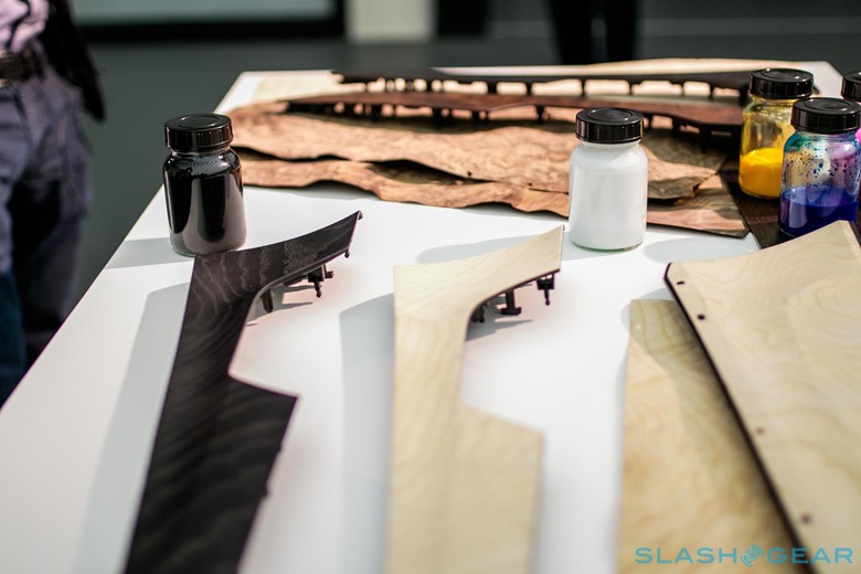
Once the design is complete, then the materials and colors need to be decided upon, and that happens under some of the brightest and hottest lights in the space. The leather color, trim materials, and other elements are hung up on the wall, where they're paired up with exterior colors. Paint, paint samples of various shapes, strips of wood veneers, leather samples, carbon fiber, and other materials were all on display. The interior designers work together creating combinations of color and materials that complement each other and are visually pleasing, from a selection exponentially greater than what buyers have to choose from in a showroom. Since the owner spends most of their time inside the car, it's vital that these pairings are perfect.
The final step is a nearly feature-complete model of the A7, which was unveiled before we progressed on to the next station. The rolling model consists of nearly all the exterior body panels in molded plastic, along with a complete interior.
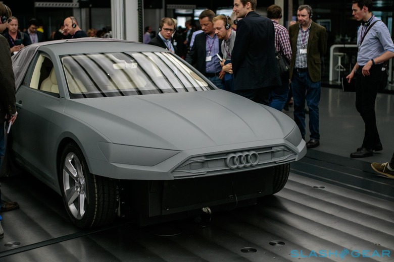
Long gone are the days of controlling a cabin solely with dials and buttons. The user experience team walked us through their design process for the latest generation of MMI – Multimedia Interface – that debuted in the all-new Audi A8. Although in the car the controls are predominantly virtual, speed across multiple touchscreens, the designers started by drawing the basic layouts and fixing them to magnets. With a magnet sized to the LCD screen, the designers can arrange the buttons easily on the screen without having to do any programming.
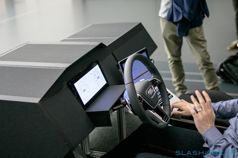
From there, they could design a flowchart of all the various menus and sources. There are over 5,000 screens and states of the new MMI: to work through all these layouts, the designers used a mockup of the interior with a 2-in-1 notebook functioning as the main MMI screen, and a smaller LCD screen for the virtual cockpit. A third computer was used to modify the HTML5 that was being used to display the layouts on the various displays. That meant any element could be tweaked within a few seconds.
That progresses to the beautifully-rendered graphics that will make up the final product. Several full-size center stacks with full functionality were produced to help test the user experience and layout. We were able to test out the new text input abilities that take advantage of swiping, for instance: you can write letters overlapping each other, and each letter is immediately recognized. Even Audi Connect was available, and I was able to test the new searching abilities live as well as the new voice controls, which now recognize phrases such as "I'm cold," "Turn the seat on," and many others.
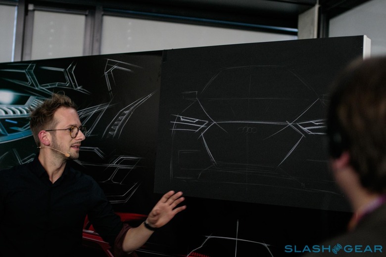
"Audi is light" the head of light design explained as he started his presentation. From the emptiness of a simple piece of black paper and a white paper, he drew the outline of the A7 and started to sketch in the headlights – or the digital eyes – of the car. Illumination used to be simply the practicality of seeing the road ahead in the dark, but his team is now leading an aesthetic revolution of the headlights at the automaker.
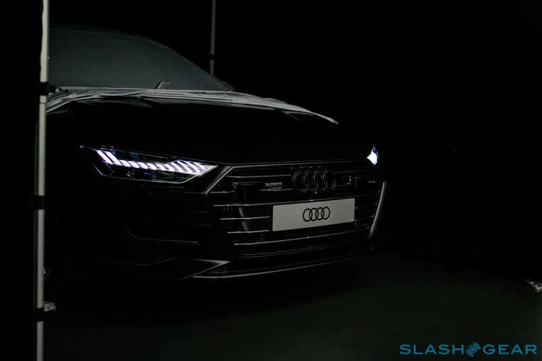
Using long-drawn lines and clear sight the idea is to accelerate the light and create what he describes as a "distinctive body signature." Each segment of the light element represents a digital signature of "1 on / 0 off" or "1 light / 0 shade" within a very distinct 3D character. The lighting designs evolve in a very natural way, with the designers working closely with their engineering counterparts to digitize the sketches in a way that's both aesthetic and technologically successful. Once that core is complete, animations such as the startup sequence for the car can be programmed. While there's an almost endless array of possibilities for what can be created, the engineers are always on-hand to make sure it's feasible and meets safety and performance needs.
All that theory and experimentation leads up to the car itself. The lighting designers slowly lifted off the veil that was covering the complete A7, and unlocked the doors to turn on the new headlights. They are certainly the most beautiful and unique lights that I've ever seen on a car. As we moved around to the back, they triggered the unique startup animation. The level of detail in the lighting design is very impressive, and the designers certainly hit their goal of making the lights the showcase of the A7's exterior.
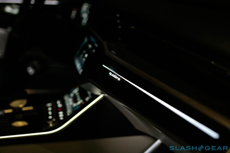
The same team is also responsible for the interior lighting, and there the had a secret weapon: a first-generation A7, but outfitted with a complete next-generation interior. It allowed the designers and engineers to do real-world testing but not give away the interior design before Audi was absolutely ready to unveil it. The first thing I noticed was just how smooth and even the lighting is throughout the cabin: there are no spaces that are too bright, nor too dim, and it's altogether a very welcoming environment. The days of the blunt overhead spotlights are, thankfully, ending. Audi has accomplished all this using strips of precisely-controlled LED lights, which will also allow the driver to adjust the color.
It's hard to conceptualize what goes into the design of a modern car, given we usually see just a few snapshots of that process: a concept vehicle, perhaps, and then anything from months to years later, a production version. Indeed, being able to walk through the Audi designer center was something that took me a few days to digest. The whole experience bordered on the overwhelming: Audi is a brand which I'm very passionate about, and that same passion for the brand was apparent in everything that these designers do.
It's also very evident from the moment you walk into the space just where you are. Spacious, simple, and elegant, it's not hard to see the parallels between the facility and the cars its team are responsible for. From talking to members of those teams, it's clear that there's a great appreciation for what they are building, down to the small details that most owners will never consciously recognize but will still appreciate without knowing it. Factor in the omnipresent technology, and Audi has undoubtedly recognized it as vital to the success of the brand in the years ahead. From state of the art milling machines to Wacom tablets, rapid prototyping tools, and the rendering cluster, Audi has made a considerable investment in its design future, and I'm looking forward to what is coming next.
