I Love The Galaxy Note But Not The Curved Edge Trend It Helped Create
Ever since my first actual Android smartphone (no, the first Galaxy Tab doesn't count), my main driver has always been a Galaxy Note, only skipping the Galaxy Note 4 (not much of a differentiator) and the Galaxy Note 7 (fire hazard). Far from being a Samsung fanboy, I have and continue to swear by the S Pen, unrivaled in any smartphone, Android or otherwise. But despite that loyalty to the mighty stick, there is one Galaxy Note hallmark I wish never came to be. In fact, I wish the entire curved edge screen design never caught on.
Every pixel counts
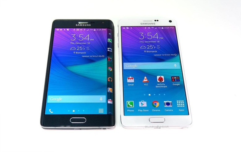
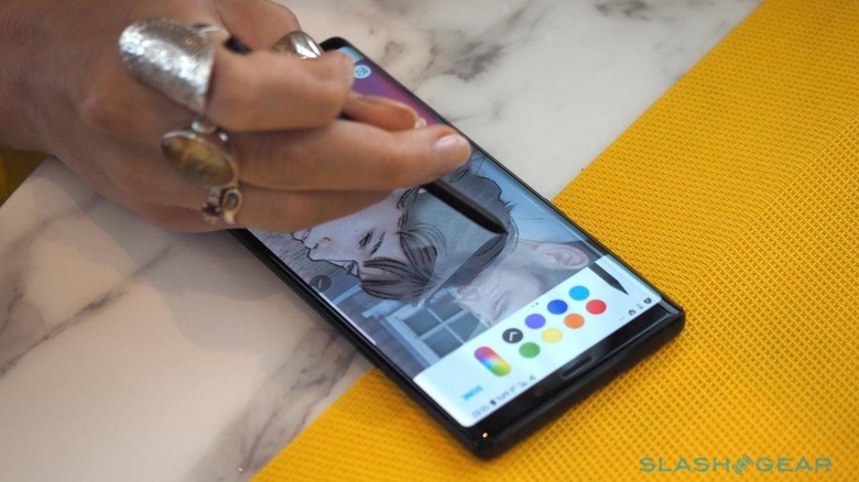
The adoption of the curved edge screen, something Samsung started playing around with in the Galaxy Note Edge in 2014, actually makes little sense on this class of device. The Galaxy Note line, be it phone or tablet, has always been defined by its S Pen. That meant it was designed for use cases like writing and drawing, otherwise why bother with the cost of having a pressure-sensitive stylus. And like any digital artist or note taker will tell, every bit of space on the paper counts.
Now imagine not being able to take full advantage of the space allotted for the screen simply because it slopes off. Or imagine writing in a notebook or painting on a canvas that curves off at the edges. It might be good for occasional odd pieces but not as an everyday medium. And yet that is what Galaxy Note users since the Galaxy Note 7 have been subjected to.

And it's a problem that won't be exclusive to the Galaxy Note. The Galaxy S series has also adopted the design and other OEMs like Huawei and OPPO are following suit, the latter with even greater curves. And as curves become bigger, the space shoved off to the side also becomes more significant. That could spell trouble for apps that try to make use of every bit of space available on screens.
Touch me not
It's not just content that gets affected by this curved design. Those areas of the screen are, naturally, not only for display. They're touch sensitive as well and they don't always differentiate your fingers from parts of your palm.
Phones like the Galaxy Note will advertise some smart palm rejection. That doesn't always work, especially when those edges trigger special functions like Edge Panels. Especially when the phone may detect touches on the edges even when you're pulling it out or putting it in your pocket.
Those accidents might become even more common when those edges come into more contact with the insides of users' hands. And if OPPO is starting a new trend, may indeed be the case in the foreseeable future.
Falling off the edge
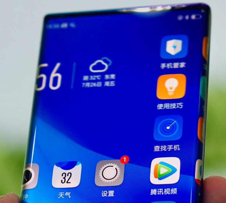
OPPO recently showed off its "Waterfall Screen" design. Rumor has it, Samsung shied away from that radical screen but no specific reason was given. Some say that it was just too risk-averse. Now we'll see if it was within reason to be so.
OPPO's Waterfall Screen boasts of an 88-degree curve, that is it's almost bent at a right angle. It speaks to the company's ability to produce such a bent screen. But, as mentioned, that also puts more of the screen closer to the palm.
As OPPO's own photos show, the user interface continues down that curve simply because it was to. That means that not only icons will be pushed to the sides, literally, but even text and parts of videos will be as well. OPPO could force apps not to use a certain portion of the screen at the sides, but that would be a terrible waste of space instead.

Form follows function
Just like notches, popup cameras, sliders and punch holes, the curved edge screen has one purpose: to reduce bezels or even remove them completely. In terms of design, an all-screen phone is undoubtedly gorgeous. In practice, there are still too many missing pieces to make that a usable reality.
Bezels aren't just an artifact of antiquated manufacturing and technology. Whether by intention or by accident, they also serve some utilitarian function. Bezels help take the blunt of the impact when smartphones fall or even shield those edges from direct contact. They also provide a safe spot for hands and even fingers to touch. Until the day technology and materials have advanced well enough that those won't be an issue, I would rather have a very flat but perfectly ergonomic Galaxy Note than a more beautiful phone that's also less usable.
