Hulu Plus For iPhone Gets New Features And Design
On Wednesday, Hulu announced the arrival of a "reimagined" version of the Hulus Plus app for the iPhone. With the newest update comes new features tucked away in various design additions (there is a trio of new panels), as well as better usability in the form of a trimmed, tweaked app design. We've got all the details for you after the jump.
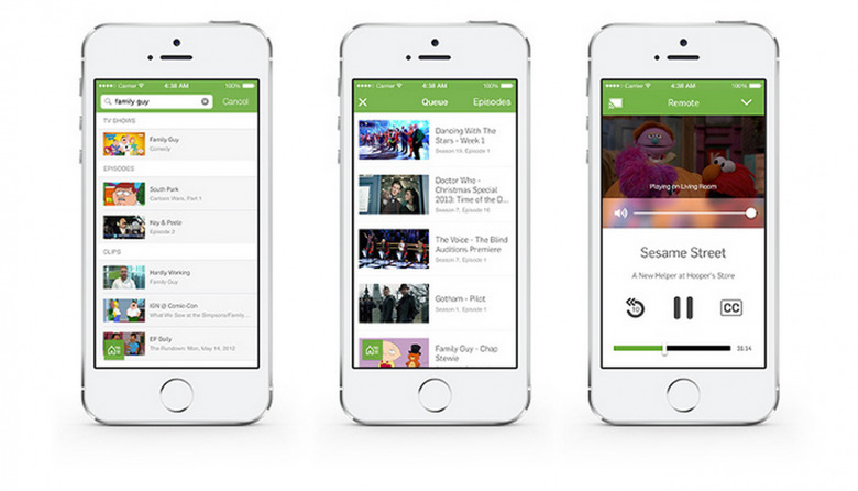
Those three aforementioned new panels hold "Home", "Shows You Watch", and a new "Navigation" panel, three oft-used options that make getting around easier. Joining these is the Action Tray, which is home to items you'd frequently want quick access to, like casting and search.
Speaking of search — the feature has been redesigned, as well, to show context-specific groups slotted into related categories, breaking the data down into specific and easy-to-navigation chunks.
As mentioned, the app's design itself has also been updated — Hulu calls it a "complete facelift" — to have a so-called cleaner set of controls. The player has had useful functionality moved into it for easier access, like casting and rewinding ten seconds. Show Pages have been included in the roster of design changes, being tweaked for easier browsing.
SOURCE: Hulu Blog
