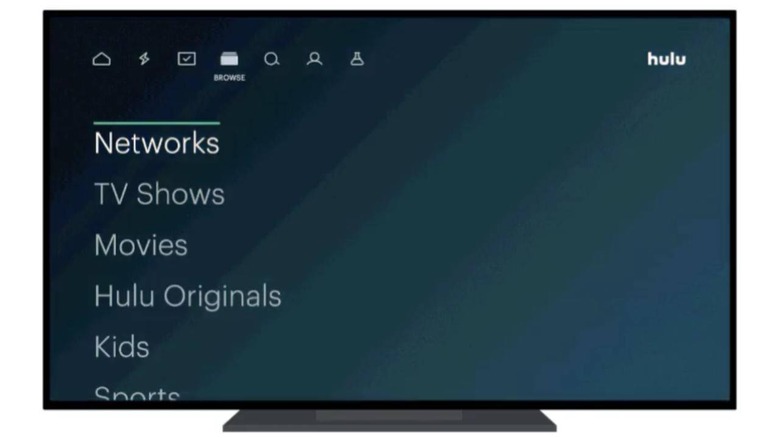
Hulu Is Rolling Out An Updated UI That Improves Accessibility
Hulu has updated its user interface with adjusted elements that make it easier to read menus, increasing accessibility for users who may have struggled with the app's previous design. This is the latest update from Hulu targeting the platform's accessibility, something the company made the focus of its hackathon for employees earlier this year.
With its update this week, Hulu has focused specifically on improving text legibility in its app and making it easier for subscribers to use screen readers when necessary. All users will see these changes applied to their apps automatically, though the tweaked UI has only arrived on Roku streaming devices and Smart TVs at this time.
Hulu says it will introduce the changes on mobile, Apple TV, and other supported devices in 'coming weeks,' but doesn't provide any specific dates beyond that. Roku users can expect to see the improvements arrive starting today, though it may take some time for it to roll out to everyone.
Put simply, Hulu says it has adjusted the text opacity in its app in order to improve the readability of menus, show names, and movie descriptions, among other elements. Beyond that, the Hulu app should now work better with screen readers (aka, audio guides), though the feature must be enabled on the user's device. This feature uses spoken guides to help visually impaired users navigate the app.
A number of platforms have taken steps over past months and years to improve accessibility for users. Hulu added an audio descriptions hub to its online service earlier this year, for example, and Netflix also expanded the number of audio descriptions it offers for shows on its own platform back in 2015.
