Huge Samsung iPhone Report Could Be Apple's Smoking Gun
A 2010 Samsung report detailing how the company's smartphones hold up against the iPhone in excruciating 132-page detail could prove the tipping point for the copycat legal case, Apple hopes. Acquired by Apple and admitted in full into evidence in the San Jose trial where Samsung fights allegations of blatantly copying the iPhone aesthetic, AllThingsD reports, the document ticks through the Galaxy S in assessment of basic functionality, visual elements, and features like browsing and multimedia, concluding that the Korean handset requires a jolt of Apple-style magic in order to compete.
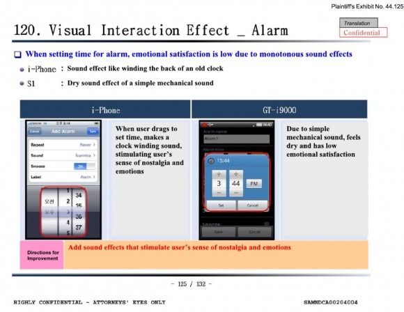
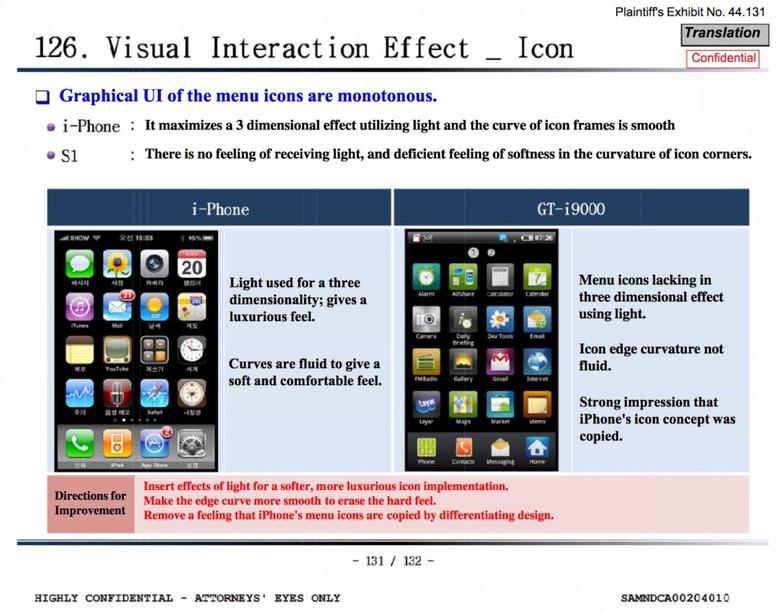
"There is no feeling of receiving light, and deficient feeling of softness in the curvature of icon corners" one section of the report concludes of the Galaxy S, suggesting that light effects should be added to the TouchWiz interface but pointing out that designers should "remove a feeling that iPhone's menu icons are copied by differentiating design." The authors don't stint on detail, either; for the alarm setting, Samsung's "dry sound effect" of clicking through the desired time is criticized, versus iOS' retro clock-ticks, and prompting the suggestion that the designers "add sound effects that stimulate user's sense of nostalgia and emotions."
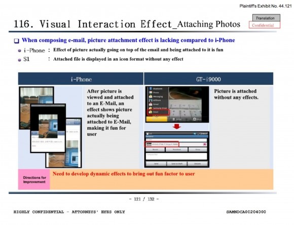
Elsewhere it's the "fun factor" that gets highlighted, with Apple's use of animations getting highlighted as another point at which Samsung's phone falls short. Page-flipping, animated attachments and even how the pin in the mapping app is dropped are all mentioned, while Samsung worries the lack of a camera shutter opening animation leads to the interpretation of lag when the app itself runs.
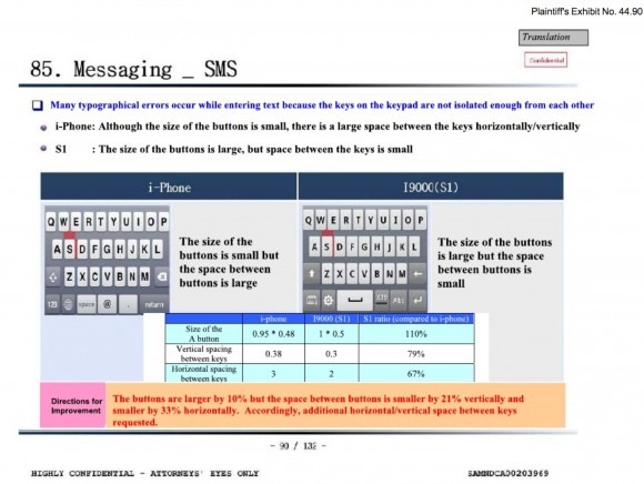
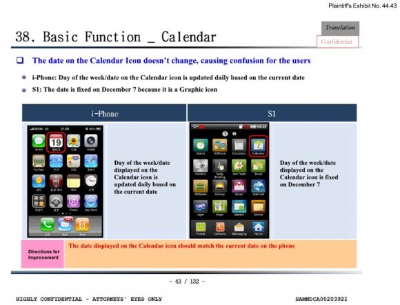
Although feature comparisons between rival devices are commonplace, it's perhaps the detail to which Samsung goes that makes the document so dangerous. At one point, the company measures the exact distances between key rows and individual keys, concluding the precise amounts by which it should rearrange its keyboard. Another page highlights iOS' Calendar icon and the fact that the date changes to match the current date, suggesting that Samsung's icon should do the same.
It's worth remembering that the English version of the document is a translation from the original Korean, and as such the exact phrasing probably should be relied on too fully. However, the report sits at odds with Samsung's earlier claims that much of the iPhone's visual and usability appeal is commonplace and merely a sign of the direction the smartphone industry as a whole was progressing in.
You can review the full report yourself below the story timeline.
