HTC Rhyme Hands-On
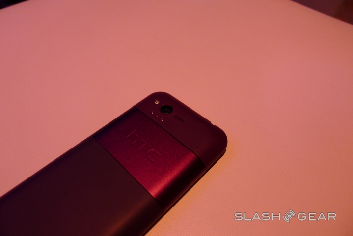
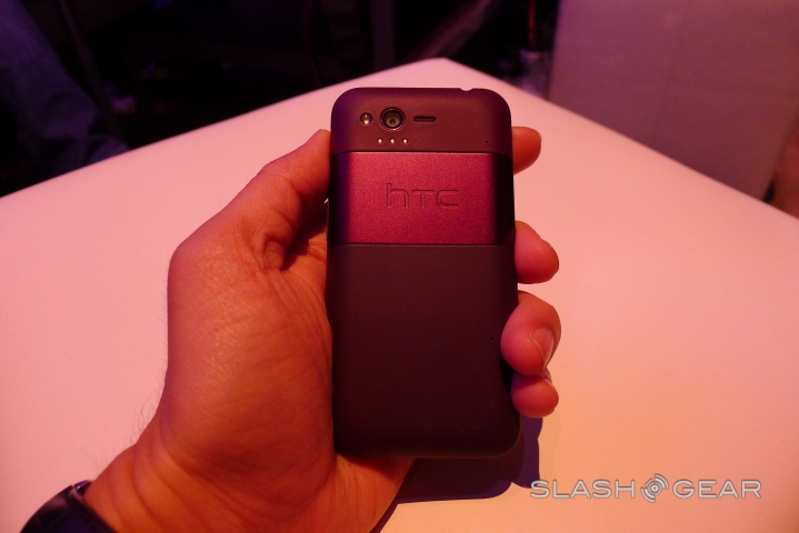
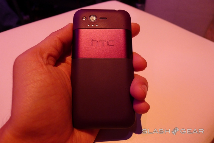
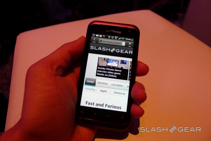
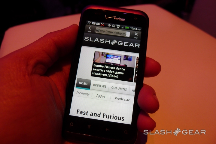
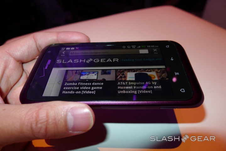
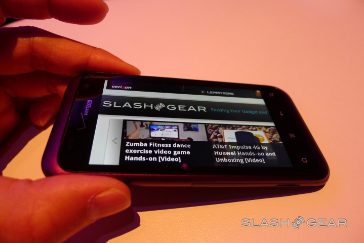
Verizon and HTC announced the Rhyme this morning, a 3.7-inch Android handset finished in a distinctive plum but offering distinctly mundane specifications. We've grabbed some hands-on time at the launch event, and while the physical design is good and the build quality decent, we're struggling to get past both the single-core processor and HTC's positioning. Read on for our first impressions.
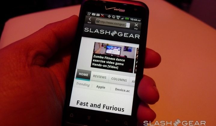
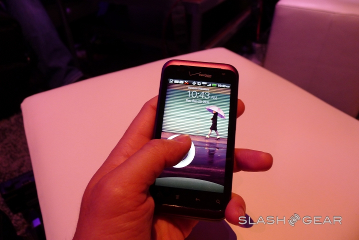
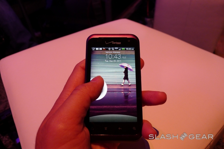
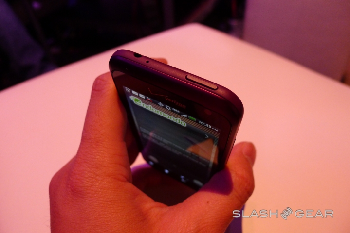
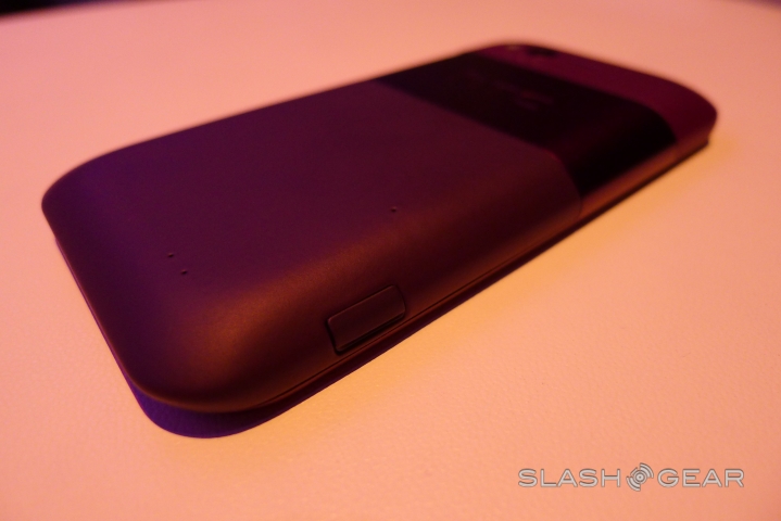
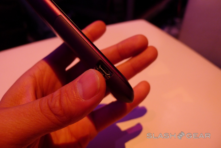
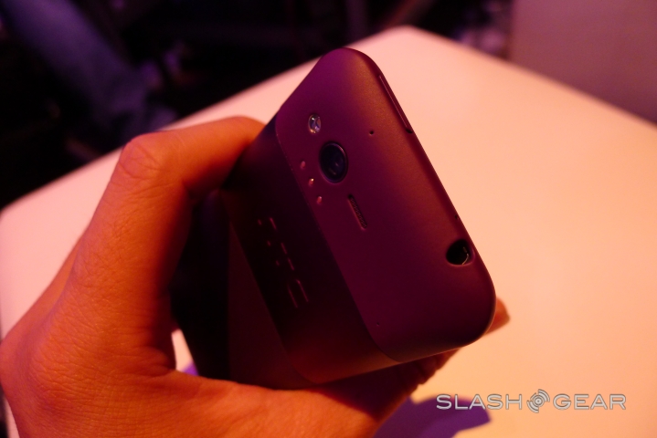
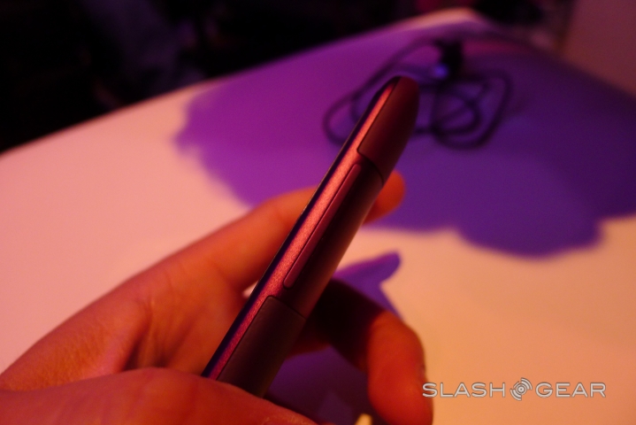
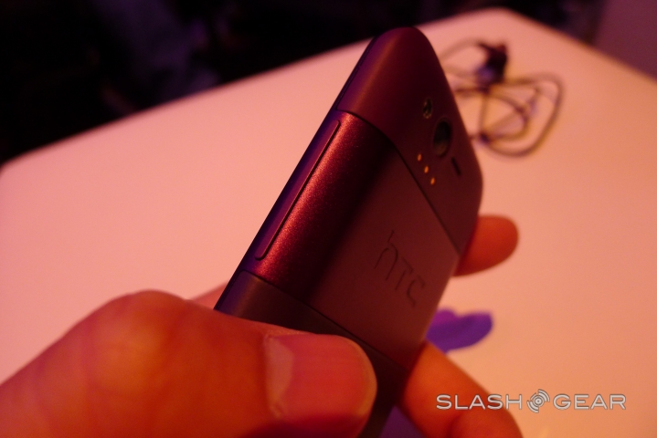
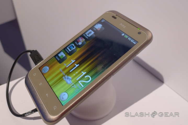
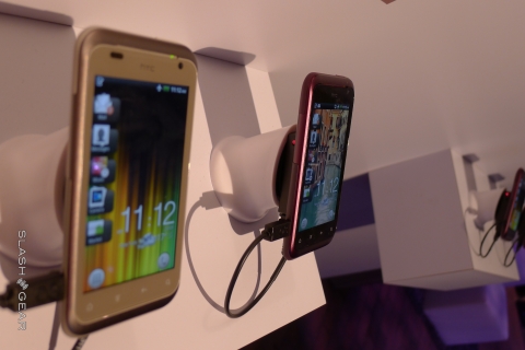
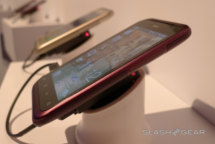
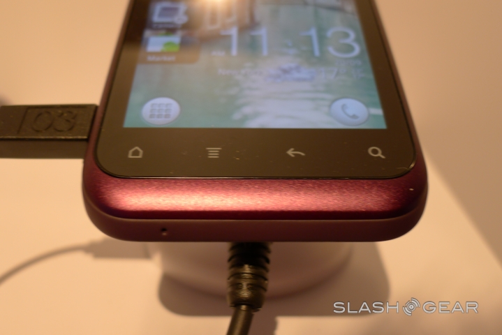
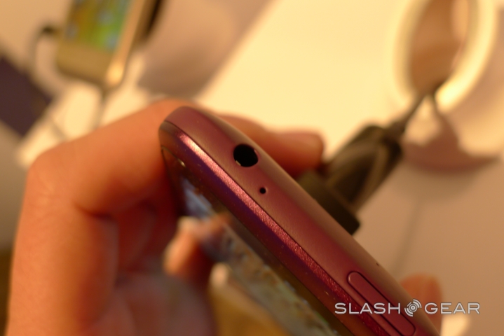
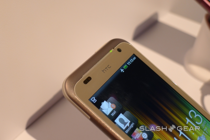
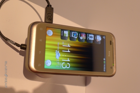
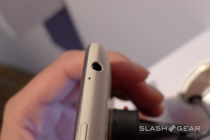
From the outside, things look solid. HTC's unibody design language is evident, and the plastic and metal components are creak-free. It's definitely very similar to the Incredible series, though more like the original rather than the second-generation model, and the soft-touch finish to the majority of the phone is pleasing in the hand.
HTC Rhyme hands-on
[vms db07e7089f9b269c31f2]
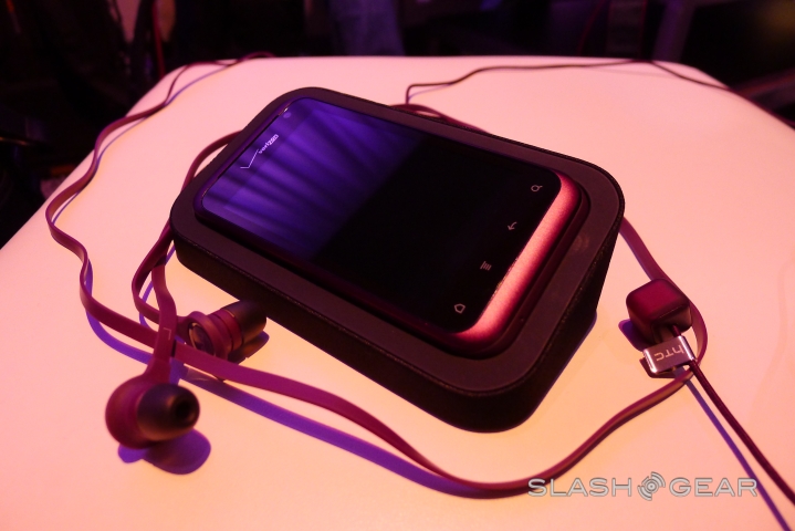
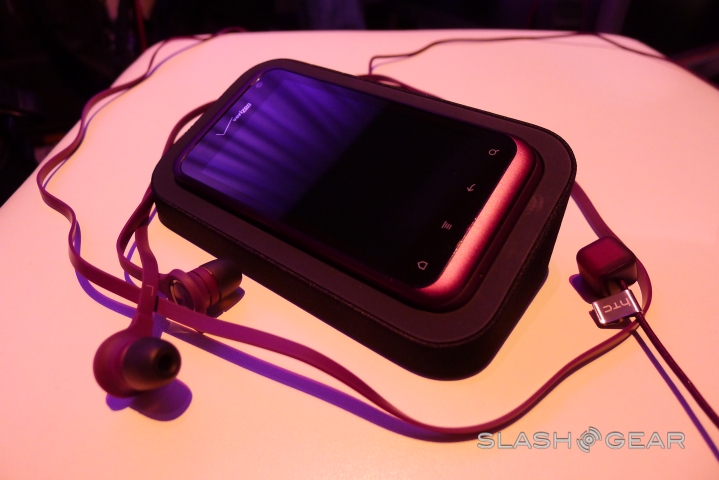
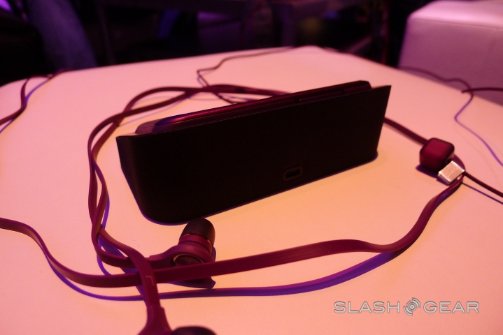
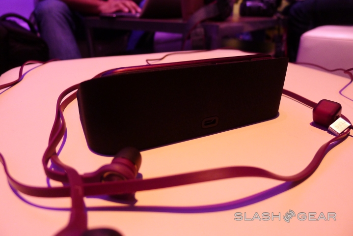
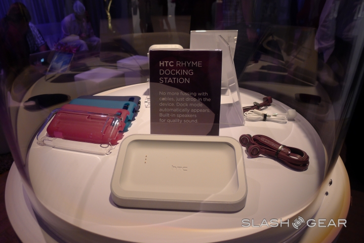
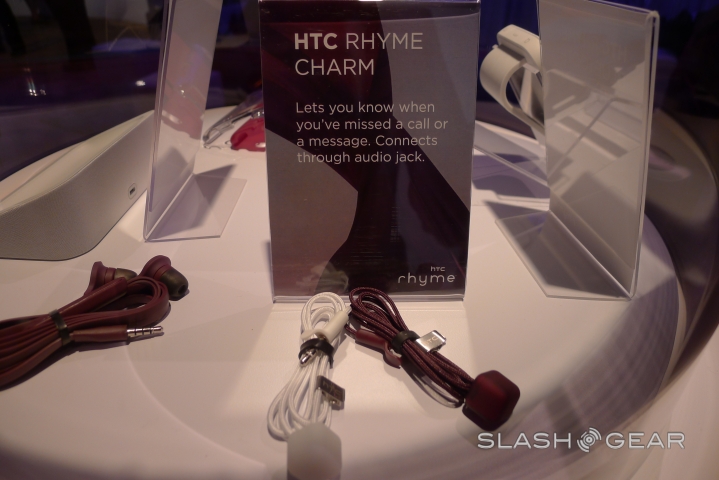
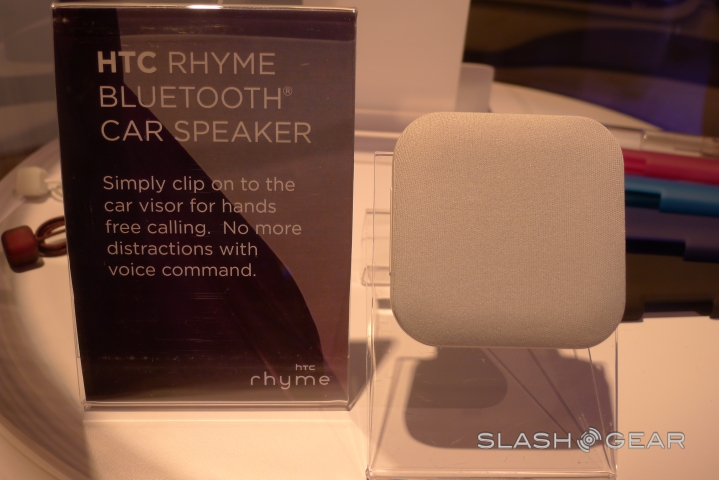
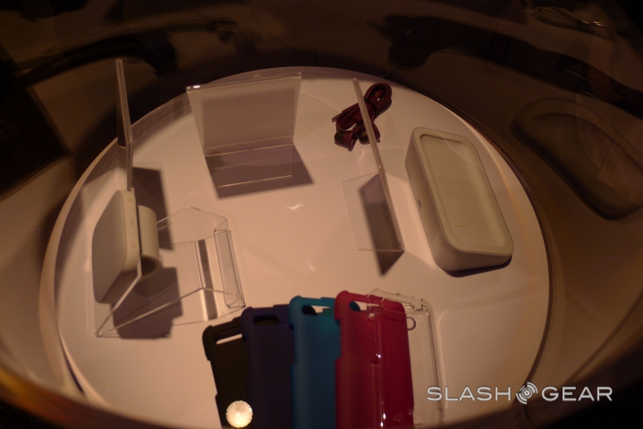
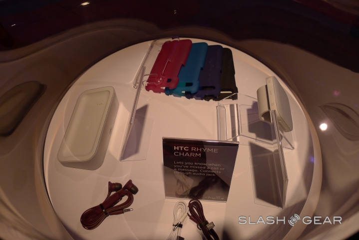
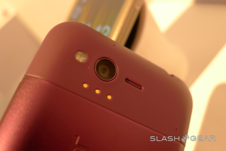
You can't argue with HTC's consistency, either: the wired stereo headset matches, in the same shade of purple, as does the Bluetooth headset and even the odd little "charm" that blinks discretely to warn you there's a call or message incoming. It's eye-catching, but it's hardly new technology; we've seen light-up keychains before, though that the Rhyme's slots into the headphone jack for safe-keeping is neat. Still, the desk cradle is likely more useful overall.

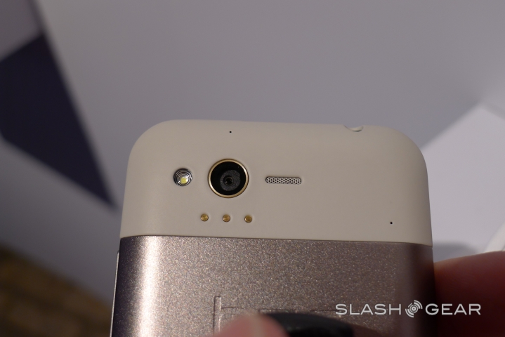
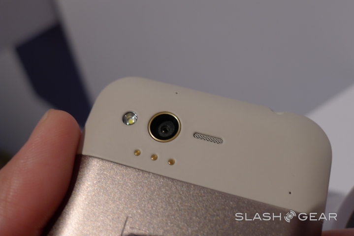
Unfortunately, that sense of "old tech dressed as new" continues in force when you get to grips with the Rhyme. Specifications that would have looked fresh twelve months ago don't exactly do much to impress: a single-core 1GHz Snapdragon, WVGA LCD display and 5MP camera with single LED flash fall well short of what we've seen on other recent Android phones. "You don't want power for power's sake" HTC said in the press conference, and Gingerbread does feel snappy, but with no dual-core and no 4G LTE like, say, the DROID BIONIC we're concerned you may find your phone struggling with future, more demanding versions of Android and apps.

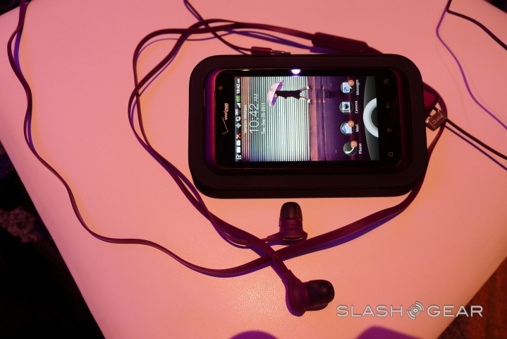
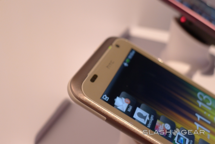
HTC Sense 3.5 makes its debut, as consistent and glossy as always, cleaning up the homescreen with simplified widgets and a tabbed shortcut bar running down the left edge of the display. The icons are dynamic, so change according to the most recent caller, message or photo, while each pulls out to show app-specific options. HTC's work to boost mobile camera performance continues, with the Rhyme promising 5 shots in the space of 2.5s in burst mode, auto backlight correction, and automatic upload to a user-designated Facebook gallery. Still, considering the Rhyme is only barely smaller than the HTC Incredible 2, though, we're struggling to see why you'd opt for the purple phone instead of that.

It's the purple, in fact, that's most confusing. HTC has offered purple devices before – the Wildfire S, for instance – but usually as part of a range of finishes. The company is making no specific case for the Rhyme being targeted at a specific demographic, and that seems oddly short-sighted. Verizon's $199 price tag doesn't seem enough to make the Rhyme appealing: it has to be put into a context that makes sense, especially when you consider that it's hardly competitive against the iPhone 4, never mind the fast-approaching iPhone 5.
HTC is having a busy month, and that looks set to spill over into early October with the promise of high-end devices and the first Beats Audio device to be designed from the ground up with the music tweaking system in mind. We can't help but wonder whether the company would've been better off developing just a couple of excellent smartphones rather than a larger selection that includes several mundane ones.
