HTC One Review [2013]
It's been a tough few years for HTC, unsung victim of the Apple-Samsung smartphone war, and the new HTC One has a lot to do to fix that. The company has seen its place in Android dwindle from trailblazer to also-ran, as Samsung's cutting-edge hardware and vast marketing budget forced Galaxy to the fore. Solid phones like 2012's One X and One S failed to relight HTC's fire, and so it has done the only thing it can: raise its game much, much higher with the HTC One. We're back to the days of risk-taking hardware decisions and legitimately interesting software, but the big question is whether the One can pull it off. Read on for the full SlashGear review.
Design
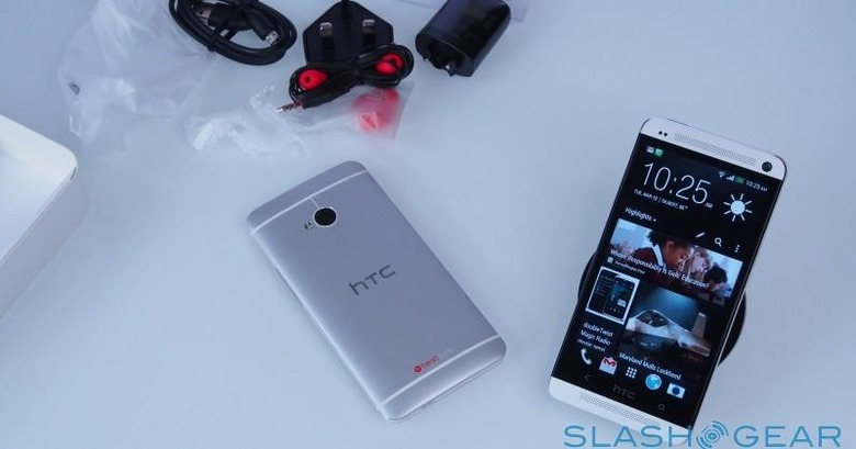
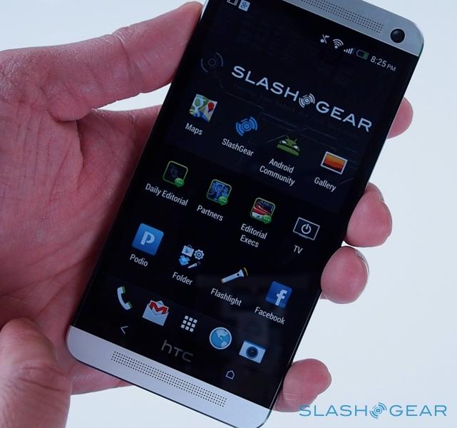
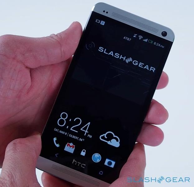
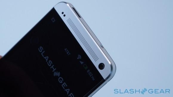
Stunning. The HTC One makes a compelling argument for being the best-made Android phone we can recall, a design that both looks and feels premium (though photos don't tend to do it justice, making it look flat and overly simplistic). Last year's One X was a solid device, with its polycarbonate plastic casing, but the One is leagues ahead. HTC went back to basics – CNC-intensive manufacturing processes; clever rethinking of how to finesse the most out of minimal antennas – with its industrial design, and the end result is a phone that's creak-free and somehow timeless in the same way that Apple's MacBook Pro design has gracefully evolved.
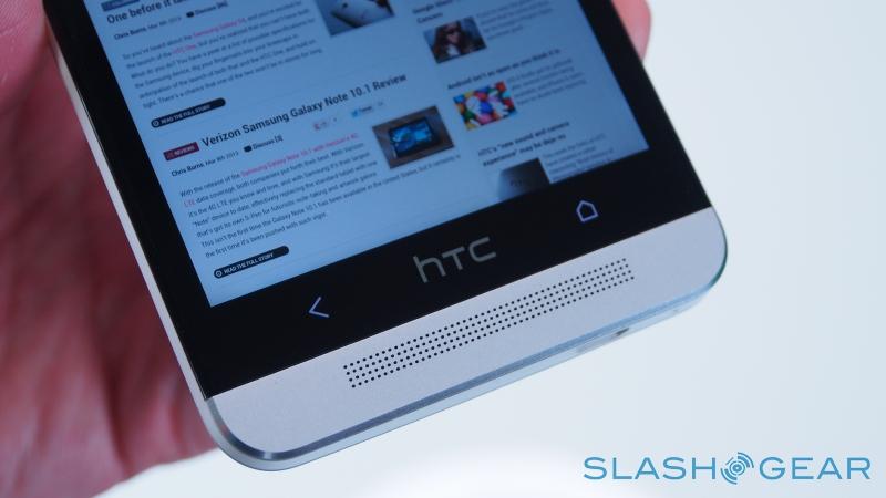
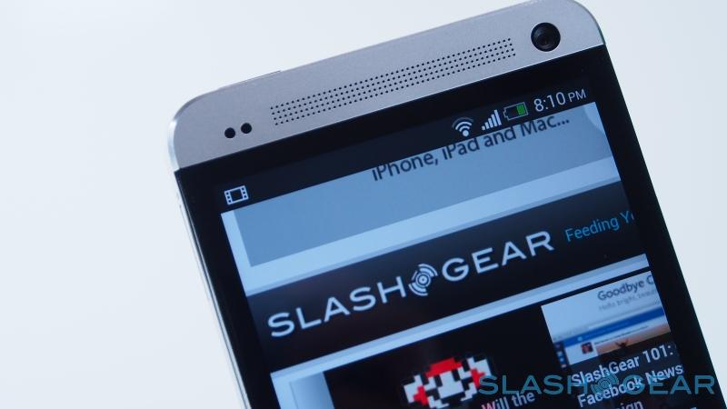
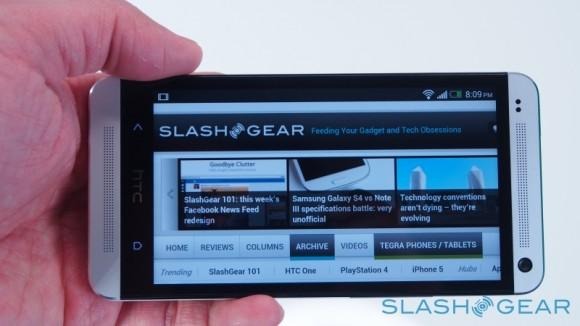
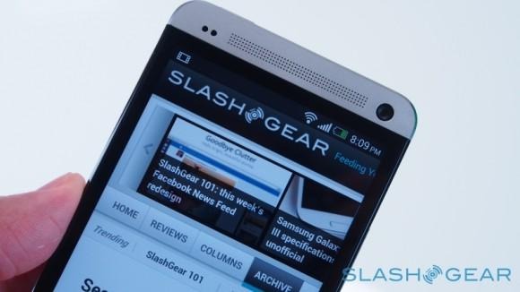
On the front, HTC's favorite micro-drilling process has spread from the earpiece to the slip of metal under the display, while the company continues to insist that Google's on-screen buttons are a waste of valuable display space, and so includes touch-sensitive keys. We're down to just two of them, however – Back and Home – flanking an HTC logo that doesn't do anything if you tap it. We can't help but wish the logo was the home button, since we kept stabbing at it out of habit.

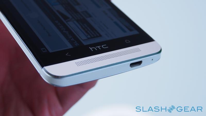
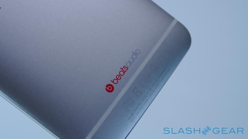
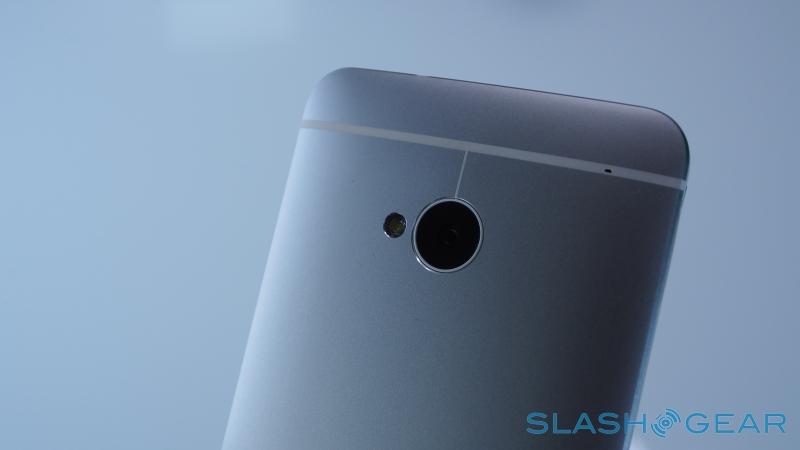
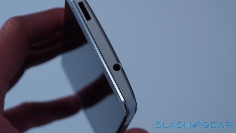
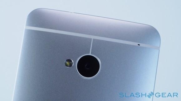
A thin band of white polycarbonate runs the chamfered edge of the One, enclosing the power key (which doubles as an IR blaster) and headphone socket on the top edge, and the microUSB port on the bottom. A volume rocker is on the side, flush with the casing. On the back, the gently bowed metal has been carefully shot through with narrow strips of plastic which allow the antennas to do their magic; there's a neat stylistic flourish with the upper band dipping to encircle the camera lens, but we could do without the Beats Audio logo which looks a little garish in comparison to the discretely metallic HTC branding.
All that metal and sturdiness comes with a compromise, and that's the battery. HTC has opted for a non-removable Li-Poly pack, a healthy 2,300 mAh, which is fixed inside. Exactly how many people ever actually swap out their batteries is unclear, but it could prove an early deal-breaker for some. Similarly, there's no microSD card slot, HTC unable to accommodate it in the 137.4 x 68.2 x 9.3 mm, 143g frame.
Hardware and Performance
HTC has thrown the works at the One, and pretty much all but wireless charging has stuck. So, you get a fast processor – Qualcomm's 1.7GHz Snapdragon 600 quadcore, to be exact – and 2GB of memory, along with a 4.7-inch Full HD display (more on which later). Connectivity includes LTE, HSPA/WCDMA, and GSM/EDGE, along with WiFi a/b/g/n/ac, MHL-HDMI with the right adapter, Bluetooth 4.0 with aptX audio support, NFC, and Miracast wireless display, while there's also a digital compass, GPS, GLONASS, gyroscope, accelerometer, and proximity/ambient light sensors.
Without a microSD card slot, internal storage becomes all the more important. HTC has sensibly bypassed the 16GB point and instead opted for 32GB and 64GB versions, though the latter will be only available in certain, limited locations. Our 32GB review unit had 25.49GB free out of the box. There's a free 25GB chunk of Dropbox storage, too, though we'd still rather see expandable local memory if given the option.
It's particularly topical since the One does so well with multimedia. For once, the Beats Audio doesn't feel like a cynical marketing mention: the One really does exceed what other phones can do, both when it comes to recording and playing back sound. For the former, it's down to two dual-membrane microphones, which HTC calls Sense Voice: in short, one half of each microphone handles high signal-to-noise ratio sound, such as regular speech, up to around the 75dB point, while above that there's a high sound pressure level membrane that can cope with the more boisterous sounds you'd encounter at a concert or club.
Sample recording from a concert
[vms 989769097660a5639506]
Together they're designed to handle every audio situation the phone might find itself in, whether that's doing speakerphone duty in a quiet office, recording your kids on the swings at the park, or in the front row of a gig. Best of all, it actually works: the stereo pick-up is excellent in normal conditions, but as soon as things get loud and you'd expect a regular phone to get overwhelmed, the One just bulldozes ahead. We kept trying to identify the point where the membranes hand over, but in fact it's more of a seamless blend; you simply can't tell what the One is doing, which is really as it should be.
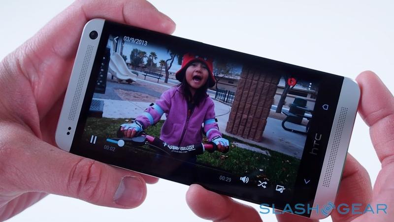
On the flip side are the speakers, which HTC is equally proud of. The One brings them up-front, flanking the display, and gives them significantly larger chambers to resonate in. Look beyond the awkward BoomSound branding and the result is impressive: loud but without distortion, and with bass that belies the fact you're listening to a phone. The speakers get their own Beats Audio branded amplifier, too, with a second powering the headphone socket. Interestingly, HTC isn't bundling any Beats Audio headphones in the box this time around, only a regular wired hands-free kit, though the One worked well with every aftermarket set we tried.
We can't complain about the One's overall performance, the Snapdragon 600 putting in a convincing show both in everyday use and in benchmarks. In Quadrant, the HTC scored 12,127, a huge step up from the 7,400 of the One X+, while in AnTuTu it managed 24,283, up from the 16,245 of the One X+. In Qualcomm's Vellamo test, it scored 2,398 in the HTML5 category and 779 in the Metal category. In SunSpider, the browser test of JavaScript performance, the One scored 1118.9ms (faster is better. Overall, then, it's clear that the One can handle anything you could throw at it today, and is likely to remain that way for the foreseeable future.
Display
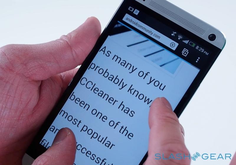
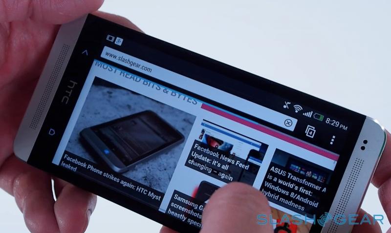
Point-three of an inch shouldn't make a difference, but it does. HTC's decision to go with a 4.7-inch screen, against the 5-inch panel of the DROID DNA and Butterfly J, is a welcome one: you still get the rich, creamy Full HD resolution, but that slightly condensed 1080p adds up to both 468ppi pixel density and a handset that's easier to hold.
HTC has stuck with LCD rather than looking to AMOLED, and the result is a panel that's beautifully balanced. Accurate colors, rich blacks, and viewing angles that are so broad as to look pasted on. It could arguably do with being a little brighter at its maximum setting – we've been spoiled with recent high-nit panels from LG and others, which do better at battling sunlight – but it's a great all-rounder nonetheless.
Software
HTC Sense
HTC Sense has had a long and at-times tortured journey. What started as HTC's attempt to tame the wild-west of raw Android back in the v1.5 days gradually became heavier, slower, and arguably less necessary as Google tightened up its own software. What were once HTC-exclusive features gradually became baked into Android-proper, and – despite a few little-developed additions, like OnLive gaming and HTC Watch – HTC seemed more interested in simply visually differentiating its phones than actually delivering a legitimately more usable UI.
That doesn't fly in 2013, when pure Android has an increasing number of fans, and rivals like Samsung have gone tweak and enhancement crazy with their own software modifications. Happily HTC has taken a clean-slate approach with Sense 5.0 on the One, and much of its new strategy works.
For a start, the swollen icons and cartoony feel has been pared back dramatically, keeping little more than wire-frame outlines of HTC's weather icons (some things, like zombies, refuse to die). Instead, you get some welcome use of Google's Roboto font – in its condensed form, which makes it look both familiar and distinctive – and a crisper, more simplistic layout with flatter icons and a black/white/blue color scheme that's reminiscent of Windows Phone in places.
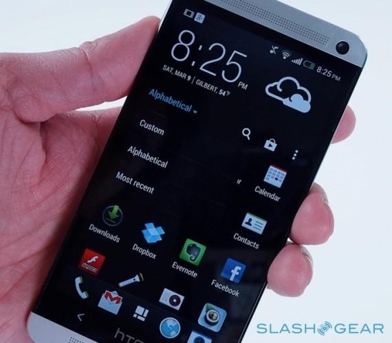
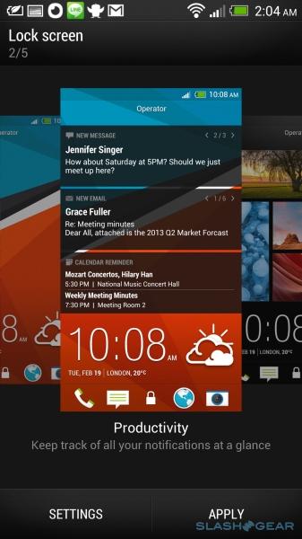
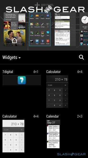
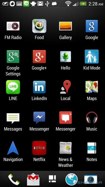
The familiar homescreen is still present, though now limited to four panes of icons or widgets – HTC says its research indicates the vast majority of users settle on a screen or two of icons, and then never bother changing them – while the app launcher comes with several apps already organized away into folders, part of HTC's encouragement to keep the layout (either 3x4 or 4x5) tidy. Our units direct from HTC have little in the way of bloatware preinstalled, and we know the company is working with carriers to try to minimize how many "added extras" get thrown in, with the goal being to have them at least corralled into a folder from the start.
Interestingly, you can treat the app launcher as a homescreen; jump from it into an app and then hit the Home key, and you'll go straight back to the launcher rather than the traditional desktop. However, HTC has another part of its homescreen that it hopes will become your default.
HTC BlinkFeed
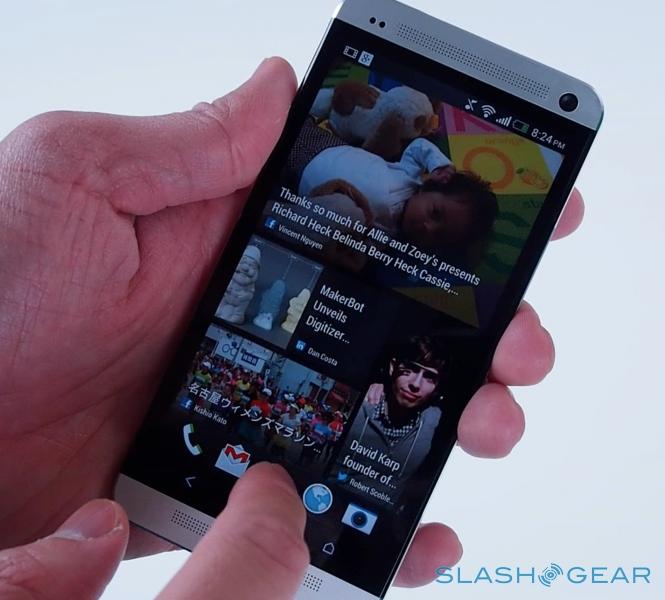
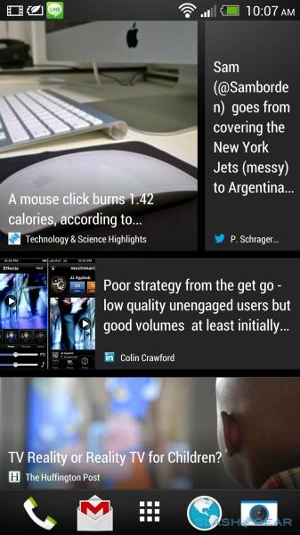
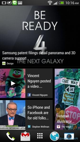
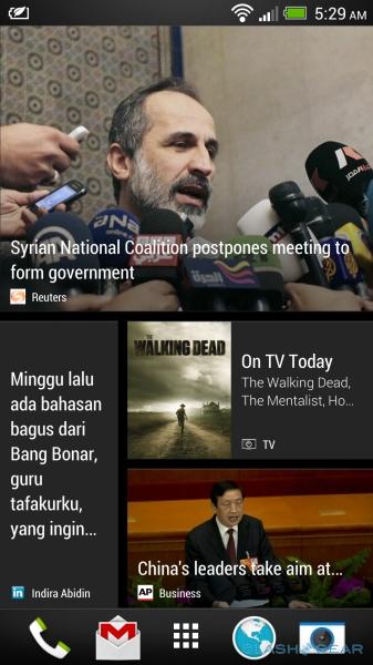
BlinkFeed is HTC's latest try at pulling together social, something it started several years back in FriendFeed. However, the new system is far more comprehensive, featuring not only Twitter, Facebook, LinkedIn, and Flickr content, but news from multiple online sources. Outwardly similar in appearance and functionality to newsreading-app Flipboard, BlinkFeed sits to a side-swipe of the desktop and fills the screen with page after page of mixed content from news and social.
In its first generation, you can only choose from HTC's selection of news sources – future iterations will support general RSS feeds being added, HTC tells us – but it's a pretty comprehensive selection from the outset, and tailored depending on your location. Those in the US will see sources like USA Today and the WSJ, while those in the UK will get the BBC and the Guardian, for instance. Subscriptions can be added on a category basis – technology, for instance, or sport – or from a specific provider. If you're on a WiFi connection then the list is updated automatically every couple of hours by default, whereas out of the box it's manual-only refreshes on a cellular data connection. A quick pull down on the BlinkFeed list triggers a check for new articles (as well as showing the options menu for managing subscriptions).
We're generally wary of news reader apps, especially those preloaded by manufacturers, since they're usually subpar compared to third-party options like Flipboard. BlinkFeed, though, is surprisingly capable. HTC describes its purpose as serving up "snackable" content, the sort of glanceable tidbit that might catch your attention when you instinctively reach for your phone in a moment of distraction, and in that respect it operates as a gateway rather than trying to be the be-all and end-all of news consumption.
Tap an article – small icons and text at the bottom of each thumbnail show whether its come from a news site or been shared from Twitter, Facebook, or another social source, along with who shared it – and it opens in the regular browser. Tweets open in the official Twitter app, Facebook links in the Facebook app; not some HTC version the company has cooked up. In the future, you'll be able to choose alternative apps – so, for instance, you could use your third-party Twitter software of choice rather than the microblogging company's own app – but that's not supported at launch. If the flow of news gets too much for you, you can shut it off and use BlinkFeed solely as a social feed, or vice-versa. Other apps will also periodically inject their content into BlinkFeed too, so for instance the gallery might remind you of an old photo taken if you revisit a location, or HTC might slide in a pane with tips about an under-utilized feature. Sadly, despite its cards arguably making the most sense for inclusion, there's currently no Google Now integration.
Despite our skepticism, we quickly grew to like BlinkFeed. Part of that's down to speed: there's very little lag in scrolling through the list – HTC has wisely kept the animations to a minimum, with just a small amount of tile-tilt when you flick through each page – and stories open up quickly. HTC's content partner does a fair amount of server-side processing to keep data transfer time and overall traffic to a minimum: the One gets the headline and an image (news sources with photos get priority over text-only stories) and then only accesses a specially formatted article when you actually tap on it. There's also a push to show the full article rather than just an excerpt, as sometimes find on Flipboard, though you can always open up the page on the original site, or share it via any of the usual Android methods. It's perfect for the casual grazing smartphone addicts do in every moment of downtime.
BlinkFeed is obviously a first-generation product, but HTC has ambitious plans for its development. Our advice has always been to buy a device for what it does today, not what it might be updated to do tomorrow, though HTC has at least made changes to Sense in v.5 to address a key complaint: that software updates are frustratingly infrequent. Typically, that's because a new firmware version demands considerable interaction between manufacturer and the carriers, and often only comes when Google pushes out a new version of Android.
To address that, HTC has divorced the update process for its own apps from the underlying OS. Rather than being forced to wait for a significant firmware change before it can tweak, patch, and generally improve BlinkFeed and other homegrown software, HTC will be able to update them piecemeal. So, when BlinkFeed finally gets third-party app support, or RSS subscription support, HTC will be able to deliver that functionality in the same manner as an app downloaded from the Google Play store can.
We've heard promises of more timely upgrades before, so the proof of HTC's ambitious new system will be in the delivery. However, if it can do it, it will go a long way to drawing some of the venom many feel about OEM skins like Sense. That's not to say HTC has turned over a new leaf entirely: the One launches running Android 4.1.2, rather than 4.2, with the company promising an update soon.
HTC Get Started
Once upon a time, HTC offered a web-based counterpart to Sense on its phones, with mobile content access, backup, find-my-phone security, and remote locking. That was quietly retired in early 2012, however, with HTC promising bright new things in its place. Those bright new things have taken until now, and the HTC One, to arrive.
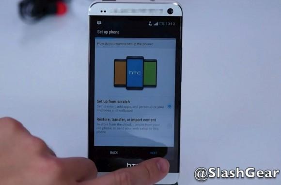
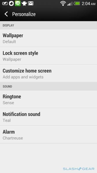
HTC Get Started is, the company tells us, in part a reaction to the growing number of online sales of phones: now, buyers will be able to jump straight into their new phone experience, even while they're waiting for the One to be physically delivered. In short, it's a simple way to set up a new device. After choosing your model (and carrier variant), you can personalize the applications, sounds, bookmarks, wallpapers, lock screen options, and even the feeds in BlinkFeed, all via a web interface on the desktop.
You can start from a blank slate, or pick from seven presets – family, games, music, photos, social, sports, or travel – which each populate the One with a set of feeds, apps, bookmarks, sounds, and other settings. So, if you opt for the games preset, you get Temple Run and Angry Birds Space automatically installed, along with gaming and sports content for BlinkFeed, and some of the popular gaming news and reviews sites bookmarked in the browser. Every choice is previewed on a mock-up of the One shown alongside.
If you'd rather craft your own setup, you can step through each content stage, picking ringtones, notifications, and alarms – or uploading your own audio to snip a sound from it – then choosing from either preloaded bookmarks or add your own, as well as from HTC's wallpapers or one of your own images uploaded specially. All of the apps you choose come direct from the Google Play store, which means they update just as if you loaded them manually on the phone itself.
It's the accounts section of Get Started that's the most useful, however. Rather than punch in your email and Dropbox credentials during the on-device setup wizard – something which can be frustrating, pecking in passwords on a soft keyboard – you can register them in the browser interface. The whole thing is then finished off with either the creation of an HTC account or, alternatively, by logging in with your Facebook or Weibo username and password. When you start up the phone, you can punch those credentials in, and the One gets automagically set up just as you arranged it online.
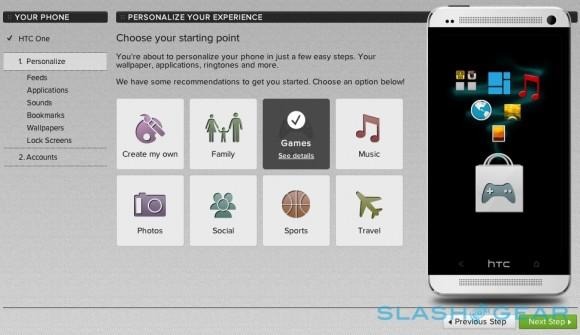
Given how much time we spend setting up new devices, we're unsurprisingly fans of HTC Get Started. You don't have to be a phone reviewer to appreciate its simplicity, however; one of the most frustrating issues new smartphone owners can face is not being quite sure what to actually do with their powerful new gadget, and so HTC's smorgasbord of curated apps is a great launching point. Unfortunately there's no way, at present, to synchronize Sense in the other direction – you can't back-up your exact phone layout to Get Started, edit it online, and then later restore that to the device – but HTC does at least offer a backup system that preserves most of the layout and settings of your handset.
TV
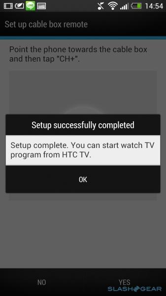
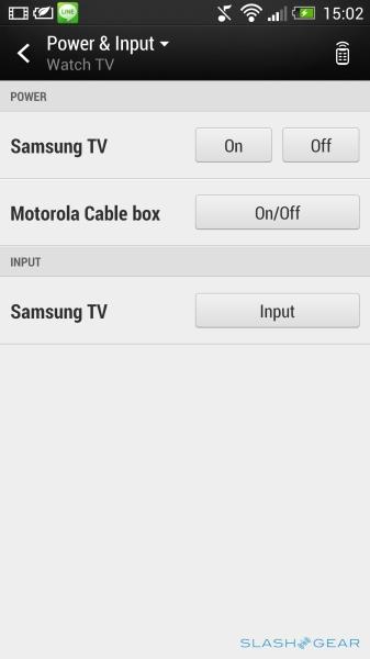
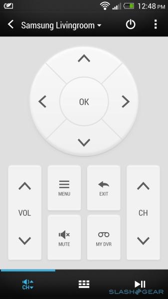
HTC's clever integration of an IR blaster into the One's power button gets a purpose right out of the box, with the company's simply-named TV app. Built on Peel technology – which powers the universal remote system included on some Galaxy Tab tablets, for instance – the app basically replaces your usual home entertainment remotes and throws in a channel guide too.
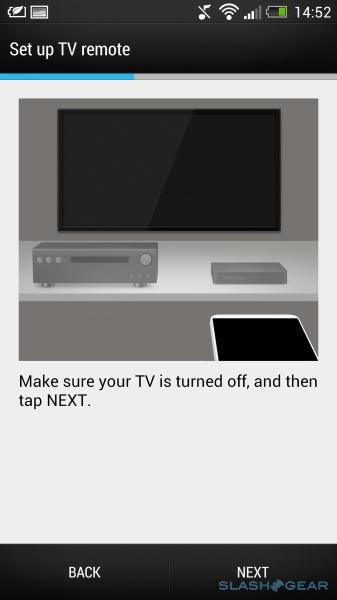
First-time setup involves telling the app where you live and what content providers you have – cable, satellite, free-to-air digital, etc. – then selecting your TV model and any other A/V kit you might have. HTC has a long list of manufacturers to choose from, and we were up and running with our TVs simply by choosing the brand; testing basically involves firing off a power signal, and making sure the TV turns on as expected. Multiple devices can be set up and switched between, and if you've something not on the list then you can teach the TV app how to use it: the IR blaster also works as a remote reader, and so by pointing the controller for your mystery device at the One, you can step through all of the key controls. That way, we were able to set up an Apple TV, a preset for which was missing from HTC's list.
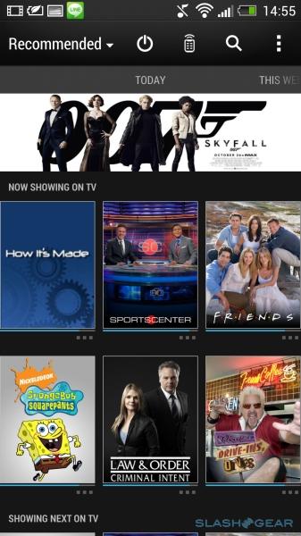
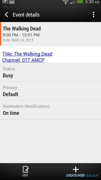
When you open TV, you find a screen of currently-playing shows based on the channels you receive. Each gets a preview and a bar running along the bottom showing how far through the show is; tapping it automatically changes the channel, or you can open up an information page with an episode summary, a list of actors, and other details. It's there you can also favorite shows: from that point, those you've favorited will show up higher in the "now playing" list, as well as have reminders of new episodes pushed into your BlinkFeed. A side-swipe from the main screen shows what's coming up next, as well as allowing you to dig into the future schedule or break your planning down channel-by-channel. It's also possible to permanently hide channels you're not interested in.
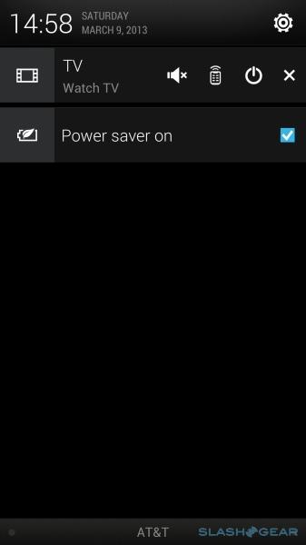
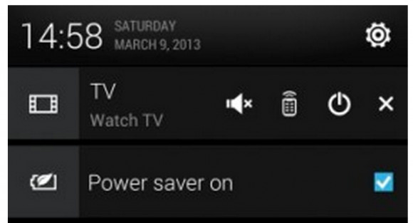
Exit the TV app and a shortcut automatically appears in the notification bar, complete with quick access to the power, to the full remote page, and details of what you're currently watching. Set the phone down with TV running and, if it goes to sleep, it'll wake up automatically when you pick it up. You can pull the app up even if the phone is PIN-locked, too, though for security users won't be able to jump from the TV app to other content on your phone if you've left it on the coffee table. It's worth noting that the app only knows what's on if you've been using it exclusively; if you switch between the One and your regular remote, there's no way for the phone to figure out what channel is currently playing.
The other aspect of TV is streaming content, though here HTC's provision is slightly less developed. You can stream video directly from the phone to a TV – it's incredibly straightforward, too, as long as it supports DLNA or Miracast, and is basically a matter of choosing the screen of choice and then watching the content show up – or from third-party services like Netflix and Hulu Plus. Eventually, HTC aims to have the TV app control the native streaming apps on smart TVs, but for now it works best if you have HTC's own MediaLink HD box plugged into your set via HDMI.
As with BlinkFeed, HTC has more in store for the TV app. Right now, it's responsive but not predictive: it'll remind you of an upcoming show if you've favorited it before, but it won't make suggestions based on what it thinks you might like. That's in the pipeline, though, and HTC will be able to iterate more regularly thanks to its streamlined update system. Meanwhile, HTC is pitching an API for the IR blaster around A/V app developers, hoping for broader adoption there, too. For the moment, it's a handy system if you're laden with remotes or often lose them, though it's perhaps too early to be a must-have feature.
Kid Mode
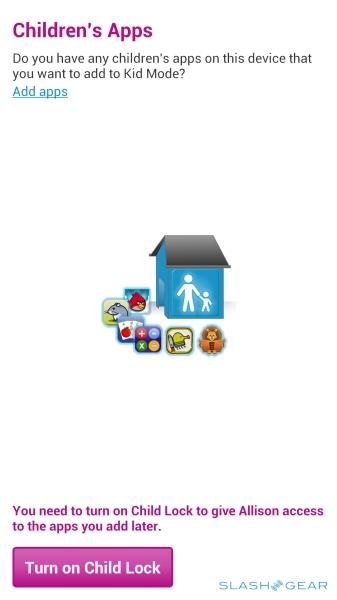
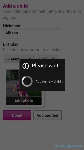
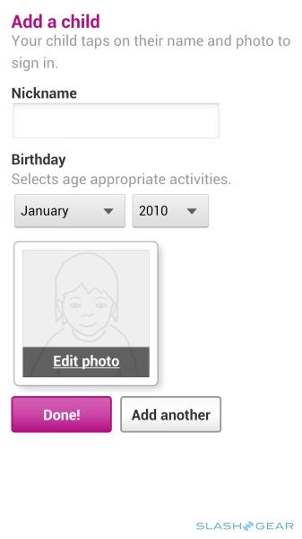
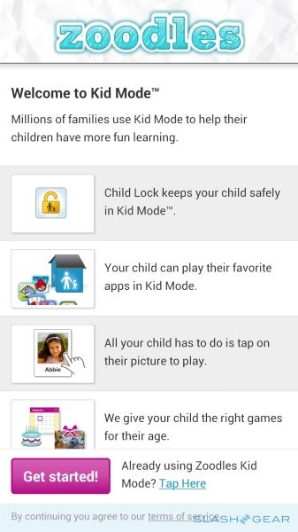
Handing your offspring your phone – especially if it's logged into an app or multimedia store, complete with a credit card registered – can be a recipe for disaster. To fix that, HTC equips the One with Kid Mode, powered by Zoodles, which offers a captive selection of games, age-appropriate multimedia, storybooks, and more, all with a child-friendly interface.
There's support for time limits on how long games and the web are accessible, as well as ad-blocking and site whitelisting for controlling what kids will come across online. Each child has their own "Playground" user-account, with management from a centralized dashboard. It's worth noting that Zoodles is already available for Android devices in general, in addition to Mac, PC, iPhone, iPod touch, and iPad.
Camera
The One's camera is probably HTC's biggest risk with its new flagship, a concerted decision to step off the megapixel bandwagon and instead reconsider smartphone photography from the perspective of how owners really use their phones. So, the One has a "mere" 4-megapixel camera – less than a third of the 13-megapixels Sony has equipped the Xperia Z with, for instance, or LG on the Optimus G Pro – but it's a specially designed sensor exclusively for HTC's use.
The key is light. HTC's research suggests most users take photos indoors or in subpar lighting conditions, rather than outdoors where most phone cameras do their best work. Although ramping up the megapixels increases detail, it also makes each pixel smaller – assuming you want to keep a pocket-friendly phone unlike, say, Nokia with the capable but bloated sensor of the 808 PureView – and that means each gets less light and so the final image gets more noise and other glitches.
HTC's approach is to use huge pixels – capable of grabbing over 300x the light of some rival cameras – so that, even though the final image may not be as large as from an 8- or 13-megapixel device, its overall quality is higher. More light means faster shutter speeds are possible, which helps cut down on phone shake; HTC also adds in two-axis optical image stabilization to assist with that. The resulting data is fed straight into the latest version of HTC's ImageChip processing, which finesses things based on the RAW data rather than, as other phones tend to, on the converted JPEG.
Sample shots
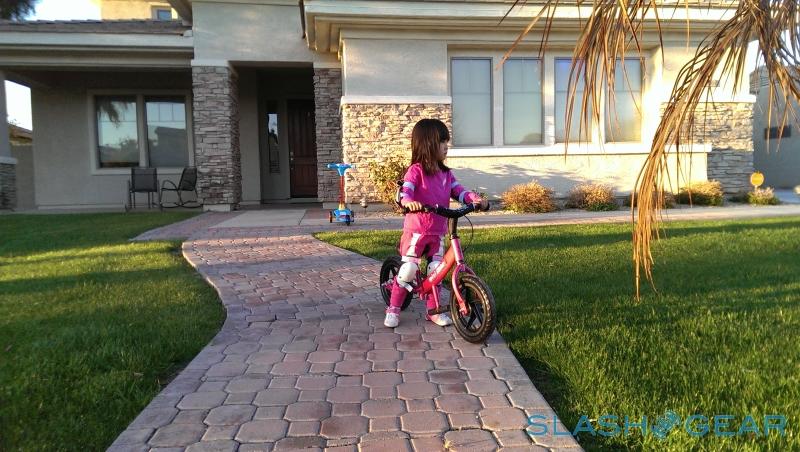
The difference is quite literally night and day when it comes to low-light images. Scenes that, on a Galaxy S III or an iPhone 5 are so murky as to be all but useless, come out with significant amounts of detail on the One. The One has an LED flash – which will automatically choose between five degrees of brightness, depending on the distance between the phone and the subject – but you can comfortably leave it off more often than not. As well as greater detail, the One can do less post-processing to remove blur, since the bigger pixels allow for faster shutter speeds.
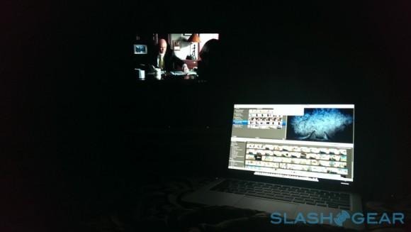
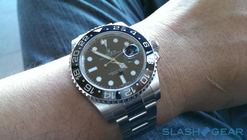
In more ideal conditions, the One's shots suffer if you blow them up and compare them side-by-side with higher-megapixel images. The 4-megapixel sensor simply lacks the resolution to compete on that level. Nonetheless, at more typical levels of crop, we're left impressed by the standard of stills from the One. Colors are accurate and there's admirably little noise, HTC's favored 28mm f/2.0 lens making its presence known once more.
Up front, meanwhile, there's a 2.1-megapixel camera which also has an f/2.0 lens, and HTC has borrowed the One X+'s wide-angle optics so that you can fit more people in-frame at any one time. It'll shoot 1080p Full HD video, too (though not Zoe shots; more on which in a moment), plus HDR stills, and there's a useful timer which means you can tap the screen and still have time to post before the frame is captured.
As for video, the One can capture 1080p footage at 30fps, or 720p footage at 60fps; there's support for HDR video, as well as simultaneously capturing a full-resolution still image while you're recording video. The results for video are as impressive as those for still images, with excellent colors, balance, and brightness levels, and minimal judder or noise. The low-light performance isn't quite as convincing as for still shots, though the One handles scenes with mixed high- and low-brightness well: in footage of a show, for instance, with bright lights on-stage and darkness elsewhere, both areas were cleanly visible.
HTC Zoe
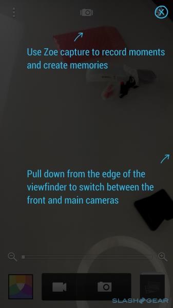
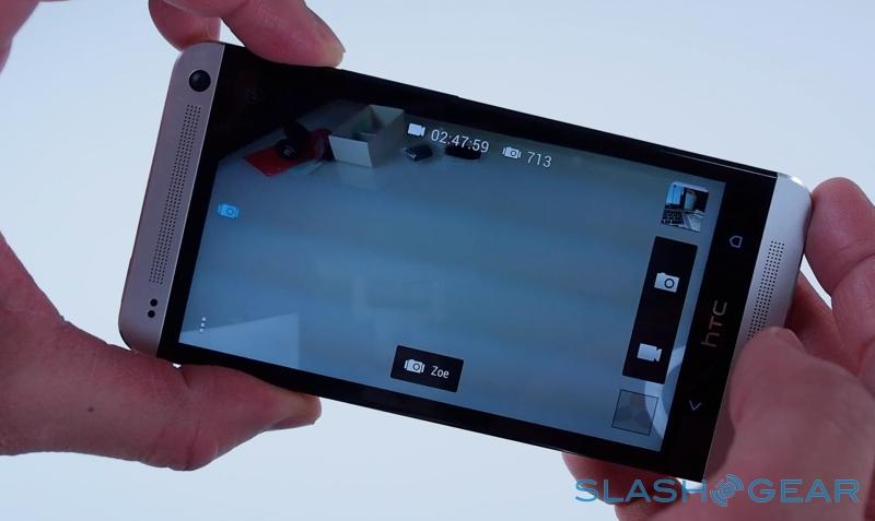
If HTC has its way, though, we'll not be taking just photos or video, but a hybrid of the two. Called Zoe, it's HTC's vision of the future of mobile photography: a 0.6s pre-capture of video, from before you hit the on-screen button, then three seconds of video along with twenty stills. There's no quality compromise involved – stills are at full resolution, and video is at 1080p complete with audio.
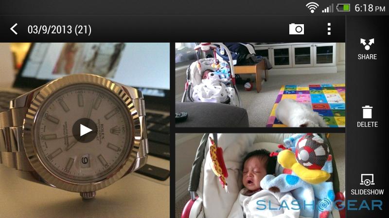
Each cluster of content can then be used in interesting ways. At the most basic, it brings the gallery alive: as you look at albums and thumbnails, the 3.6s video clips cycle through as if you're looking at a magical Harry Potter newspaper. However, open up a Zoe and you can scroll through the clip with a timeline bar, picking out individual frames to keep. HTC has baked in some editing features too, so you can pick out faces from different frames and combine them into one, ensuring everyone has their eyes open and are smiling, or remove objects from the picture. The One can identify faces, too, and allow per-face tweaks like eye-whitening, anime-style enlarging, and skin smoothing.
Each event – a group of recent Zoe clusters, either automatically created by the One or manually merged or split off – gets a thirty second "highlight reel" that the phone produces itself. That sits at the top of the event view, and is basically an automatically curated overview of the themed content. There are six themes to choose from – ranging from "Eifel" with its quirky Parisian style, to the more hipster "Vega" with fast chops and cool color tones – and you can switch between them at will, the reel changing on-the-fly. Hit the remix button, meanwhile, and you instantly get another edit, the speed at which it's created a testament to HTC's processing power.
The technology behind the highlight reel is surprisingly complex, too. The cuts aren't solely random; instead, the One is analyzing each clip and photo for the most interesting parts, such as those which include action, or faces, or even how often you've looked at specific photos in the gallery. What you can't do is manually tweak the reels – only have the phone cook up a new remix itself – or use your own music; HTC tells us the latter is likely to come in a future update, as well as more themes to choose from, but for now you're limited to the six preloaded.
We'll admit, it seemed like a gimmick at first. Yet after a short while – and the fact that shooting a Zoe basically has no downside compared to a photo; there's no processing lag after it finishes, for instance, you simple tap the button and watch the little red highlight slide across the icon – we found ourselves sticking in Zoe mode altogether. Being able to step back through the array of stills, even to before the point we actually took the photo, and pick out the best frame was useful for portrait and action shots, while the highlight reel is the perfect length for Facebook sharing (without boring friends and family with minute after minute of the same mundane thing).
That sharing can be done directly to YouTube, Facebook, or something similar, with the reel exported as an MP4. However, there's also Zoe Share, HTC's own social system. A free online gallery, it allows you to choose a reel and an accompanying ten photos or Zoes to upload to a special gallery, with the One automatically pinging you a link in the notification bar which can then be shared via email, Twitter, Facebook, or somewhere else.
Zoe Share isn't ideal, however. For a start there's a time limit on how long HTC will host the collections – currently three months – after which they get deleted. Individual stills can be downloaded from Zoe Share, but not individual Zoe clips nor the thirty second highlight reel. Links are entirely public, too; you can't have a private Zoe Share, with a password in case someone forwards the URL, for instance. There's also no way to change the video resolution – it defaults to 1080p – which can mean slow uploads unless you're lucky enough to have a decent connection.
Again, HTC tells us it's working on a more comprehensive export system – perhaps integrated into the HTC Sync Manager app, which is used to synchronize audio and other content from your PC or Mac to the phone and back, as well as doing file browsing duties – but there's no timescale for when it might arrive. Meanwhile, if you use an auto-upload service, whether Dropbox (as is prompted during the initial One setup) or something like Google+, every one of the twenty Zoe frames gets automatically uploaded, and there's no way (aside from manually deleting the shots) to have it only upload one or two of them. Storage – whether on-device or cloud – could quickly become an issue, with each cluster of Zoe content coming in at around 32MB (the 30s video along is 4MB).
That said, we still think it's a great feature. Zoe injects the fun back into being a mobile shutterbug, producing multimedia that others would actually want to look at. In fact, the biggest drawback of the One isn't its photo quality, or its overall usability, but trying to educate potential buyers as to what makes the camera special. HTC does itself few favors by turning the full force of its branding machine on the One's camera system, with confusing results. Instead of megapixels you get UltraPixels; the video/snapshot clusters are called Zoe; but there are also Zoe Highlights, the longer videos that pull in content from multiple Zoes for the ad-hoc, curated 30 second clip complete with music and filters. It's enough to confuse even the professionals, and that doesn't bode well for how easy a sale it might be.
Phone and Battery
Given the quality of the HTC One's music playback performance, we had high hopes for in-call audio. Interestingly, though, the phone was pretty average: the earpiece has a somewhat hollow sound to it, with callers certainly audible but not quite as clear as on some other devices. We had no complaints about microphone performance, though, with the One's noise cancellation doing a capable job, and the speakerphone was suitably loud.
HTC quotes up to 18hrs 3G talktime (27hrs 2G) from the One, or 500hrs 3G standby (479hrs 2G); that's based on our European-spec review units, since US-spec versions aren't available yet. Given the size of the display (and the amount we've been playing with the One, particularly the camera) it comes as little surprise that it falls in line with other recent smartphones in terms of real-world longevity.
With all of the usual accounts doing their work in the background – push email, Facebook and/or Google+ multimedia uploads, periodic checking of social networks, etc. – and with regular use, we took the phone down from 88-percent to around 20-percent in the space of just over 7.5hrs. That's predominantly on WiFi, though with some AT&T HSPA+ use. From a full charge to flat, then, with heavy use you could expect in excess of nine hours of runtime.
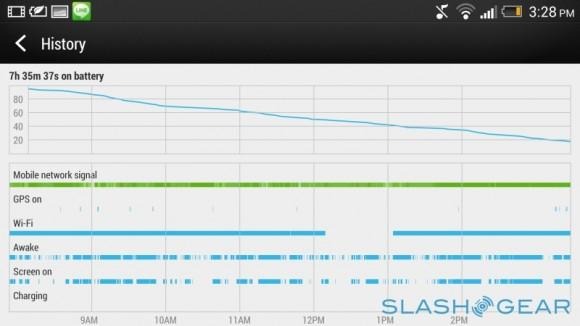
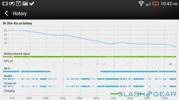
Unsurprisingly, once you notch back on some of the background activity, things start to improve significantly, and in fact HTC offers a Power Saver option – readily accessed from the notifications pull-down – which optionally throttles the CPU, lowers screen brightness, turns off vibration alerts, and shuts off off data when the phone is locked. Unfortunately there's no way to prioritize certain apps to maintain their connection with Power Saver is turned on, which means you won't get the benefits of push-email and similar. Instead, the One wakes the radio periodically to check what's new, with no user control over how frequently that happens.
Display and camera are the biggest battery hogs, really. The impact of the screen isn't much of a shock, since it's a common culprit, but camera users might be surprised by how much in the way of resources significant use of Zoe photography can cause. After all, the One is constantly buffering video and photos whenever Zoe mode is active in the camera app.
There are two ways of looking at the One's battery showing – and bear in mind we'll be running ongoing battery testing over the coming days, including on LTE networks. You could be disappointed, frustrated by the fact that big screens and lots of data use take their toll on a battery, even if it's a reasonably sized 2,300 mAh pack; you could also decry HTC's decision to chase solid form over replaceable battery flexibility. Or, you might accept the regular recharging as a fact of life with any modern smartphone; we're yet to find one – barring perhaps the DROID RAZR MAXX and Galaxy Note II, each of which have simply huge batteries and the oversized form-factors to accommodate them – which doesn't demand such compromises.
Wrap-up
It doesn't take genius to realize that the One is HTC's best phone in a long time. The build quality and crisp, minimalistic design is a step above any other Android phone, and comfortably sits alongside the iPhone 5 for premium feel in the hand. The display is beautiful, the UltraPixel camera technology and Zoe system both ambitious but capable of hugely engaging results, and the performance superlative. Meanwhile, HTC Sense has finally rediscovered its roots, and evolved with BlinkFeed into a legitimately useful and compelling interface – one which didn't instantly leave us pining for unmodified Android.
Nor is the One perfect, however. The battery life is merely average, and while the UltraPixel system pays dividends in low-light performance, it's not the solution to every photographic need that HTC might have billed it as. HTC may not be the first to eschew removable storage and a replaceable battery, but we still don't like it when they're omitted.
Nonetheless, there's a sense that HTC's challenge isn't in the device – after all, it had good phones in 2012 – but in the market. Samsung's risen star in the Android ecosystem has left little room for rivals, and HTC simply lacks the marketing heft to build the same brand-recognition that "Galaxy" has achieved. That's notwithstanding the fact that HTC's phone looks better, is built better, takes generally better photos, and has arguably better software than the Galaxy S III; we'll have to wait and see how it holds up to the new Galaxy, but Samsung will need to pull out all the stops if it hopes to even get close to rivalling the One for its perfect quality feel.
Just as it took becoming the underdog to force Nokia to adopt an innovative "challenger" attitude, so its taken a rough year to provoke HTC into raising its game. The end result is a phone that's beautiful, solid, and cleverly, thoughtfully equipped – one which makes bold challenges to our expectations of hardware specifications and software. Now, HTC has to find a way to educate consumers as to why they should care about it.
Chris Davies contributed to this review
