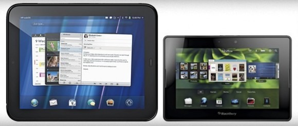
HP Sees "Uncanny Similarities" Between Touchpad And PlayBook UI; RIM Blames "Optimization"
Maybe it's the fast-approaching iPad 2 making them cranky, but HP and RIM have taken time out of their busy schedules for a little back-and-forth over tablet UI design and the settling point of inspiration. HP kicked things off, telling LaptopMag that "from what we've seen in the market, there are some uncanny similarities" between the webOS UI on the HP Touchpad and the QNX interface on the BlackBerry PlayBook.
Director of product marketing at HP, Jon Oakes, throws in a little barb, too, suggesting that "we'll keep innovating, we'll keep honing and those guys hopefully will continue to see the value in it and keep following us by about a year."
RIM, meanwhile, believes it's a case of solid usability boiling designs down to similar paradigns; similar, it's suggested, to how all cars would be the same shape if coefficient to drag ratio was the sole guiding principle. Jeff McDowell, senior vice president for business and platform marketing, reckons "when you're trying to optimize user experience that juggles multitasking, multiple apps open at once and on a small screen, you're going to get people landing on similar kinds of designs."
Cards, swipes, gestures and flicks: that's what webOS and QNX are made of. Of course, not all cars are the same air-profiled blobs, since manufacturers throw in some distinctive design – perhaps at the cost of a few decimal points of efficiency – for the same of differentiation.
