Google's Mobile Homepage Gets A Redesign
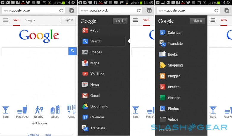
In a move to further improve on their mobile offerings, Google has redesigned its mobile homepage that includes much easier navigation and a cleaner look that's almost identical to the desktop version. Google took a lot of the buttons and selections that were once taking up space on the homepage and moved them to a new hidden sidebar.
If you click the icon with the three bold lines in the upper-left corner ( called the "Options" tab), this reveals the magical sidebar that includes a ton of more selections, like a list of your most used Google services. However, if a certain service you want isn't listed, you can find it by hitting "All Products" at the bottom.
Navigation is fairly straightforward and simple from here. Clicking on "Search" will bring up the main Google Search homepage, and it's also the default window whenever the Google homepage is first launched. Then, obviously, tapping on "Images" will bring up Google's Image Search. You can then tap on it again to close Image Search.
While it's reported that the redesign is showing up on all mobile devices, it seems it's mostly just working on Android through Google Chrome at the moment. We tried it on the iPhone in the Chrome browser, but we were still seeing the old design, and we're not really sure when Google will roll out the redesign to all platforms and browsers, so we'll just have to wait and be patient for the time being.
[via Android Community]
