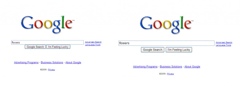
Google Supersize Search Box, Sit Back For Applause
It's saying something when you're so important a site to so many people that just tweaking a search box makes headlines, but then if you're Google that search box is all-important. The company has debuted its latest update to their hallowed homepage, a larger text entry box with a bigger font, and if you believe the PR hype it's just another example of how they're the big dog in search.
"Although this is a very simple idea and an even simpler change, we're excited about it — because it symbolizes our focus on search and because it makes our clean, minimalist homepage even easier and more fun to use" Marissa Mayer, VP, search products & user experience, Google
Yes, perhaps it's a little easier to use now – especially if you're partially-sighted, though we can't help but think that only the very moderately afflicted will benefit from such a relatively small increase in size – but we've been trying it out and there's not much more "fun" coming through. Given so many people now search via dedicated boxes integrated into browsers – like Google's own Chrome – the new homepage may not even be seen as often as you'd think.
Still, expect numerous hacks and workarounds by people wanting the standard-sized text box over the next few days, followed by general "wasn't it always like that?" apathy. Right now it's showing up on the US Google page, but not on all of the international versions, so enjoy the compact, narrowness of the outmoded pages while you can.
