Google Search Results Favicon UI Rolled Back, Redesigned In Experiments
Today Google updated the way Google Search results appeared in web browsers on desktop computers after a similar redesign earlier this month. The most visual bit of this update – the most prominent, easy to see, and central element of this update – is the favicon. As it was with mobile UI for Google Search results updated in May of 2019, so too shall it be for Google Search results on desktop computers – or at least that's what Google suggested on the 17th.
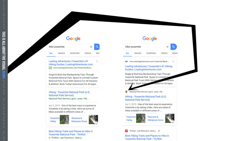
"We're dedicated to improving the desktop experience for Search," wrote Google search liaison Danny Sullivan. "As part of our efforts we rolled out a new design last week, mirroring the design that we've had for many months on mobile." They speak of the May update in the year 2019, the same redesign that appears in Search results here in January of 2020. Below you'll see an example of what that MOBILE redesign looked like, then even lower in the article here you'll see what came with the redesign for desktop, as well as the rollback.

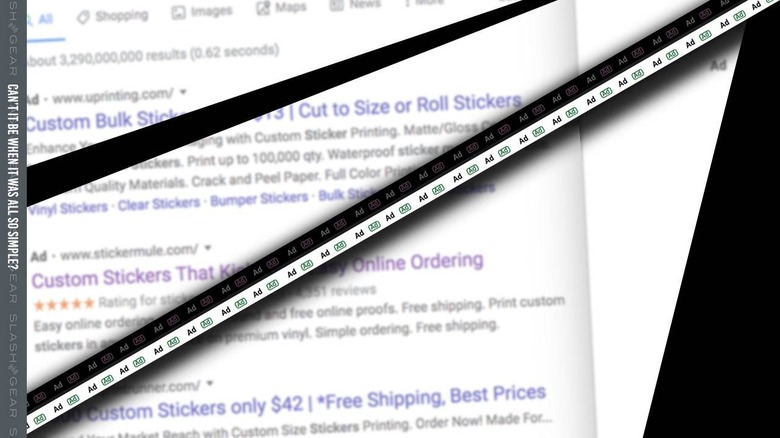
"The design has been well received by users on mobile screens, as it helps people more quickly see where information is coming from and they can see a prominent bolded ad label at the top," wrote Sullivan. This change, as shown in the original mobile update from back in May, puts more emphasis on the visual mark of the source, where earlier designs were largely text-based.
"We've heard your feedback about the update," wrote Sullivan, referencing the bit of backlash Google received at the release of the design back at release on January 17th. "We always want to make Search better, so we're going to experiment with new placements for favicons [and] our experimenting will begin today."

Google search results will show different UI for different users over the "coming weeks" while Google tests iterations. Some users "might not see favicons while some might see them in different placements as we look to bring a modern look to desktop."
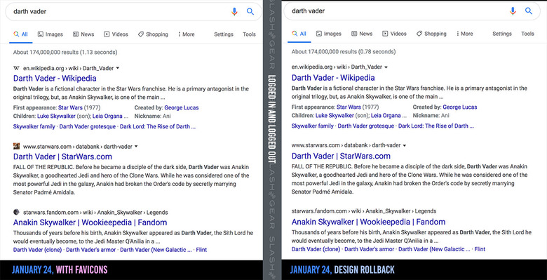
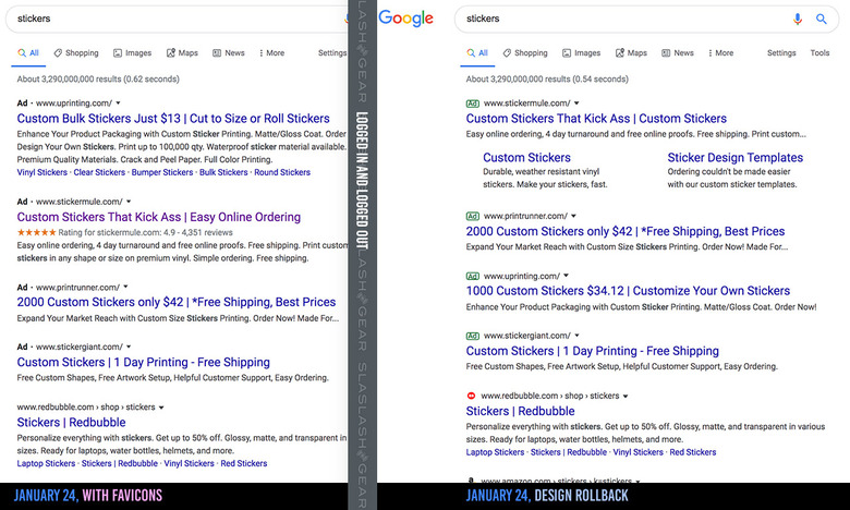
On the left you'll see Google Search results as they appear today before Google's roll-back of design changes. On the right you'll see results with the roll back to pre-favicon UI.

As an experiment, if you'd like to see the difference in your own Google Search results, try to search for a term in one browser window where you're logged into Google, then another where you're in incognito mode. You might see the same results, but you might just see two completely different sets of links – and different looks!
