Google Search Redesign Puts Brands To The Front
Google Search is getting a makeover, with results set to add recognizable brands and more in order to make finding your answer even quicker. The update will be showing up in mobile results first, Google says, though it coincidentally arrives in the midst of an indexing glitch that has left the search giant ignoring new content.
That glitch started overnight, and has left both Google Search and other properties like Google News with old articles and pages. Google confirmed it was "currently experiencing indexing issues that may cause stale search results in some cases," via its Google Webmasters account earlier today.
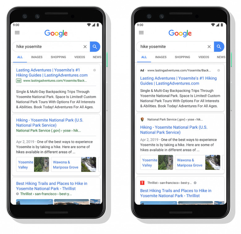
It's bad timing, given this new search results interface. That now includes website names and brands in the UI, at the top of each results card. Google says it's intended "to help anchor each result" and make it easier to skim down the page and focus in on the sites you might trust more or simply prefer. In the image below, the old UI is on the left, while the new look is shown on the right.

Meanwhile, adverts and promotions are also getting new branding. Products and services that are commercially pushed will now have a new bolded ad label at the top of the card, alongside the web address. Again, it's designed to make identifying what content is promoted more straightforward.
It's not the only clarifying changes to the interface which Google has made recently. The company also confirmed it would be changing how anti-abortion advertising would be shown in results, starting next month. Adverts for organizations which capitalize on abortion keywords, but which don't actually provide abortions – and in fact may attempt to push women to anti-abortion groups – will be flagged appropriately.
Google says it plans to use this evolving layout more in future, as it surfaces different content formats and actions in search. That could include buying a movie ticket directly from the results, or playing audio like podcasts. As such, the company says, "this new design allows us to add more action buttons and helpful previews to search results cards, all while giving you a better sense of the web page's content with clear attribution back to the source."
Mobile users will get the search interface update first, and it'll be rolling out over the next few days. Google hasn't said when it plans to deliver desktop search the new UI.
