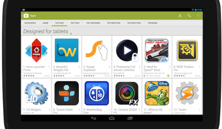
Google Play To Feature By Default "Designed For Tablets" Section On November 21
Google has been pushy with developers for a while now over its apps for tablets criteria, trying to get better looking app offerings for Android slate users. To further this, the company has announced an upcoming change that will be seen by Android tablet users specifically, moving the "designed for tablets" section front and center by default.
The "designed for tablets" section was added to the Google Play Store earlier on this past year, allowing those using 7-inch+ Android tablets to more easily find apps that were designed for use on their devices. Such a change also turned out to work well for developers, with some reporting large jumps in downloads after the section was added.
Starting on November 21, this section will be offered up on the top lists by default for those accessing the Play Store with a tablet. Those who want a wider view of apps will be able to toggle to a different view, however, so that all apps are displayed rather than just tablet-optimized ones. Furthermore, Google will also be adding another flag that could spur developers to begin meeting tablet criteria.
Beginning on the same day next month, all apps that fail to meet the tablet criteria set forth by Google will be labelled as "designed for phones," making it easier for tablet users to weed out offerings that would look poor on their device while simultaneously potentially introducing a hit in download numbers for apps that haven't been optimized for tablets.
VIA: Android Community
