Google Play Rolls Out New Design And Simpler Check-Out
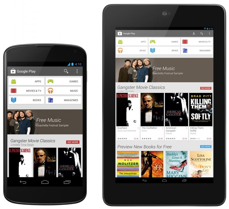
As expected, Google has issued a redesign to the Google Play store, and it's starting to roll out now to Android smartphones and tablets running Android 2.2 Froyo and higher. Google says that the redesign is much more simple and clean this time around, and the new design also helps users find the things they want in a faster manner.
The new design is more heavily image based than before, which means that content will feature bigger images that "jump off the page," not only making it appealing to look at, but to also make it easier to spot the content you're looking for. Themed items are also grouped together, such as magazines, books, apps, games, etc.
Recommended content is definitely not absent from the redesign. Google has made sure that you'll always see recommended content on the home page. As you scroll down, new recommendations will continue to appear, since "there is always more to see and explore." However, for someone like me who can't be bothered with such content, it may only come as a distraction.
However, Google says they simplified the check-out process, making apps, games, books, movies, etc. much quicker and easier to purchase. Google says they want users to start enjoying their purchase as soon as possible, but we can't ignore the fact that a quicker check-out process is a great way for buyers to think less about putting the item back on the shelf. Android users in the US should see the update at some point today, while international users will get the redesign in the coming weeks.
