Google Play Family Icons Updated With Consistent Designs
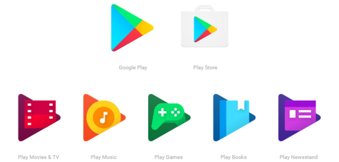
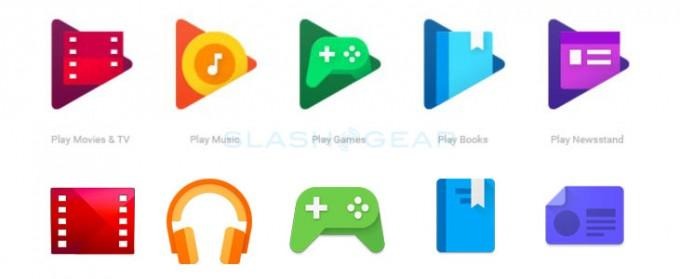
Soon the Google Play family of icons on your Android device will look different, and yet oddly similar. Google announced a design refresh for the icon family today, saying the new designs — each of which feature a triangle akin to the Google Play icon — are more consistent with each other, and better show their relationship within the overall Google Play family.
If you're not the type to pay too much attention to things, you may not even notice the change — each one retains a bit of its former self, only as a smaller icon within a larger colored triangle. The controller for Play Games is still present, for example, just slightly altered and now wedged within a green triangle. Play Music is more substantially altered, ditching the headphones icon in favor of a musical note within a couple of circles within a triangle.

Aside from the triangles, there are some other subtle changes — the icons are now flat, for example, with the crease in the Play Store icon disappearing, among other things. The colors are also more saturated, and they pop better on high-end phone displays.
Google doesn't go into an elaborate narration about whey it decided to change the icons' appearances — aside from making them more consistent, that is, and likely intending to make them more inline with Material Design. According to the company, users should see the new icon family arrive on their device some time in the next few weeks, so keep an eye out.
SOURCE: Android Blog
