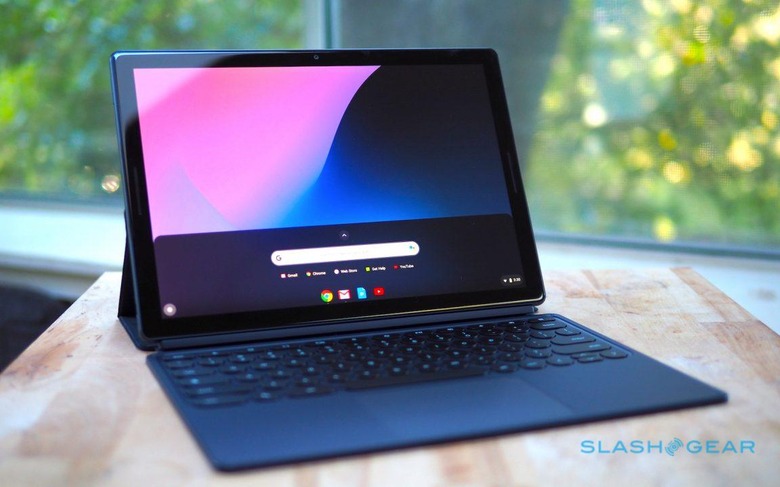
Google Pixel Slate Review: An Expensive Experiment
- Handsome, well-constructed hardware
- Keyboard is comfortable to type on
- Two USB-C ports are flexible
- Screen is beautiful
- Android app are still awkward on Chrome OS
- No headphone jack or SD card reader
- Pixel Slate Keyboard underwhelms in your lap
- Expensive
If the Pixelbook demonstrated Google could make a compelling laptop, the Google Pixel Slate is its attempt to do the same for tablets. Like the latest iPad Pro, it's a confident claim that what was once considered a pared-back, mobile OS can now wear Big Boy Pants and be everything you need to do "real work" on the go. In the process, though, Google finds itself bumping up against some of the same challenges that Apple did with its tablet, and the Pixel Slate doesn't always have the best answers either.
Hardware and Design
With its midnight blue anodized aluminum casing, curved edges, and rounded 2.5D Gorilla Glass 5 cover glass, the Pixel Slate is a handsome tablet. It's also thin, too, at just 7mm thick, though there's no flex when you hold it. The 12.3-inch "Molecular Display" is a delicious 3000 x 2000 resolution LCD panel, with bright and bold colors, though its bezels look positively thick compared to those of the latest iPad Pro.
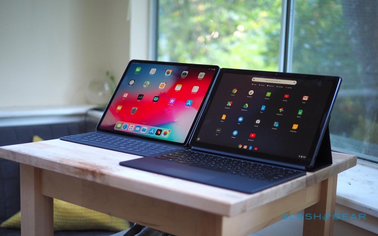
Although its display falls in-between the iPad Pro's 11- and 12.9-inch panels, the Pixel Slate is actually heavier than both. 1.6 pounds is on the hefty side for a tablet, though it's weight is nicely balanced. Like Apple, Google has opted to ditch the 3.5mm headphone jack, which will undoubtedly continue to frustrate many. At least it gives you a second USB-C port, either of which can be used for charging, 4K display output, or data.
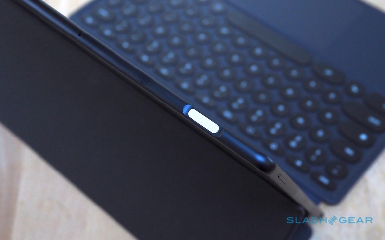
There's a volume key and a Pixel Imprint fingerprint sensor, integrated into the power button. Press that and you can be automatically logged into Chrome OS, or authorized Google Pay transactions. Personally, I prefer how Face ID on the iPad Pro works day to day, but the Pixel Slate has the advantage with Chrome OS' multi-user support, which iOS currently lacks.
Google has a wide range of processors for the Pixel Slate, spanning Intel's Celeron through its 8th Gen Core m3, i5, and i7 chips. You can have 4GB, 8GB, or 16GB of memory, and from 32GB to 256GB of storage. As you might expect, then, the price varies significantly: $599 for the entry-level Celeron/4GB/32GB tablet, up through to $1,599 for the Core i7/16GB/256GB version.
How you feel about that degree of choice – there are five configurations in the line-up – will depend on whether you see the Pixel Slate as a laptop replacement or as an iPad Pro alternative, I suspect. Certainly Google's cheapest tablet undercuts the iPad Pro significantly, though its performance won't match it. The Core i5 model, with 8GB of memory and 128GB of storage, that Google provided for review is $999, however, what you'd pay for an iPad Pro 12.9 3rd Gen with half the storage.
Whichever Pixel Slate you get, there's WiFi 802.11ac 2x2 MIMO, Bluetooth 4.2, dual front-firing speakers that sound reasonably for their size, and twin microphones. 8-megapixel cameras are front and rear. Sadly there's no cellular option for integrated LTE: Google tells me that it expects Pixel Slate owners to be happy with tethering, though I think there's nothing quite like the convenience of getting online with built-in cellular.
Chrome OS
A month after Apple's iPad Pro event, and the discussion around whether you can get "real work" done on a tablet – and, indeed, just what "real work" actually consists of – is still raging. The Pixel Slate wades into that discussion with Chrome OS, the ability to run Android apps, and two UIs. Some aspects of that arsenal works better than others.
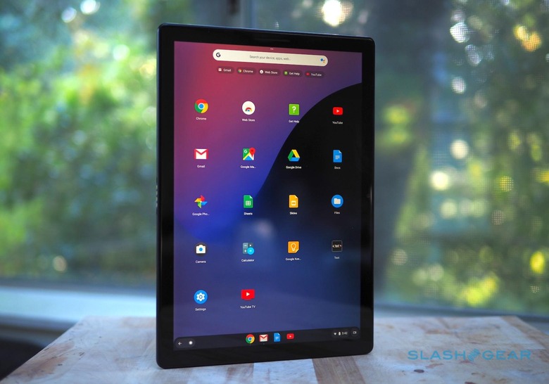
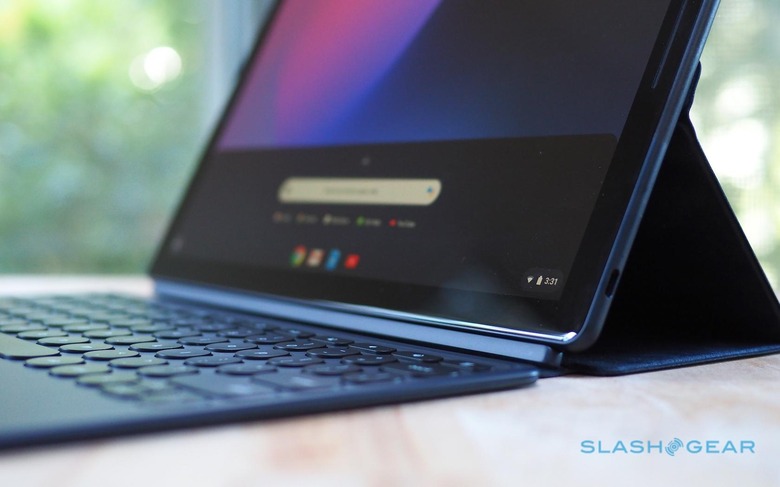
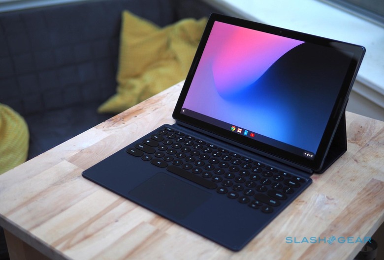
It's fair to say that Chrome OS has made huge strides since its early days. With the Pixel Slate it takes another step forward, with both a desktop mode and a tablet mode. Dock Google's tablet on the Pixel Slate Keyboard and desktop mode kicks in automatically, complete with a mouse cursor and a minimized launcher bar at the bottom of the screen.
Use it as a slate, though, and you get tablet mode. That expands the app launcher to occupy the desktop, with a row the apps Chrome OS predicts you're likely to want running across the top. It all looks very much like an Android phone, unsurprisingly by design.
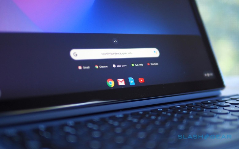
How Chrome OS operates depends on which mode you're in, most notably when it comes to multitasking. In desktop mode, you can have resizable windows that overlap and support flexible positioning, just as you would on a macOS or Windows 10 notebook. In the tablet mode, however, you get split-screen instead, with only the ability to adjust the proportion of each app on-show. There's a new gesture to pull out a Chrome tab and automatically create a split-screen view with it.
Considering multi-tasking is one of the more contentious aspects of the "can a tablet be used for real work?" argument, this twin approach by Google is a strategic one. In practice I do prefer it to how iOS does multitasking. It's hard to avoid the feeling that the iPad Pro 12.9 is squandering the display real-estate it has to play with; in contrast, being able to use the Pixel Slate – in desktop mode – as you might a regular laptop makes much more sense to me.
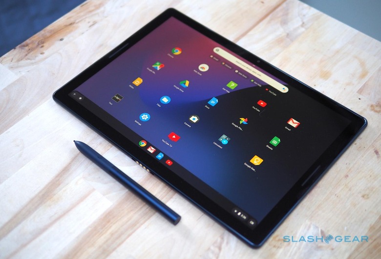
Similarly, Google's implementation of its Pixelbook Pen has a big advantage over the new Apple Pencil: handwriting recognition. You can write instead of using the on-screen keyboard and have that converted into text. It wouldn't be my first choice for composing a lengthy document, no, but for search terms or quick message replies it's much easier than fumbling between stylus and fingertip.
The downside to Chrome OS, of course, is the app selection. Performance on the Pixel Slate was noticeably smoother than on Google's demo hardware back at the early October launch, though I did encounter a couple of crashes in my testing, but it's the apps you get to use which might present the biggest hurdle.
Google's suite of office apps shows Chrome OS at its best. Then, the line between web app and local software is most thoroughly blurred. At the other extreme, though, there are Android apps that run on Chrome OS. While in theory that gives you the wealth of the Play Store for your Chrome tablet, the reality is that the experience just isn't refined enough yet. Apps magnify in space-wasting ways, or refuse to let you resize their windows.
In so many ways, Google has unlocked the hurdles that Apple has arbitrarily placed in iOS. The Pixel Slate's USB-C ports don't care about what accessories you plug in, for instance, while the Chrome you get is the desktop version, not a mobile browser. The downside is that, where the iPad Pro has limits Apple establishes in the name of creating a more elegant – if controlled – experience, the Pixel Slate's more libertarian approach means you'll inevitably run into some awkwardness or downright ugliness where the reality doesn't match the promise.
Pixel Slate Keyboard
Google proved with the Pixelbook that it knew how to make compelling notebook hardware. The fact, then, that it has opted to ignore some of the most-loved features of the Pixelbook for the $199 Pixel Slate Keyboard is frustrating. The so-called Hush Keys feel like change for its own sake.
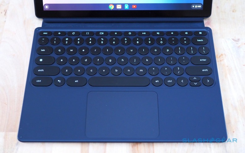
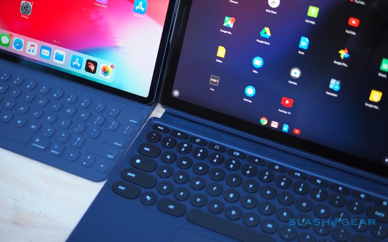
The 16mm diameter circular keys have a healthy 1.2mm of travel, and they're backlit which is useful. Since the keyboard uses pogo-pins for both power and data, there's no charging. Its magnetic stand can pose the tablet at any angle, unlike the two fixed positions of the iPad Pro's Smart Keyboard.
Another advantage over Apple's tablet keyboard is the trackpad. The Pixel Slate Keyboard gets a sizable 73.9 x 102.7mm 'pad, with a nicely textured glass surface and multi-touch support. It does help the Pixel Slate feel more like a proper laptop – though with a big footprint that's unwieldy and floppy on your lap – when it's docked.
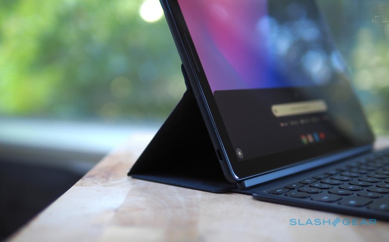
In fact, it feels a little like the Pixelbook trackpad, which is why the fact that the Pixel Slate Keyboard's keys aren't the same is so frustrating. The circular buttons aren't bad, and I'd certainly rather have them over those of the iPad Pro's keyboard, but they're also not as good as the more traditionally shaped keys on the Pixelbook.
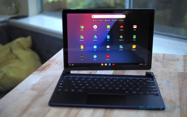
I preferred the keys of the third-party Pixel Slate keyboard Google also sent, the handiwork of Brydge. The $159.99 Brydge G-Type looks and feels far more like the 'board of the Pixelbook, albeit in a matching blue to the new tablet. Unfortunately, you then miss out on some of Google's own keyboard's niceties: the Brydge's has no pogo-pins so recharges separately via USB-C and connects to the tablet via Bluetooth. Closed, the whole assembly is thicker than a Pixelbook, too.
Pixelbook Pen
If you've used the Pixelbook's digital stylus then you won't be too surprised by how it performs on the Pixel Slate. In fact it's exactly the same hardware, only now available in a matching blue finish. You still pay $99, and you still don't get a place to dock or attach the Pen to either the tablet or the keyboard.
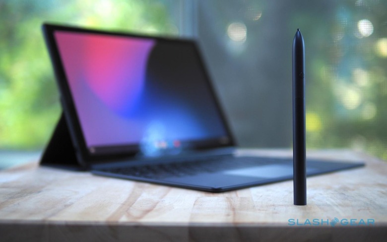
What you do get is pressure and tilt support, which makes note-taking and digital art more rewarding and natural. Hold down the side button and circle images and text, and the Google Assistant will search for related answers. Clever, though honestly it's not something I find myself using too often. I'd rather be able to reprogram the button, Apple Pencil 2 style, for secondary features.
Battery
Google says the 48 WHr battery in the Pixel Slate should last for up to 12 hours, though that's based on a mixture of standby, web browsing, and other use. The reality has still been impressive, though. Based on my own mixed use, primarily web browsing, some music and video playback, and some typing, 8-9 hours seems reasonable.
Verdict
For every device promising us the functionality of a laptop with the flexibility of a tablet, there's also a different approach to how those two identities will operate. Google's strategy with the Pixel Slate feels a lot like its mobile strategy in general. You're poised on the cutting-edge of what Chrome OS – and Android apps on Chrome OS – can do, in a way that's far less restrained than Apple's stance with iOS and the iPad Pro.
Sometimes that works out, like being able to use the Pixel Slate with a keyboard as a multi-window laptop alternative. Other times, however, you pay the price of being at the bleeding edge. Android apps still don't feel mature enough to be more than a stopgap measure in many ways, ungainly and unpredictable in a way that you can't really accuse the contents of the iPad Pro's App Store.
Like with the iPad Pro, too often I ran into frustrations that the Pixel Slate threw into my path, and sent me scurrying back to my regular laptop. And the cold reality is that the App Store has more to suit Apple's tablet than the Play store has for Google's. Factor in that the Pixel Slate – with expensive and pretty much essential keyboard attached – is thicker than the Pixelbook, not to mention the annoyances of trying to perch it on my lap, and I think I'd still go for the far more affordable convertible notebook not its new tablet sibling.
