I'm No Notch-Hater But Jeez, This Pixel 3 XL
I'm not a notch hater. Honestly, I'm a little surprised that that's a sentence you can say in 2018 and have it relate to an actual controversy in the tech world, but nobody said this year would make any sense. Anyway, I don't have an instant revulsion to phone display notches, but I have to say, I'm not feeling the Pixel 3 XL's screen right now.
After the Pixel 2 XL display debacle last year, where Google faced (legitimate, I felt) criticism for the quality of its OLED panel and the odd blue tint it suffered from, I was exceedingly pleased to see the Pixel 3 XL's screen didn't suffer the same complaints. Richly colored, it's much more akin to an iPhone XS panel, though falls short of the over-saturation that many associate with Samsung's Super AMOLED.
That was the nice surprise. Something I wasn't expecting to be so bothered by, however, was the notch. That's the cut-out in the top center portion of the Pixel 3 XL's display, and it's undoubtedly been the most controversial element of the smartphone's design since the first leaks began months ago.
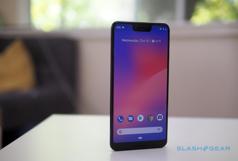
The way I've always seen it, the screen notch is a necessary evil. We demand a lot from smartphone design, and physics sometimes gets in the way. If you want a) a big screen, that b) takes up as much of the front of your device as possible, but c) aren't willing to give up the selfie camera and various sensors that modern phones come with, then you're more than likely going to get a notch.
Some people – and companies – aren't willing to make that compromise to hit all three of those factors, and so you end up with a rectangular display with at least a thicker bezel at the top. Samsung's Galaxy S9 and Galaxy Note 9 are excellent examples of that this year. No notch, but neither are their top and bottom bezels quite as slim as those on other handsets.
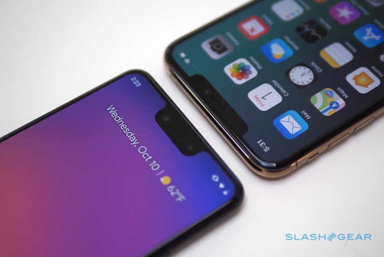
The iPhone XS, meanwhile, has thoroughly embraced the notch. Apple puts its clever TrueDepth camera array there, of course, and as of its 2018 line-up there's no new iPhone without a notch to choose. Want the latest hardware? Get used to the cut-out.
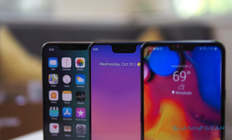
Notably, Apple doesn't follow the path of other smartphone makers with dimpled displays. LG, for instance, has had notches on some of its phones since last year. The LG V40 ThinQ is the latest, and you can dip into the menu settings if you find the cut-out truly infuriating and switch on an option to mask it. Effectively apps treat the remaining screen as a regular rectangle, though in the process you probably end up with less usable space than if LG had just used a no-notch design in the first place.
Apple doesn't have such a setting. It's the notch way or the highway. Google said yesterday it would offer Pixel 3 XL owners the choice, though there's no obvious setting to do that on the review devices it has handed out so far.
Instead you have to dig into the developer settings to flip it, something I suspect few people will ever do. They shouldn't, either, because it's a mediocre workaround. Even with it enabled, for instance, you still don't get a full status bar's worth of notification icons. They still cut off when they get to the section where a notch would start.
A combination of understanding that's the necessary evil behind the choice we make, and the knowledge that I can probably get used to most things unless they're causing me legitimate pain, has helped me past any real notch annoyance. I don't really see it day to day, as I use the iPhone XS Max. While I've been spending time with the LG V40 ThinQ, my eyes have just generally learned to ignore it.
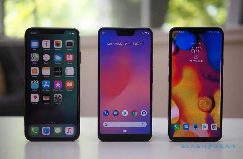
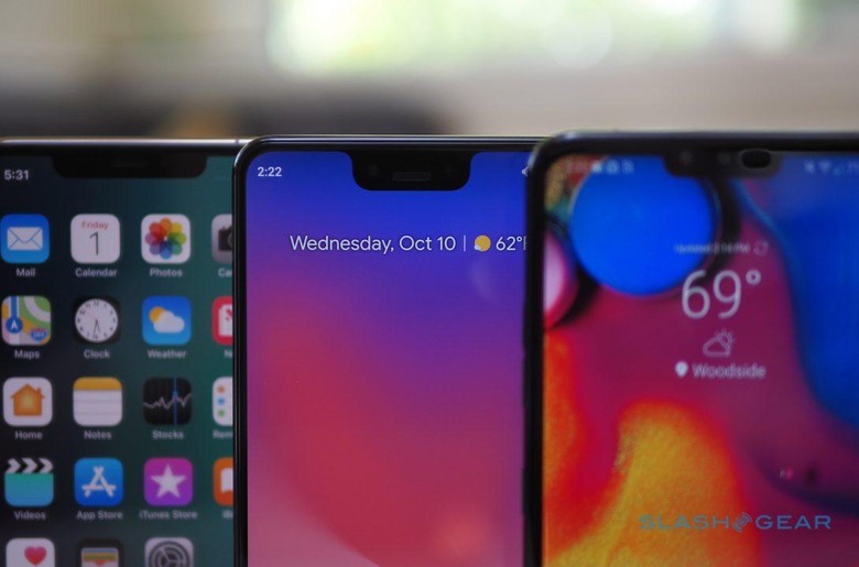
The Pixel 3 XL's notch, though, feels a little different. For a start it's more intrusive: deeper, perhaps twice as much so, as the cut-out in the V40's screen. The fact that's not as broad as the iPhone XS Max's notch only emphasizes the depth, at least to my eyes. It looks, frankly, out of place.
Google's argument is the same as that of Apple, LG, and the other notch-adoptees. It has put two front-facing cameras there, along with the earpiece and other sensors, so that it can offer both regular and wide-angle photos. If they didn't intrude into the screen, then the upper bezel would be broader all the way across, as it is on the Pixel 3.
Why, though, does the Pixel 3 XL notch have to be quite so big? The V40 ThinQ has two front-facing cameras as well, for similar regular and wide-angle selfies, but it doesn't suffer from notch-swell in the same way. Apple may only present one front-facing camera to users, but the TrueDepth array has a variety of sensors and projectors it uses, which all take up space. Even then, its notch is less overt than Google's. The Pixel 3 XL doesn't even have a fancy Face ID-style 3D feature mapping system for security.
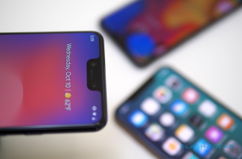
"The notch enables us to provide the best cameras (two, one of which is wide angle) and audio experience," Google argued with one display critic on Twitter this week. "Pixel 3 also has a smaller border & front-firing speakers to provide optimum sound quality. Our notch-to-display ratio is actually less than many top competitors."
That latter factoid may be correct, but if there's one thing this whole notch saga has demonstrated it's that the reaction is primarily an emotional one, not a rational one. Whether you not only see the notch but get enraged by its presence isn't just a factor of what proportion of notch-to-display you've hit. Instead, it's a matter of how the cut-out fits into the overall styling of the device.
There, I'm not sure Google has quite got the balance right. I'll admit, though, I'm in my second full day of using the Pixel 3 XL: it's entirely possible that, after a little more time, my eyes will give up their objections. Something legitimately useful, like Face ID has been on the notched iPhones, might've helped smooth that process.
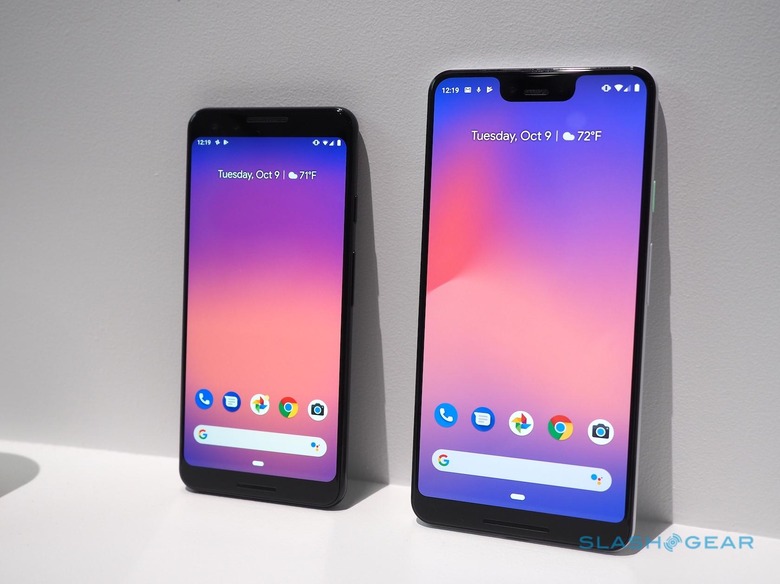
Instead, Google has been its own worst enemy, and provided us with the perfect example of how the Pixel 3 XL could've been better. That is, of course, the Pixel 3, a handset which looks far more balanced when it comes to the width of its top and bottom bezels. The 5-inch Pixel 2 left me feeling it was just a little bit too small to be my everyday device last year. This 5.5-inch Pixel 3, however, is nestling right into a sweet spot.
Consistency speaks volumes. Samsung sticks with its no-notch design on its flagships: its attitude to display shape is clear (even if it then feels obliged to shove some snark in Google's direction, just to double-down on that). Apple, meanwhile, switches over wholesale to notches: you can't miss its attitude there.
Is Google embracing the notch, or just suffering it, or unclear either way? I'm not sure and, looking at the Pixel 3 and Pixel 3 XL, I don't think anybody could be. For 2019's Pixel 4 and Pixel 4 XL – if, indeed, they do end up being called that, and if there are still two sizes of phone – will there be a notch, or no notch, or will it be half and half again?
It's a question the importance of which is elevated by the fact that Google doesn't just make phones, it makes phones that drop hints – heavy or otherwise – to other Android device-makers how it envisages the future of the OS progressing. Native support for non-rectangular displays in Android was the first sign that Google was acknowledging this new world of screen shapes, but if you're trying to divine exactly what it thinks the "right" screen is for the platform, neither of these new Pixels are much help there.
Maybe I'm reading too much into all this. Perhaps Android OEMs aren't following quite so closely in Google's footsteps these days, and are happier treading their own design path. Part of Android's value has always been the choice inherent to the ecosystem: if you don't like how Google's phone looks, you could buy an LG, or a Samsung, or a Huawei, or something else.
The Pixel 3 XL, therefore, might just be an awkward looking phone in a sea of device options. No grand error in Android's legacy, but just a tougher decision for those who expected to buy the biggest Pixel around this year, but who now find themselves questioning its aesthetic. Perhaps time will temper just how odd it looks. All I know now is that the Pixel 3 XL seemed at first like a no-brainer, but even to my notch-agnostic eyes this Android flagship is making me have second thoughts.
