Google Photos App Gets A New Design And A New Feature
Although often seen as a form of narcissism, selfies, just like the normal photos that we take, are the way this age celebrates and preserves memories. The growing capabilities of smartphones allow us to take photos by the dozens even hundreds, making it hard to organize and search for photos take just months ago. Google says it created Google Photos (and related cloud and AI features) just for that and now it's giving the app a refresh to put your memories front and center.
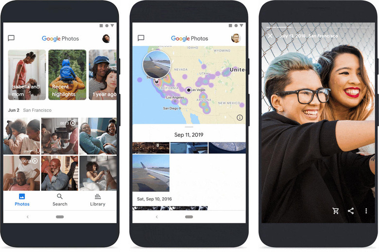
Google Photos has condensed everything into three tabs, with "Photos" as the first and primary place you'll see all the still and moving photos you've taken. This is also where automatically generated Memories are now found since the "For You" tab is now gone. Those Memories are promised to include more kinds of content but you're still free to hide memories of specific people or places you don't want to revisit.
The Search tab lets you do more than just search. It also has Google Photos' newest feature, a map view. Now you can follow your travels around the world as chronicled by your smartphone camera. As with any privacy-related feature, though, you always have the option to edit or even completely turn off location information.
The Library tab is pretty much where everything else that didn't fit those other two tabs can be found. It's the dumping ground for Albums, Favorites, Archives, and even Trash. Users in the supported markets will also find the Print Store here.

The new Google Photos is pretty much the same old Google Photos, just cleaned up and re-organized to adapt to the latest trends and user habits. Just like the app itself, the icon also got a refresh, still depicting a pinwheel that represents nostalgia but with a design that's more in tune with Google's latest design language.
