Google Nest Hub Might Have Its Very Own App Launcher
Although they look like stationary tablets, smart displays like the Nest Hub or Echo Show are specifically designed to remove that misconception. The software, in particular, has an interface that isn't exactly conducive for physical interaction and is more geared towards voice commands with audiovisual feedback. It seems, however, that Google is taking things in a different direction with an experiment that brings a familiar app drawer to the Nest Hub.
Technically speaking, the Nest Hub platform doesn't have apps. It does have Actions that fulfill that role but are more like simplified versions of apps. These weren't designed to be accessed directly like you would launch apps on Android, but Google might be getting other ideas.
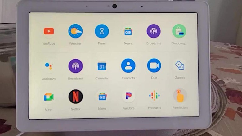
A post on Reddit shows a Nest Hub Max with this new app drawer. In many ways, it is similar to the stock Android or Pixel experience, with a short swipe up to first reveal some "Suggestions" and a fuller swipe to show the full grid. "Apps" are ordered alphabetically, as you would normally see on most app launchers.
Tapping on the icons naturally launches the Actions associated with them, be it viewing YouTube or Netflix or making a Duo call. Normally, these Actions can be started with voice command, but Google also surfaced recommended Cards from time to time. Those cards can still be accessed with a swipe from the left.
This app launcher experiment is clearly in its initial stages as the gesture recognition seems to still be unpolished. Whether it actually becomes a new staple feature of Nest Hubs is another open question, but it could change the way how consumers approach smart displays if it does.
