Google Maps Redesigned Web Interface Goes Live For All
Those in the beta program for Google Maps might have forgotten that not everyone enjoys the same access to the new version of the service, with most still using the previous version. That finally changed today, with the new design going live for everyone to use, giving access to what has – until today – been the domain of those who received an invitation.
We got a look at what the new Google Maps would hold earlier this year, with Google showing off the upcoming redesign at it I/O 2013 event this summer. A beta program went live not too long after, allowing users to submit for an invitation, with some of us lucky enough to receive them quickly, and others finding themselves still waiting up to the day the new design was unleashed for everyone.
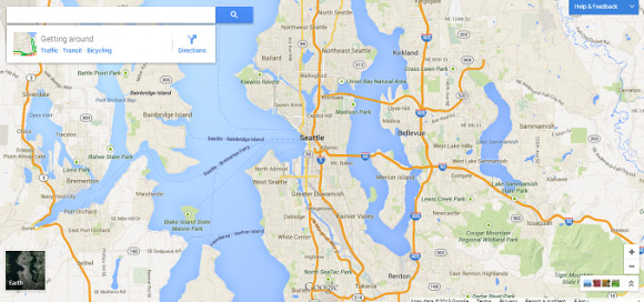
With the new update – which users will need to get by heading over to the new Google Maps information page and selecting "Try it" at the bottom of the screen – is a completely new design over the previous version. Users will find it brings with it faster loading, which is achieved by swapping out the graphics tiles for vectors. The Maps' interface has been stretched to fill up the entire screen, as well, rather than leaving a portion on the left side for data.
The other significant change has been the addition of Google Earth-like outer space exploration to Google Maps. This feature requires users to meet certain standards, such as running Chrome or Mozilla Firefox, as well as having hardware under the hood capable enough of running the software. Space is a few "Zoom Out" button clicks away.
There are other features, as well, which you can find for yourself by heading on over to the site. You'll be able to take photo tours of locations, view public transportation routes with ease, pull up comparison charts, and more. What do you think of the changes? Do you like them, or are you already lamenting the change?
SOURCE: TechCrunch
