Google Maps Next For Material Design Revamp
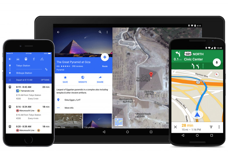
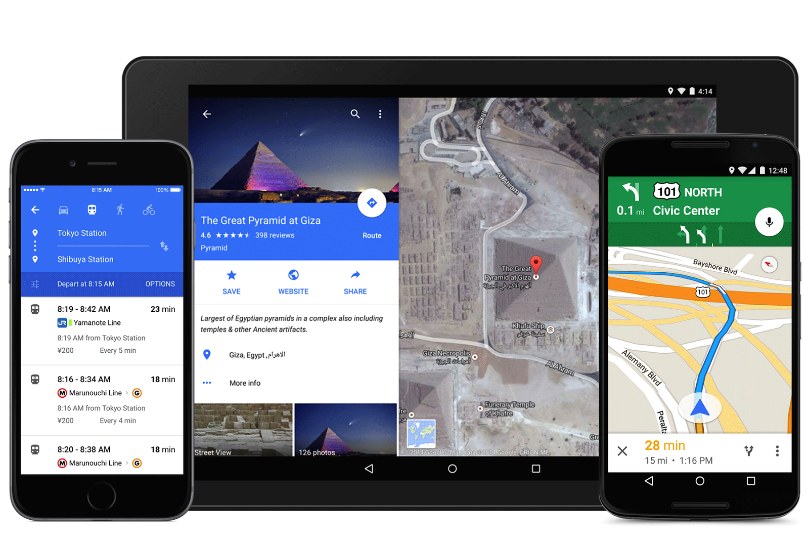
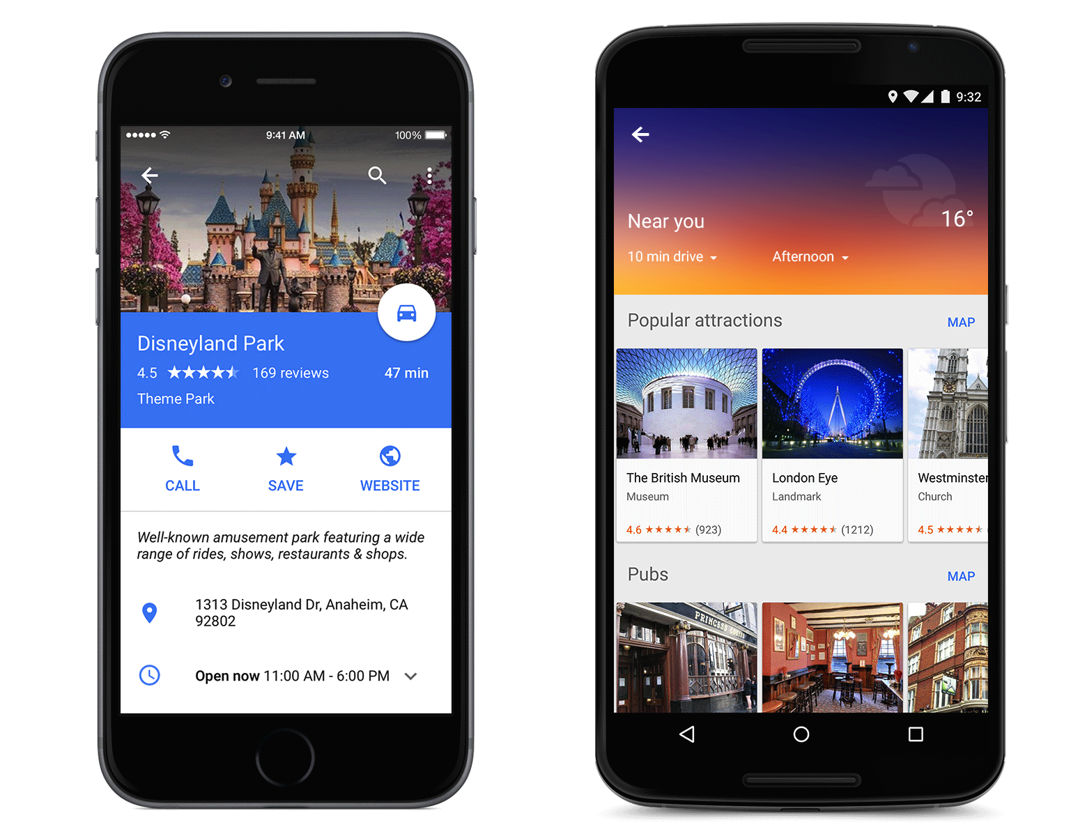
Google has been on a roll recently, updating its core app suite with Material Design style, and next in line is Google Maps. Both the Android and the iPhone versions of the popular navigation app are getting a revamp, with cleaner graphics, more intuitive controls, and a look that meshes with the Android 5.0 Lollipop aesthetic. Although the most obvious changes are to the design, though, that's not to say there aren't new features tucked in there as well, including closer integration with third-party services like OpenTable and Uber.
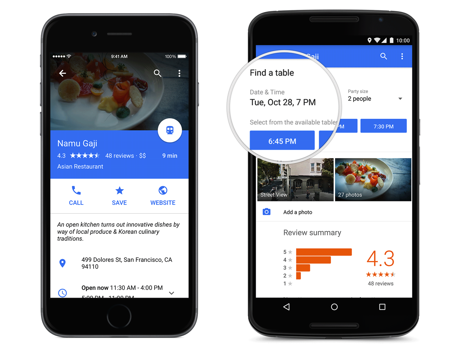
So, for instance, there's now the ability to not only see restaurant details, as per the existing app, but to make a reservation directly from the listing. Those in the US will be able to use the OpenTable-powered service initially, with the usual controls over time and party size.
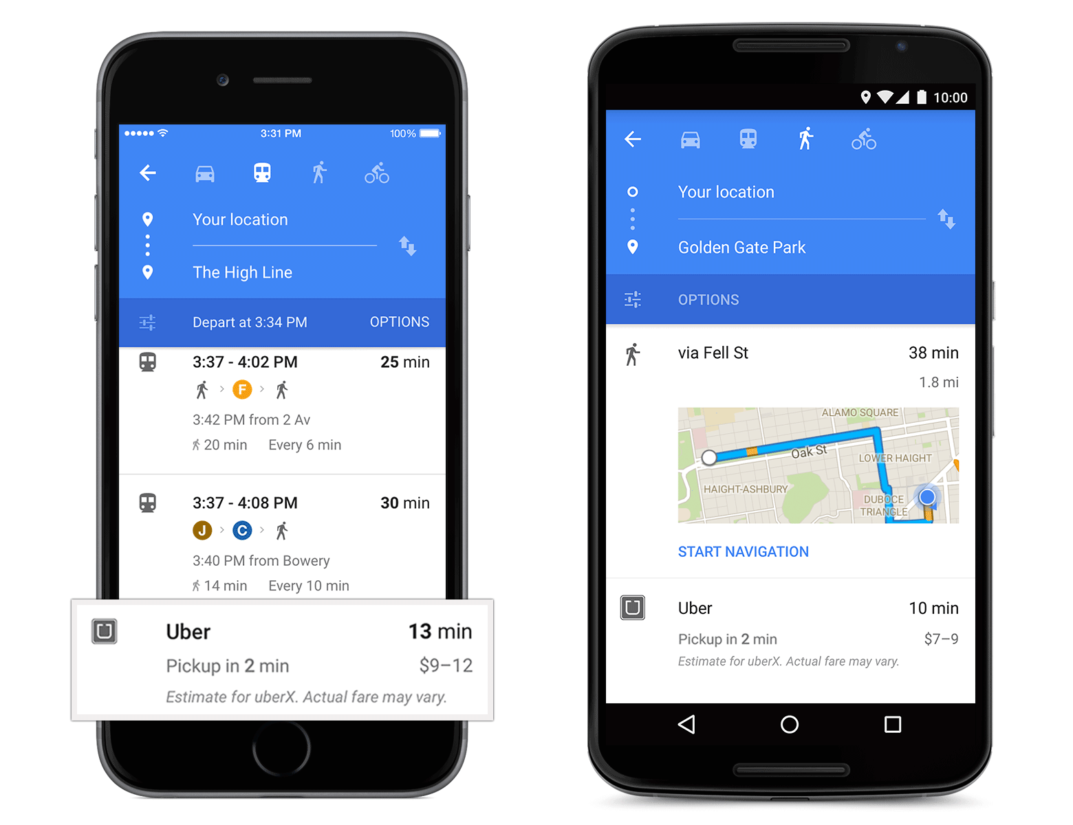
As for Uber, Google Maps first added links with the taxi-replacement service back in May, but only effectively as a shortcut to the regular Uber app. In the new Google Maps, though, you get an estimate for pickup time and price: you'll still have to switch app to actually book, but it should speed up the time it takes to compare with public transportation or other methods.
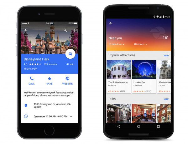
It's the UI which is most intriguing, though, with a flatter layout that gives the impression of vertically-stacked cards and panes.
Tapping on the info-sheet at the bottom of the screen, for instance, pulls up an info layer on top of the map with a new animation. There are also new links to "more to Explore' for those wanting extra details.
What's interesting, perhaps, is Google showing little inclination to match Google Maps for iPhone to the iOS 8 theme, instead pushing its own Material Design in preference. We'll be able to see how well that works over the "next few days" when the Google Maps update rolls out.
SOURCE Google
