Google+ Is Not Dead, Classic Look Will Soon Be
Reports of Google+'s death are largely exaggerated, despite how some might want it to be. At least, that is definitely the vibe that Google is giving off by announcing a somewhat major refresh to its social network turned community platform. The new Google+ will make smarter use of space by hiding "low-quality" comments and taking advantage of huge, hi-res photos. Google is also bringing back Events functionality to the platform but is also on the verge of saying farewell to a classic look.
Initially envisioned to take on the likes of Facebook and Twitter, Google+ never really reached mass adoption beyond the Google faithful as well as Android app communities. Google+ has, in fact, become more of a community hub for interest groups instead of a high-traffic social media outlet. Which is probably for the best, as it keeps Google+ more focused and the noise to signal ratio quite low.
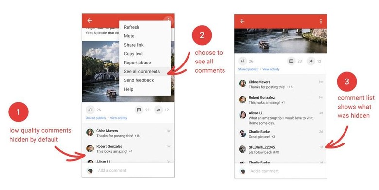
Still, unnecessary, sometimes even unfavorable, content still manages to come through at times, especially in the comments section. Using its world-renowned ranking algorithms, as well as feedback from other commenters, Google+ is now able to hide those lower quality comments from your list. Should you want to see them all, however, it's just two taps or clicks away.

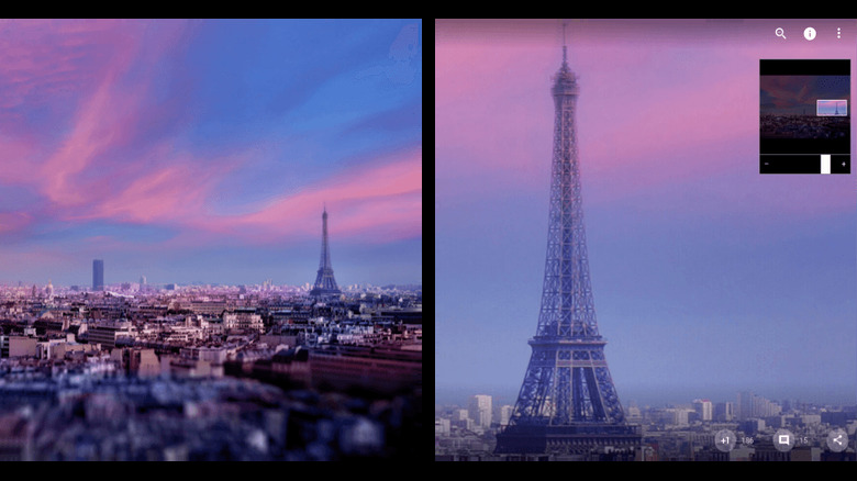
Screens are getting larger, even on phones, so Google+ tries to make smarter use of the real estate. In addition to cramming as much content as possible, edging out the once ubiquitous whitespace, Google+ now also lets you zoom in on photos, which is great for high-resolution captures posted on the website.

Perhaps most importantly, Google+ is getting its Events feature back, which will allow users to create as well as join events on the platform. At least on Google+ for the Web. Considering how Google+ has turned into a community hub, that's pretty much a necessary feature.
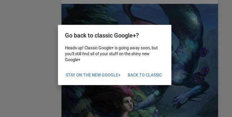
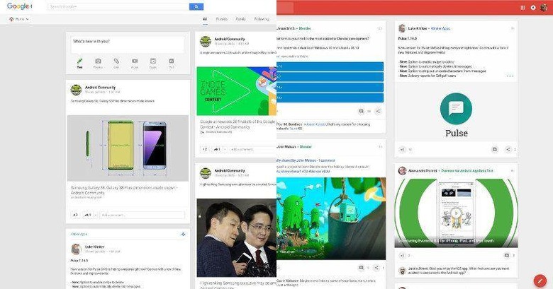
Google+, however, is also shedding off something. For far too long, it has supported the "Classic" look, bearing an aesthetic language before the days of Material Design. While Google+ already has a more modern theme, it has allowed users to switch back and forth between the two. Soon, however, the Classic theme will be gone for good and users who are either still on Classic or are switching to it will be greeted by big fat warnings that it will soon be the case.

SOURCE: Google
