Google Images Redesigned With Side Panel For Easily Comparing Results
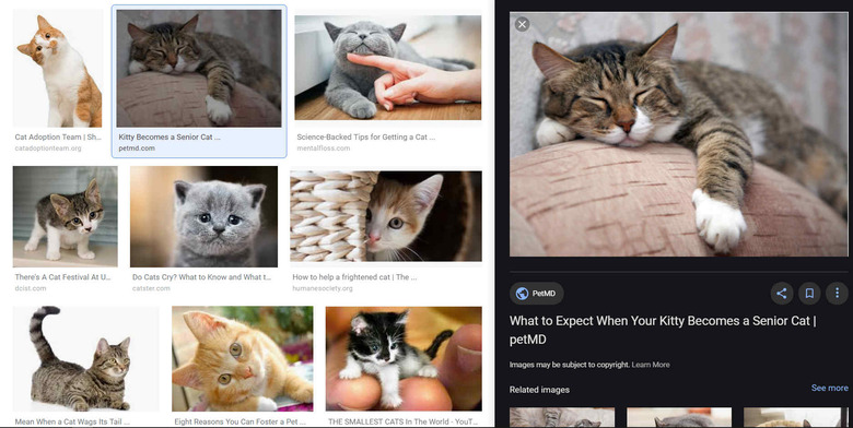
Google has updated its Image Search tab with a new design that enables users to easily compare images. Unlike the previous design, which was somewhat slow and opened a large info box around the image directly in search, the new design opens the image in a static sidebar that remains in place while the rest of the image search results are scrollable.
The new design has been introduced on Google Images on desktop. The primary change is the large side panel that remains in place when users scroll through the rest of the search results. The side panel shows the image, the page it comes from, and the rest of the Google Images features, including the share, bookmark, and collection buttons.

Users can scroll down in the side panel independently of the image search results in order to see other images similar to the one that was selected. The side panel also includes useful information, including the brand and price for products featured in a selected image.
When applicable, these product listing in the Google Images side panel also show reviews from others who have purchased the product. The overall experience is seamless, requiring fewer clicks for more information while maintaining — or allowing the user to continue browsing through — the original image search results.
Google points out that the new design is also better for publishers and retailers because users can easily click through to the site where the image is located. The new design started rolling out today and is available for users who access Google Images on desktop.
