Google Glass Original Prototype Eyes-On With Isabelle Olsson
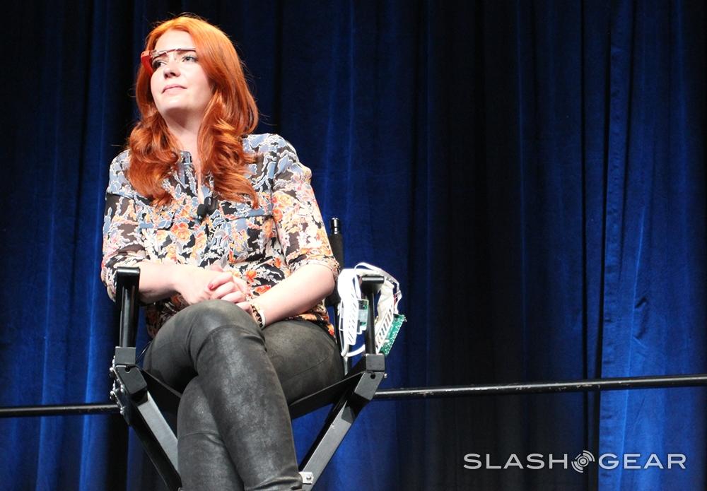
At this years' Google I/O developers conference, a Fireside Chat with several members of the core Google Glass team proved to reveal much on not just the future of the device, but its origins as well. While earlier in the day a single slide had been shown depicting a set of six original prototypes of what was then called Project Glass, here lead industrial designer Isabelle Olsson had one key prototype on hand to show SlashGear in the plastic, as it were.
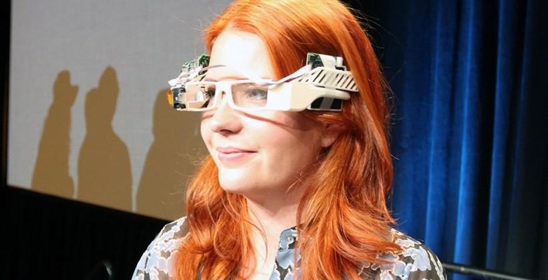
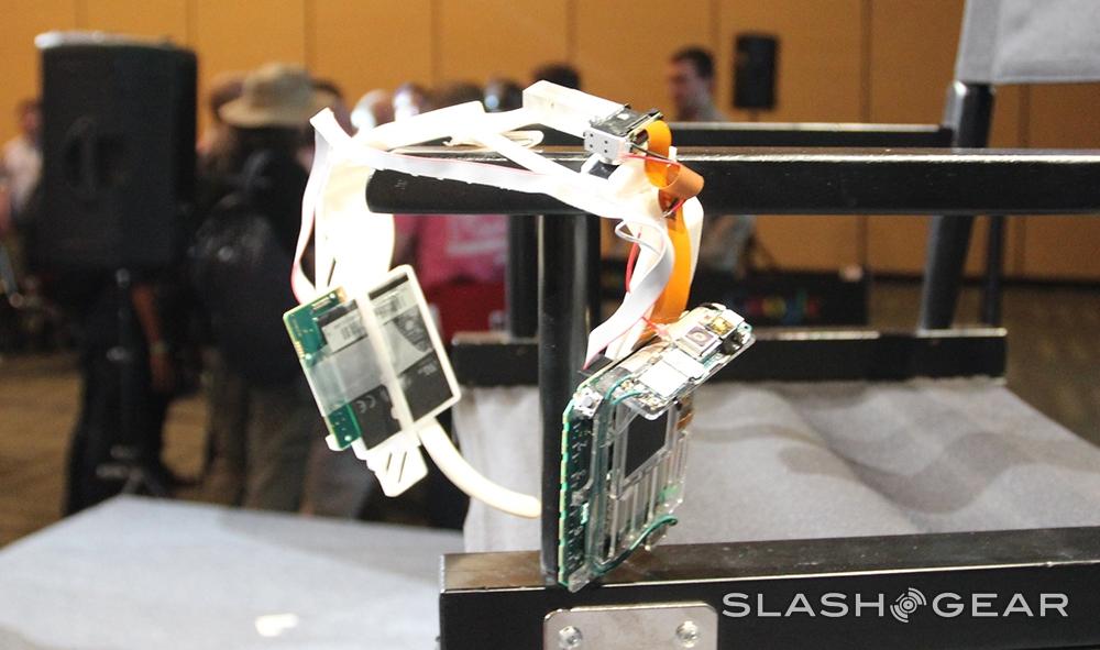
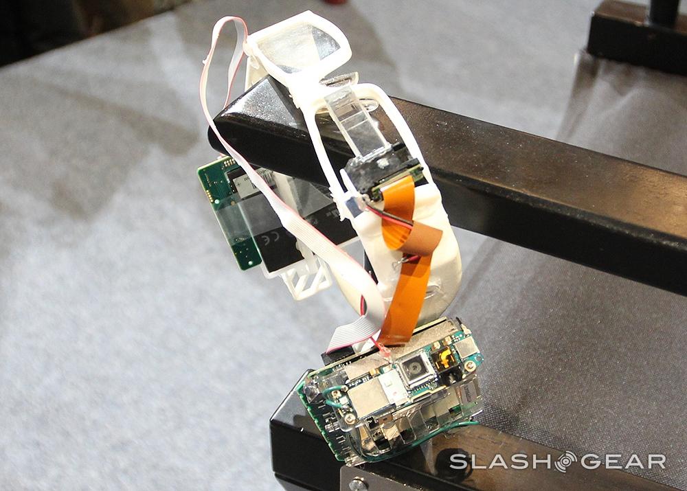
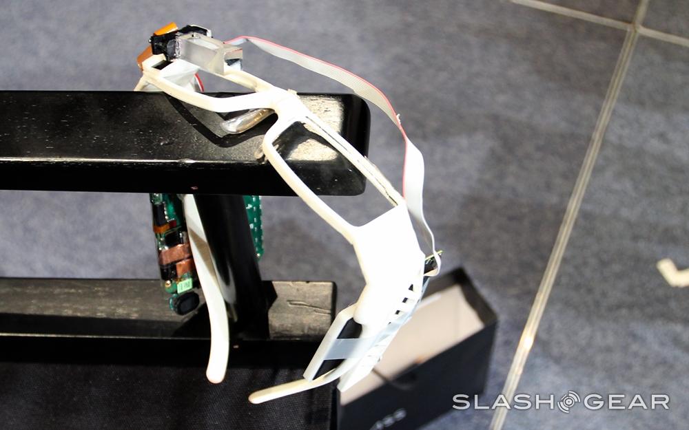
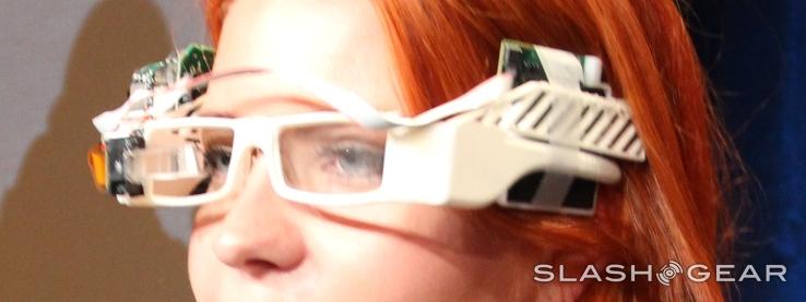
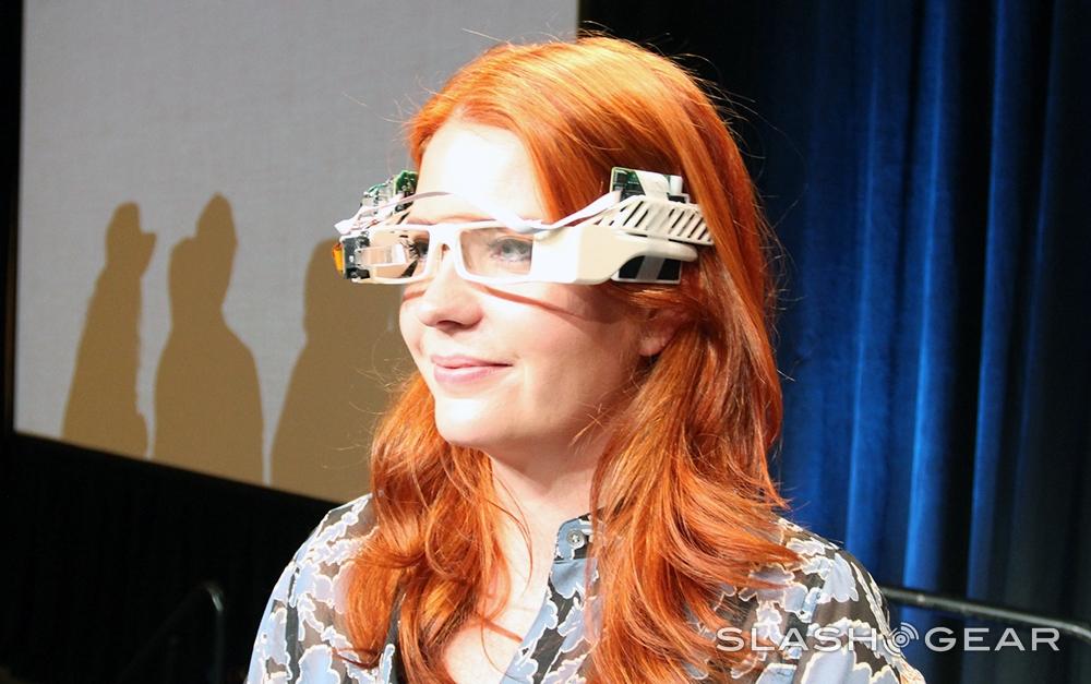
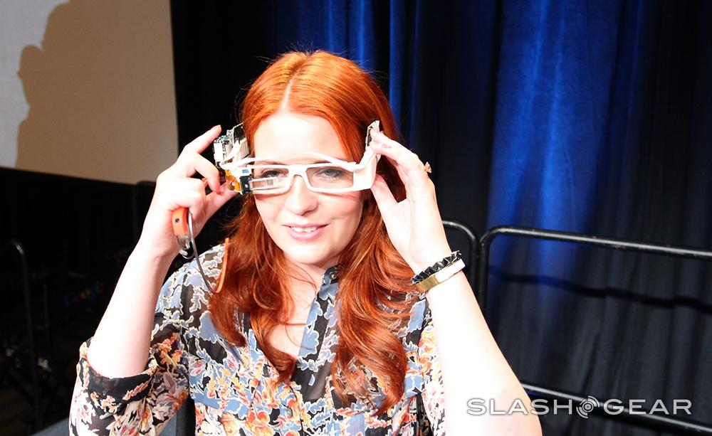
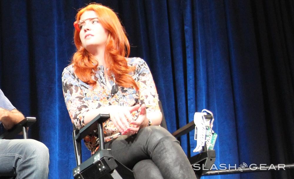
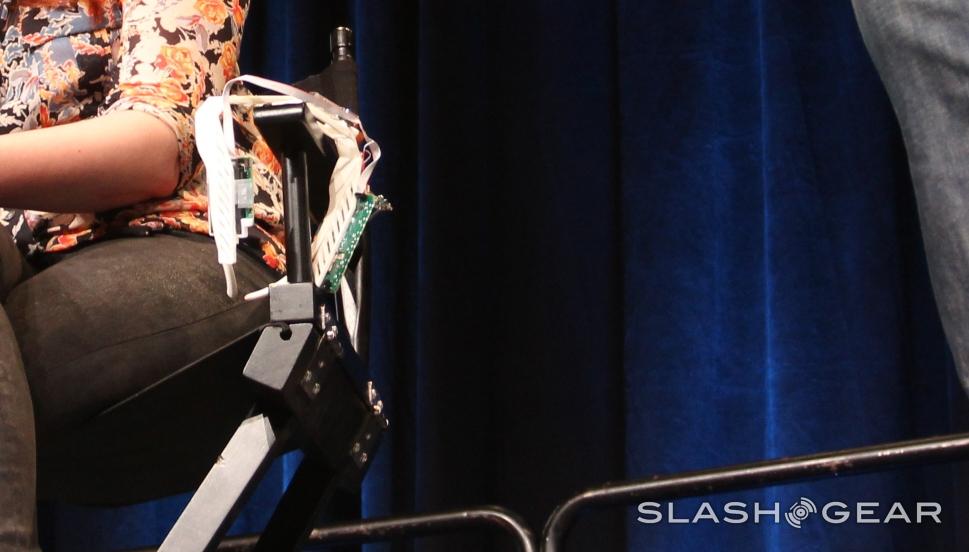
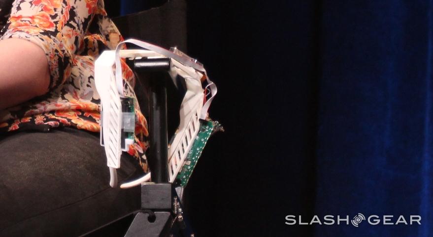
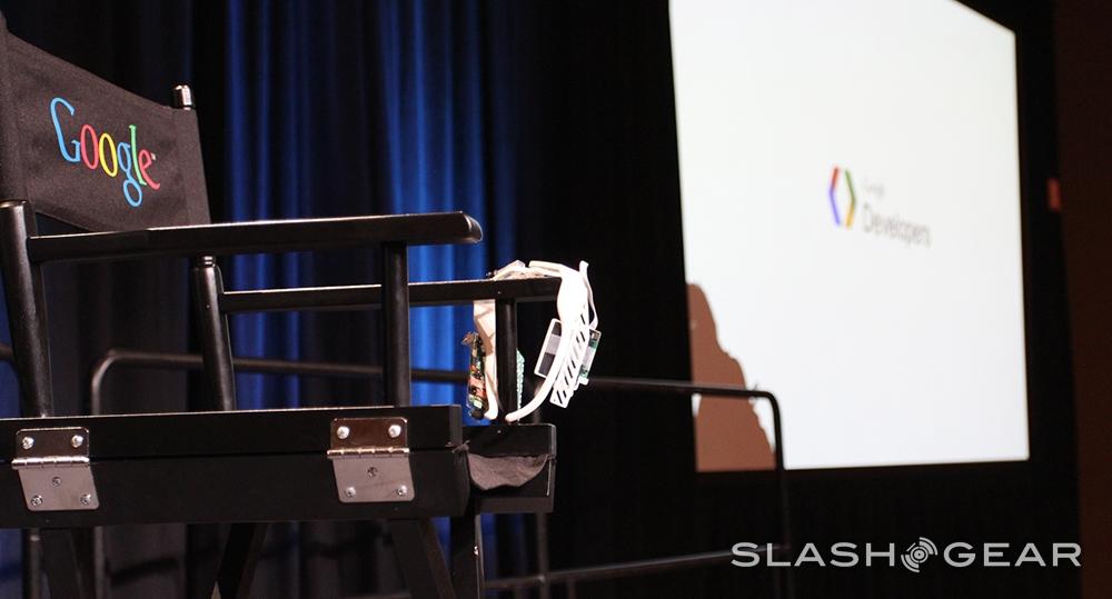
As Olsson made clear, this device was created as one of the very first iterations of what's been reduced to a simple skeleton frame and single, removable computer element. What you're seeing here is a set of development boards attached to two full-eye glass lenses, white plastic, tape, exposed cords and all.
Isabelle Olsson: When the team started working on this, it was very clear that we're not taking something that already existed and making incremental improvements to it. The team wanted to create something that's much more intuitive, immediate, and intimate. But to create a new kind of wearable technology, that's so ambitious, and very messy at points.
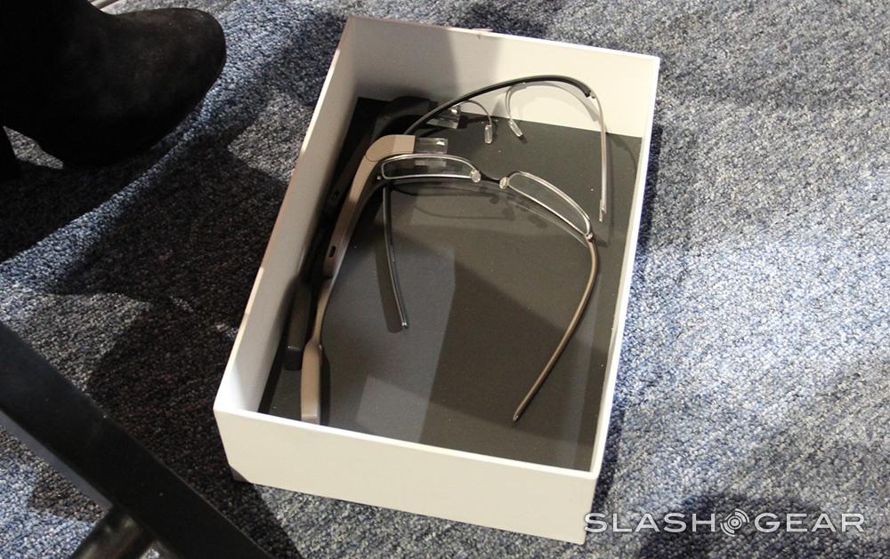
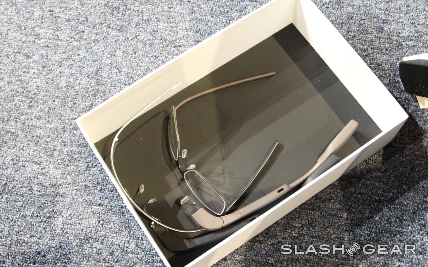
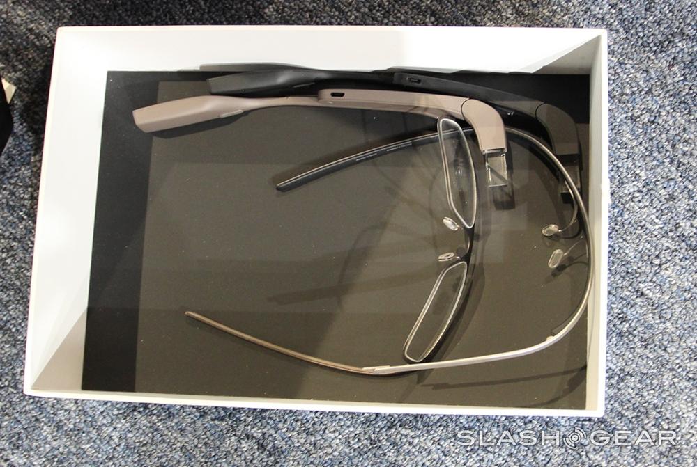
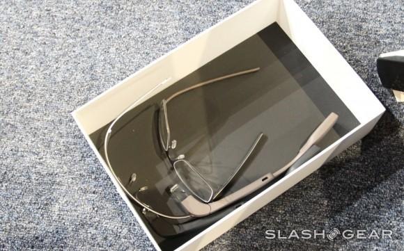
In addition to showing how this pair of glasses worked with folding sides and a real, working set of innards (if you can call them innards, of course), Olsson showed one of the prototype pairs of prescription Glass glasses as well. These are seen in the box below, and their design was seen on Google employees here and there during the week as well, live and active.
Olsson: I will never forget the first day on the team and when I walked into a room wearing these CRAZY things on their heads. I brought the prototype so you could see what I walked in to. It comes in a fancy bag...
Olsson: I think like the colors of the board, maybe, fits my hair color, but I don't know. It's kind of heavy, though. I think I'm going to take it off now. So – but – how do you go from something like this to what we're all wearing today?
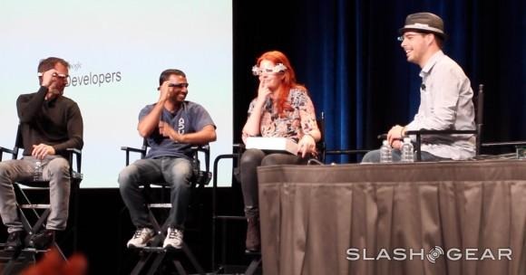
Olsson: We took a reductionist approach. We removed everything that wasn't absolutely essential. And then in addition to that, I formed three principals to guide the team through this ambitious, messy process. Those are:
• Lightness
• Simplicity
• Scalability
You'll find this particular chat split up across three different features, each surrounding Olsson's fireside chat contributions. The one you're in now of course stays within the bounds of the prototype you're seeing above and below. There are also posts on color choices for Glass, a bit about Modular Fashion, and another expanding on the design of the final product.
Olsson: When I joined the project, we thought we needed 50 different adjustment mechanisms, but that wouldn't make a good user experience. So we scaled it down to this one adjustment mechanism.
This prototype works with the Glass projection unit nearly the same as what we see in the Explorer Edition of Glass. It's attached to one of two computer boards, the one on the right temple – here also working with a camera, even in this early state.
This first development board is also connected to the second board, the second presumably reserved for storage space connections and a battery. While tape holds this unit together along with soldered bits and pieces along the board as well as glue, here and there, they do work.
There's a single button above the camera lens that activates the camera – there's a similar button (a hidden button) in this area on the Explorer Edition of Glass as well. This original prototype works with essentially every element available in the final release – here it's just a bit larger, and not really made to look too fashionable for the uninitiated.
Google I/O 2013 also played host to a chat we had with Sergey Brin – co-founder of Google and currently Director of Special Projects for the company. He also gave some insight into the way Glass was first tested, noting that while there were some non-functional bricks used to test form for Glass, it certainly all started with function:
Sergey Brin: We did have some non-functional models, but mostly we had functional, uglier, heavier models. Very early on we realized that comfort was so important, and that [led to] the decision to make them monocular.
We also made the decision not to have it occlude your vision, because we tried. We tried different configurations, because [it's] something you're going [need] to be comfortable. Hopefully you're comfortable wearing it all day? [That's] something that's hard to make. You're going to have to make a lot of other trade-offs.
Have a peek at the photos in a larger sense in the gallery below and let us know if you see anything you recognize – it's all there, piece by piece.
